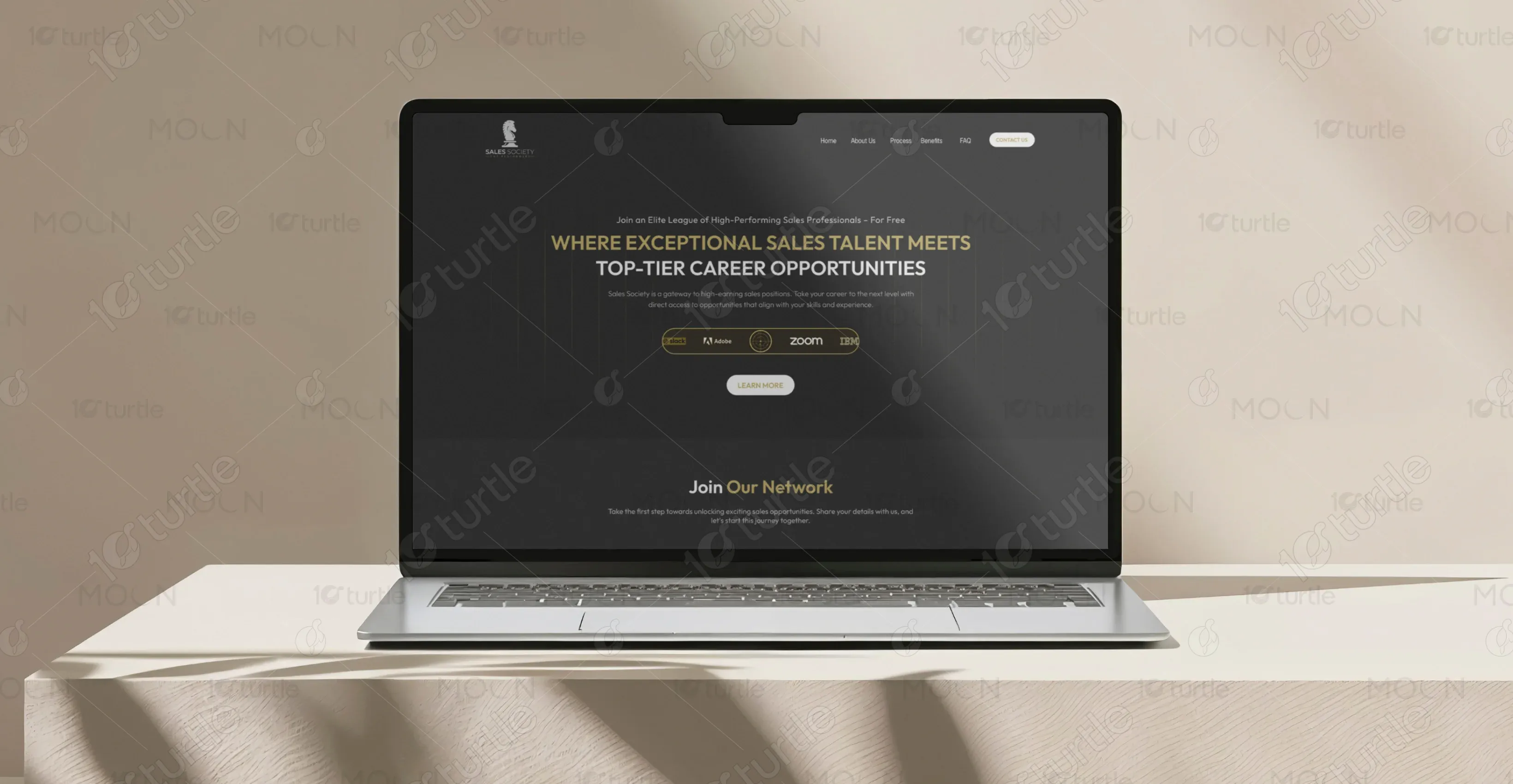
Sales Society is a premium network connecting elite sales professionals with top-paying roles at vetted companies. Designed to streamline hiring for sales teams and unlock high-potential roles for candidates, Sales Society is redefining how companies source top-tier sales talent.
UX Design
UI Design
Research
Websites Design
Industry
Professional Networking
Tools we used


Project Completion
2024
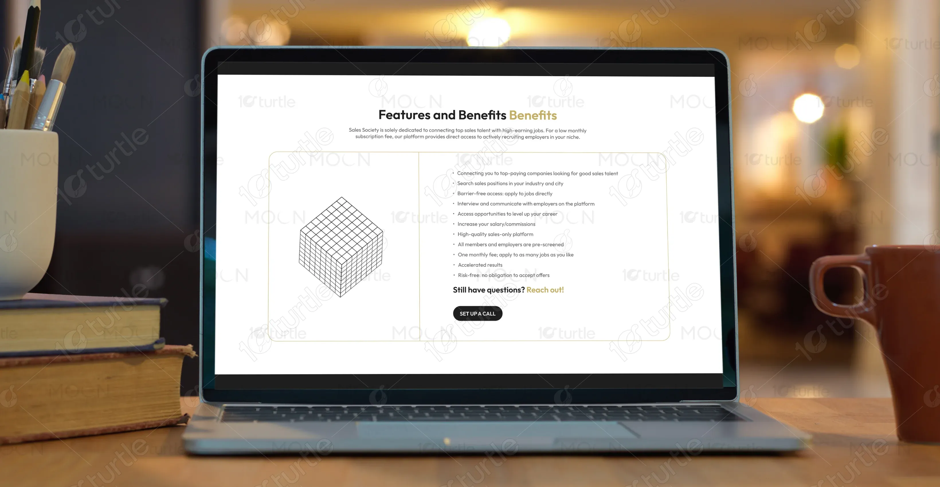
Sales Society offers a barrier-free, curated platform that allows sales talent to find premium job opportunities without subscriptions or recruiter bias. Members enjoy direct access to employers, flexible job opportunities, and a risk-free experience.

Industry
Professional NetworkingWhat we did
User ResearchUI UX DesigningResponsive ExperiencePlatform
-Sales recruitment platforms are often cluttered, expensive, or inefficient. High-performing sales professionals struggle to find premium, verified opportunities that value their talent without being lost in a sea of generic listings or AI-driven hiring processes.
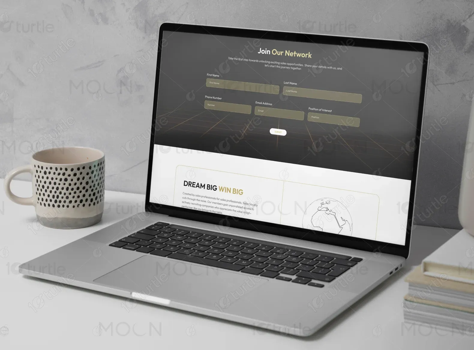
Sales Society solves this by offering a curated, premium network where top sales talent connects directly with vetted employers. It eliminates clutter, cuts out recruiters, and ensures high performers access quality opportunities without noise or bias.
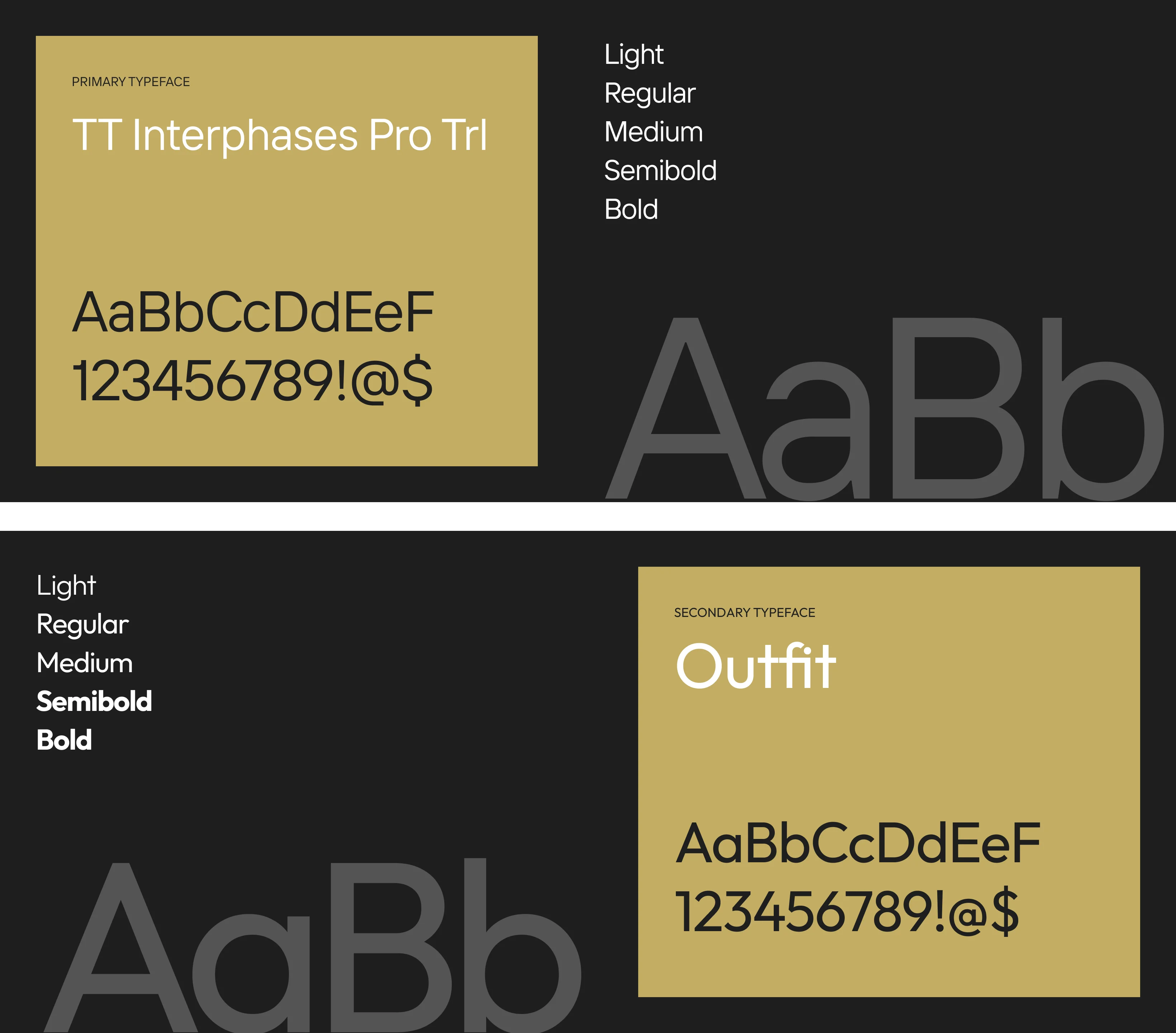
The client envisioned a clean, luxurious, and corporate look using a black and gold palette with elegant, minimal typography. They drew inspiration from high-end SaaS and executive talent platforms to convey a premium, professional image.
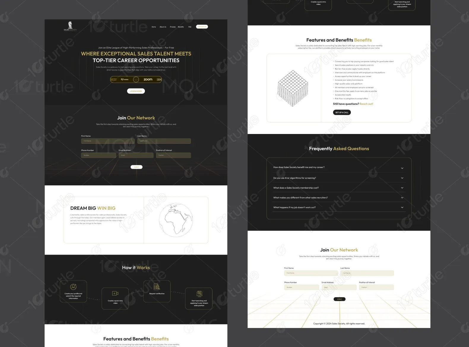

The Sales Society logo features a sleek silver knight chess piece, symbolizing strategy, precision, and elite performance. Paired with refined typography and a gold-accented “Top Performers” tagline, it conveys professionalism, prestige, and exclusivity.
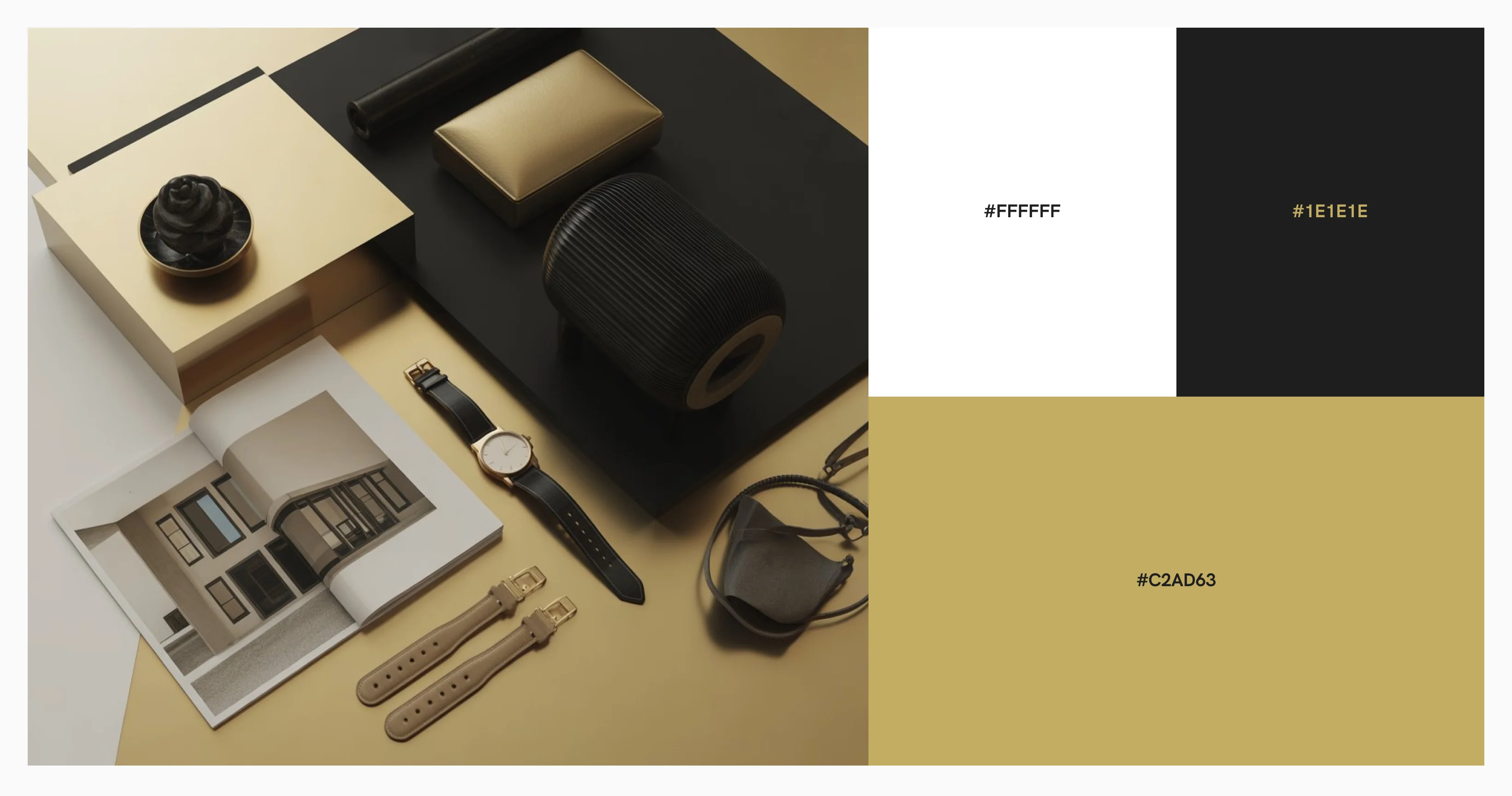
The color palette combines #1E1E1E (Onyx) for a sleek, professional background with #C2AD63 (Gold) to highlight success and prestige. White (#FFFFFF) is used for text and forms, ensuring clarity and modern simplicity. The gold-on-dark contrast reinforces a sense of trust, authority, and exclusivity—perfect for a premium brand.
The wireframes were built on a 1920px canvas with 60px margins, using a clean grid system for consistent spacing and structure. Modular sections and a clear hierarchy prioritize the above-the-fold CTA, ensuring flexibility and strong user engagement.