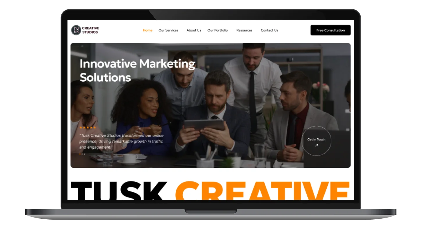
Tusk Creative Studios is a forward-thinking marketing agency that blends creativity with strategy to deliver impactful results. With over 20 years of experience and a client satisfaction rate of 98%, the agency empowers businesses with comprehensive digital marketing services, branding solutions, and creative content campaigns.
Website Design
UI/UX Design
Branding
Conversion Optimization
Industry
Technology, SaaS & Startups
Tools we used

Project Completion
2024
The project aimed to design a bold and modern website that reflects Tusk Creative Studios’ expertise in innovative marketing. The landing page needed to clearly communicate services, showcase client success stories, and highlight the agency’s impact through metrics and testimonials.
Industry
Technology, SaaS & StartupsWhat we did
User ResearchUI UX DesigningPlatform
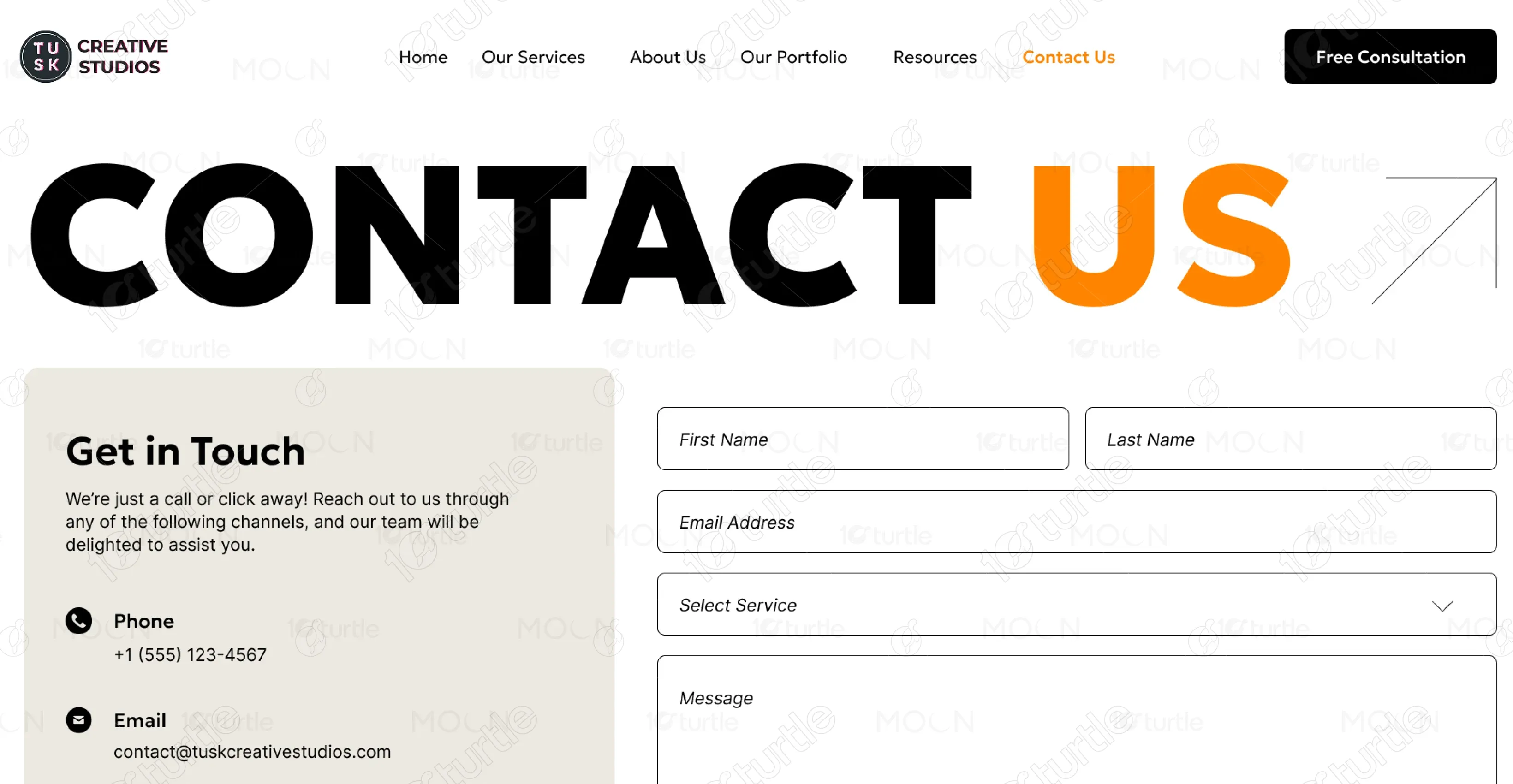
WebsiteThe client’s previous web presence did not reflect the creativity or professionalism of their agency. The lack of strong visuals, structured service breakdowns, and credibility-building elements made it difficult for potential clients to understand the value Tusk Creative Studios could deliver.
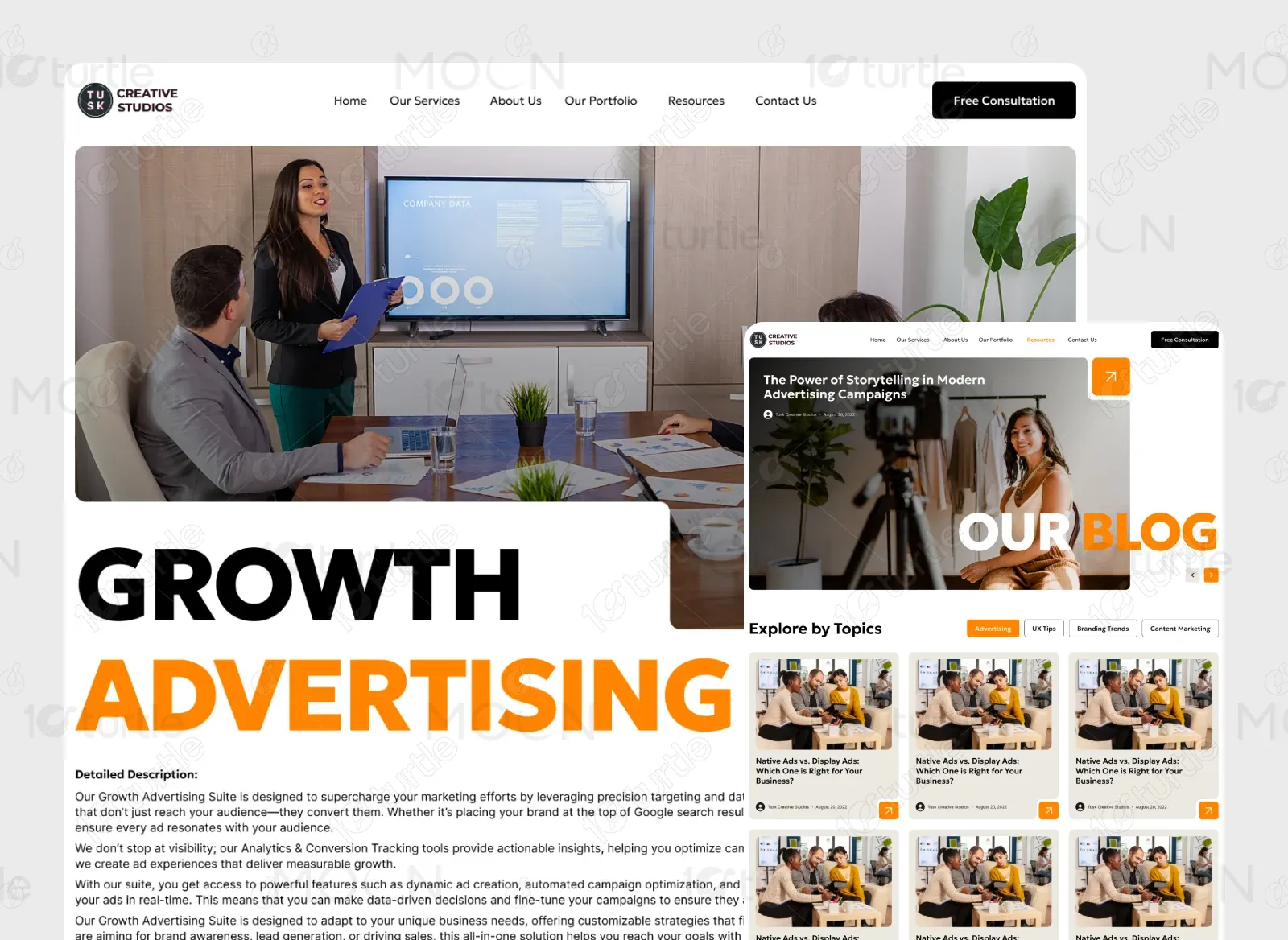
We designed a visually striking landing page with bold typography, dynamic imagery, and engaging layouts. The page highlights services, case studies, key metrics, and client testimonials, while strategically placing CTAs such as “View Services” and “Let’s Create Something Great.” The design combines modern aesthetics with clear communication, ensuring both impact and usability.
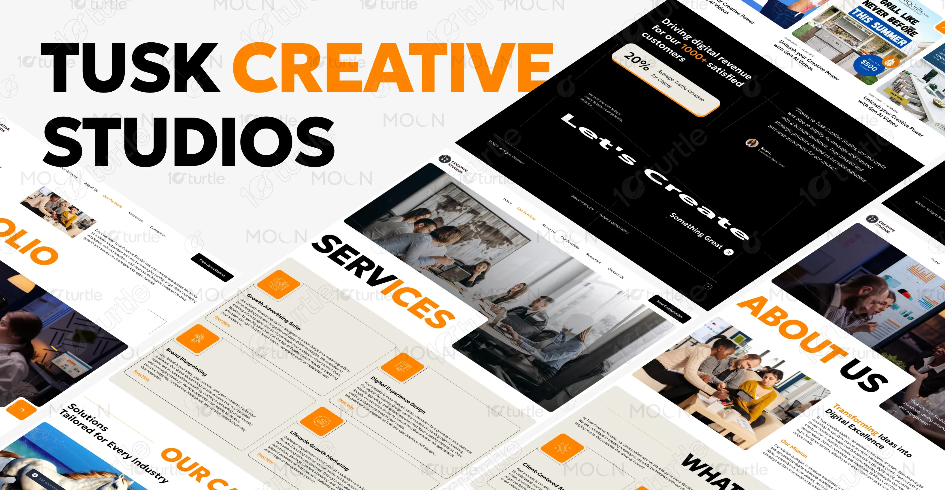
The client envisioned a bold, modern, and professional design that balances creativity with credibility. Their goal was to craft a landing page that stands out visually while maintaining a sense of trustworthiness. They emphasized bold typography, dynamic layouts, and a structure that keeps services, results, and testimonials front and center to communicate expertise and build confidence with potential clients.
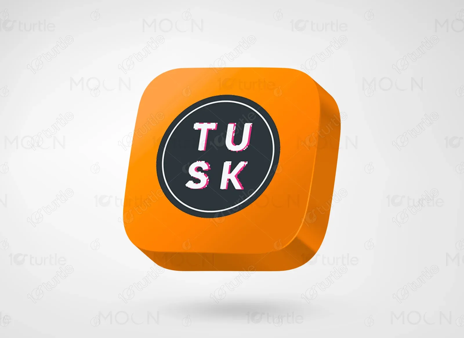
The Tusk Creative Studios logo features a minimal black and white design with a circular icon, reflecting creativity and professionalism.
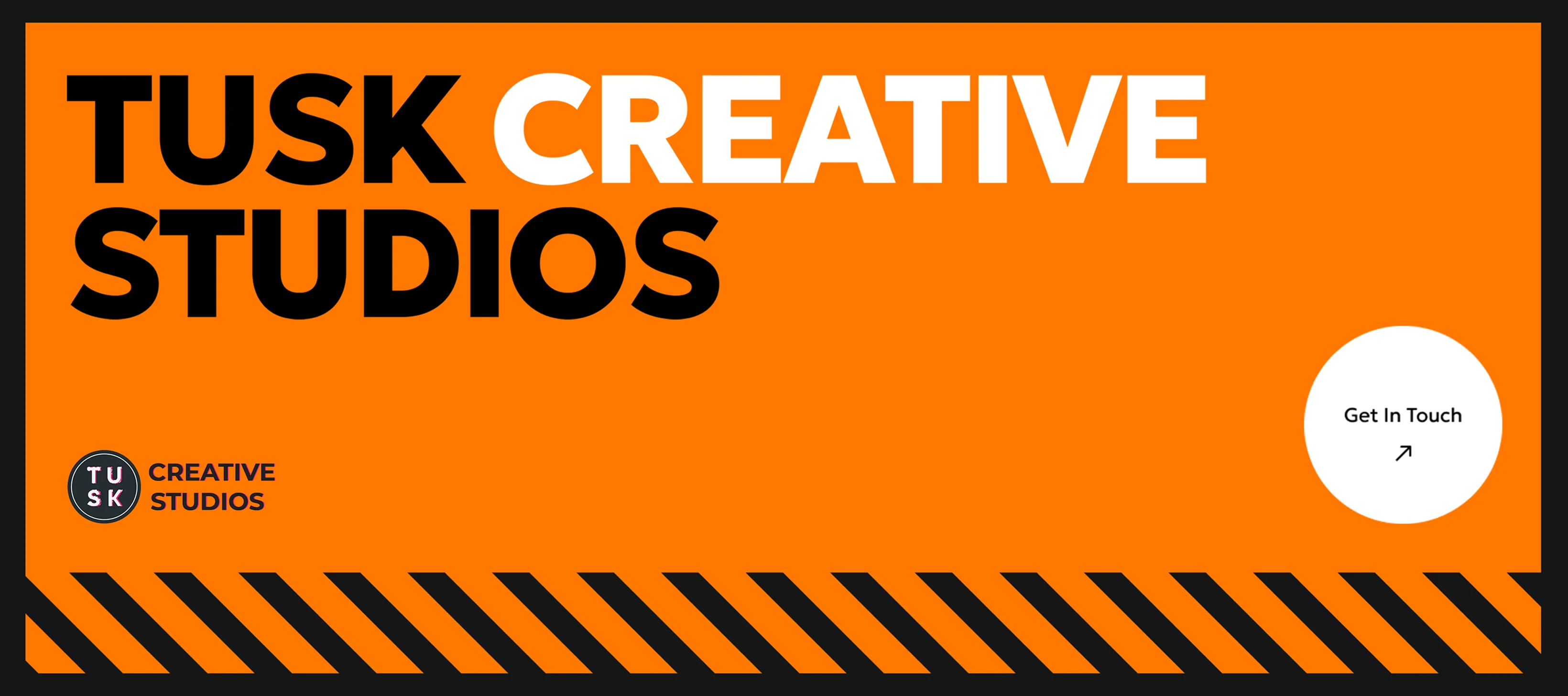
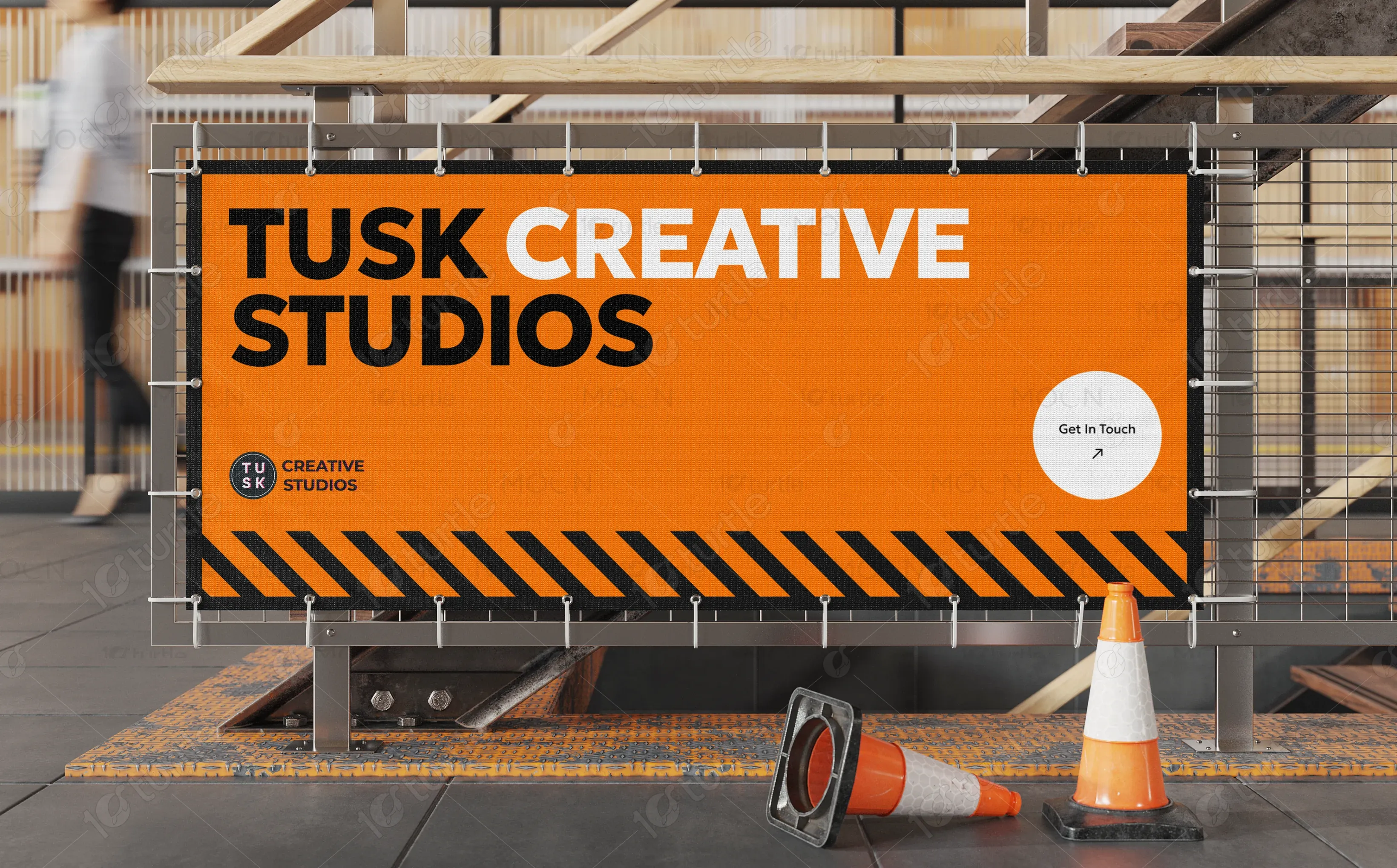
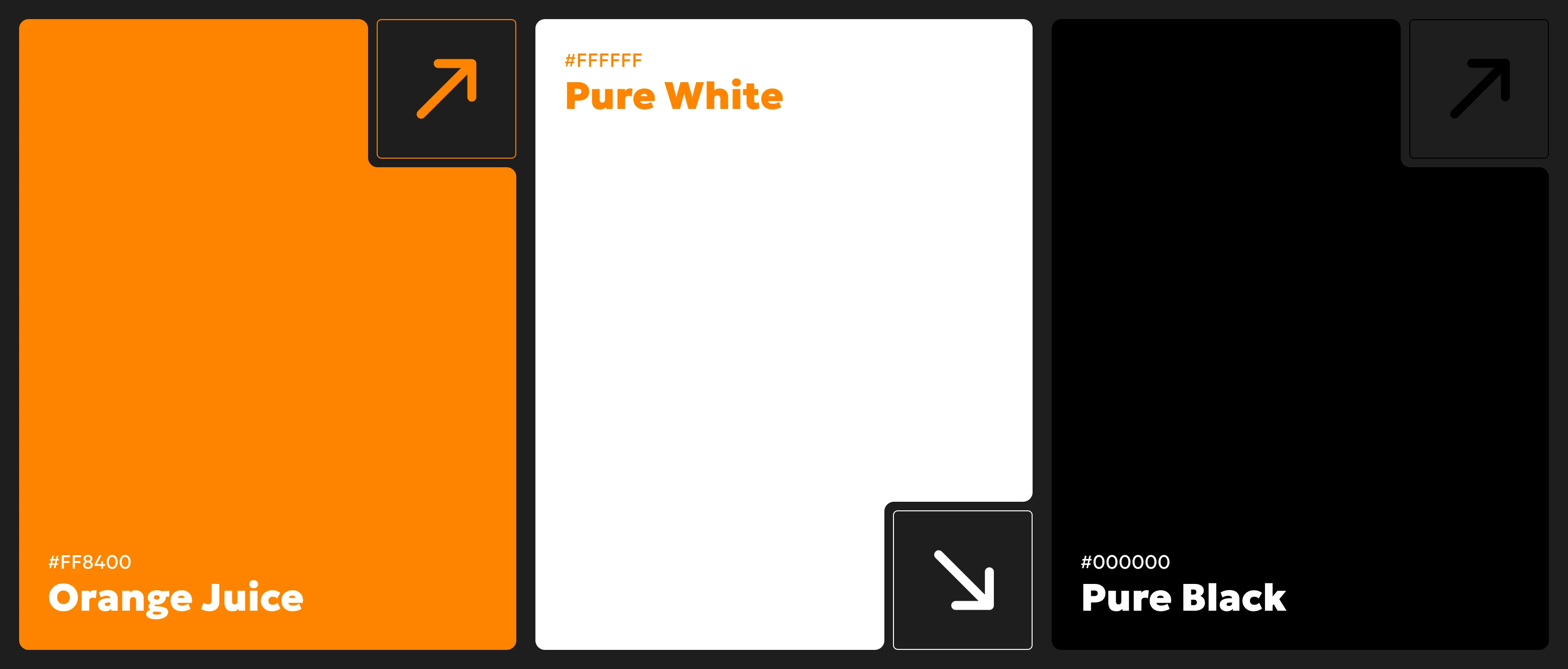
The chosen color palette combined contrasts of black, white, and bright orange (#F7931E) to create a strong and recognizable identity. Supporting tones like light gray (#F2F2F2) and muted beige accents were introduced to soften the design and maintain visual harmony. These shades work together to highlight key elements, draw attention to calls to action, and balance energy with readability across the website.
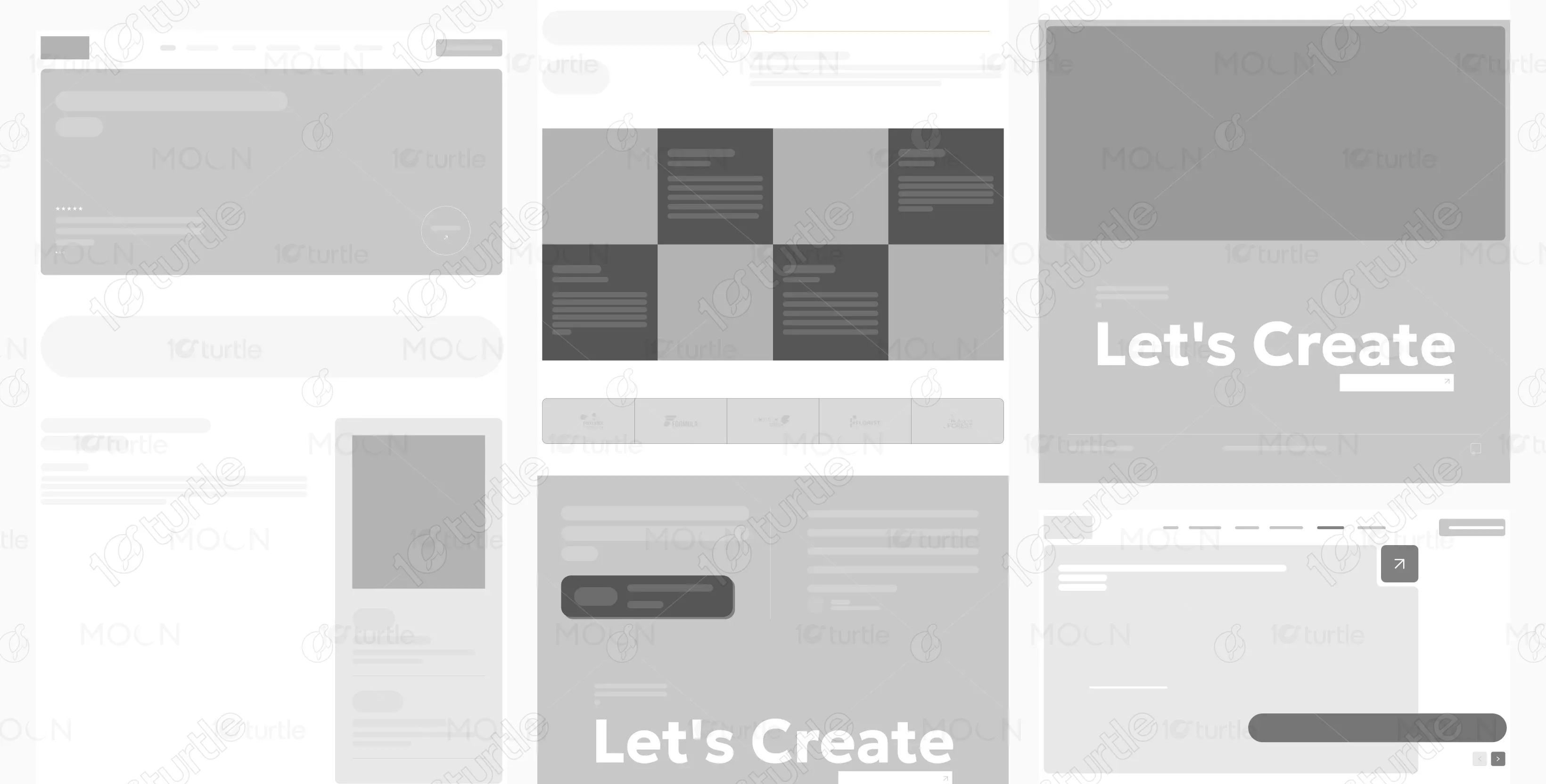
The wireframe was structured to emphasize clarity and flow, with modular sections guiding the user through the brand story and services. It began with a hero banner and CTA, followed by an about/mission section, a services grid with visual cues, and real-world client results.
