Levitate transforms daily planning with thoughtfully designed planners that blend functionality and inspiration, turning organization into a lifestyle rooted in clarity and growth.
UX Design
UI Design
Research
Website Design
Industry
Consumer Goods & Retail
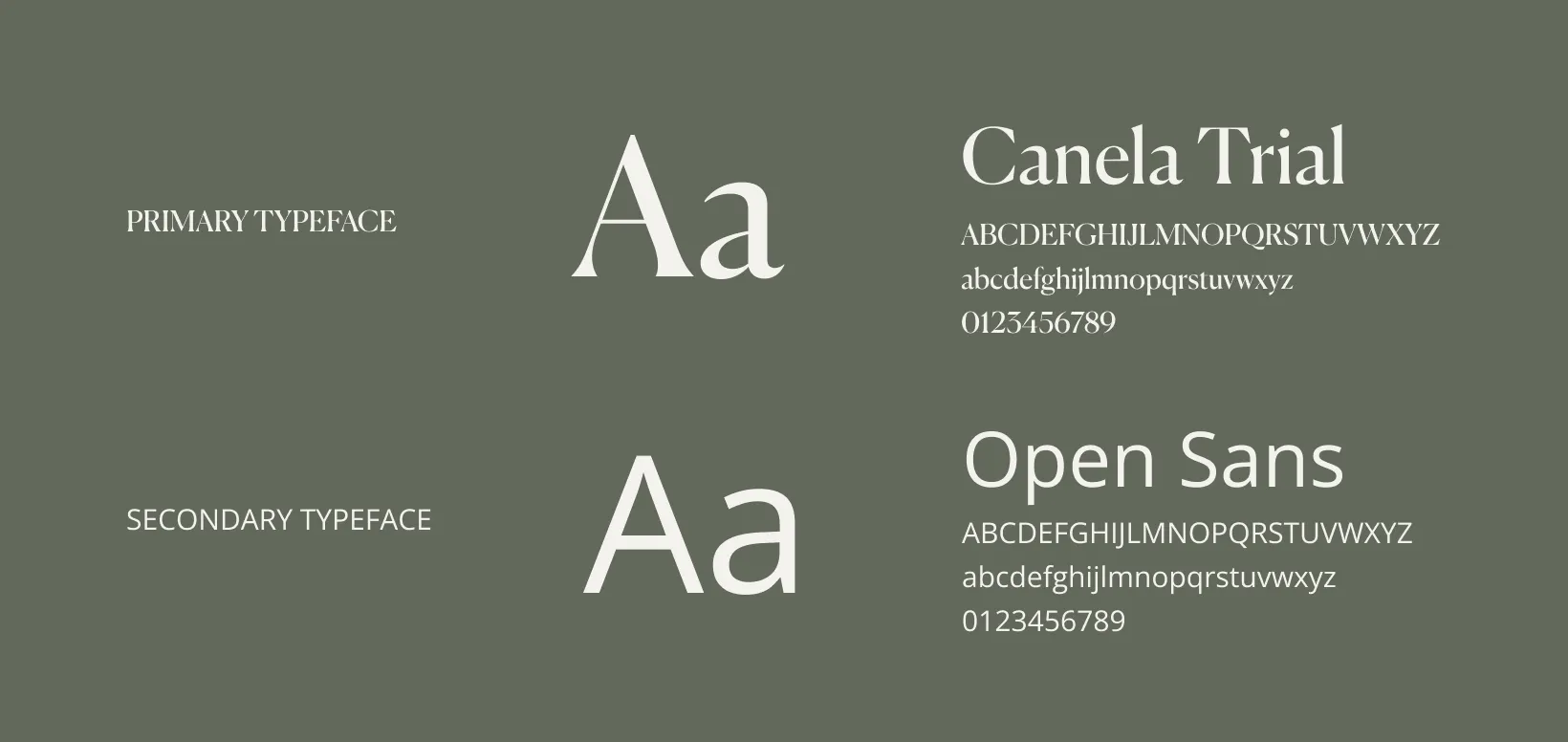
Tools we used

Project Completion
2024
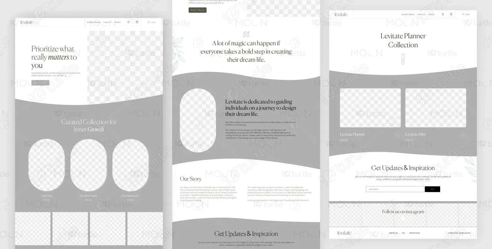
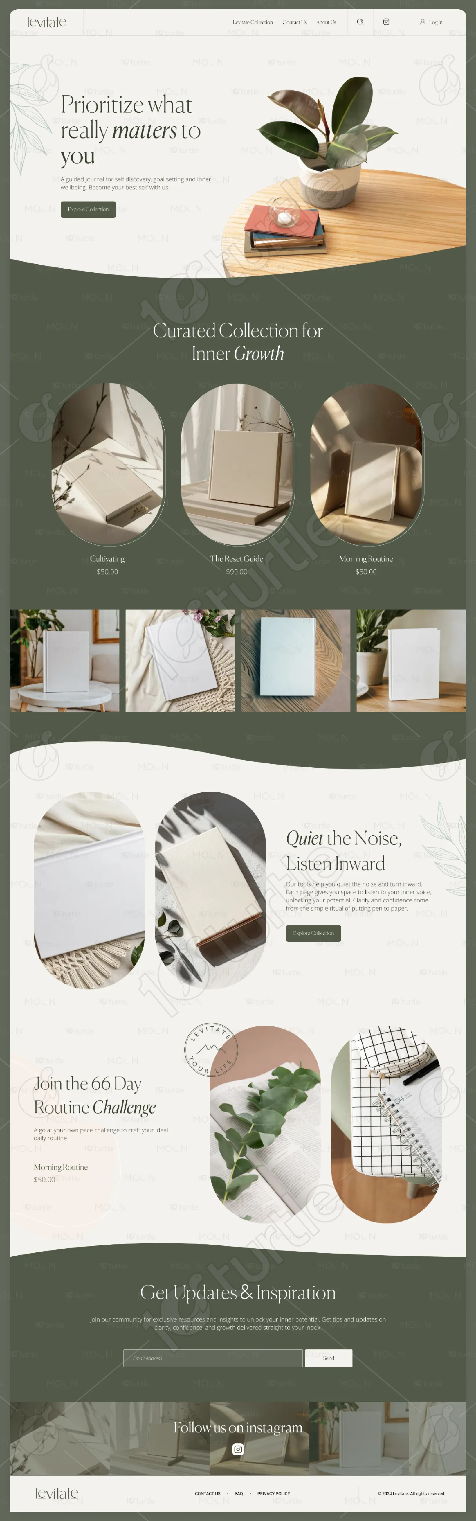
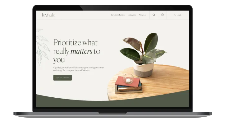
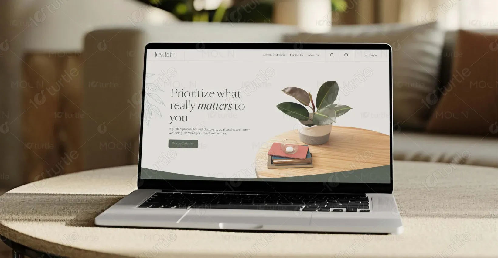
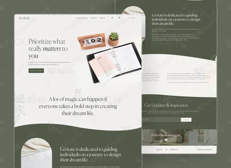
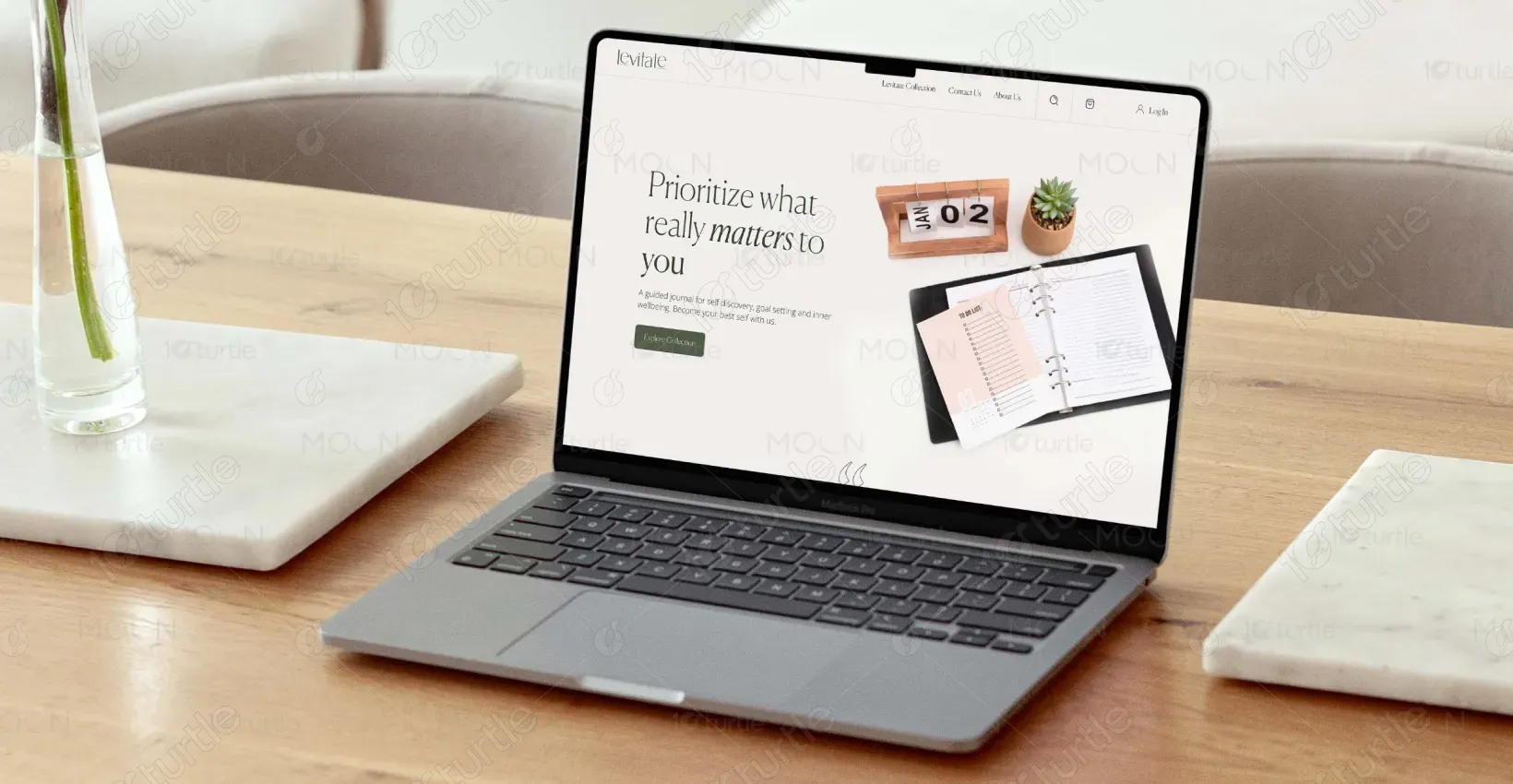
The design of Levitate’s digital experience centers on minimalism, clarity, and storytelling—reflecting the brand’s ethos of intentional living. Clean layouts, a neutral palette, and structured typography create a sense of calm, while product-focused visuals and intuitive navigation ensure usability without distraction. Every element, from product pages to the brand story, is crafted to feel aspirational yet approachable, seamlessly blending commerce with inspiration.
Industry
Consumer Goods & RetailWhat we did
User ResearchUI UX DesigningResponsive ExperiencePlatform
-The client struggled to communicate the deeper value of their planners beyond organization. Their digital presence lacked storytelling and emotional connection, making it hard to differentiate the brand and inspire customers to view the planners as tools for intentional living.
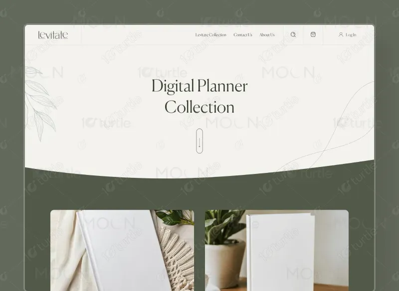
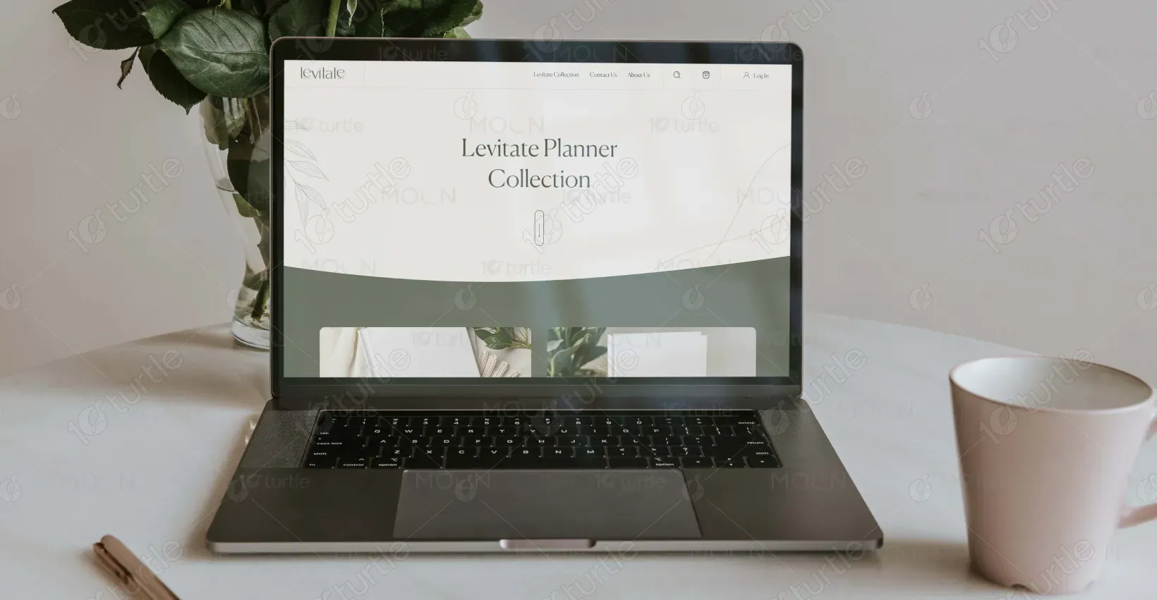
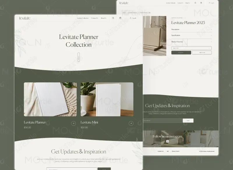
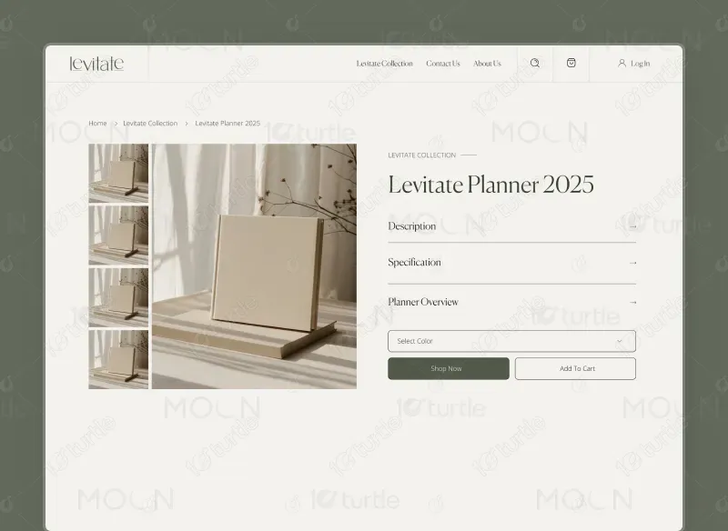
We designed a minimal website that enhances brand identity. With structured layouts and intuitive navigation, we improved visibility while reflecting the brand’s philosophy of clarity and growth. This streamlined experience positioned the brand as a lifestyle choice.
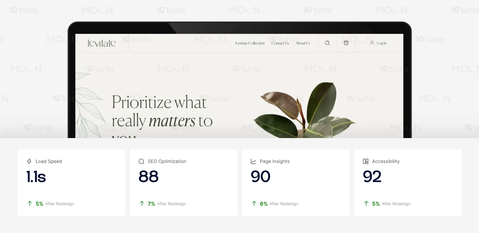
The page is optimized for fast loading and high accessibility, ensuring a smooth user experience. With strong SEO performance, it is more likely to attract organic traffic. The persuasive design elements, including customer reviews and CTAs, significantly enhance user engagement and conversion rates, improving overall sales.
We created a clean, minimal design reflecting Levitate’s philosophy of clarity. By combining structured layouts and storytelling, we enhanced the digital experience, making planners easy to explore and emotionally resonant. This improved product presentation and built brand credibility, positioning Levitate as a lifestyle choice.
The logo embodies simplicity and elevation, mirroring the brand’s philosophy of clarity and growth. Its clean typography and minimal design evoke a sense of calm and balance, while subtle detailing suggests upward movement—symbolizing progress and intentional living. The logo acts as both a visual anchor and a reflection of the brand’s mission to inspire purposeful lifestyles.
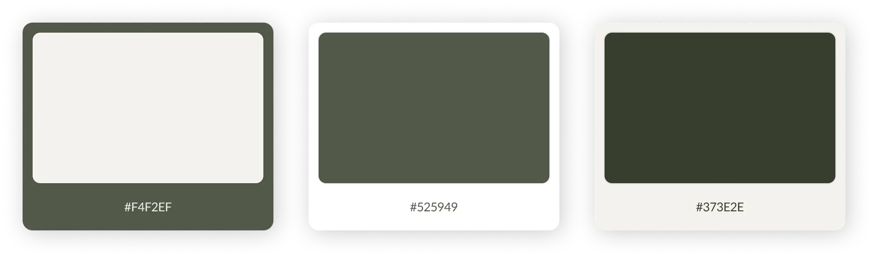
The palette emphasizes calm and sophistication with muted earthy tones. The primary shade is soft off-white (#F4F2EF), representing clarity and minimalism. A deep gray-green (#525949) conveys stability and harmony, while charcoal green (#373E2E) adds depth and contrast.
The wireframing stage translated Levitate’s vision into functional layouts before high-fidelity design. Low-fidelity wireframes defined content hierarchy and navigation flow, ensuring a seamless journey from discovery to checkout. By simplifying elements, we refined usability and validated design decisions early, aligning aesthetics with the brand’s values.