Infographic Design • Data Visualization • Digital Presentation Design
Overview
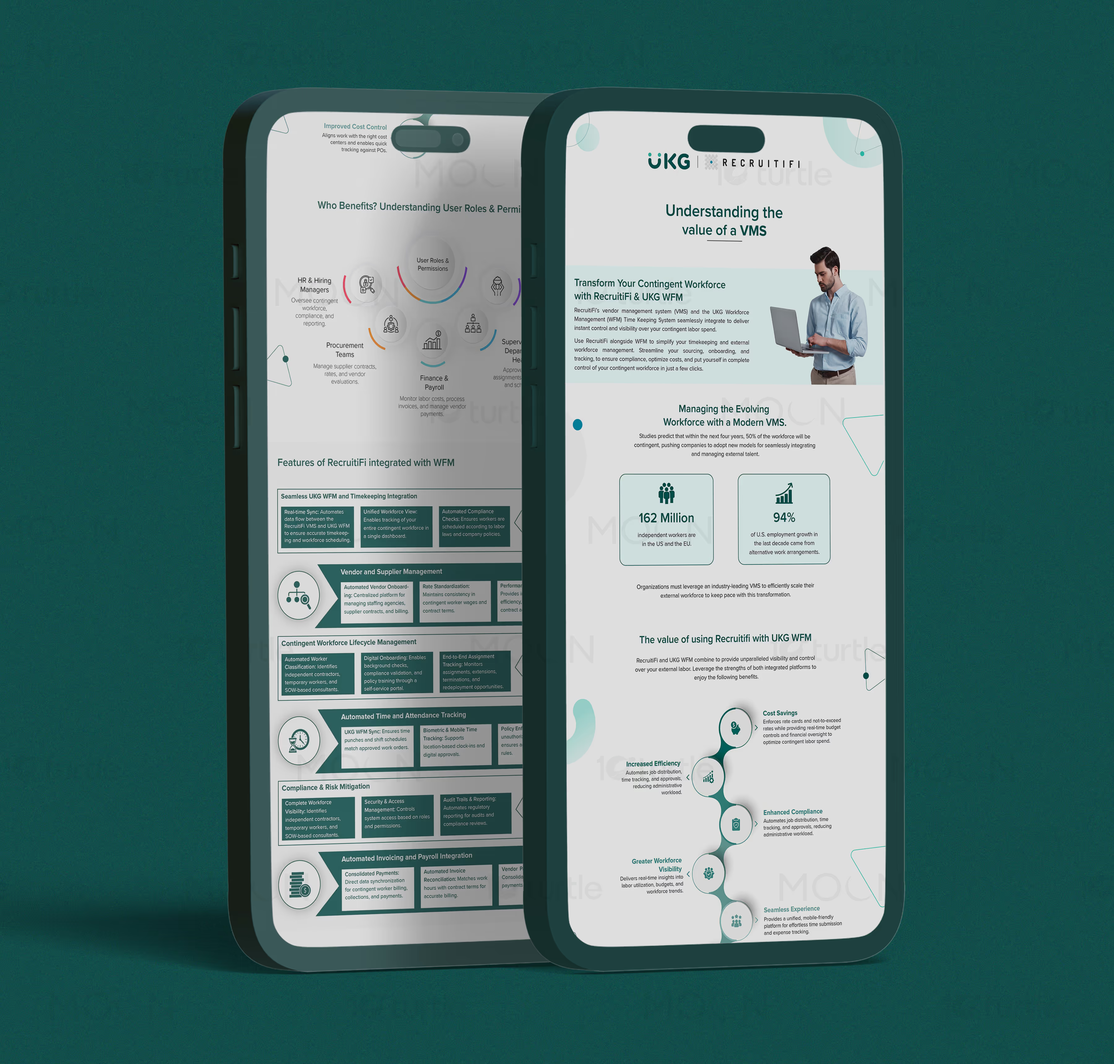
This infographic design project presents Workforce Management SaaS information in a clear, professional, and conversion-focused way. The visuals explain VMS value, contingent workforce management, platform integrations, user roles, permissions, cost savings, compliance, and operational efficiency. Designed for digital viewing and sales communication, the set turns technical product information into an accessible buyer-facing narrative.
The Challenge

Workforce Management SaaS platforms often deal with complex features such as vendor management, contingent labor visibility, compliance, permissions, payroll connections, and enterprise integrations. Without strong infographic design, this information can feel heavy, technical, and difficult for decision-makers to absorb quickly. Poorly structured visuals weaken product understanding and make the platform seem more complicated than valuable. For SaaS buyers, unclear communication can delay trust, demos, and purchase decisions.
The Solution

The infographic system organizes complex Workforce Management SaaS content into a clear visual journey. Circular user-role diagrams, modular feature grids, benefit callouts, and icon-based sections help explain how the platform supports different teams and workflows. A restrained teal and white palette creates a clean enterprise SaaS feel while keeping the layouts approachable. The design works across long-scroll digital pages, presentation screens, and sales collateral, making the product easier to explain in multiple business contexts.
The Impact

This work helps the brand communicate technical SaaS value with more clarity and authority. By making VMS benefits easier to understand, the infographic design supports stronger sales conversations, faster buyer education, and better product positioning. The visual system also gives the brand reusable design language for future SaaS presentations, pitch decks, landing pages, and sales enablement materials. Long-term, it helps the brand stand out as a clear, organized, and enterprise-ready Workforce Management SaaS solution.


Workforce Management SaaS brands often have powerful platforms, but explaining that power clearly is not always easy. A VMS or workforce management platform usually connects many operational layers, including contingent workforce visibility, vendor coordination, procurement workflows, payroll support, compliance tracking, user permissions, and workforce analytics. For buyers, especially enterprise teams, the challenge is not only understanding what the software does, but seeing how every feature connects to everyday business outcomes. This is where strategic infographic design becomes essential.
For this project, the goal was to create a visual communication system that could simplify a technical Workforce Management SaaS offering without making it look basic. The design needed to feel professional, structured, and enterprise-ready while still being easy to scan. Instead of presenting the content as long product explanations, the layouts transform key information into guided diagrams, modular cards, icon-led sections, and benefit-based visual blocks. This helps viewers move naturally from product context to platform value, then into specific use cases such as user roles, permissions, integrated workflows, and operational improvements.
The visual direction uses a clean teal, white, and soft grey palette to reflect clarity, trust, and modern SaaS positioning. The layouts avoid unnecessary decoration and focus on hierarchy, spacing, and readability. Large headings introduce the value proposition quickly, while supporting diagrams break down how different teams benefit from the solution. This makes the infographic design useful for sales conversations, landing pages, digital presentations, and product education. It can support both high-level brand messaging and deeper product explanation.
A strong Workforce Management SaaS infographic must do more than look polished. It needs to help prospects understand why the platform matters. In this case, the design highlights how VMS technology can improve visibility, reduce manual work, support compliance, manage external talent, and connect workforce operations across departments. These are not just software features; they are business outcomes that matter to procurement teams, finance teams, workforce managers, and executive decision-makers.
As part of a broader B2B SaaS marketing design approach, this project gives the brand a more confident way to explain its product. The infographic system creates a bridge between technical detail and buyer understanding, helping the platform feel organized, scalable, and credible. Long-term, this type of SaaS product communication can improve sales enablement, strengthen digital campaigns, and create a consistent visual language for future collateral. For a Workforce Management SaaS brand, clear information design is not just decoration — it is a strategic tool for building trust and moving prospects closer to action.
#infographicdesign
#datavisualization
#informationdesign
#reportdesign
#businessinfographic
#corporatedesign
#visualstorytelling
#presentationdesign
#researchdesign
#printdesign
#digitaldesign