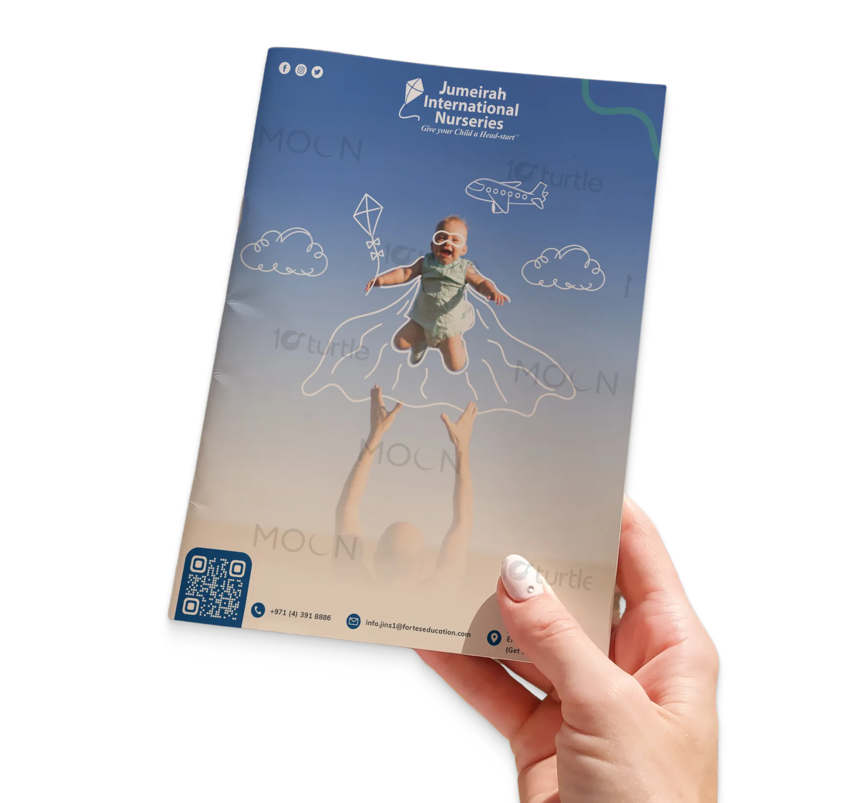
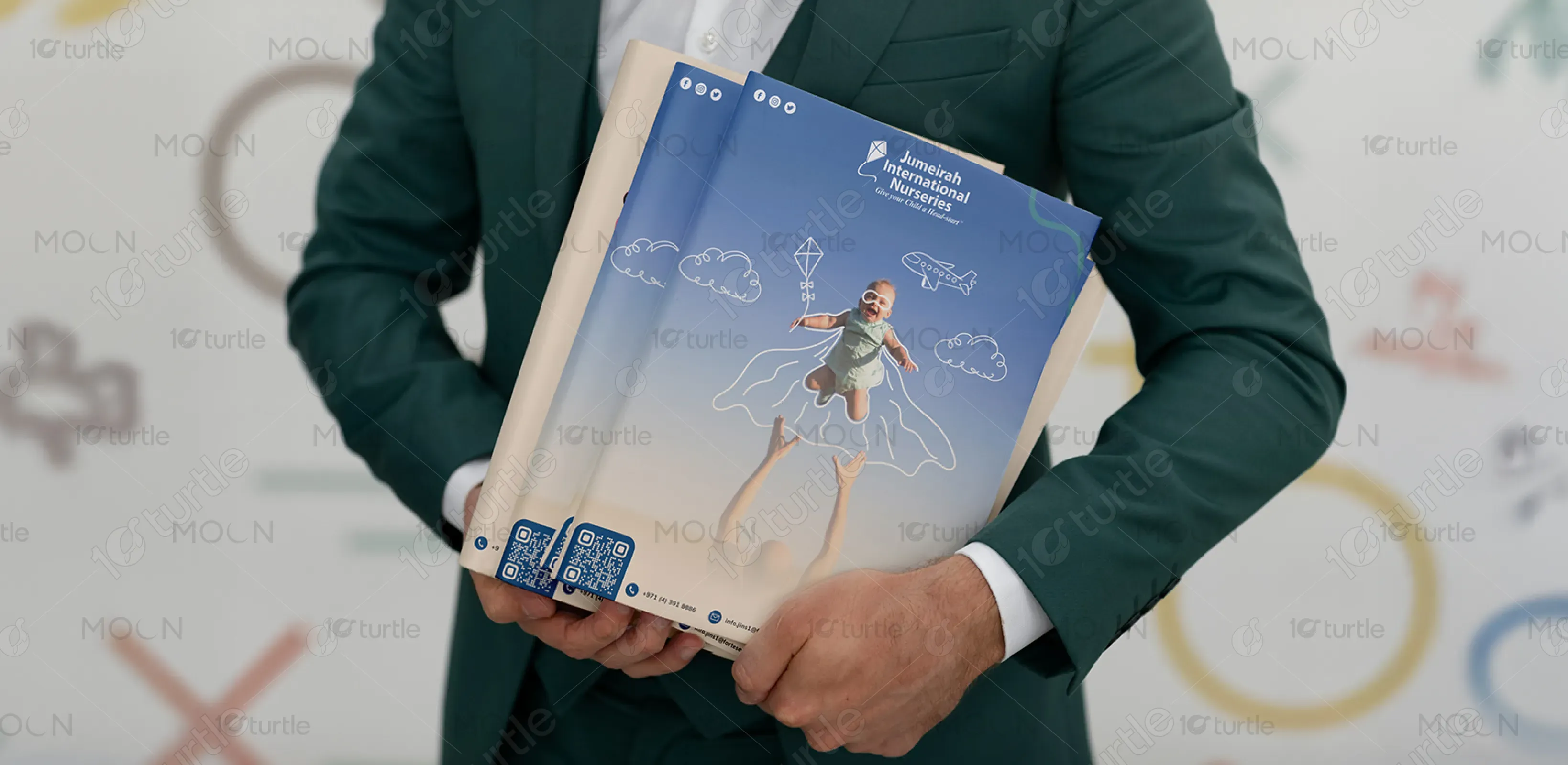
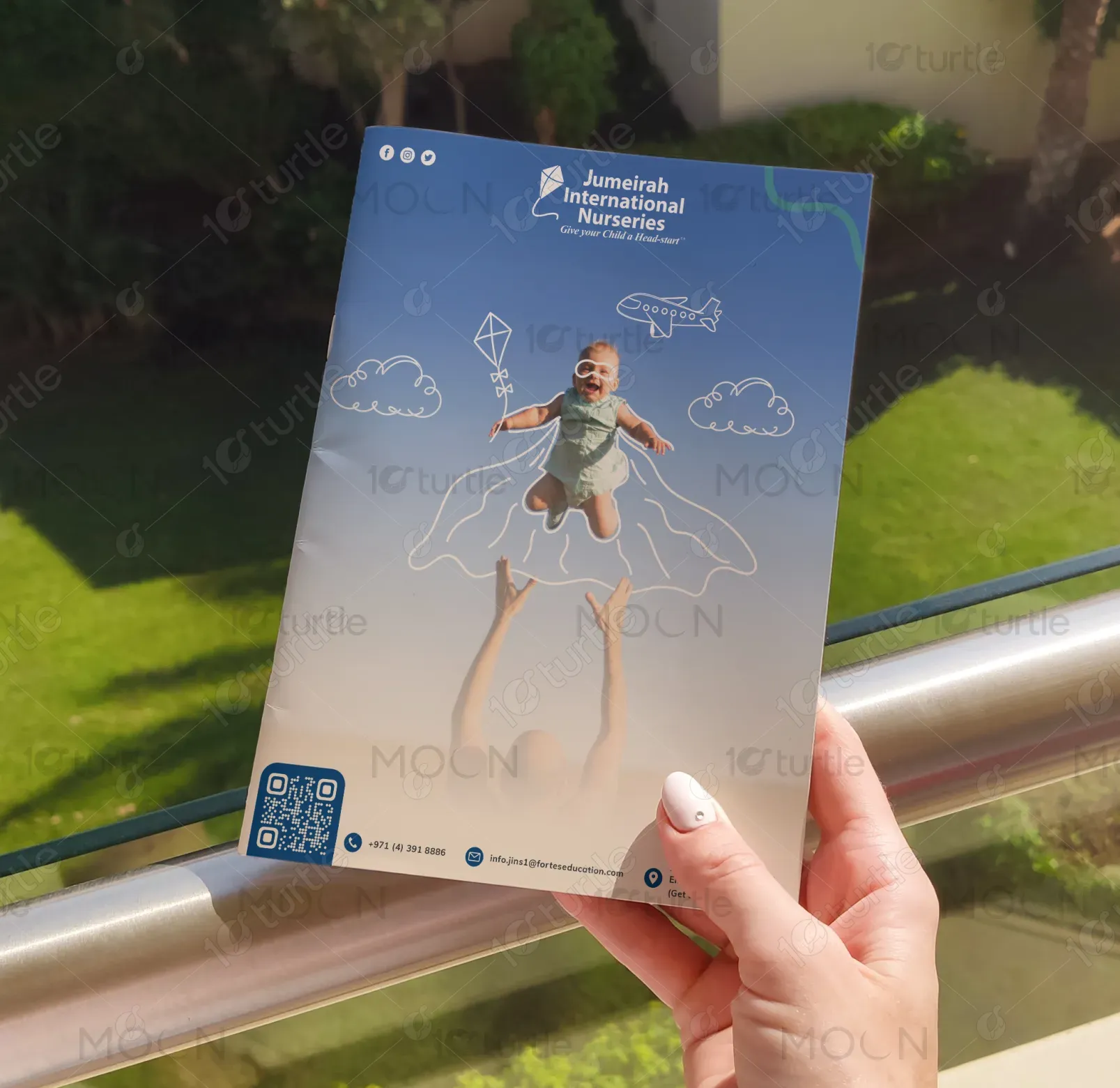
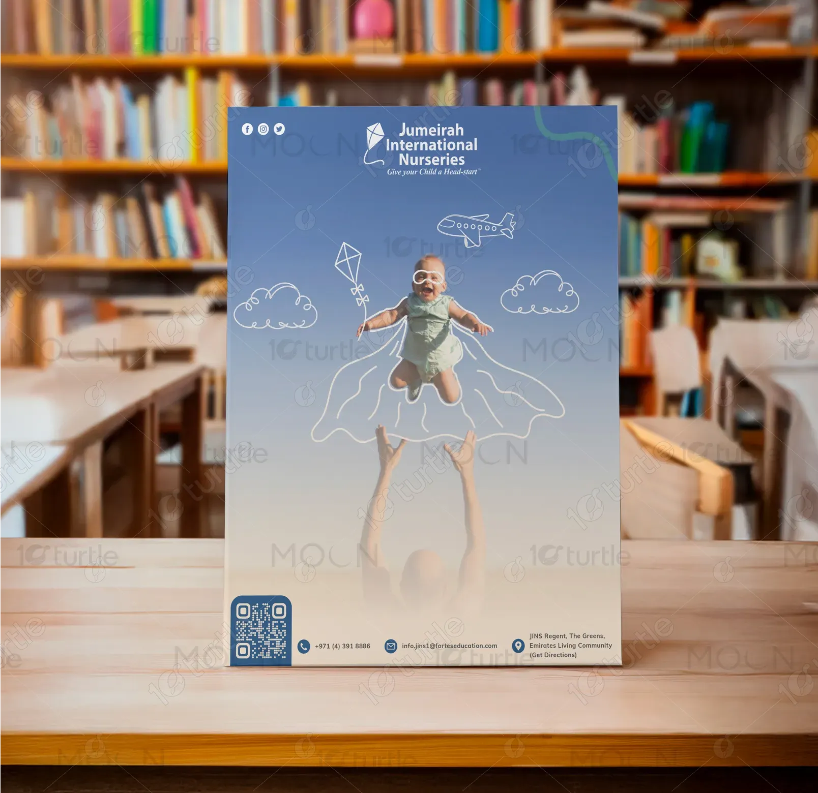
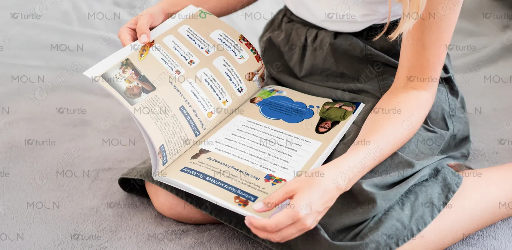
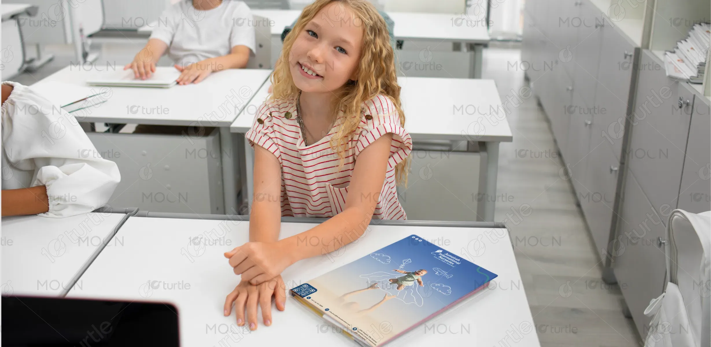
This brochure adopts a warm, playful, and child-friendly aesthetic with a focus on nurturing early development. Soft, earthy tones paired with pops of vibrant color enhance readability and engagement. Real-life images and illustrated elements (like the flying baby with a superhero cape) convey imagination, growth, and joy. The layout is clean yet dynamic, guiding the reader through the content effortlessly while maintaining visual interest. Overall, the design blends professionalism with warmth, reflecting a premium, caring early learning environment.
Brochure Design
Graphic Design
Industry
Education & Training
Tools we used


Project Completion
2025
Key Market
Global
The brochure promotes Jumeirah International Nurseries (JINS), a premium early childhood education provider in the UAE. Designed for parents seeking trusted childcare, it highlights JINS’s nurturing curriculum, modern facilities, and experienced educators. The content focuses on holistic development, cultural diversity, and a fun, secure environment. Unique selling points include a research-backed approach, vibrant learning activities, and a strong community presence. Visually, it appeals to both heart and mind—instilling trust while reflecting a joyful, enriching experience for every child.
Industry
Education & TrainingWhat we did
Brochure DesignGraphic DesignPlatform
-In the UAE’s rapidly growing education sector, parents often struggle to find nurseries that combine safety, developmental expertise, and emotional nurturing under one roof. Many early education centers either focus heavily on academics or offer generic care with little individualized attention. Additionally, busy parents seek trustworthy, transparent institutions with a clear communication strategy and a supportive environment for their child’s social and emotional growth.
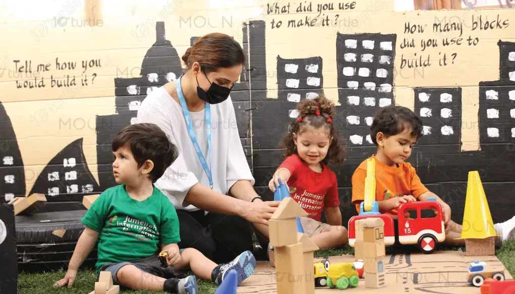
Jumeirah International Nurseries addresses these concerns with a well-rounded curriculum that integrates play-based learning, emotional intelligence, and cultural diversity. The brochure effectively communicates these through engaging visuals, real testimonials, and curriculum highlights. The use of joyful imagery (such as the flying baby) symbolizes the confidence and creativity nurtured at JINS. Key features include small class sizes, qualified teachers, hands-on learning spaces, and strong parent-school communication—creating a truly child-centered, safe, and stimulating environment.

The long-term vision for JINS is to be the leading early years provider in the region, known for shaping confident, curious, and compassionate learners. By continually evolving its methodologies and maintaining global best practices, JINS aspires to set the benchmark for early childhood education. The brand envisions a future where each child is empowered with a lifelong love for learning—making meaningful contributions to society from the very start.
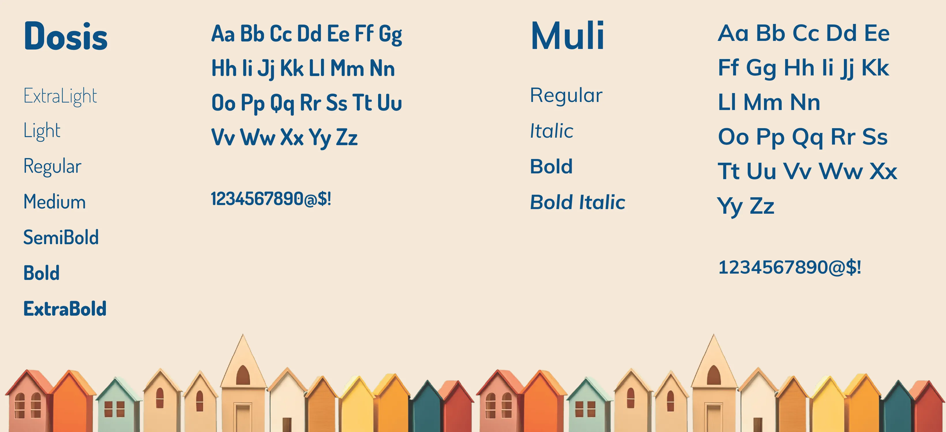
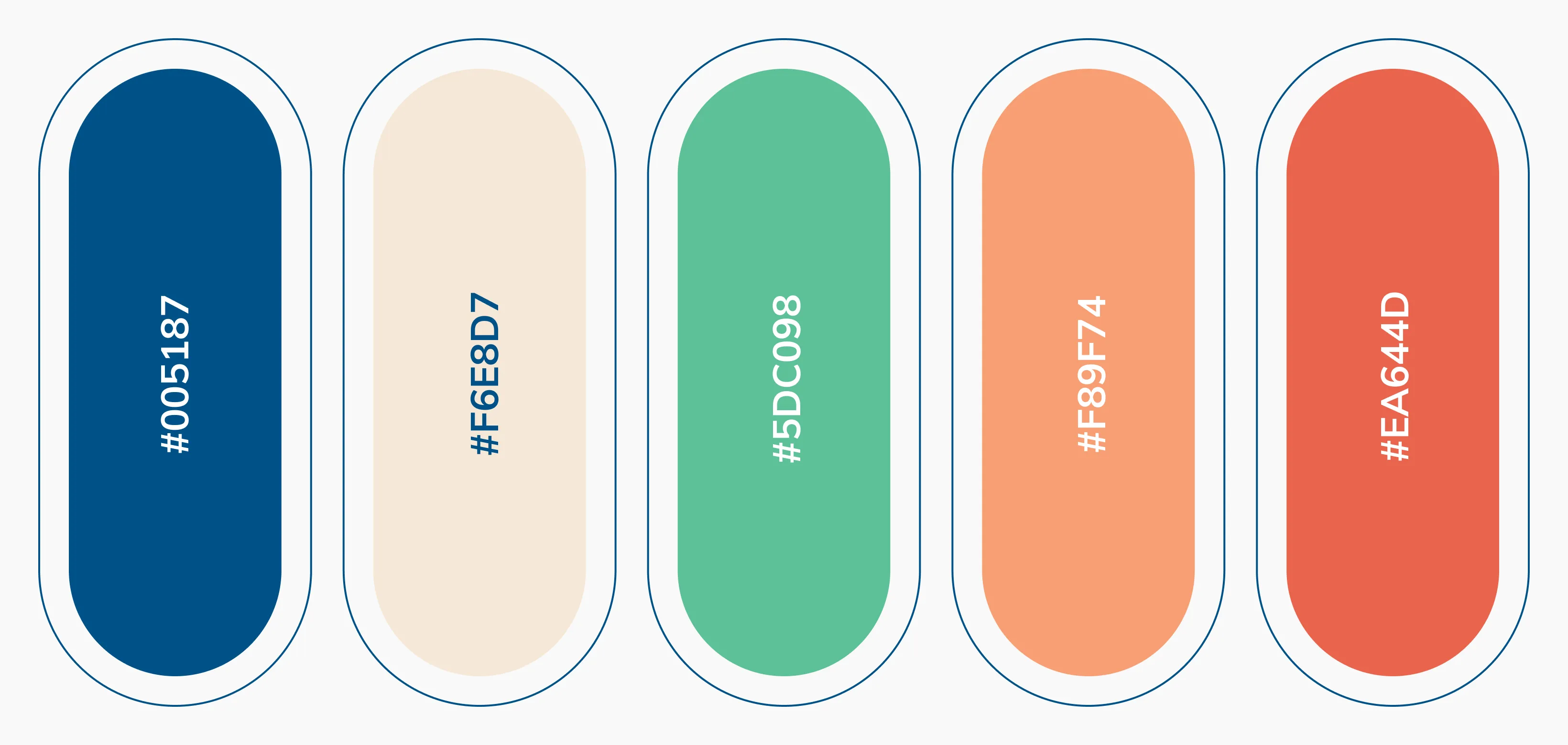
The brochure uses a calm beige background with accents of navy blue, orange, and soft primary tones. The beige provides a neutral, warm base that evokes safety and comfort. Navy blue conveys trust, professionalism, and stability—ideal for reassuring parents. Orange and bright accents inject playfulness and creativity, aligning with the brand’s child-focused, energetic ethos. Together, these colors build an inviting and emotionally resonant aesthetic while reinforcing JINS’s balanced approach to early education.
