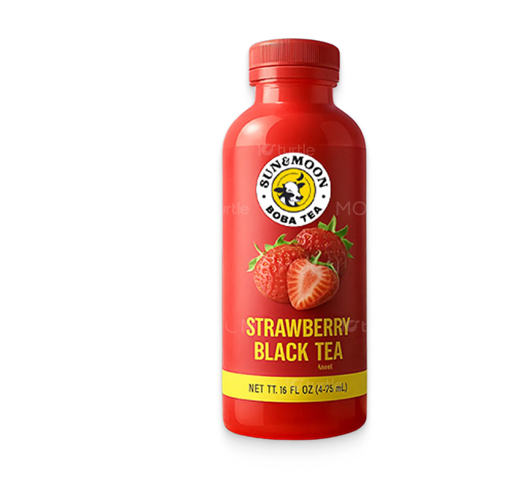
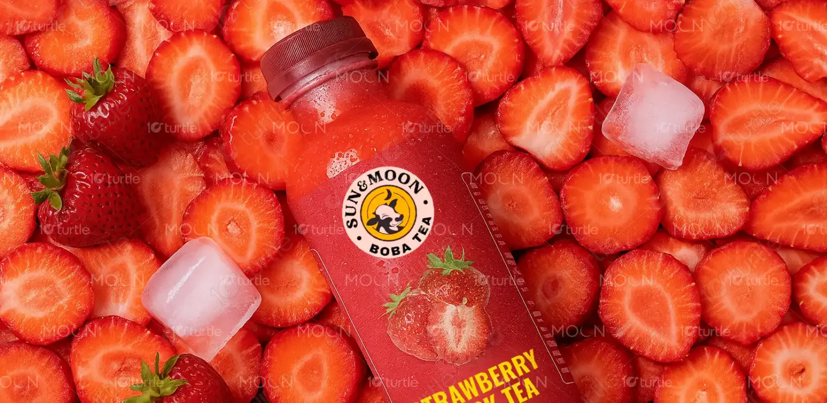
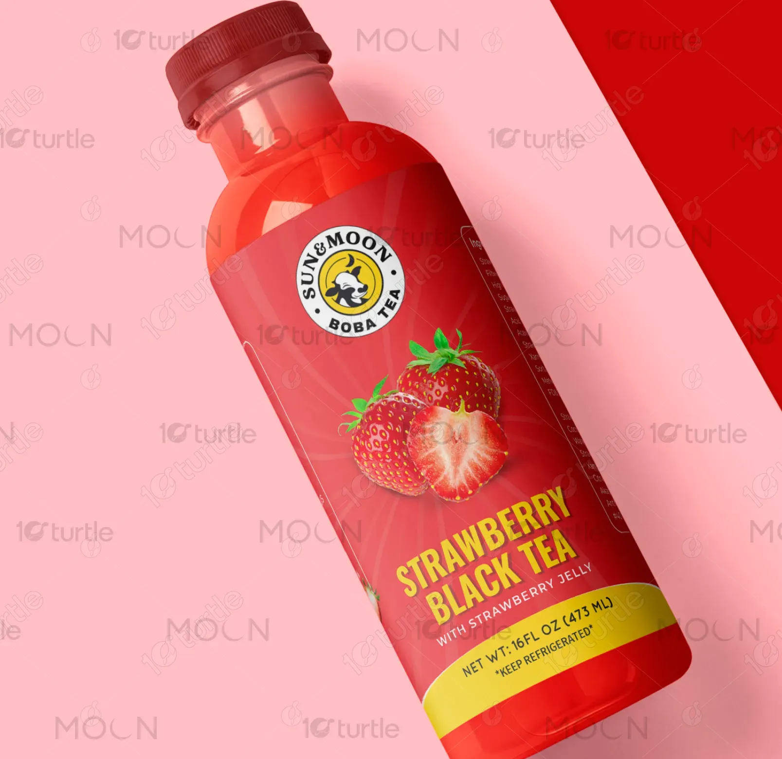
The label design captures freshness and flavor through a vibrant red palette symbolizing strawberries and energy. The strawberry illustration adds a natural and juicy appeal, while the bold yellow-green accent emphasizes vitality and health. A modern sans-serif font communicates clarity and youthfulness. The diagonal split background balances soft pink with deep red, visually drawing attention to the product while enhancing shelf presence. The logo stands out clearly, reinforcing brand identity and trust.
Label Design
Graphic Design
Industry
Food, Beverage & Hospitality
Tools we used


Project Completion
2025
Key Market
Global
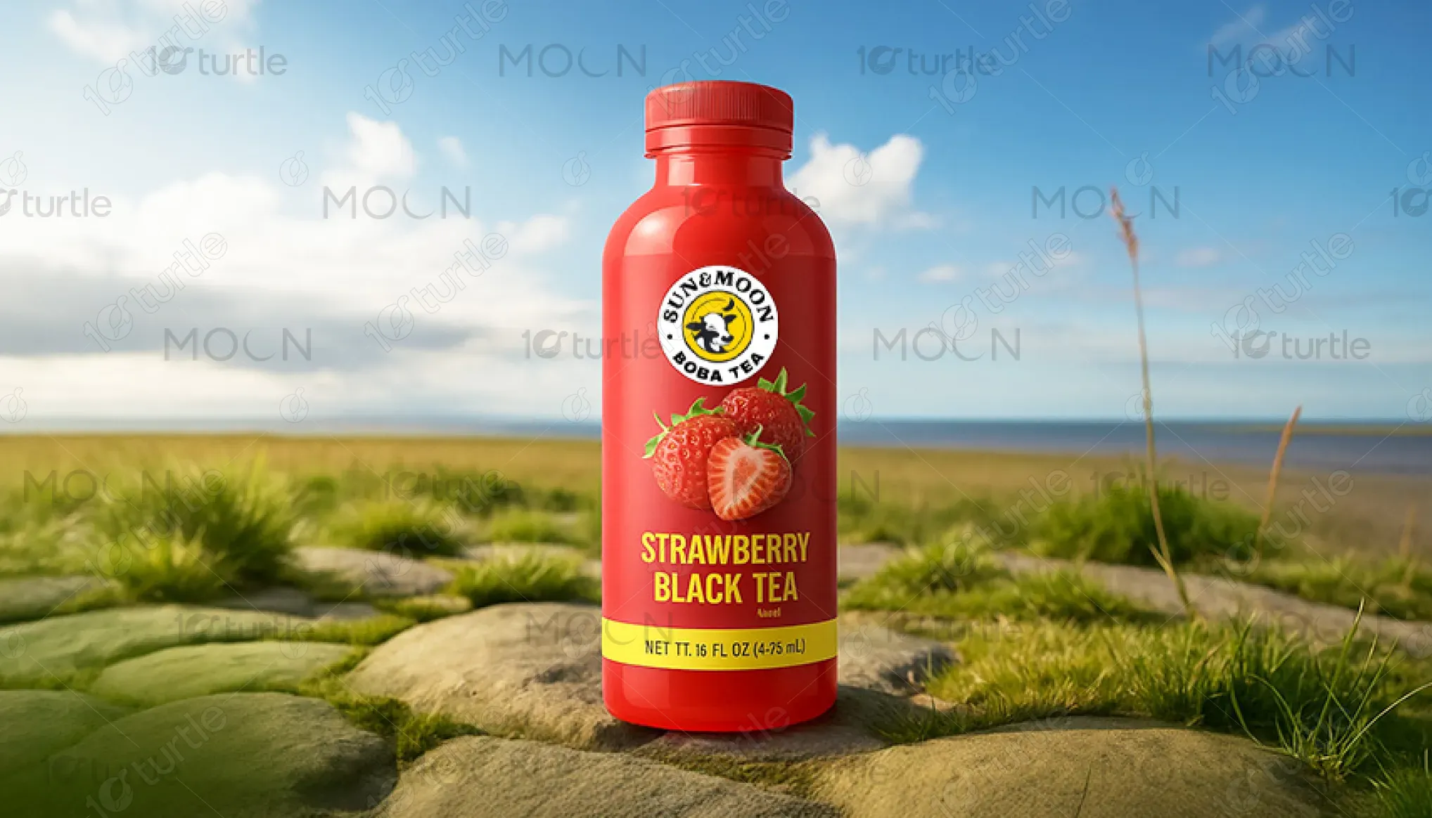
This product is a ready-to-drink Strawberry Black Tea under the "Sunmoon Boba Tea" brand. Designed for on-the-go tea lovers, it merges the bold richness of black tea with the refreshing sweetness of strawberries. Targeting health-conscious youth and boba fans, its unique selling point lies in blending premium tea with fruity freshness—without excess sugar or artificial additives. The clean label, vibrant colors, and fresh visuals speak to both natural quality and modern beverage trends.
Industry
Food, Beverage & HospitalityWhat we did
Label DesignGraphic DesignPlatform
-The RTD tea market is crowded with overly sweet or artificial options that fail to reflect real fruit and tea authenticity. Many labels are either too clinical or too flashy, disconnecting from health-conscious consumers seeking transparency and visual appeal. Additionally, boba beverages are often restricted to cafes, limiting their availability in grab-and-go formats. This gap makes it harder for customers to enjoy premium tea blends in portable, healthy, and aesthetically pleasing packaging.
This design bridges that gap by offering a visually clean, fruit-forward, and premium-ready boba tea. The bottle communicates freshness with real strawberry imagery and vibrant colors while keeping the layout uncluttered. The yellow-green accent suggests natural energy, and the balanced typography ensures readability. The design brings cafe-quality tea into a convenient form, making it accessible anytime, anywhere—without compromising on aesthetics or authenticity.

Sunmoon Boba Tea envisions becoming a leader in healthy, flavorful, and portable tea experiences. It aims to expand its lineup with more fruit-tea fusions, herbal blends, and limited-edition seasonal flavors—all designed with sustainability and wellness in mind. The long-term goal is to redefine how consumers perceive boba: not just as a treat, but as an everyday lifestyle beverage rooted in quality and culture.
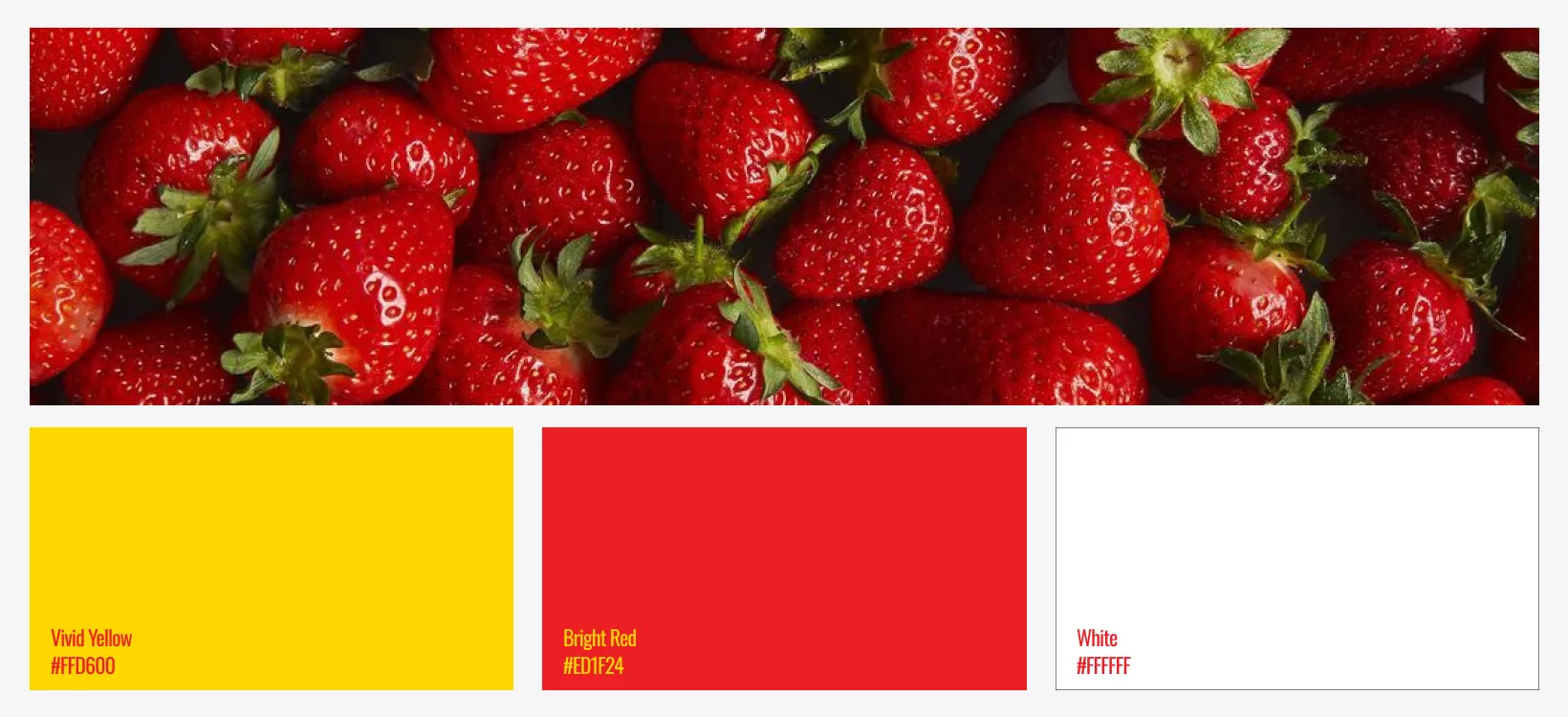
The color palette for the Sunmoon Boba Tea – Strawberry Black Tea label combines vibrant and appetizing tones to capture freshness, flavor, and energy. The rich strawberry red (#C82F2F) dominates the design, instantly evoking fruity sweetness and boldness. It’s balanced with a soft pink (#F8BFC8) background that adds a gentle, playful feel, appealing to a younger demographic. A deep crimson (#A31212) gives depth and reflects the robust character of black tea. The lime-yellow accent (#D4DF36) adds a pop of citrusy brightness, symbolizing vitality and natural freshness. Clean white and black are used for text and the logo to ensure strong contrast, legibility, and a professional finish. Together, these colors create a fresh, modern, and flavorful identity that reflects both indulgence and authenticity.