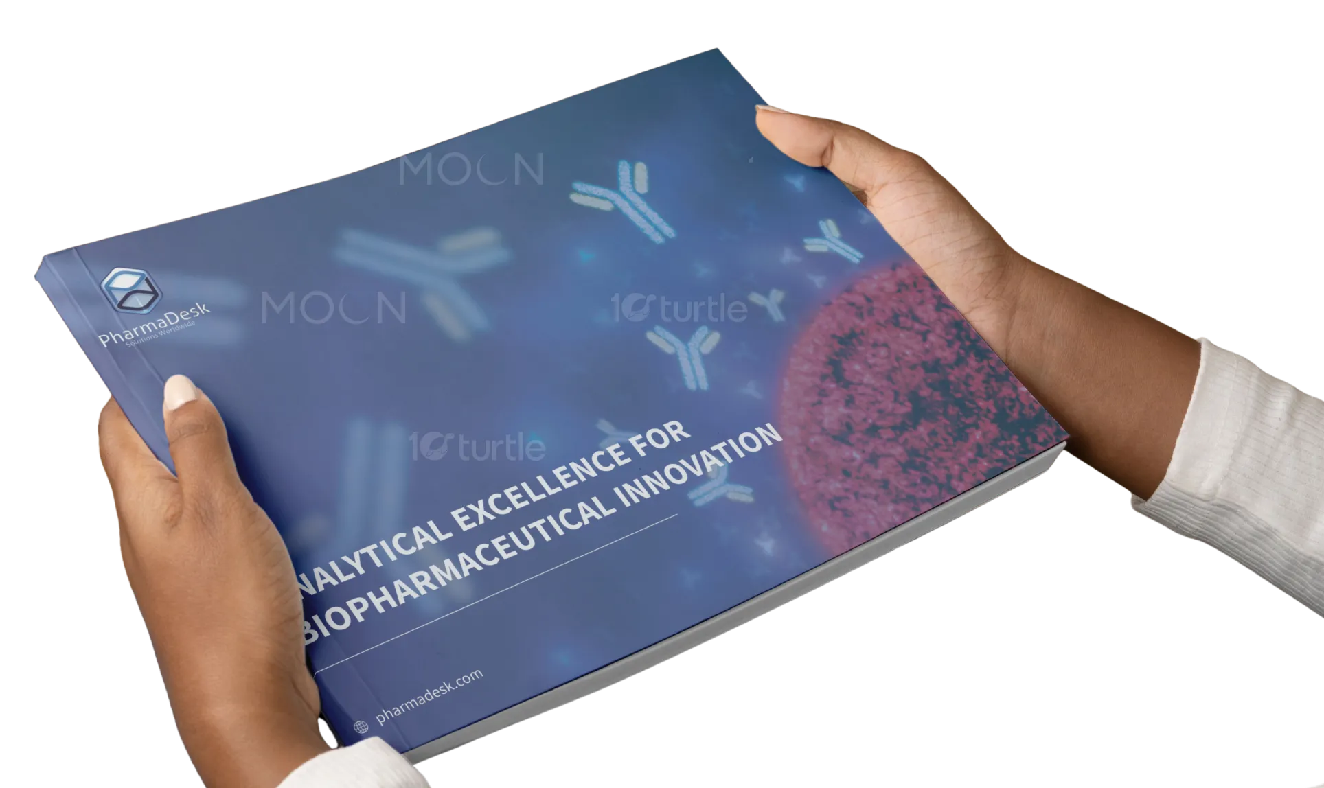
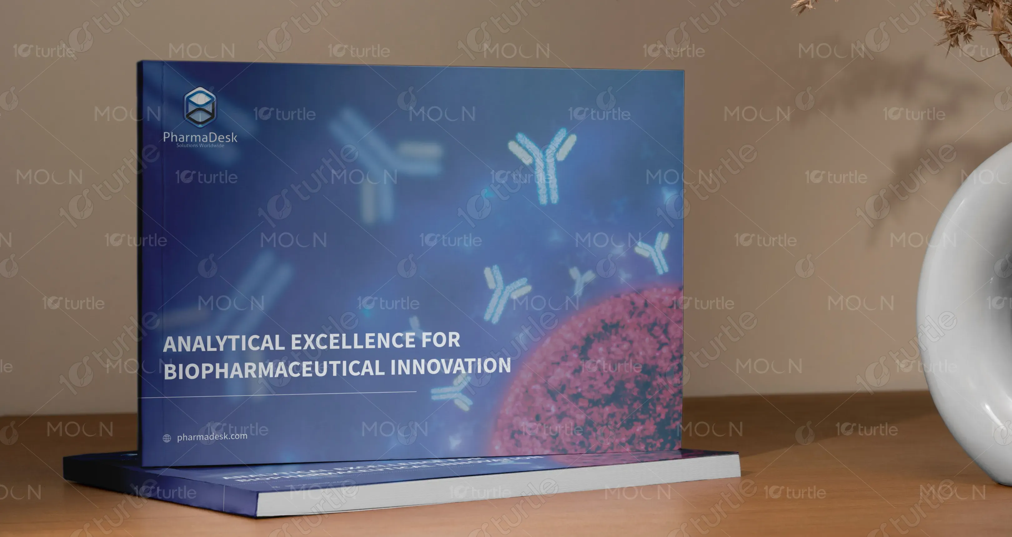
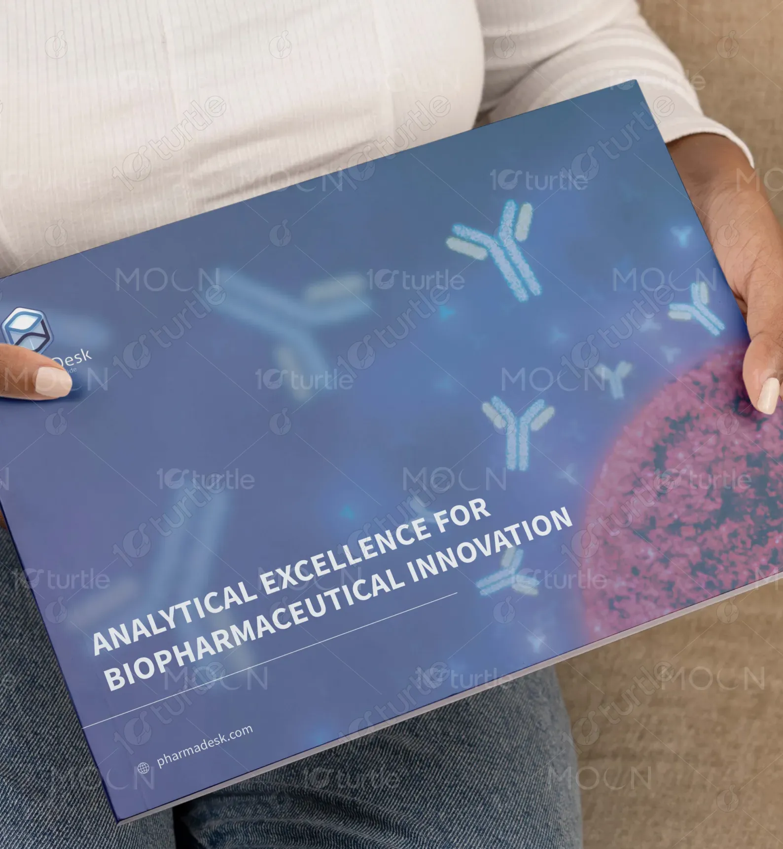
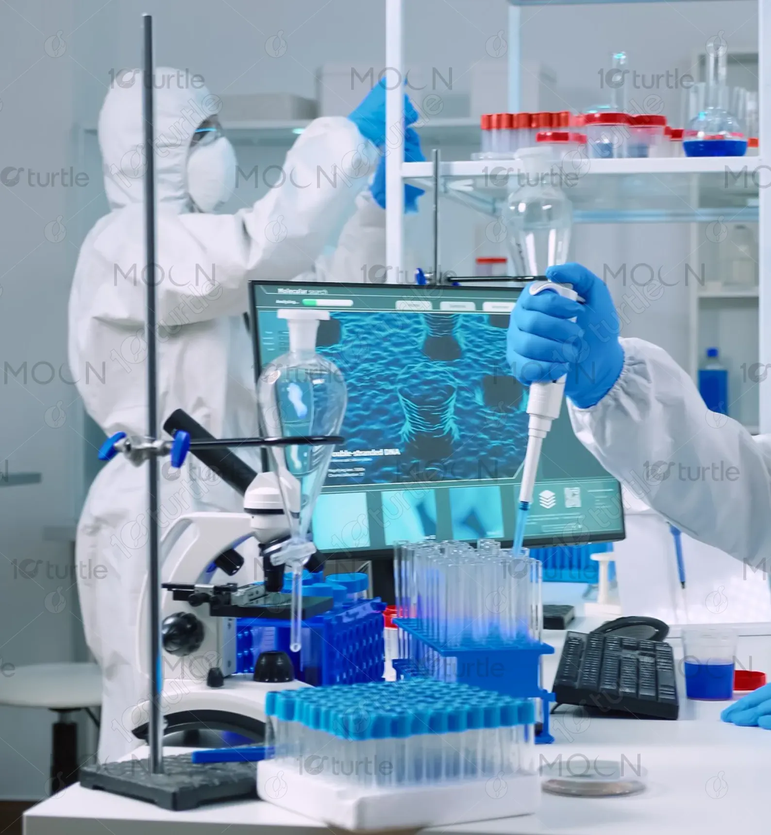
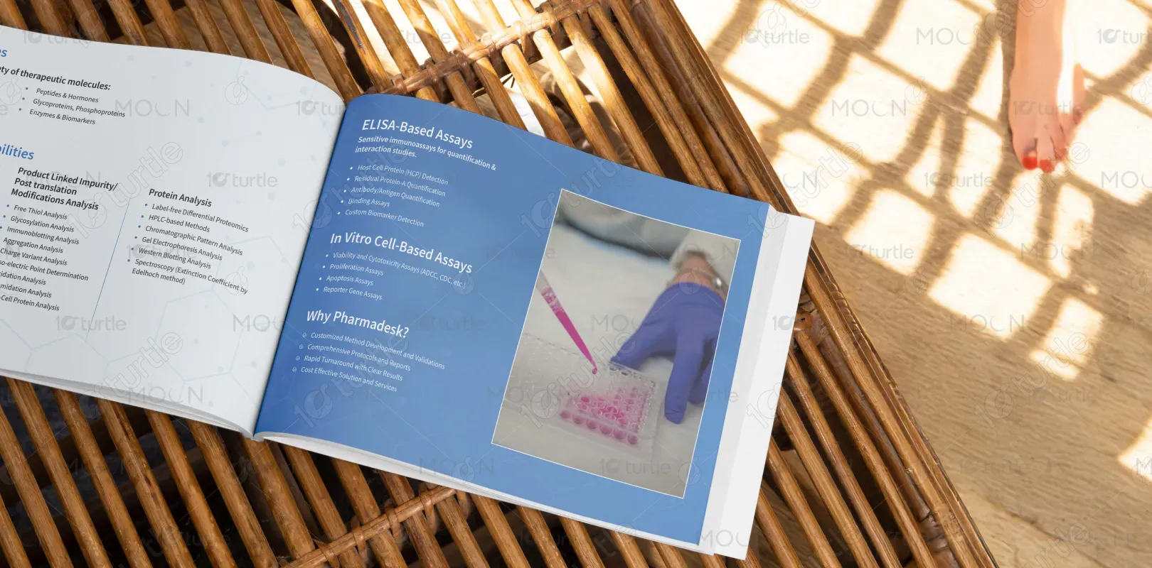
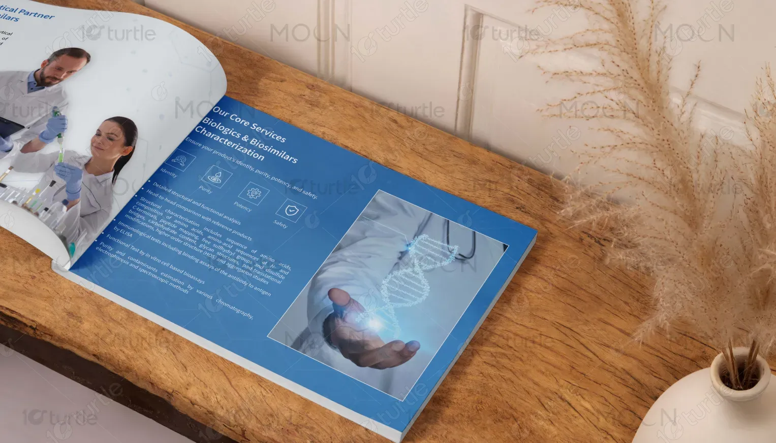
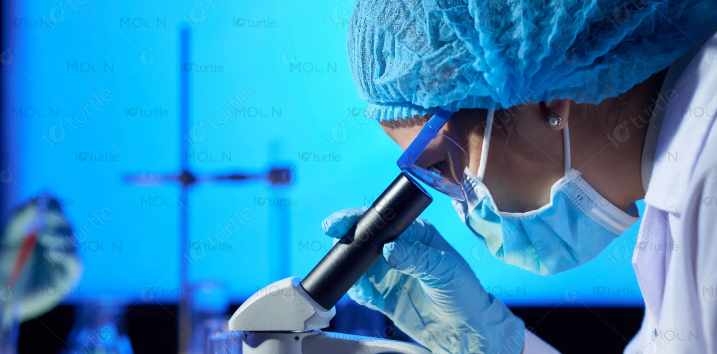
The brochure design adopts a sleek, modern aesthetic that aligns with the advanced scientific domain it represents. The use of deep blue hues conveys trust, precision, and professionalism core attributes of the biopharmaceutical industry. Clean typography, strategic white space, and scientific imagery like antibodies and lab environments create a sophisticated visual narrative. The layout is highly structured yet visually engaging, guiding the reader through complex information with clarity and visual balance, while reinforcing the brand’s commitment to innovation and analytical excellence.
Brochure Design
Graphic Design
Industry
Healthcare & Wellness
Tools we used


Project Completion
2025
Key Market
Global
PharmaDesk’s brochure introduces its cutting-edge solutions for biopharmaceutical innovation, emphasizing analytical excellence and regulatory-aligned services. It highlights offerings such as drug-device combination testing, prototype development, usability engineering, and comprehensive analytical services. Positioned as a trusted partner for life sciences companies, PharmaDesk's unique value lies in its scientific rigor, regulatory expertise, and collaborative, client-focused approach. The sleek visual identity reflects a deep commitment to quality and precision making the brochure both informative and aesthetically compelling.
Industry
Healthcare & WellnessWhat we did
Brochure DesignGraphic DesignPlatform
-Designing for a scientific and highly regulated industry like biopharma presents the challenge of translating complex, technical information into a digestible and visually engaging format. Additionally, many competitors use outdated, text-heavy brochures that fail to reflect innovation or clarity. The gap lies in presenting credibility and scientific sophistication without overwhelming the audience especially in a market where regulatory compliance, trust, and data clarity are paramount.
This design bridges the gap by using a highly visual and structured layout that simplifies technical language through iconography, sectioning, and concise copy. Strategic use of real-life lab imagery builds authenticity and human connection. Visual hierarchy guides the reader’s attention effortlessly, while icons quickly communicate core services. The integration of regulatory notes and service highlights directly addresses client concerns, delivering information with both speed and confidence.
The long-term vision is to position PharmaDesk as the go-to analytical partner in the biopharma space, known for clarity, innovation, and reliability. The design aims to evolve into a broader suite of marketing assets—from digital decks to trade show materials maintaining consistency and visual authority. This brochure sets the tone for a recognizable visual language that supports the brand’s future growth and industry leadership.
.webp)
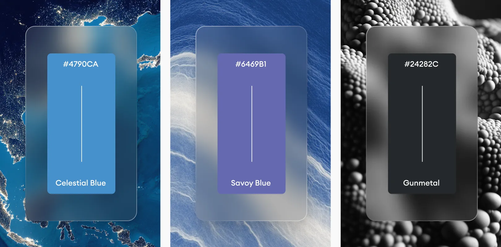
The dominant palette of cool blues and purples symbolizes trust, intelligence, and precision—ideal for a brand in scientific research and pharmaceuticals. Accents of white ensure clarity and breathability, while subtle gradients and molecular illustrations reinforce the brand’s tech-forward, research-driven ethos. This palette not only aligns with industry expectations but also evokes a sense of clinical professionalism and futuristic innovation.