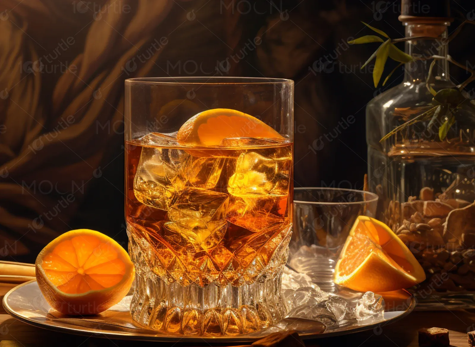
Horns Down Spirits was created to unite people around shared memories and good times. Whether it’s game day, a backyard gathering, or a casual night with friends, this whiskey is a tribute to American tradition, with its distinct apple pie flavor and smooth vanilla finish.
UX Design
UI Design
Research
Websites Design
Industry
E-Commerce
Tools we used

Project Completion
2024
The objective of the project was to craft a homepage that reflects the brand's bold identity, traditional roots, and festive energy. The client aimed to showcase the unique flavor profile of the whiskey, present creative cocktail ideas, and build emotional connection through rich storytelling and design. The site needed to promote awareness, encourage social sharing, and visually communicate the brand’s personality.
Industry
E-CommerceWhat we did
User ResearchUI UX DesigningResponsive ExperiencePlatform
-Prior to this project, Horns Down Spirits lacked an online presence that matched the cultural tone and emotional resonance of their product. There was no digital platform where users could engage with the brand story, explore cocktail recipes, or feel part of a larger community. A solution was needed to bring the brand’s essence to life in a meaningful and interactive way.
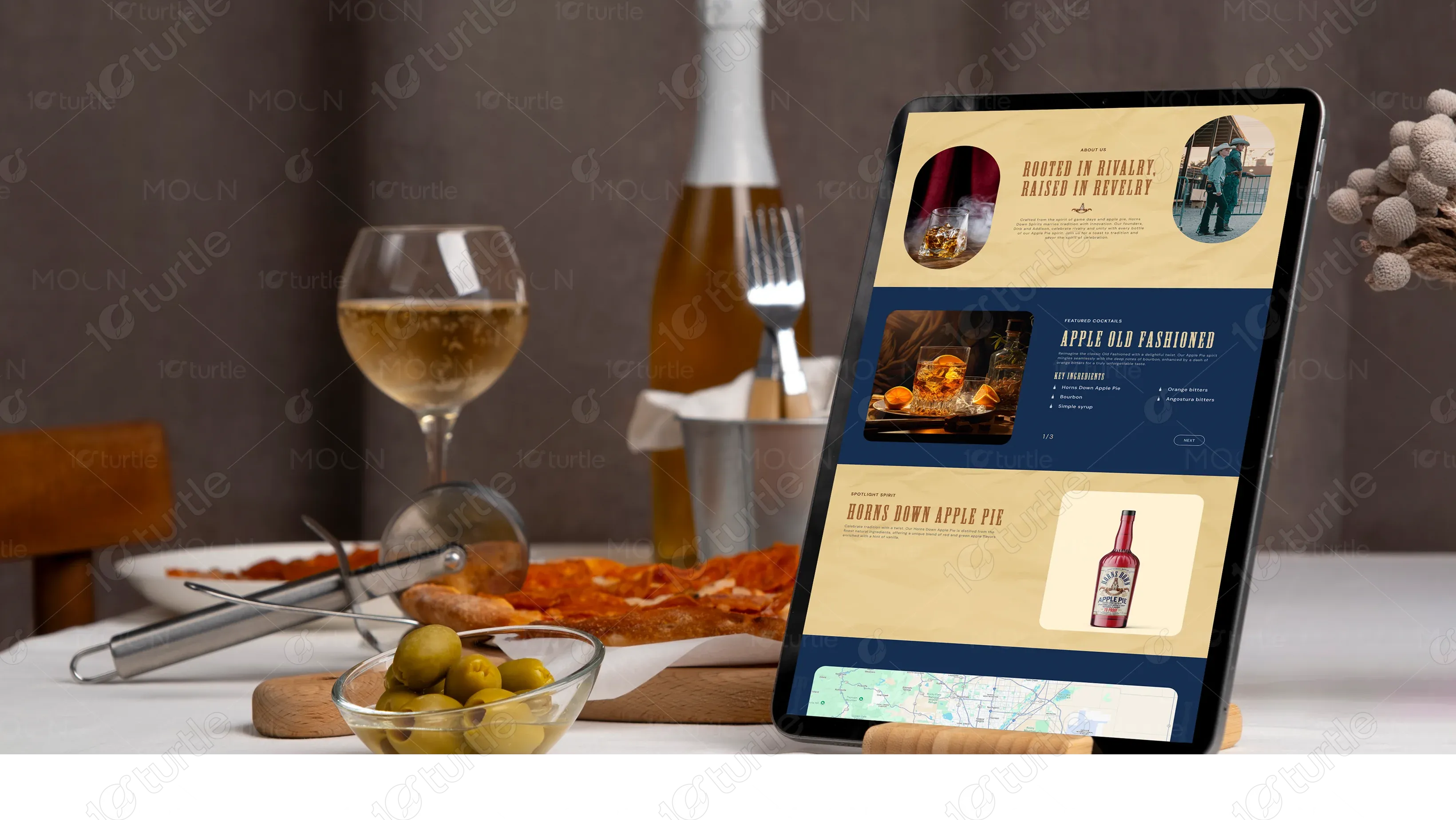
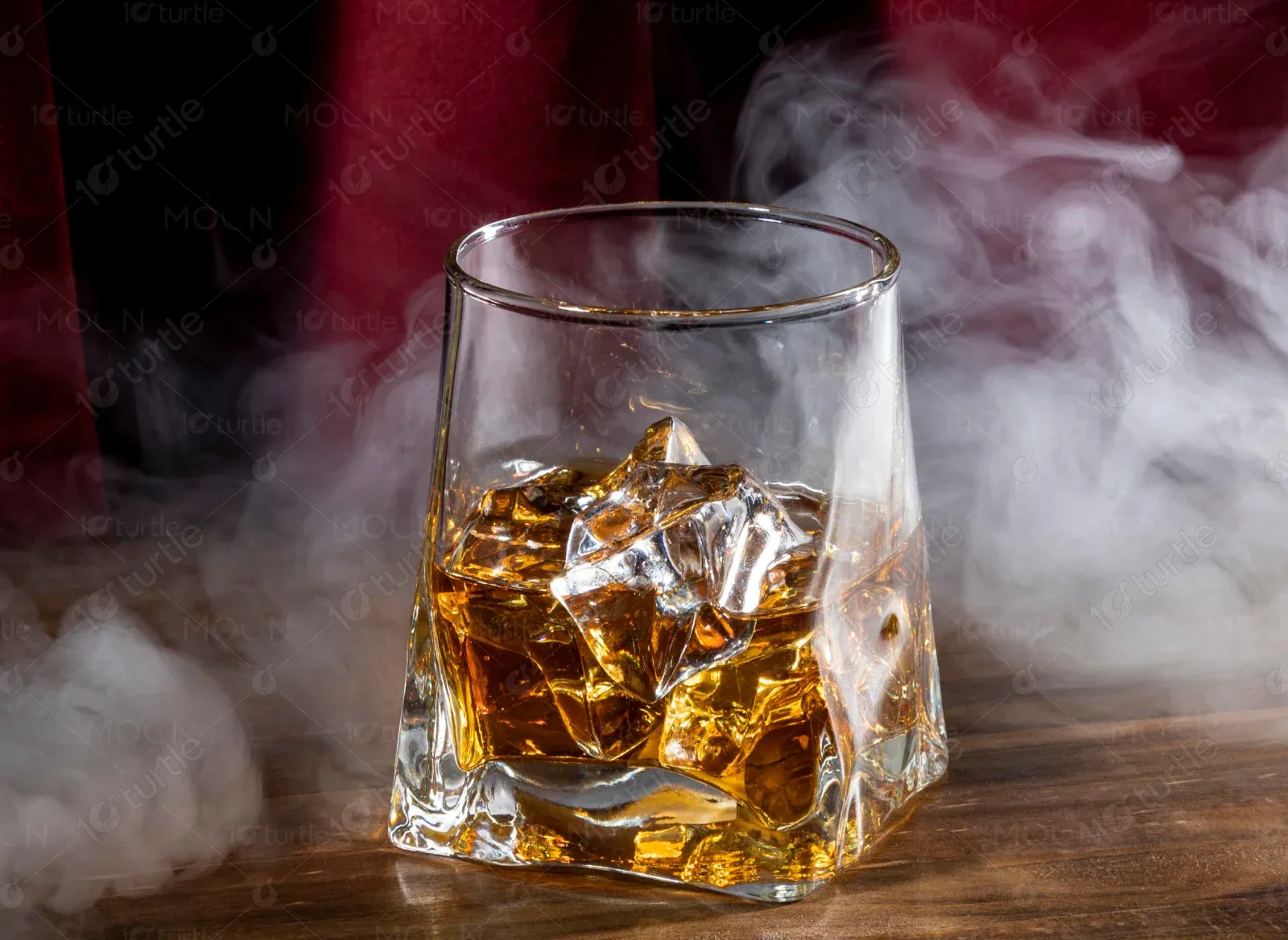
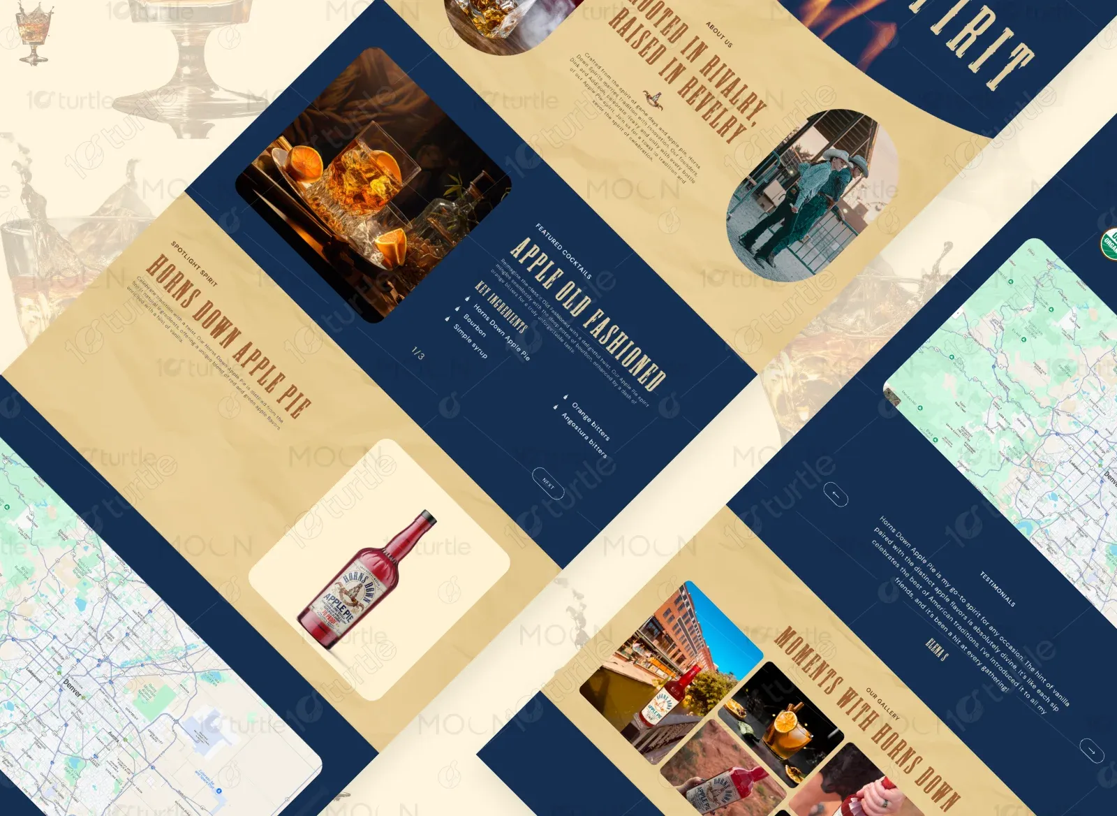
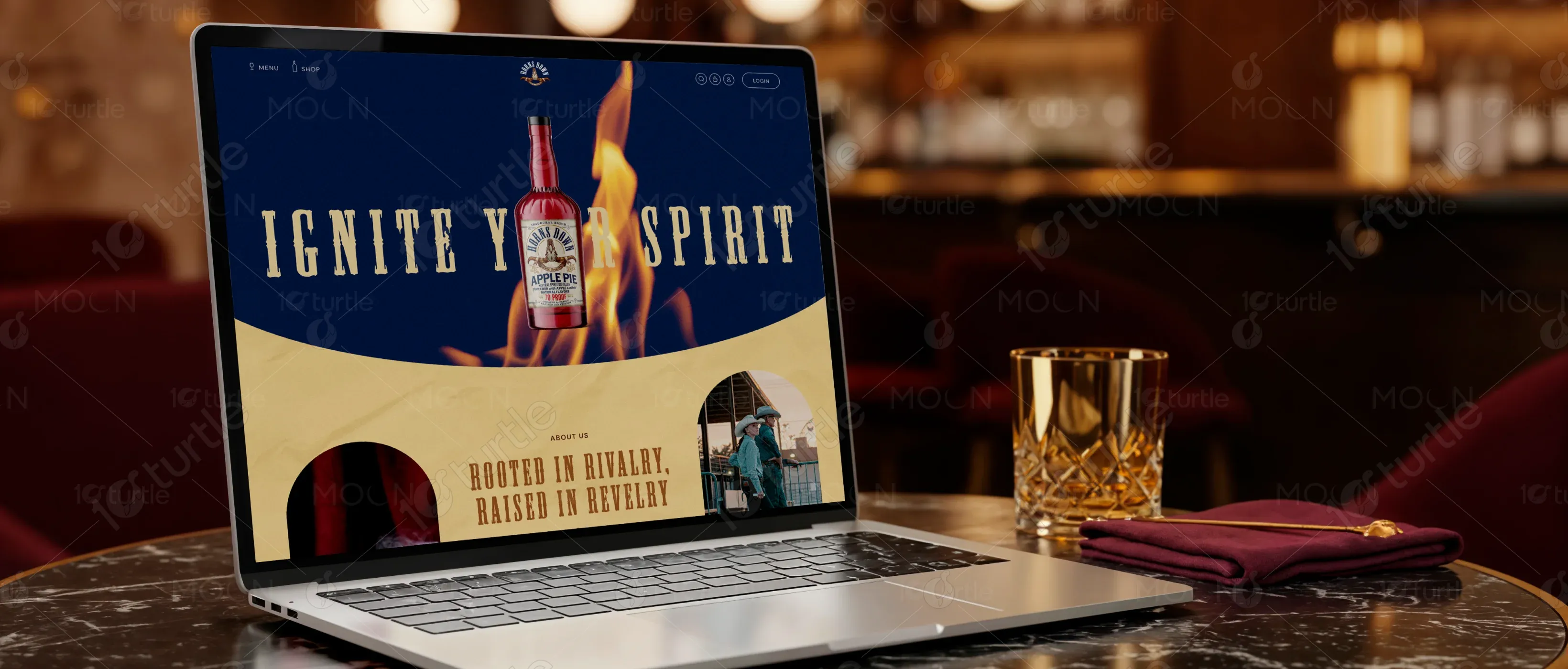
The homepage design focused on immersive storytelling, strategic visuals, and emotional cues. The design featured a striking hero section with flames and bold typography, a dynamic cocktail carousel to drive engagement, and a spotlight on the signature Horns Down Apple Pie whiskey. An interactive map and community-driven gallery enhanced connection and authenticity. Warm tones, nostalgic design motifs, and rustic textures brought the brand's Americana spirit to life.
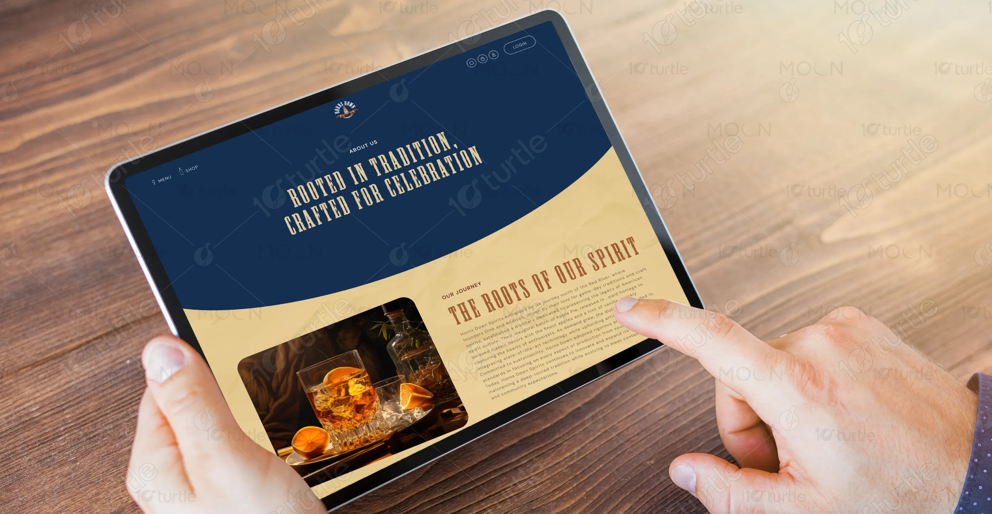
The client envisioned a visual direction rooted in vintage aesthetics, rebellious energy, and a sense of pride in tradition. Inspirations were drawn from college sports rivalries, tailgate parties, and autumn landscapes. The desired tone was celebratory, nostalgic, and bold—designed to appeal to both new whiskey drinkers and seasoned enthusiasts. The design was expected to feel like a handcrafted label with modern functionality.
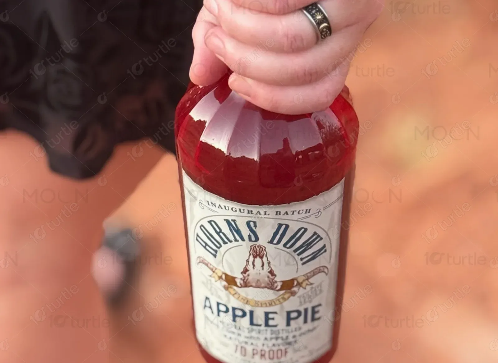
The Horns Down Spirits logo blends heritage with boldness, using a badge-style format and serif typography. The label on the bottle supports the vintage whiskey aesthetic, reinforcing trust and authenticity through its emblematic structure and detail-oriented design.
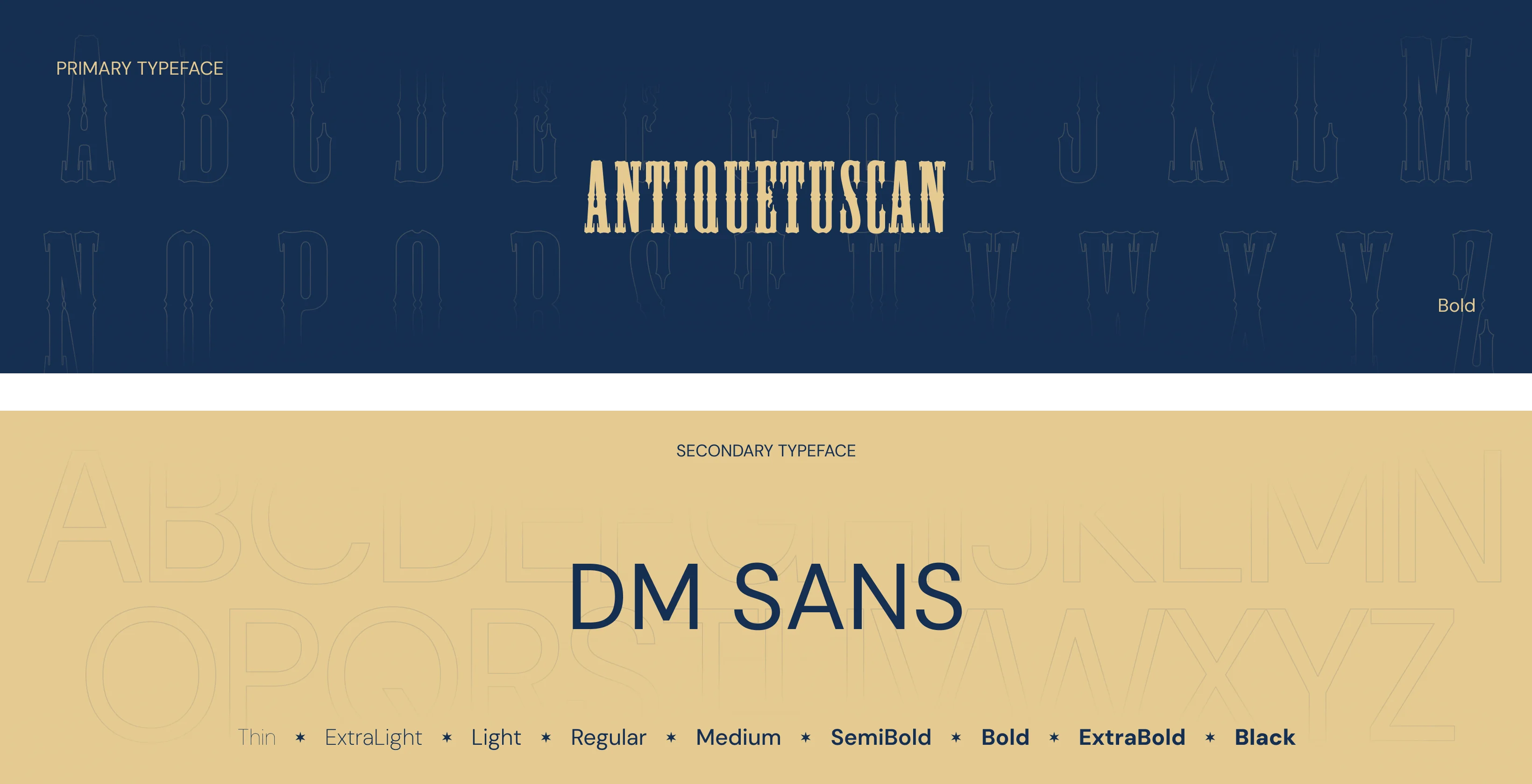
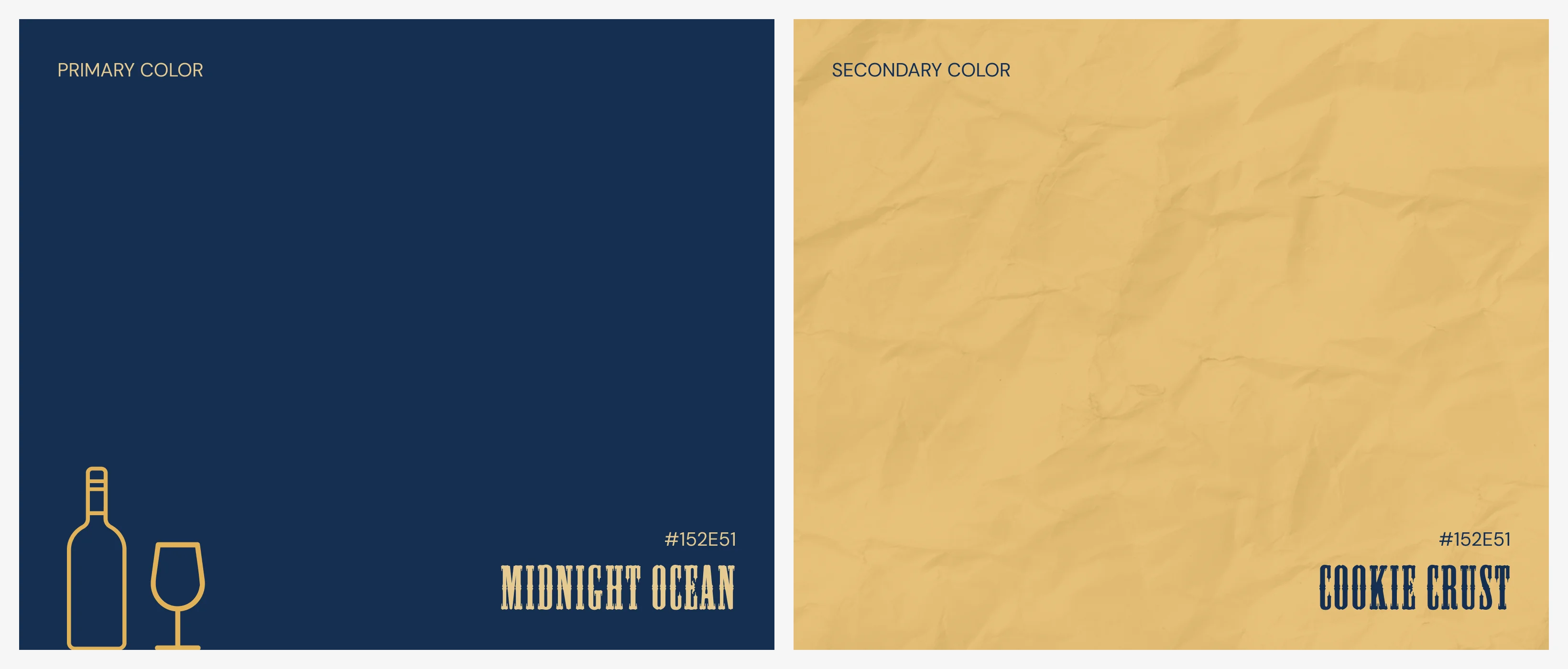
The brand’s identity is defined by a rich palette of Deep Navy Blue (#152E51), Warm Sand Beige (#F0D7A8), Rich Whiskey Red (#911E1E), and Cream White (#E1B258). This combination evokes trust, warmth, and bold flavor, blending masculinity with handcrafted charm. The colors work together to create a nostalgic yet modern, flavorful experience.
Initial wireframes followed a vertically stacked layout that focused on storytelling and scroll engagement. The hero section was positioned to command attention, with structured blocks for about, cocktails, product spotlight, map, and gallery. The layout emphasized a clear visual hierarchy and mobile-first responsiveness to ensure accessibility on all devices.