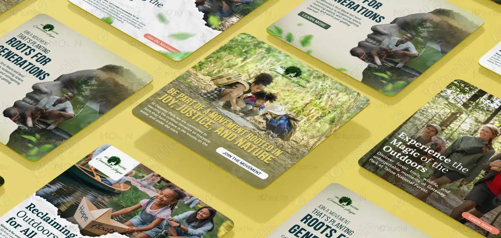
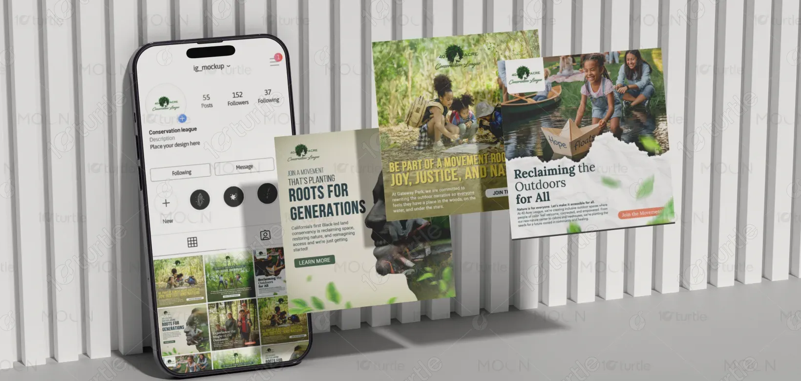
The design uses immersive, nature-centric imagery paired with warm, inclusive visuals to evoke a sense of belonging and empowerment. Layered compositions, clear hierarchy, and impactful typography guide the viewer’s eye while reinforcing the message. The aesthetic blends natural textures with community-focused storytelling, making the digital experience feel both vibrant and authentic. The floating effect and soft drop shadows around each static post enhance depth and engagement, ideal for social-first storytelling in today’s digital landscape.
Static Post Design
Graphic Design
Industry
Education & Training
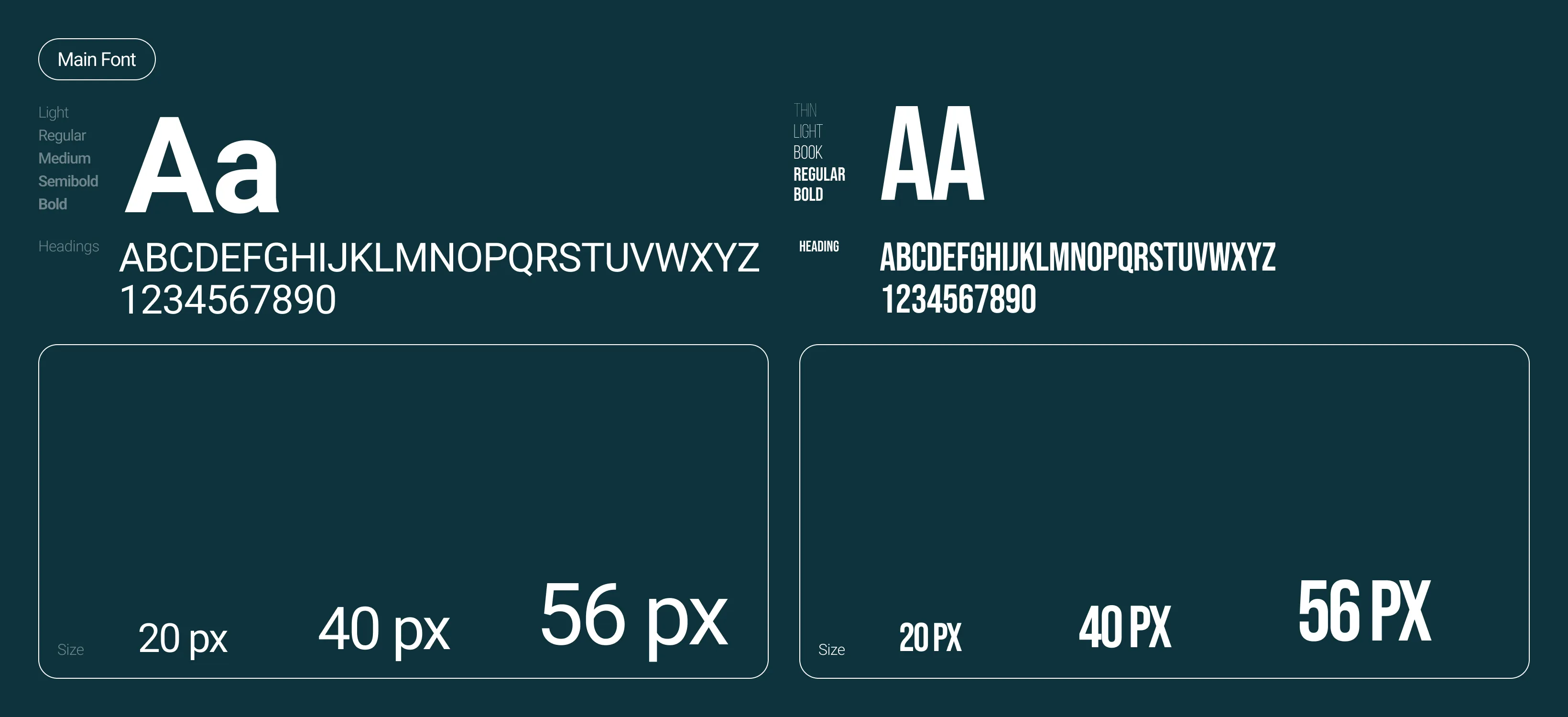
Tools we used


Project Completion
2025
Key Market
Global
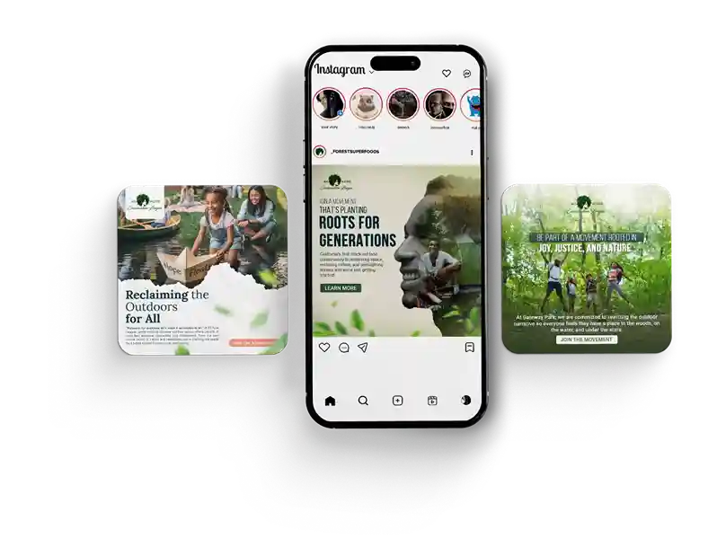
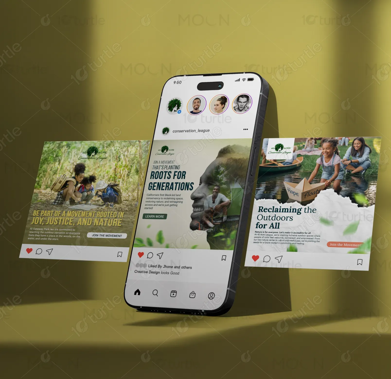
This Instagram carousel highlights Green Pathways’ mission to reclaim outdoor spaces for marginalized communities. It invites users to engage with nature through a movement grounded in justice and sustainability. Designed as a static post campaign, it merges storytelling with strong visual identity to connect emotionally with audiences. The clear CTA buttons and thematic consistency increase both awareness and action, making it a powerful tool for environmental nonprofits, community organizers, and eco-activism groups.
Industry
Education & TrainingWhat we did
Static Post DesignGraphic DesignPlatform
-Many outdoor brands fail to represent communities of color, resulting in a lack of visibility and engagement from underrepresented groups. Marketing in this sector often leans toward a narrow demographic, alienating diverse audiences. This design addresses the gap by centering inclusivity and representation, which are frequently missing in traditional environmental campaigns, especially on platforms like Instagram where aesthetic plays a critical role in reach and impact.
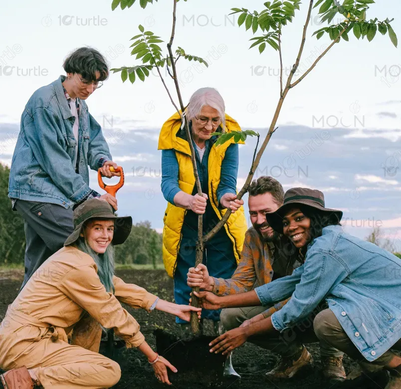
This design flips the narrative by celebrating diversity in outdoor spaces. It features people of color actively engaging with nature in joyful and meaningful ways. The campaign uses emotionally resonant copy, empowering headlines, and relatable imagery to draw in the audience. The strategic CTA placements (“Join the Movement,” “Learn More”) guide action, while the design’s consistency and cultural sensitivity help build trust, inspire engagement, and drive change.

Green Pathways envisions a future where all communities feel welcomed, seen, and empowered in nature. By reshaping the narrative around who belongs outdoors, the brand aims to democratize access to nature and environmental leadership. Over time, it plans to expand into educational programs, community-led eco-initiatives, and strategic partnerships that amplify its impact nationwide.

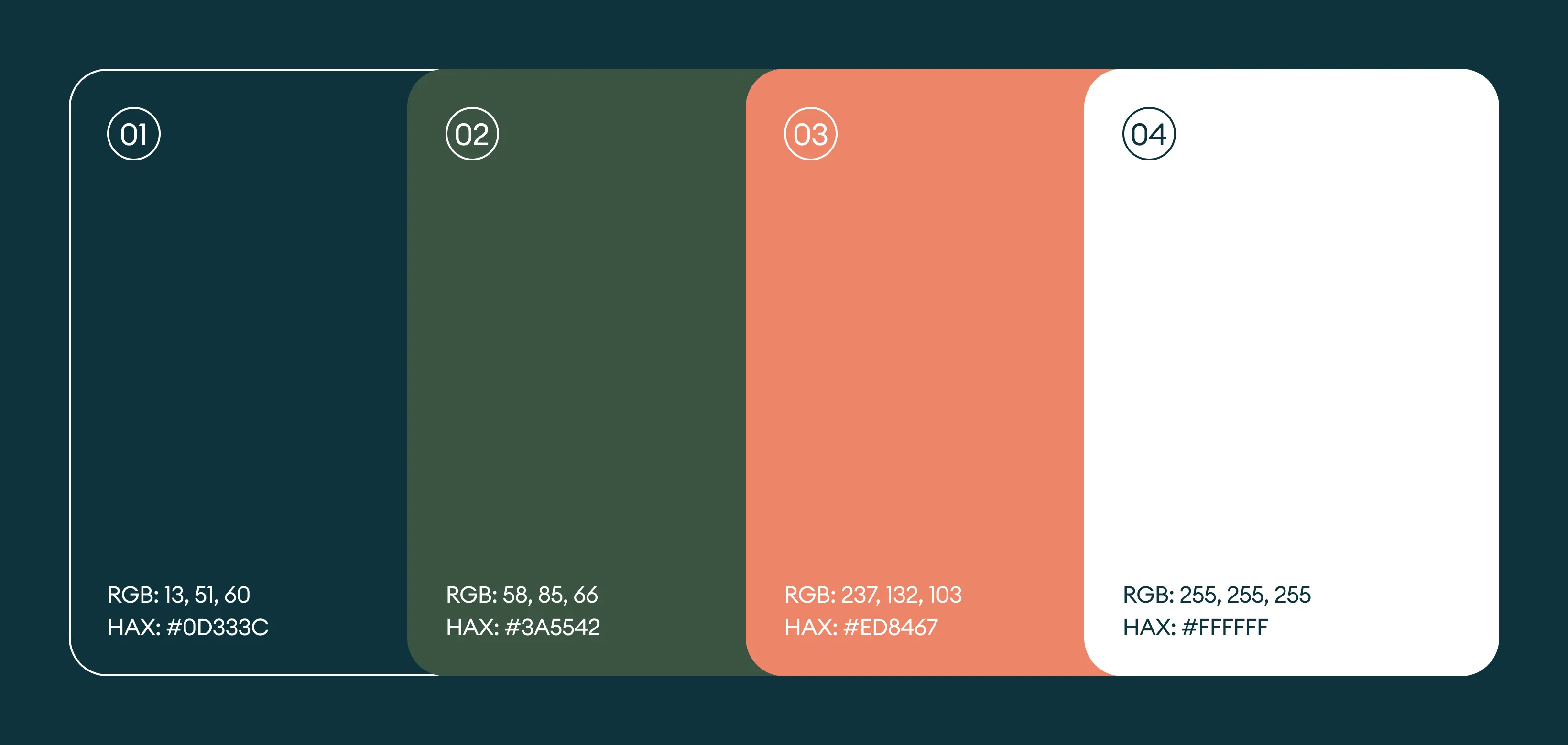
The palette centers around earthy greens, warm neutrals, and hints of soft orange. Green symbolizes growth, healing, and connection to nature. Neutral tones provide balance and approachability, while orange adds optimism and urgency. Together, these colors create a sense of harmony and purpose, aligning perfectly with the brand’s values of inclusion, nature advocacy, and community empowerment.