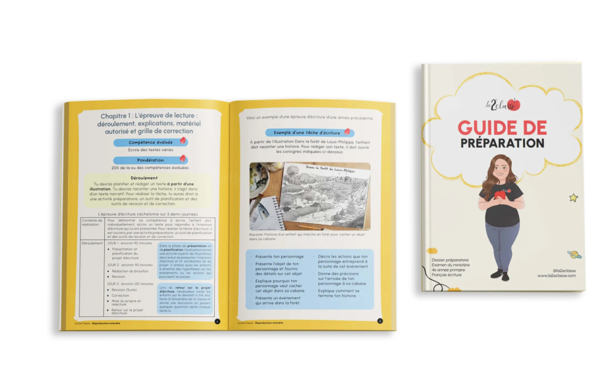
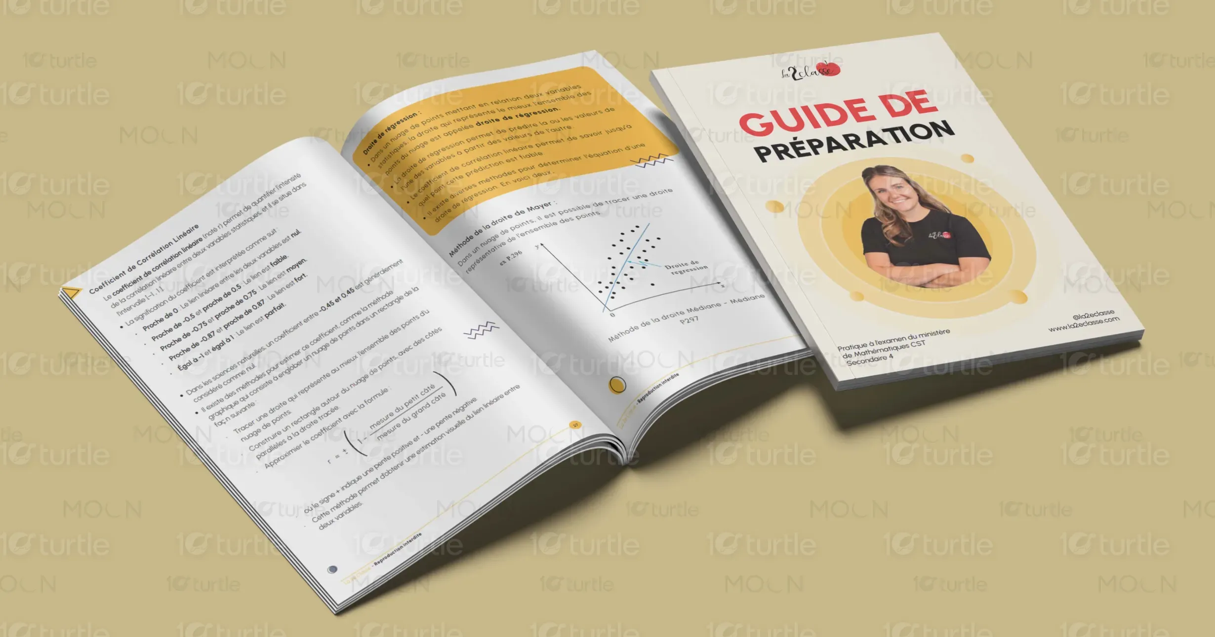
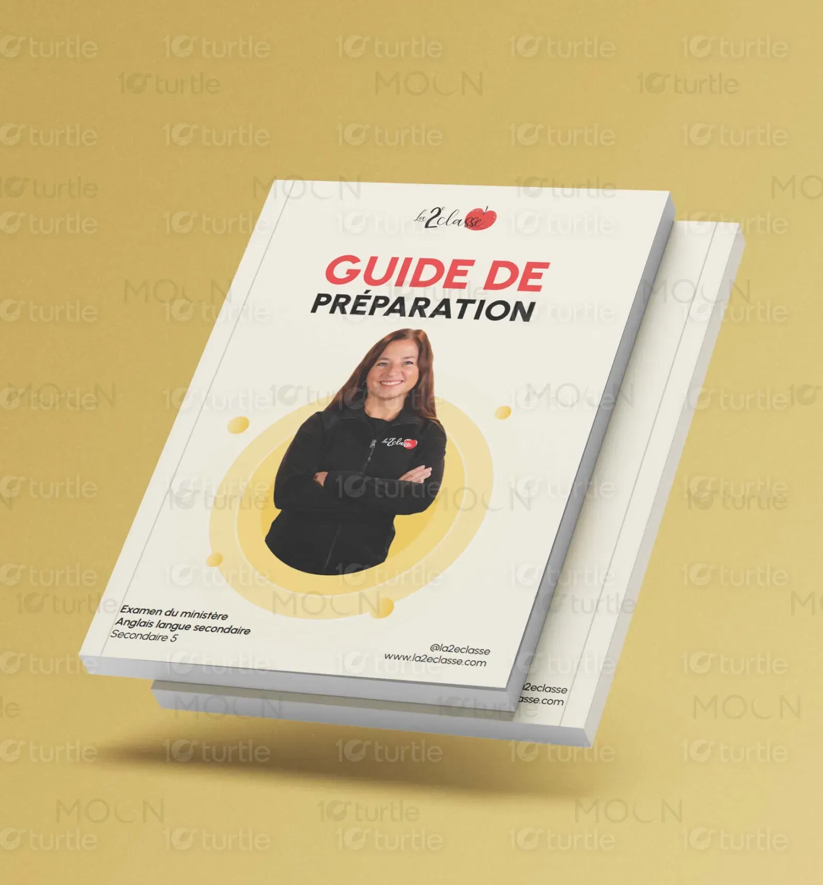
The design takes a modern and professional approach, combining clean typography with a structured layout. The use of bold headlines, highlighted sections, and engaging visuals ensures readability and clarity. The color palette, featuring soft yellows and neutrals, creates warmth and approachability, aligning with the subject matter. A balanced mix of graphical elements, icons, and text blocks enhances comprehension. The overall aesthetic is both visually appealing and functional, designed to engage readers while maintaining a professional and educational tone.
Graphic Design
Book Design
Industry
Education & Training
Tools we used



Project Completion
2025
Key Market
Global
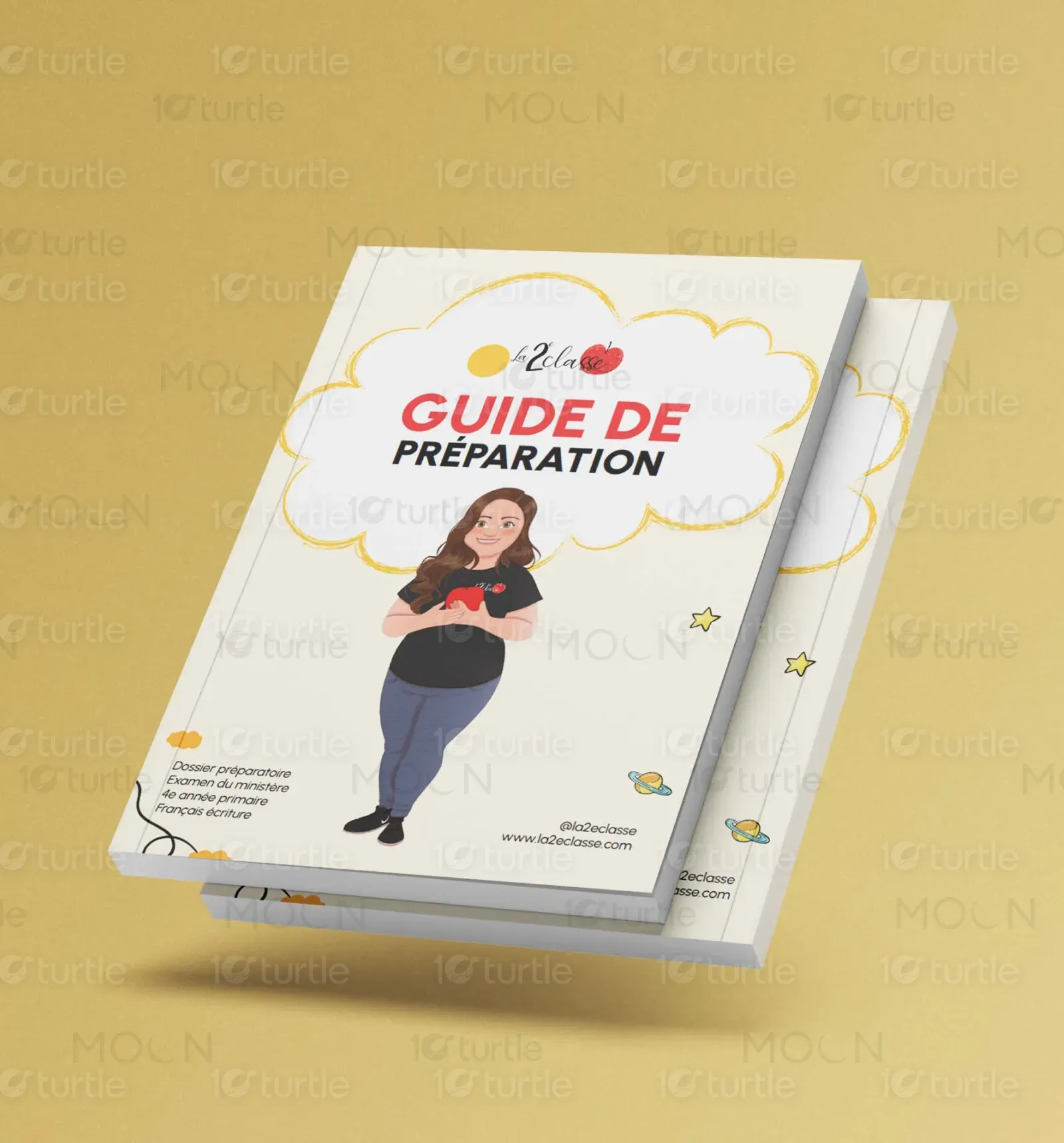
This Guide de Préparation is an educational booklet designed to help students grasp complex mathematical and statistical concepts with clarity. It provides structured explanations, practical examples, and visual aids to enhance learning. The guide is tailored for students preparing for standardized tests or academic assessments. The combination of well-organized content, engaging graphics, and an accessible layout makes it a must-have study tool. Its modern and sleek design ensures a smooth reading experience while reinforcing key learning objectives.
Industry
Education & TrainingWhat we did
Graphic DesignBook DesignPlatform
-One of the biggest challenges in designing educational booklets is balancing information density with visual appeal. Many study guides tend to be text-heavy, making it difficult for students to absorb information efficiently. Another issue is maintaining reader engagement—without proper use of design elements, lengthy content can feel overwhelming. Additionally, mathematical formulas and graphs require precise formatting to ensure clarity and accuracy, demanding a layout that supports seamless comprehension without visual clutter.
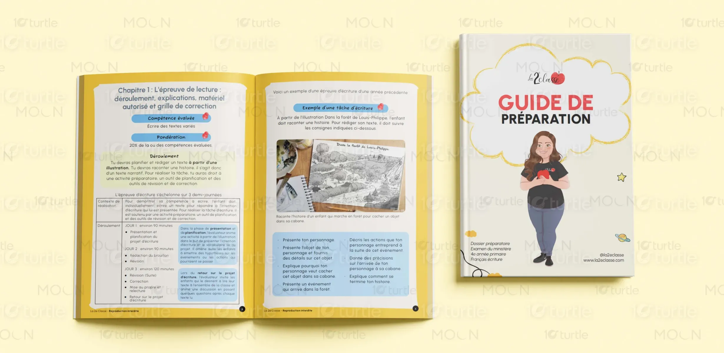
This design resolves the problem by incorporating strategic visual hierarchy, using bold headers, bullet points, and color-coded sections to break down complex information. Highlighted callouts and graphic elements make key concepts stand out, aiding quick revision. The integrated diagrams and charts provide visual support to textual explanations, enhancing understanding. Ample white space ensures that content remains digestible, while a modern typeface boosts readability. The thoughtful use of colors and graphical highlights transforms learning into a more engaging and interactive experience.
The long-term vision for this design is to create a series of visually compelling and easy-to-navigate study materials that enhance student engagement and retention. The goal is to set a new standard for educational booklets, making them more intuitive and interactive. By continuously evolving the design with user feedback, future editions can incorporate augmented reality (AR) elements, QR code links to video tutorials, and interactive digital versions to further enhance learning. The aspiration is to revolutionize study guides, making education more visually stimulating and effective.

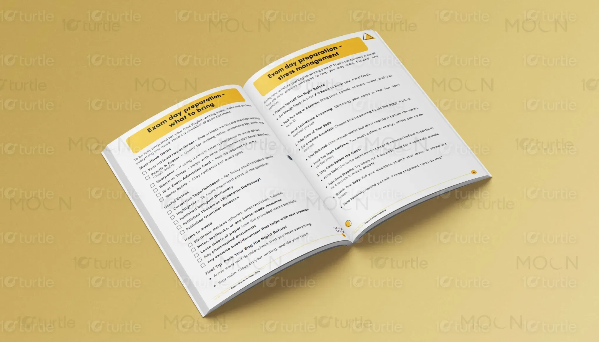
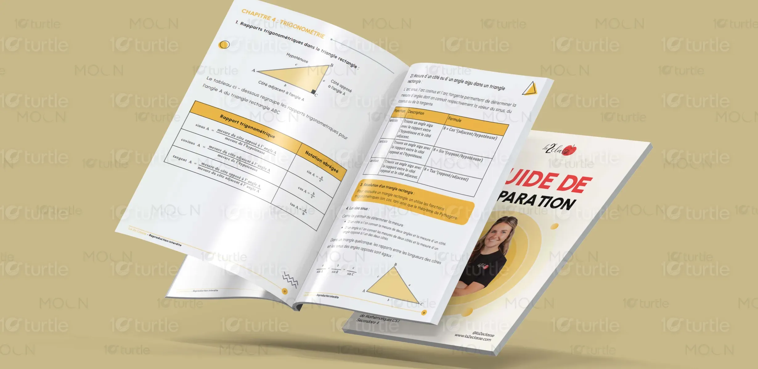

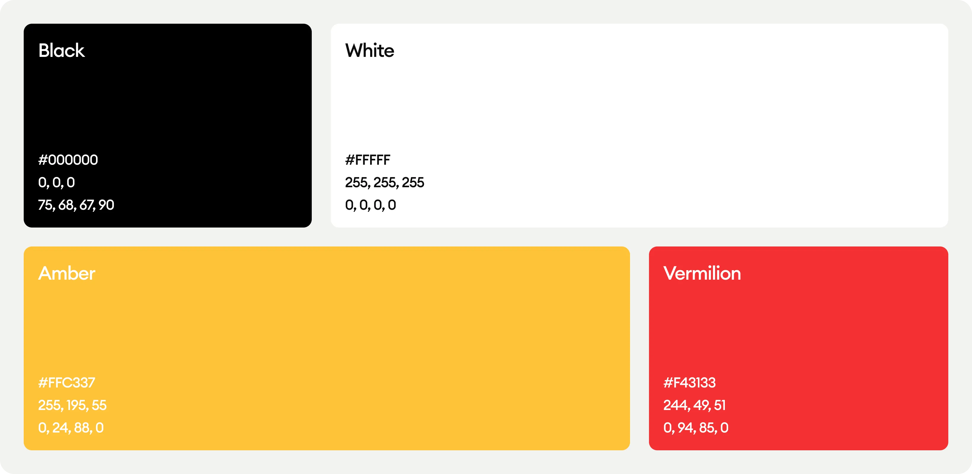
The soft yellow and neutral tones in this design evoke warmth, approachability, and positivity—key emotions that reduce study anxiety and enhance engagement. Yellow is often associated with clarity and intellect, making it a great choice for an educational guide. The contrast between bold black typography and warm highlights ensures legibility while maintaining a visually cohesive look. This color scheme aligns with the brand’s identity, projecting a friendly yet professional aesthetic that enhances user experience without overwhelming the reader.
