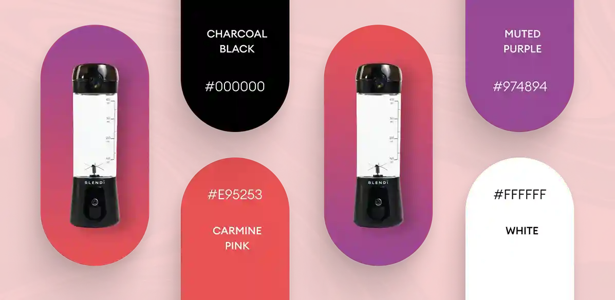
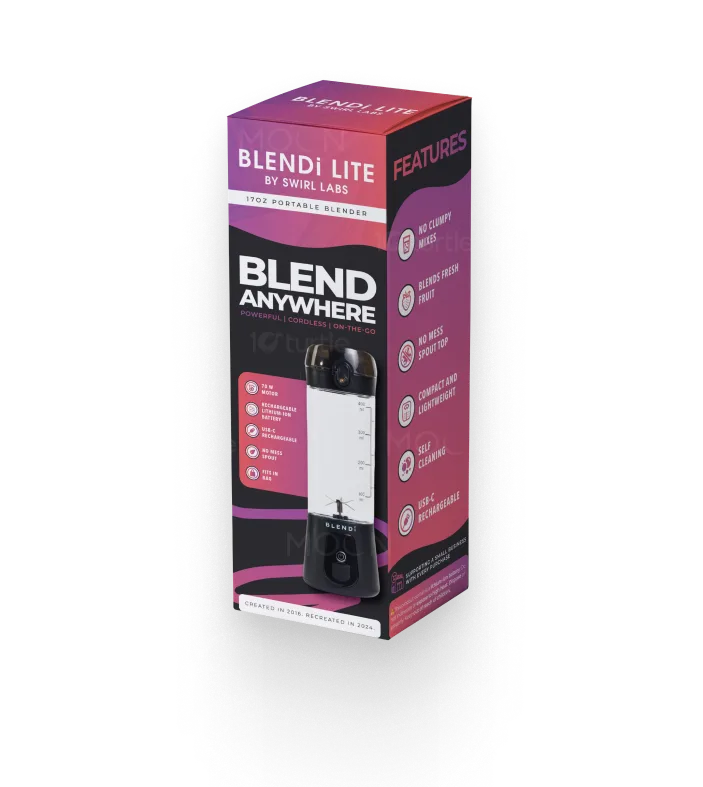
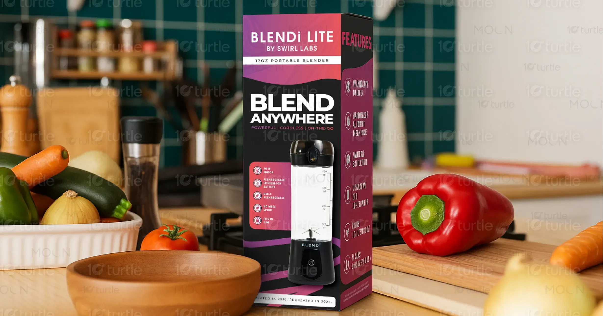
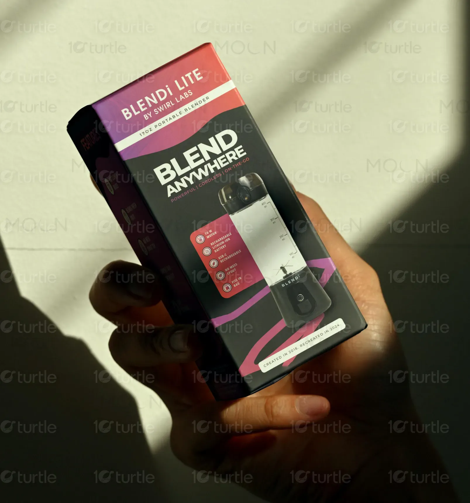
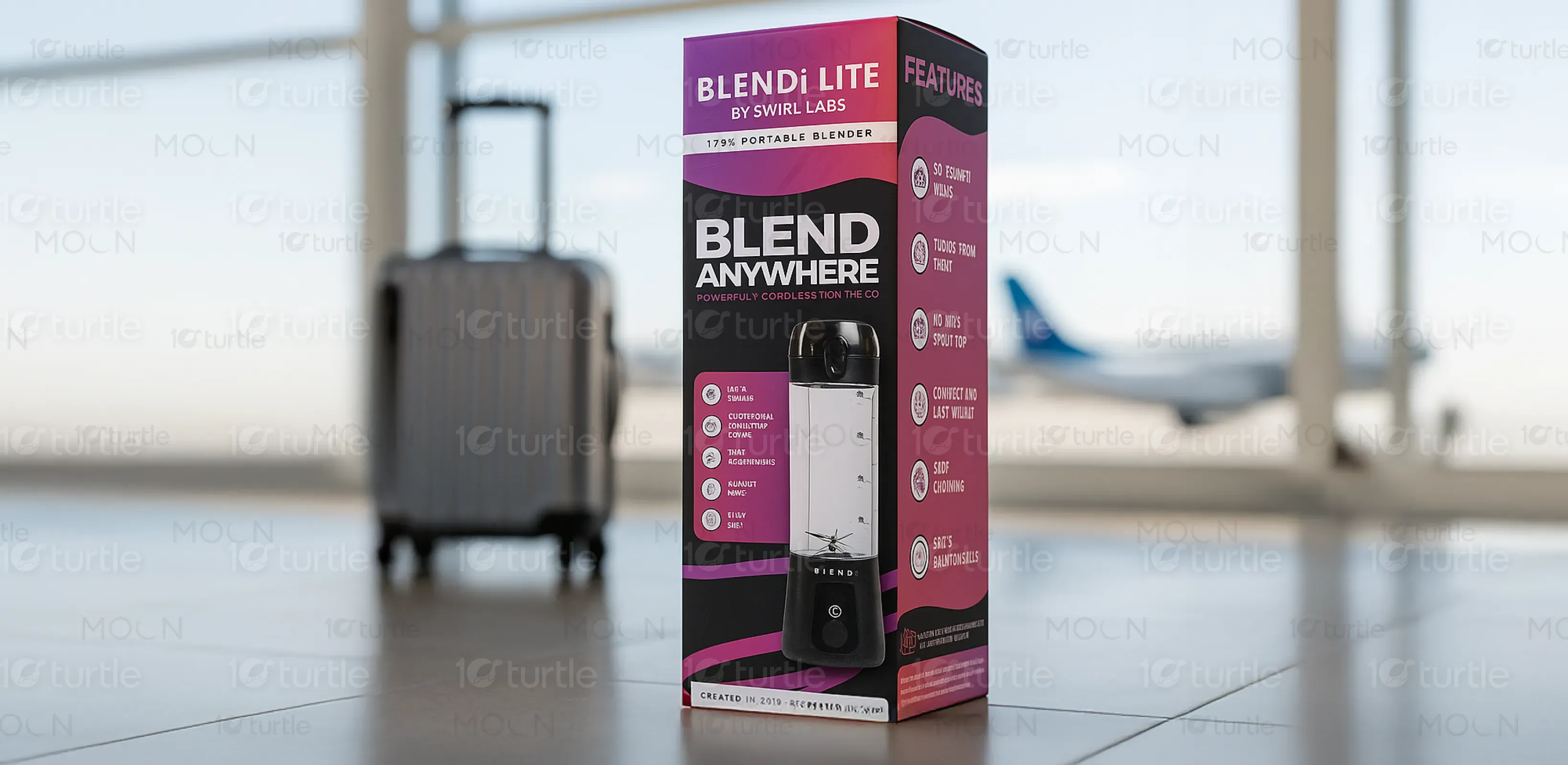
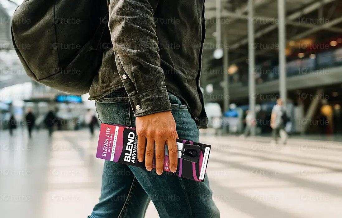
The packaging design for BLENDi LITE follows a sleek and functional approach tailored for modern, health-conscious users. A bold contrast between deep maroon and black reinforces a sense of power and sophistication, while white and pink highlights enhance readability. The front layout heroically showcases the product, with concise icons and copy strategically placed to highlight portability, performance, and convenience. The clean design and bold typography create a confident shelf presence that appeals to on-the-go, design-savvy consumers.
Packaging Design
Graphic Design
Industry
Consumer Goods & Retail
Tools we used


Project Completion
2025
Key Market
Global
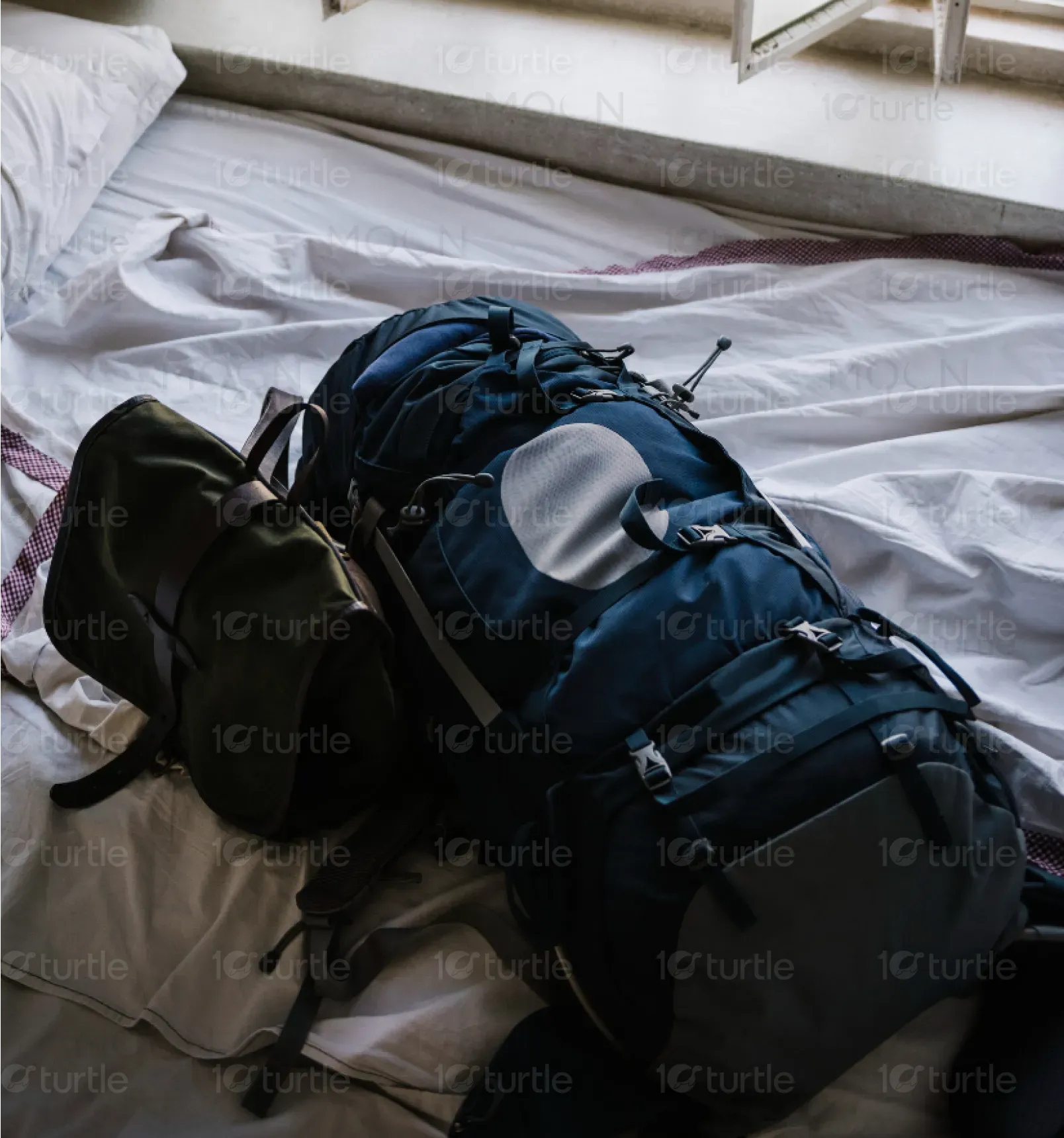
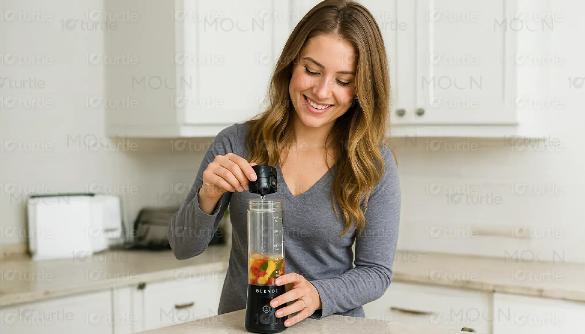
BLENDi LITE is a 17oz portable blender designed for active lifestyles. Ideal for smoothies, shakes, and meal preps, it combines portability with powerful blending performance. Its cordless, USB-rechargeable design makes it perfect for travel, office, gym, or home use. Positioned at the intersection of wellness and convenience, it appeals to health-conscious users seeking efficiency without compromising style. Its minimalist, functional packaging and bold value proposition—“Blend Anywhere”—make it stand out in a crowded kitchen appliance market.
Industry
Consumer Goods & RetailWhat we did
Packaging DesignGraphic DesignPlatform
-Many users struggle with traditional blenders that are bulky, non-portable, and dependent on constant power supply—limiting their use to kitchens only. This is especially problematic for busy professionals, students, or travelers who need on-the-go nutrition. Additionally, a cluttered packaging design or poor UX in portable products often fails to communicate features clearly, leading to confusion or underuse. There's a clear gap in stylish, portable, and powerful blending devices with a design that communicates functionality at first glance.
BLENDi LITE addresses these gaps by offering a sleek, portable, and USB-rechargeable blender with clear, benefit-driven messaging on its packaging. Its compact size and cordless use break the boundaries of kitchen-only blending, while the user-friendly layout on the box instantly conveys key features: powerful motor, easy cleaning, rechargeable, and safe to use. The icons and concise copy remove confusion, ensuring immediate understanding and purchase confidence. The design also appeals to a lifestyle-first audience with a modern, aspirational tone.
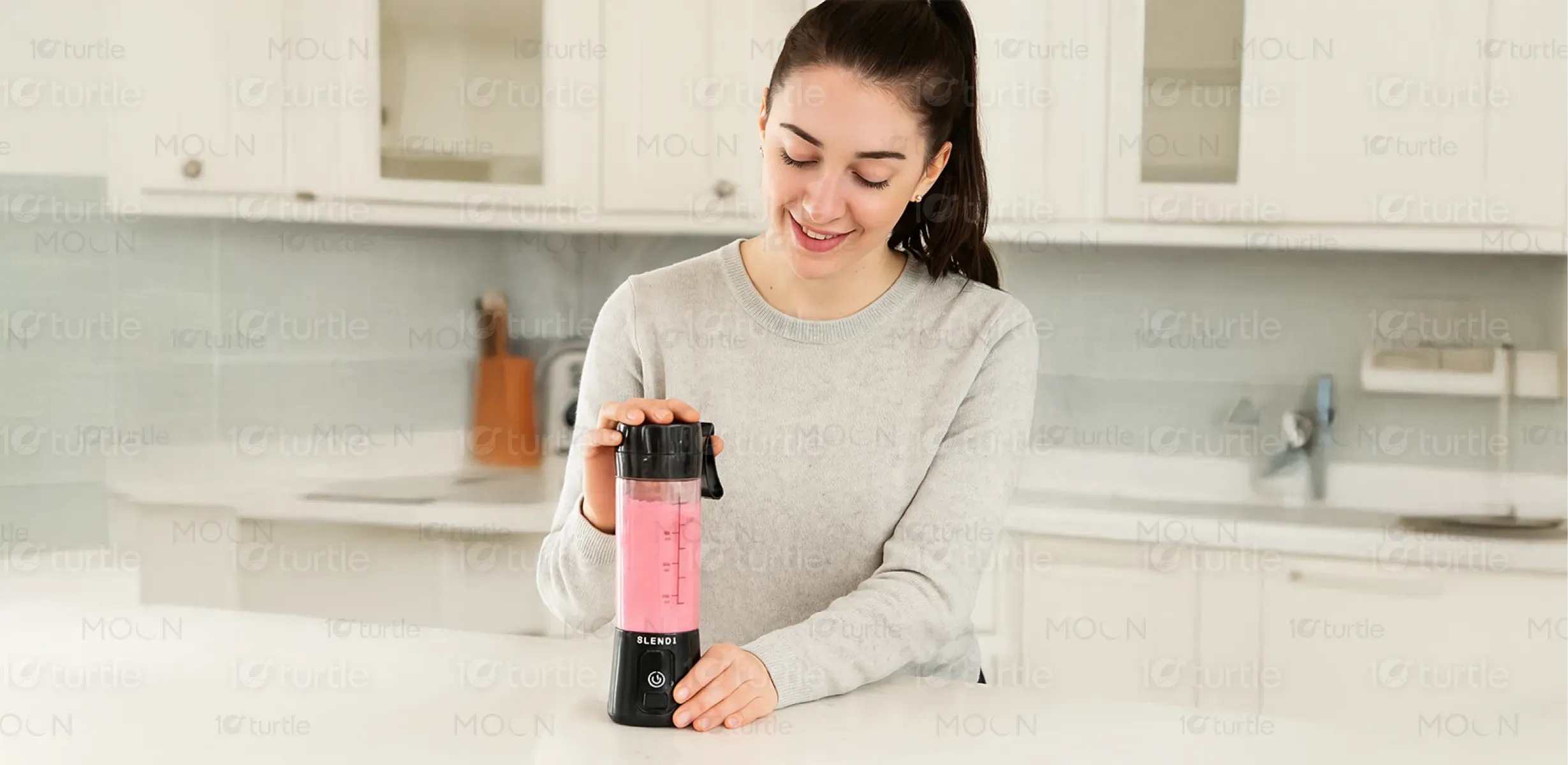
BLENDi LITE aims to become the go-to brand for portable blending solutions globally. The long-term vision is to lead innovation in compact wellness appliances—blurring the lines between lifestyle, health, and tech. Future expansion includes smart integration (app controls, auto programs), sustainable materials, and a broader product range targeting wellness on-the-go. The brand envisions empowering users to stay healthy, energized, and independent, no matter where they are—by making nutrition accessible, mobile, and stylish.
The palette includes electric teals, royal blues, magentas, burnt oranges, and metallic golds—each chosen to evoke vibrancy, luxury, and a sense of the fantastical. These colors mirror the iridescence of tropical bird plumage while complementing both neutral and bold furnishings. Gold accents add opulence and warmth, while the contrast between dark backgrounds and vivid forms ensures visual clarity. This palette not only aligns with modern décor trends but also elevates brand identity by signaling creativity, boldness, and uniqueness.
