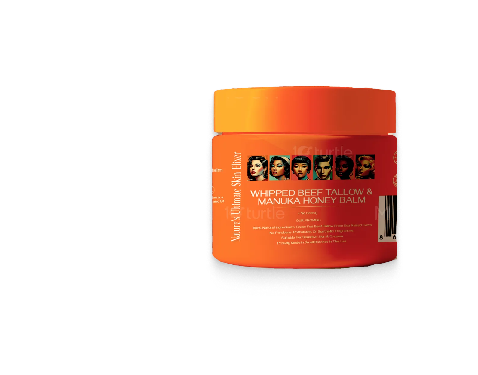
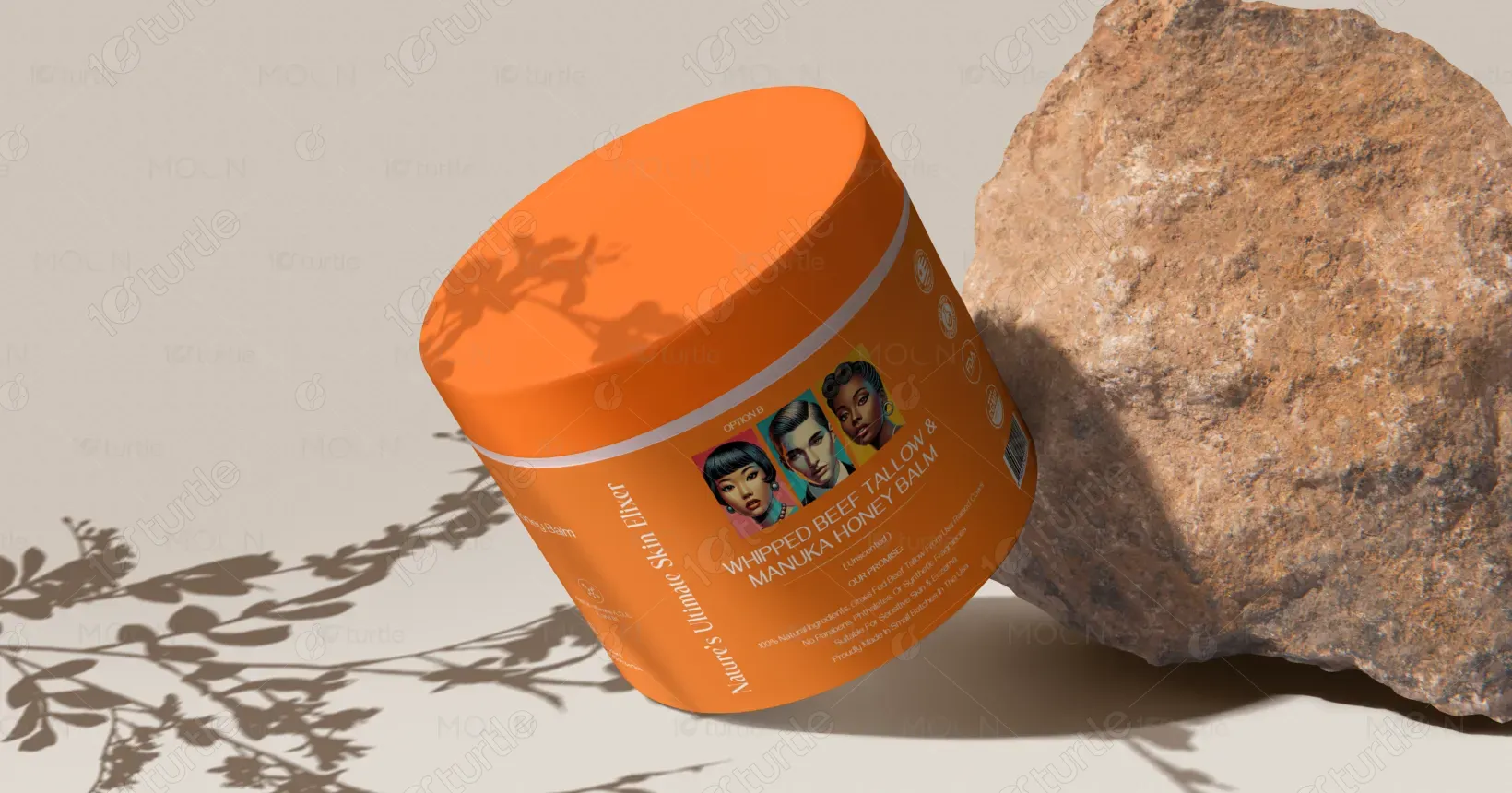
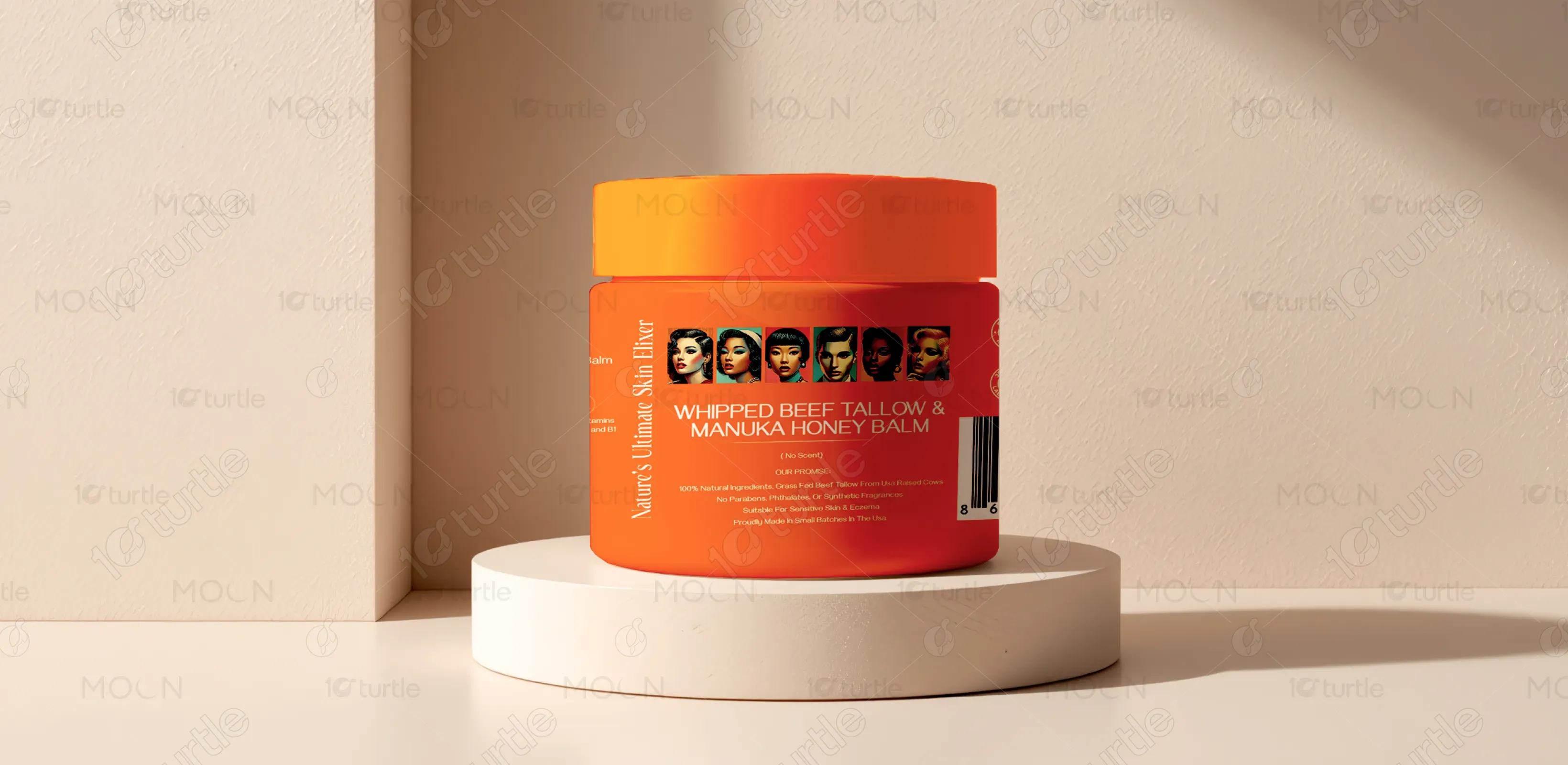
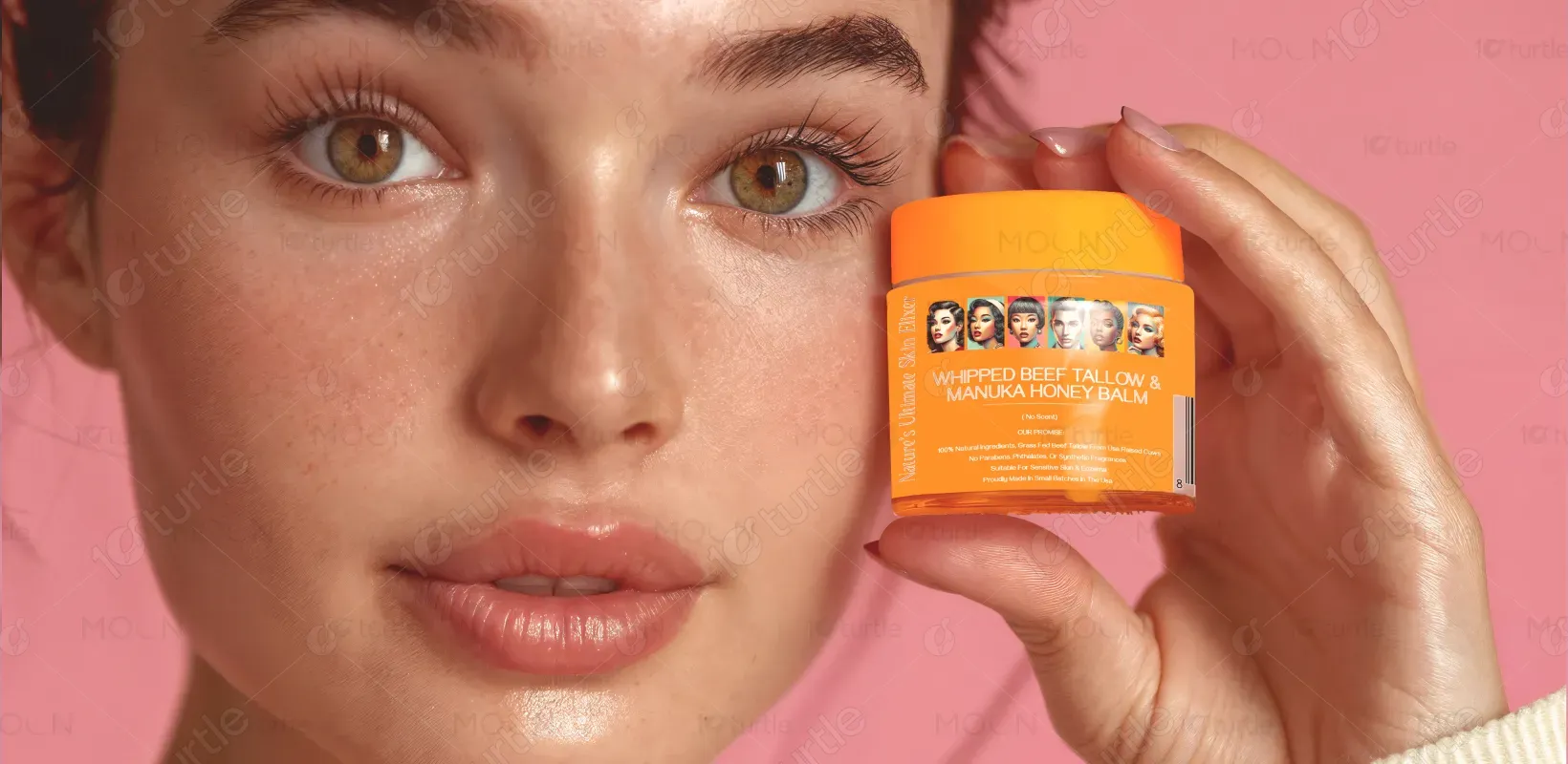
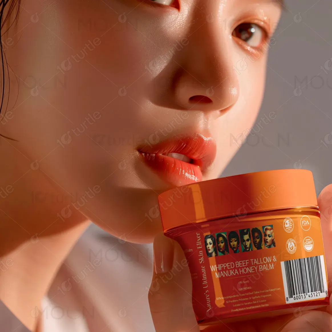
This label design is created for a high-quality consumer product, with a focus on shelf appeal and brand recognition. It serves as both an informative and aesthetic piece, communicating essential details while elevating the brand story. Positioned in a competitive market, its unique appeal lies in its clean, uncluttered layout and balanced use of visual space. Whether used on jars, bottles, or boxes, the design ensures instant recognition, communicates premium value, and creates a strong, professional identity.
Label Packaging Design
Graphic Design
Industry
Consumer Goods & Retail
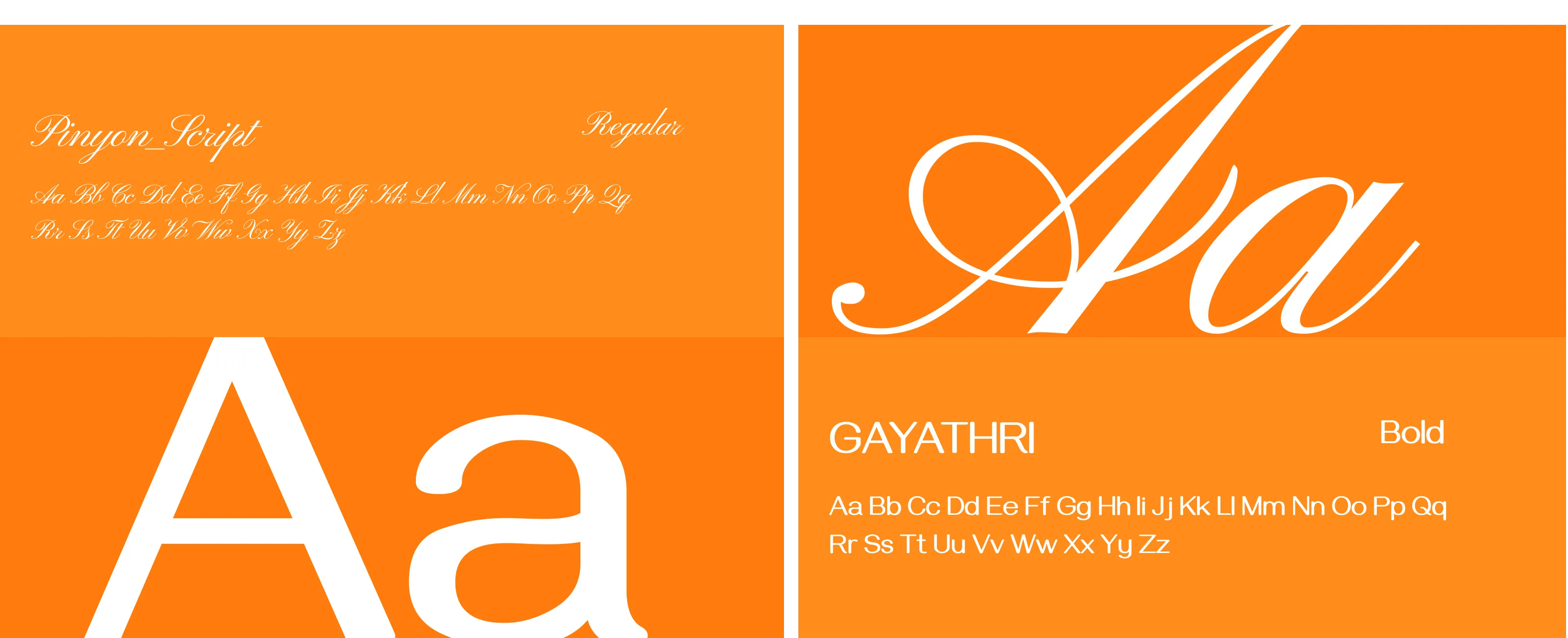
Tools we used


Project Completion
2025
Key Market
Global
Many labels in today’s market are either overly cluttered or lack distinctiveness—making it hard for customers to quickly identify or trust the product. Overuse of complex graphics or poor typography hierarchy often dilutes messaging. Especially in competitive shelf environments or fast-scrolling digital platforms, a label must communicate fast, clear, and emotionally. Brands struggle to balance information with elegance—losing either the customer's attention or their confidence in the product’s quality.


Industry
Consumer Goods & RetailWhat we did
Label Packaging DesignGraphic DesignPlatform
-This label design resolves the above issues with a minimalist yet bold approach. It uses consistent font pairing, hierarchy, and whitespace to create visual breathing room. Key elements like product name, ingredients, and certifications are easy to spot. The design is highly adaptable, ensuring it looks equally strong on physical packaging or e-commerce listings. Small design touches—like contrast borders, elegant icons, or texture overlays—add a tactile, memorable quality that increases brand trust and recognition.
The long-term goal is to position this label design as a flagship identity for the brand—instantly recognizable and easily extendable across product lines. The vision includes creating a cohesive label system that can grow with the product family while maintaining consistency and customer trust. It aims to become a benchmark of premium, modern packaging—one that connects emotionally, stands out visually, and leaves a lasting imprint in both physical and digital retail spaces.
The long-term goal is to position this label design as a flagship identity for the brand—instantly recognizable and easily extendable across product lines. The vision includes creating a cohesive label system that can grow with the product family while maintaining consistency and customer trust. It aims to become a benchmark of premium, modern packaging—one that connects emotionally, stands out visually, and leaves a lasting imprint in both physical and digital retail spaces.
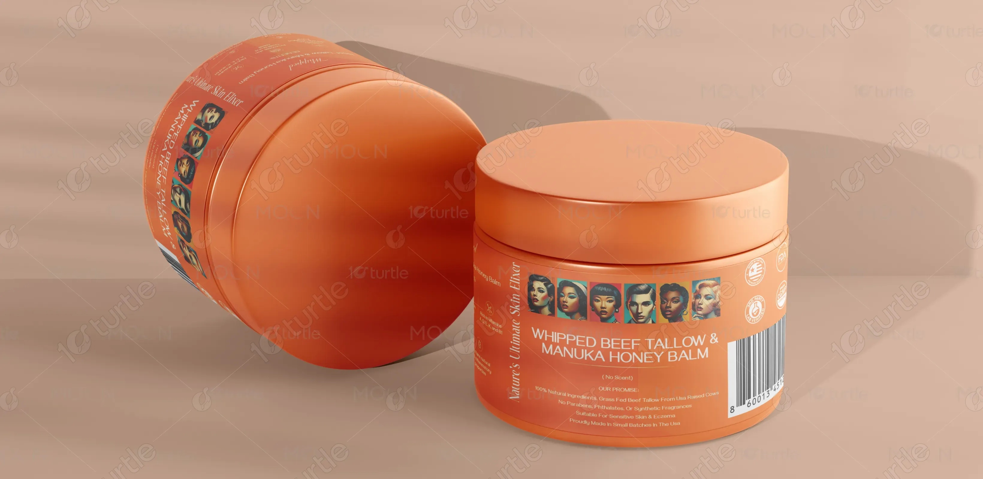
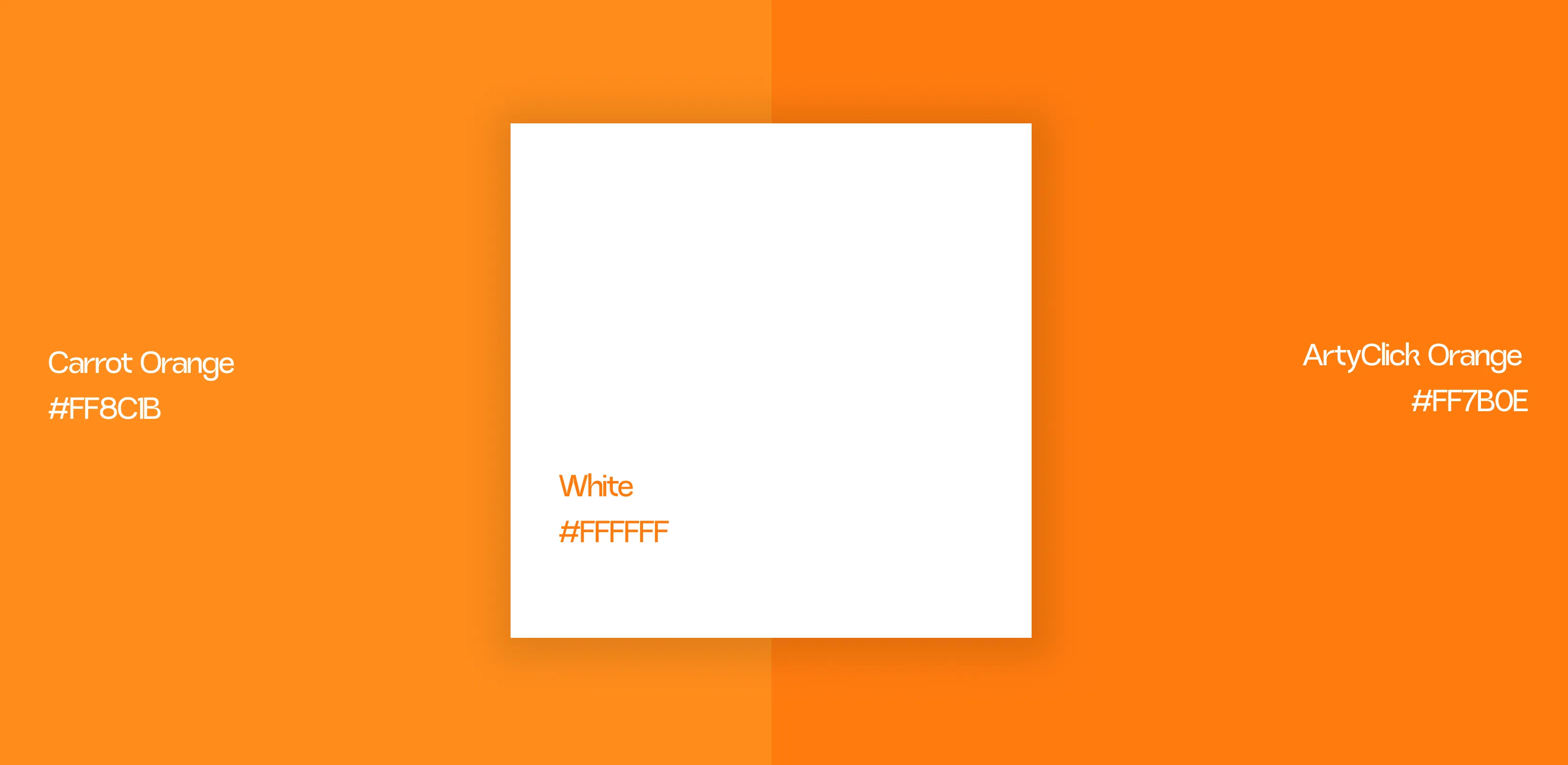
The color palette is a curated mix of earthy neutrals and bold accent tones—such as matte black, deep terracotta, olive green, or muted gold. These tones evoke natural quality, craftsmanship, and elegance. Neutrals provide a timeless base, while the accent colors highlight key information and guide user attention. The palette aligns with modern artisanal branding and signals purity, sophistication, and trust. It ensures the label stands out while remaining aligned with contemporary consumer tastes.