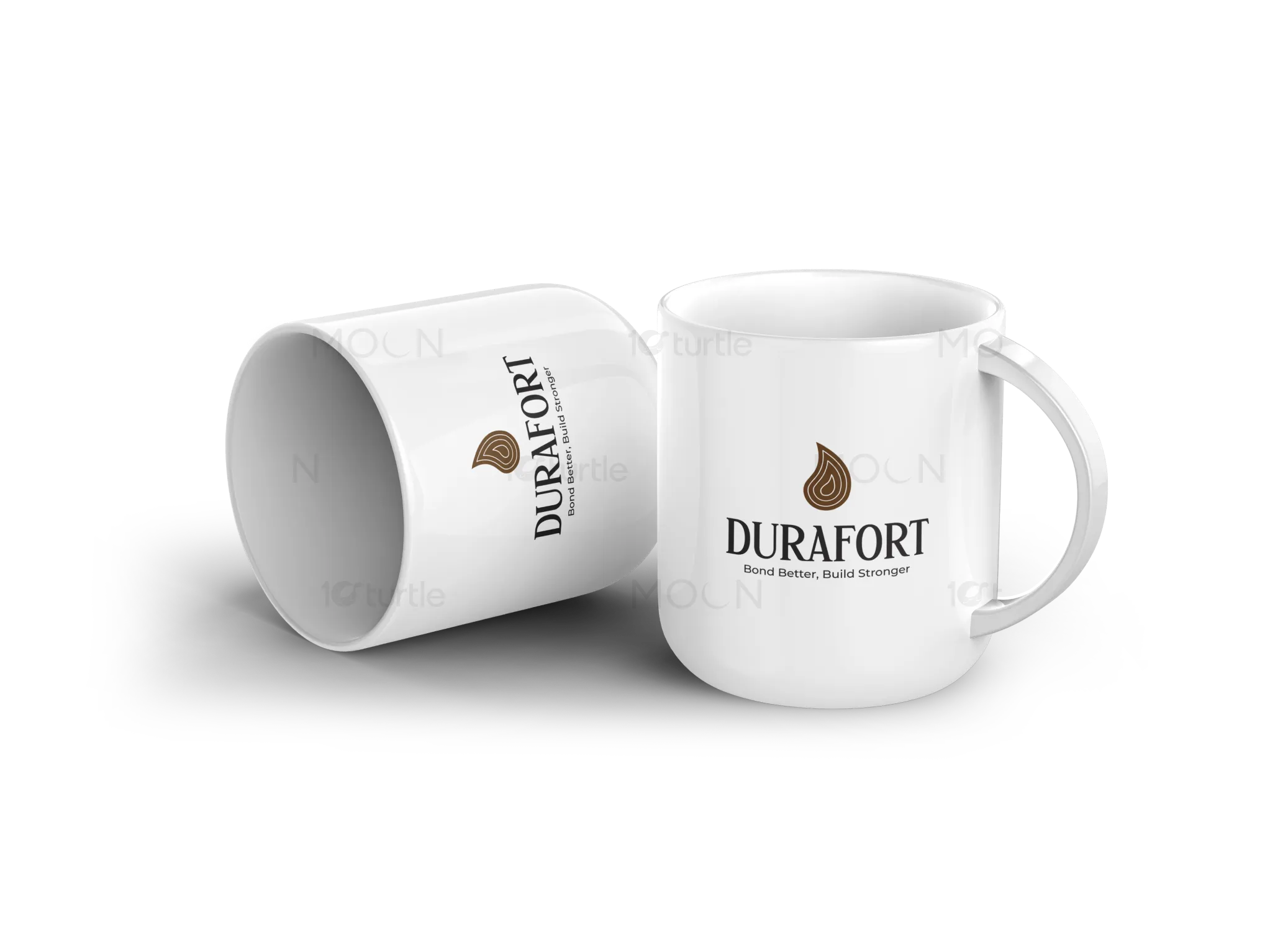
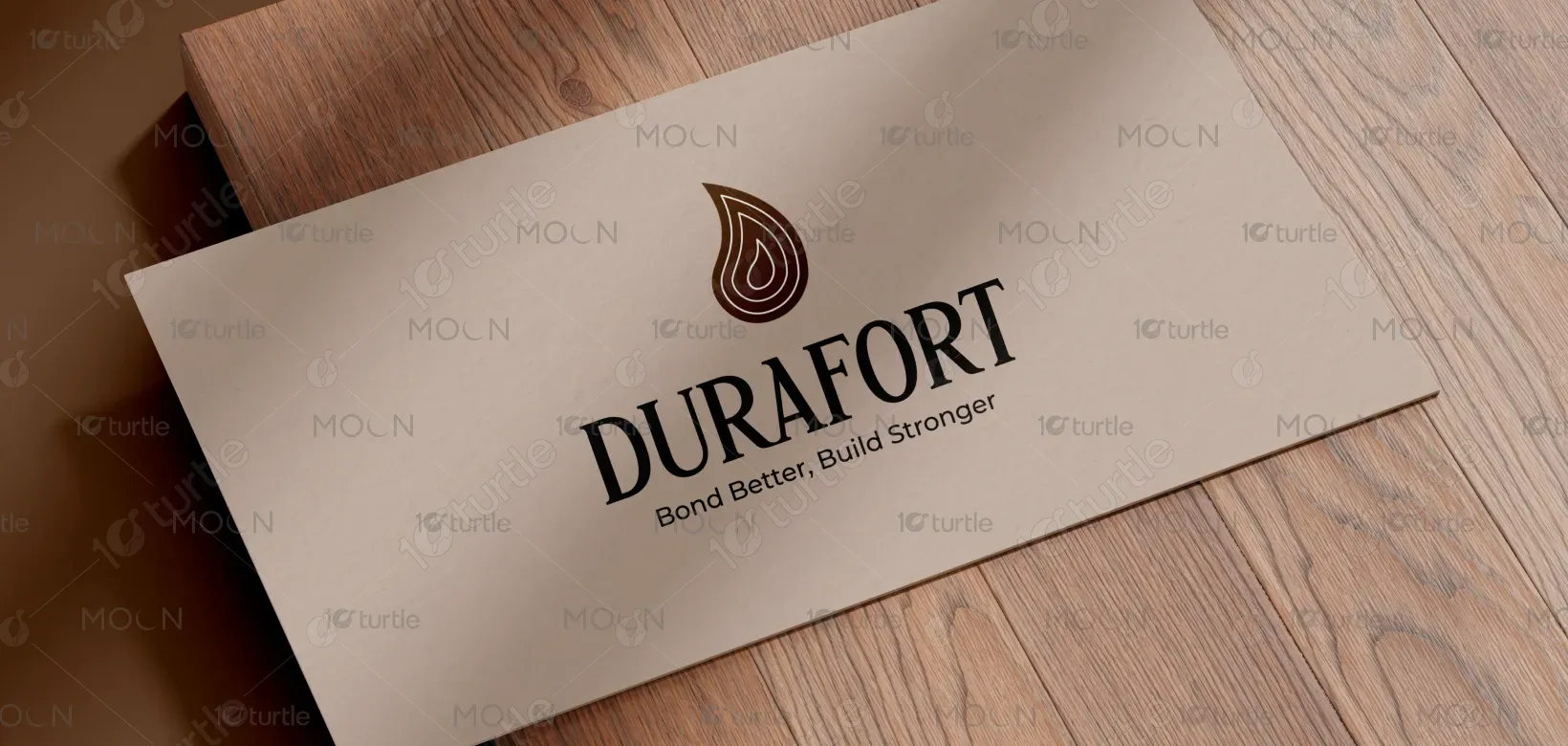
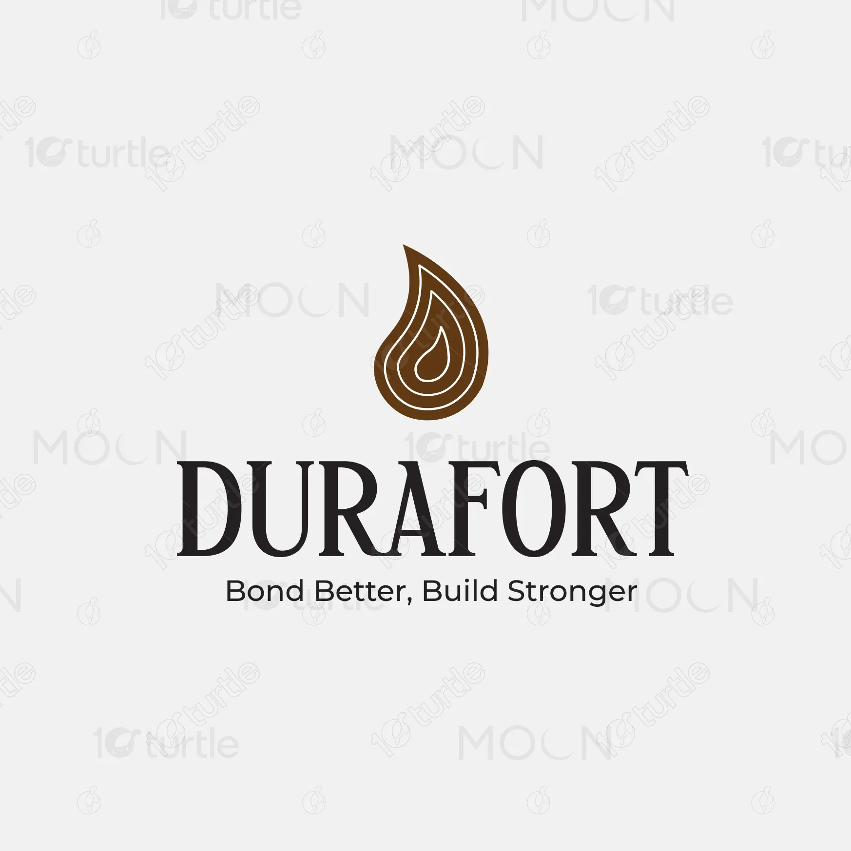
The design for Durafort combines strength and trust, focusing on clean, bold visuals that communicate the brand’s reliability in the adhesive and construction market. The logo features a water droplet, symbolizing the adhesive’s bonding power and fluidity. The color scheme uses earthy tones of brown and yellow, which suggest warmth, stability, and energy. The design balances professionalism with accessibility, ensuring that it resonates with both industry professionals and DIY enthusiasts.
Logo Design
Graphic Design
Branding
Industry
Property, Construction & Real Estate
Tools we used
Project Completion
2025
Key Market
Global
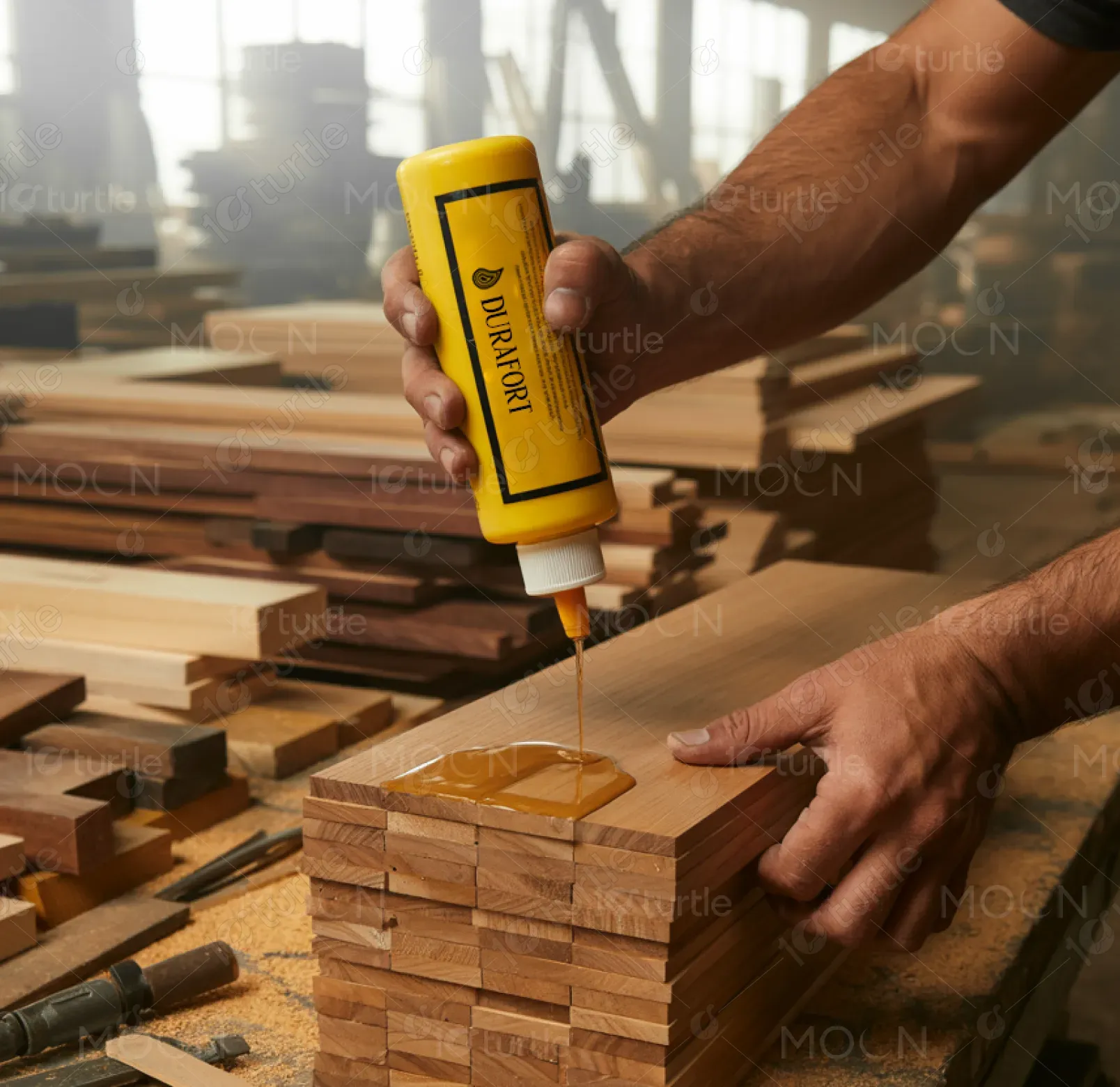
Durafort is a leading brand offering high-performance adhesives designed for professionals in the construction and woodworking industries. Its product range includes glues, tapes, and other bonding solutions that ensure stronger, longer-lasting connections. The brand’s unique selling point lies in its premium quality and reliability, making it ideal for both small-scale and large-scale applications. The functional appeal is reinforced by a straightforward aesthetic, with packaging that emphasizes durability, ease of use, and strength, making it instantly recognizable in the marketplace.
Industry
Property, Construction & Real EstateWhat we did
Logo DesignGraphic DesignBrandingPlatform
-The construction and woodworking industries often struggle with adhesives that fail under pressure, resulting in weak bonds and costly repairs. Many brands overlook the need for an adhesive that can perform under a wide variety of conditions, from extreme weather to heavy-duty projects. Additionally, users are frequently frustrated by unclear labeling or difficult-to-use packaging. These issues can cause delays and inefficiencies in the construction process, affecting productivity and overall quality.
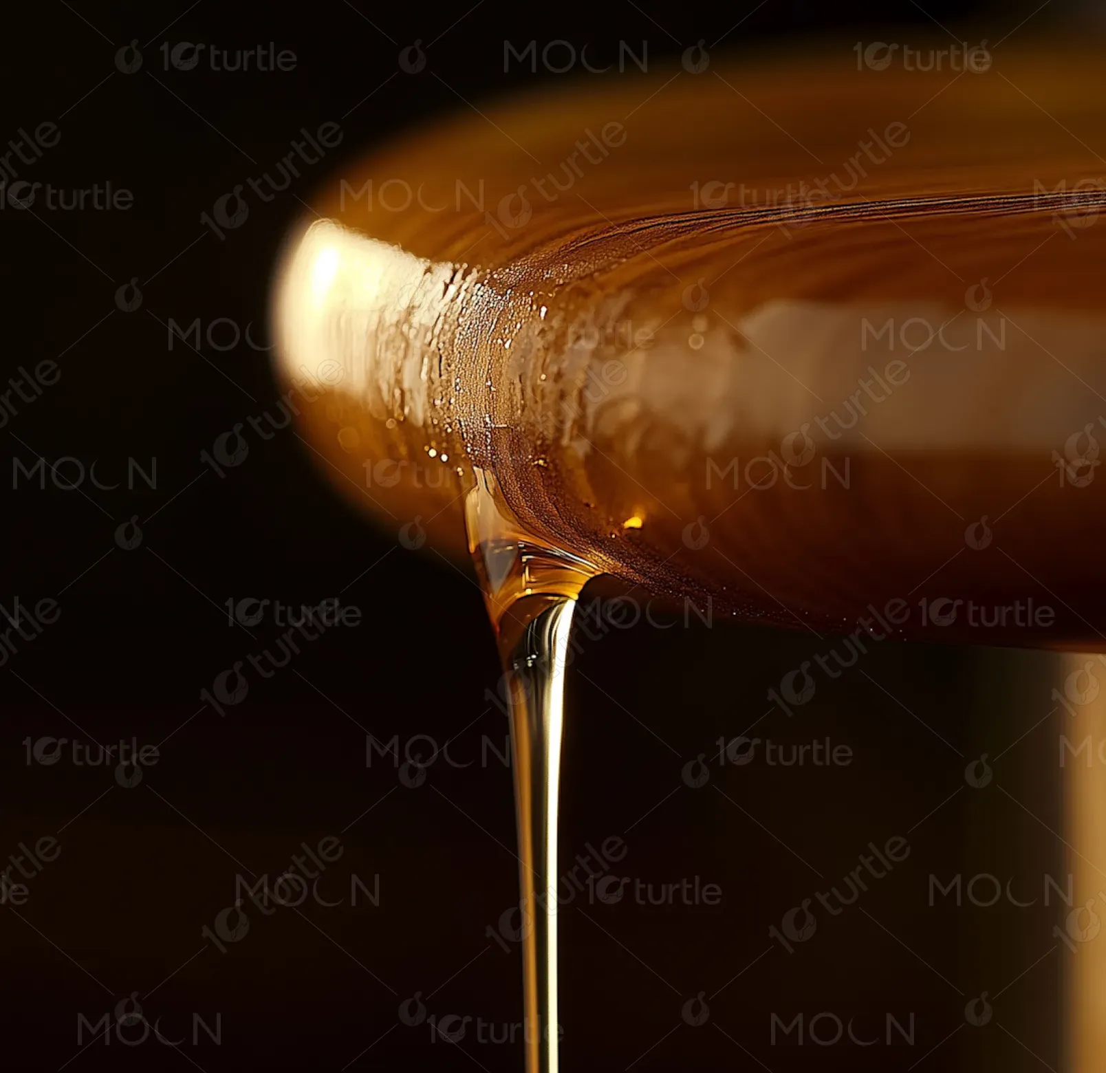
Durafort provides a solution to these challenges by offering adhesive products specifically designed for professionals who demand the best. The products feature high durability, easy application, and reliable bonding under all conditions. The packaging is designed for convenience, making it easier to apply the adhesive with precision. The logo, bold and recognizable, ensures immediate trust and confidence in the product. The brand’s commitment to quality and innovation in adhesive technology sets it apart from competitors.
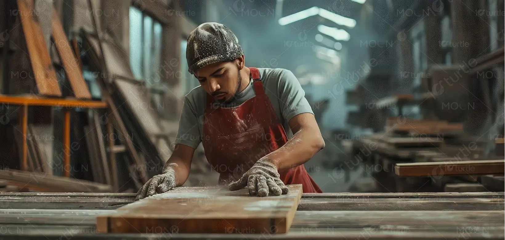
Durafort aims to become a recognized name globally, synonymous with high-quality, reliable adhesives. Long-term, the design will evolve to reflect technological advances in the adhesive industry, such as eco-friendly solutions or faster-curing formulas. The goal is to expand into new markets and establish Durafort as the go-to choice for professionals who demand strength and precision in their bonding materials. The design will continue to inspire confidence, aligning with the needs of the evolving industry.
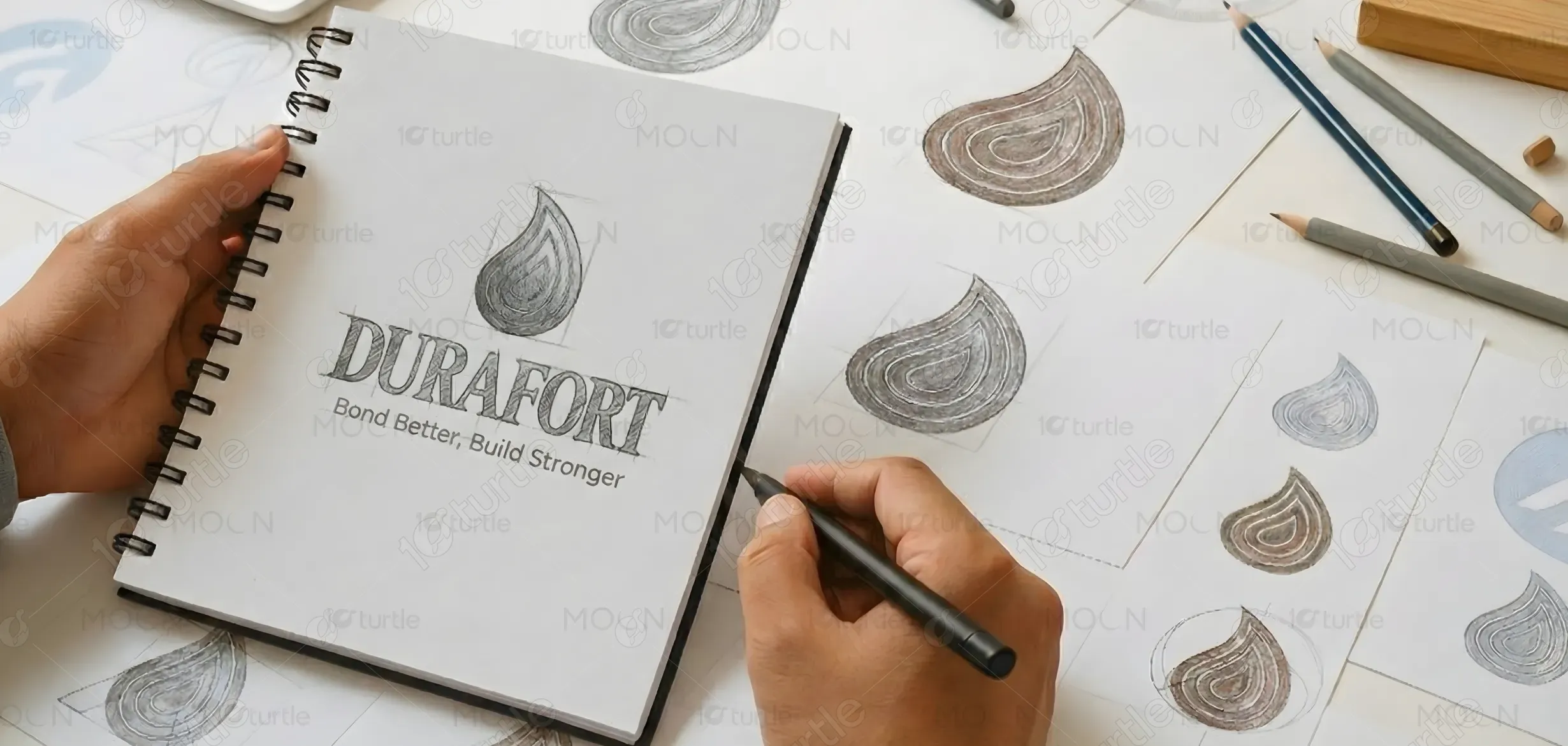
The Durafort logo combines a stylized water droplet symbolizing strength, fluidity, and reliable bonding. The modern typography and droplet design convey precision and power, reflecting the brand’s core adhesive product. The color evokes natural elements like wood and construction, reinforcing Durafort’s promise of trust and durability.
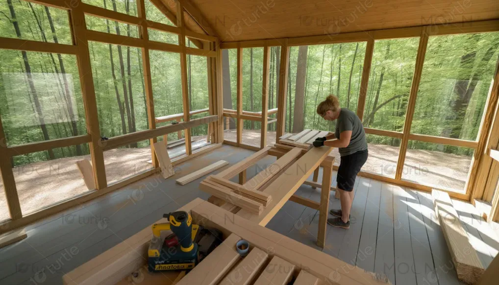
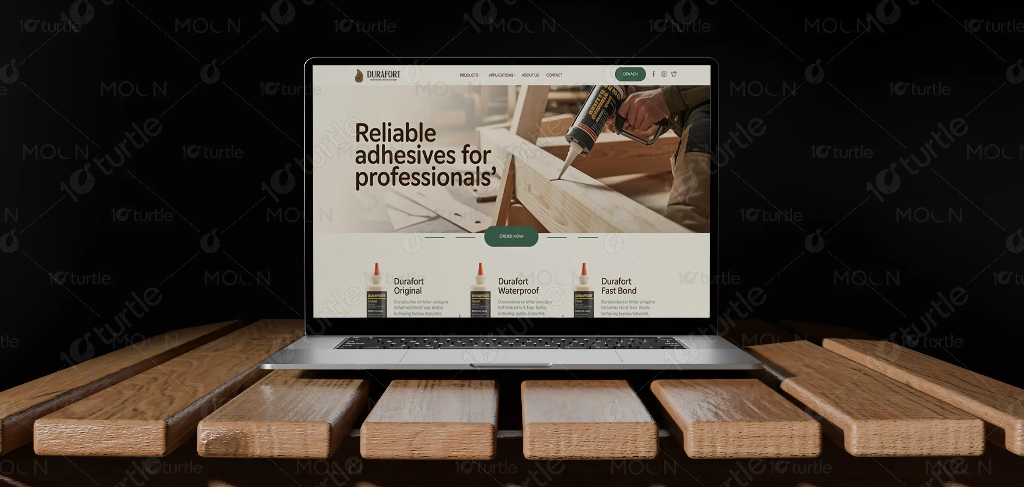
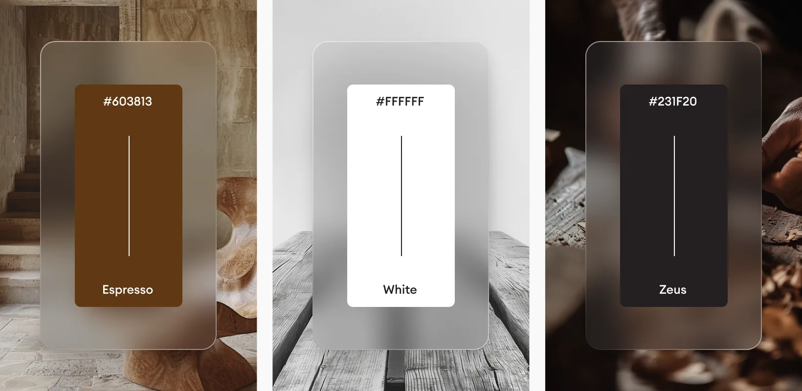
The color palette of yellow and brown aligns with Durafort's identity as a strong, reliable, and professional brand. Yellow evokes energy, optimism, and precision, mirroring the application of adhesives and their role in securing materials. Brown symbolizes stability, earthiness, and trust, reflecting the brand’s deep connection to the construction and woodworking industries. Together, these colors create a balanced, approachable, and professional image, ensuring that Durafort stands out while evoking confidence in its products.
