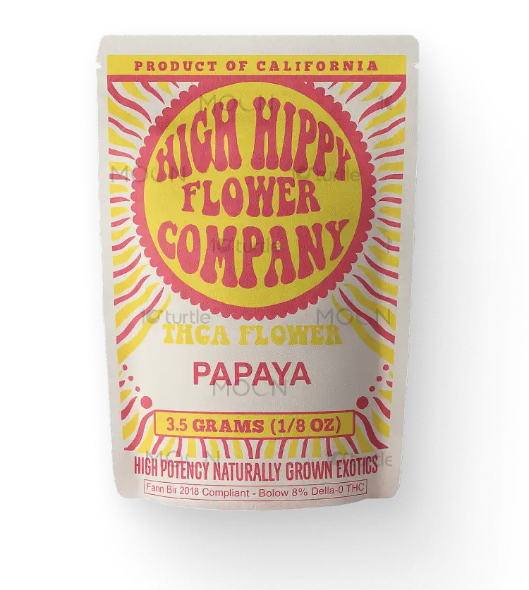
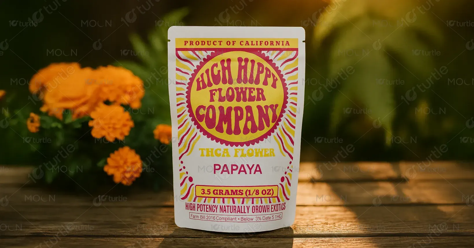
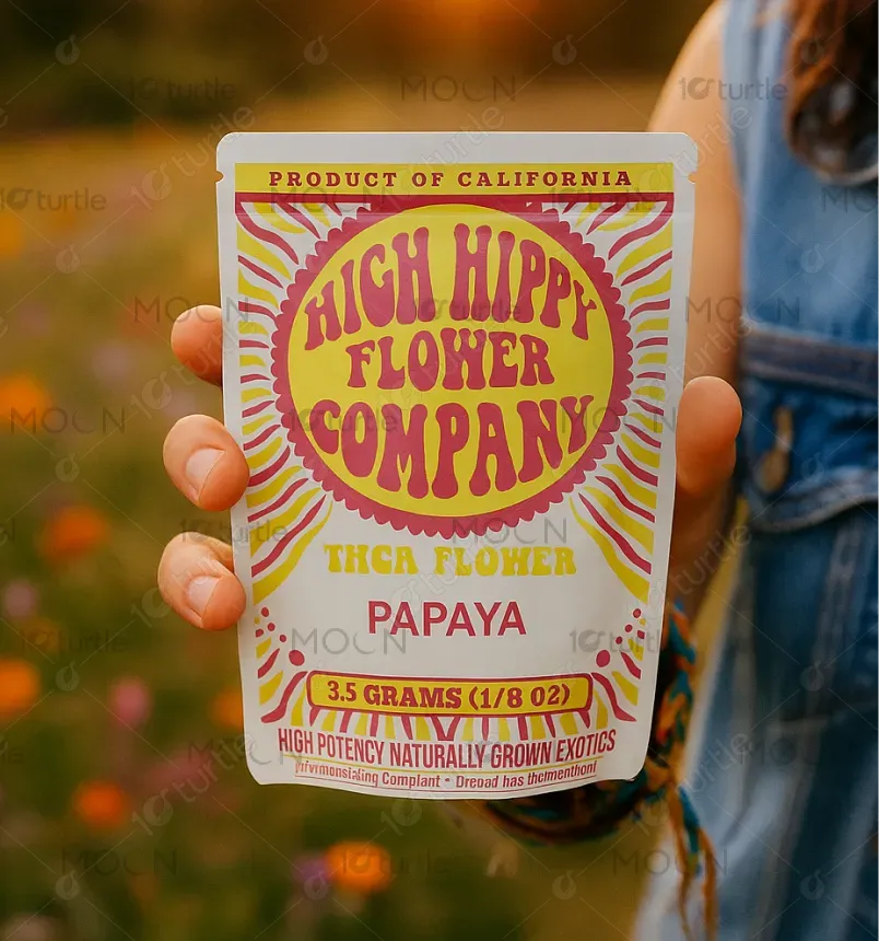
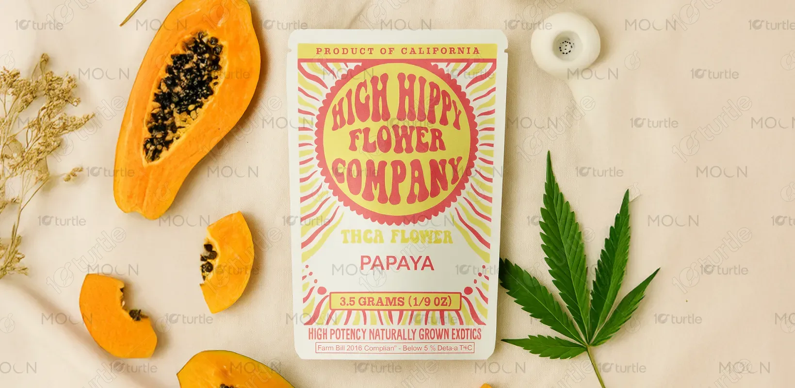
The design captures a retro-psychedelic aesthetic inspired by the 70s flower power movement. Using bold, wavy typography and radiating patterns, it creates an instantly recognizable, carefree vibe. The bright color palette of pink and yellow is playful and eye-catching, reflecting both the product’s organic roots and the brand’s joyful, laid-back spirit. The packaging merges vintage nostalgia with modern cannabis culture, striking a balance between fun and trustworthiness while ensuring strong shelf presence in a saturated market.
Packaging Design
Graphic Design
Industry
Consumer Goods & Retail
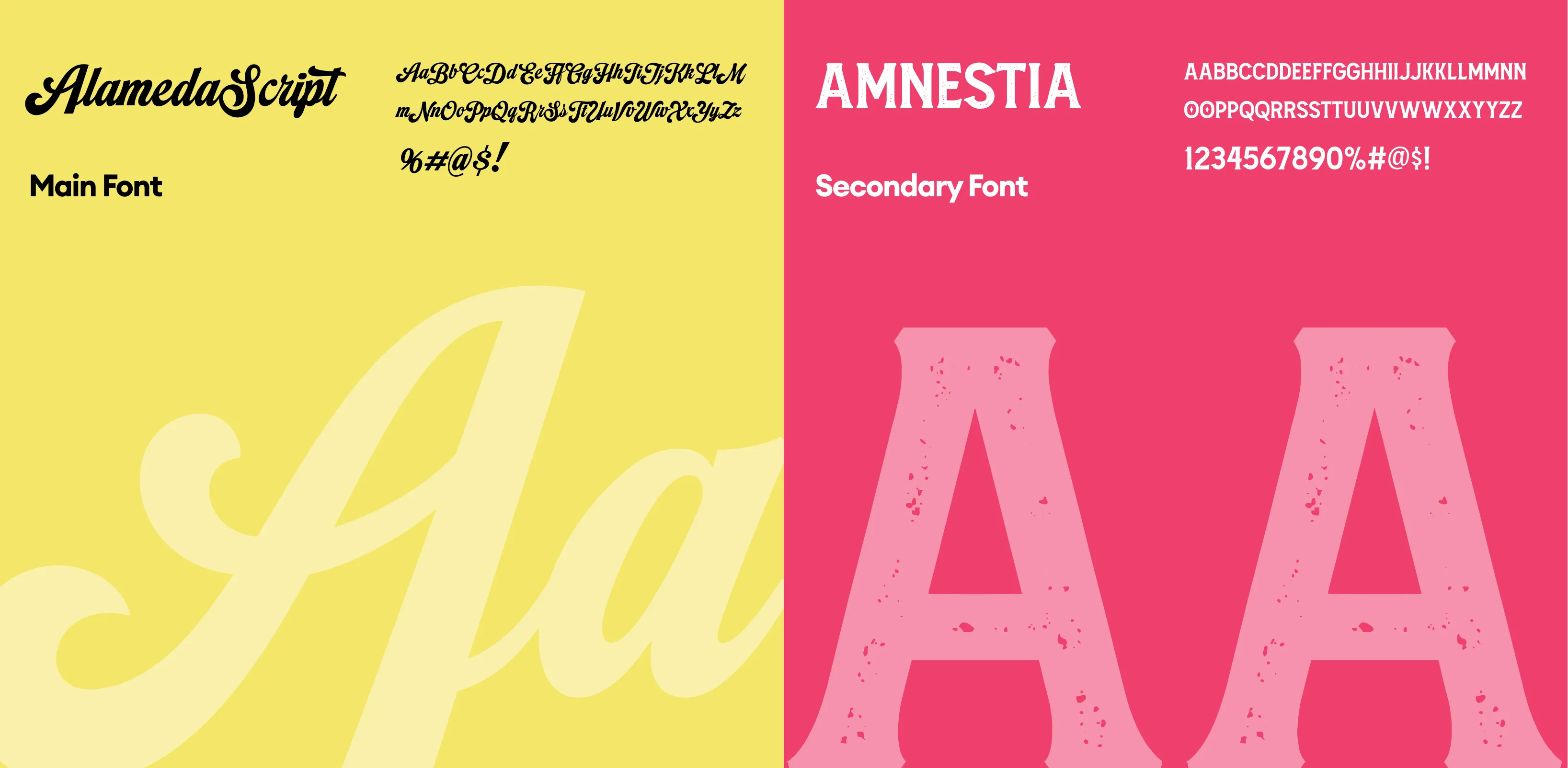
Tools we used


Project Completion
2025
Key Market
Global
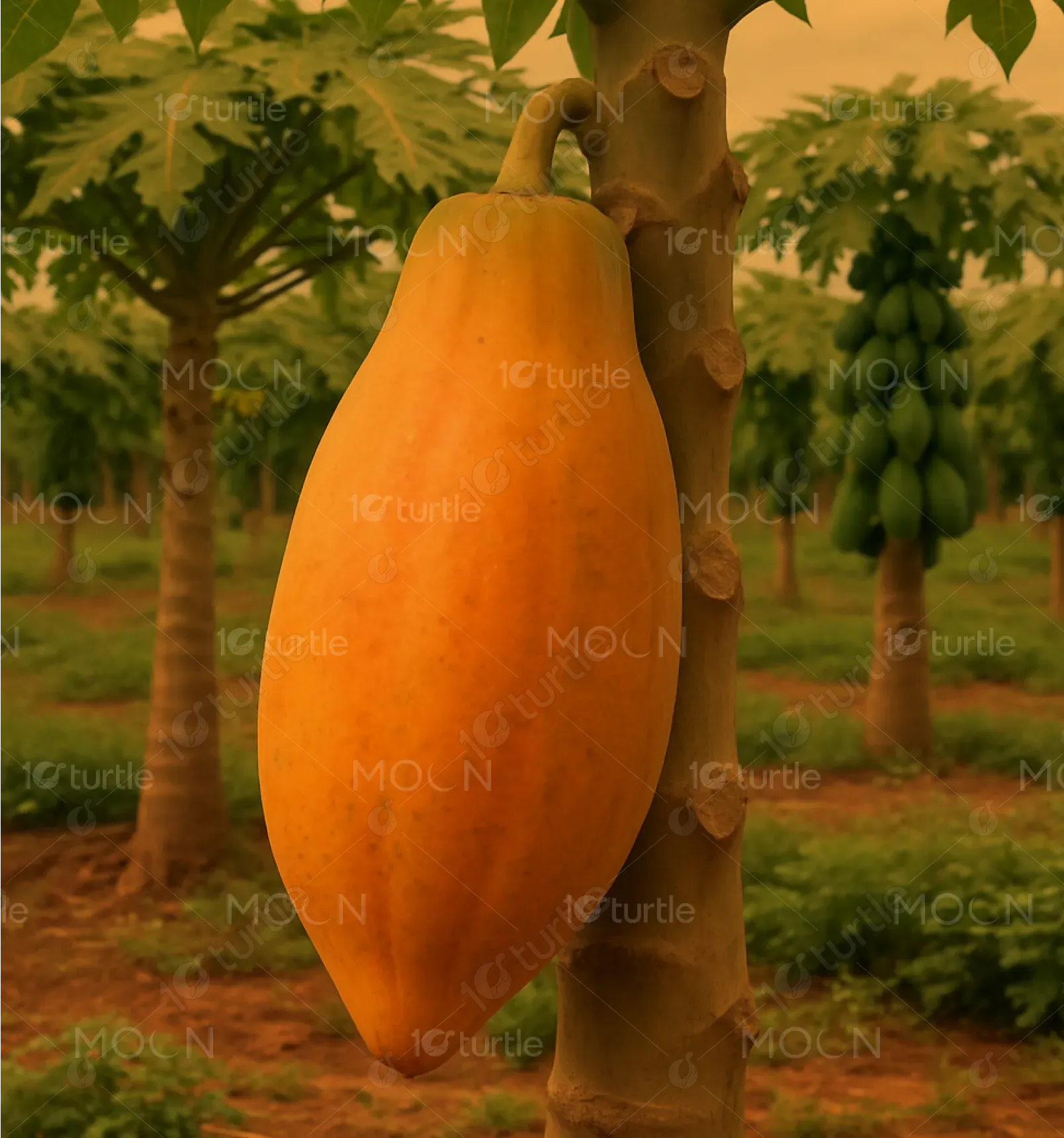
High Hippy Flower Company offers premium THCA flower strains, with a strong emphasis on natural cultivation and high potency. This product—Papaya, a 3.5g offering—is designed for users who value both quality and personality in their cannabis. In a market flooded with sterile, clinical packaging, High Hippy stands out with its playful, vibrant branding that appeals to lifestyle-conscious consumers. Its unique identity blends wellness and counterculture, appealing to those seeking a feel-good, premium, and nostalgic cannabis experience.
Industry
Consumer Goods & RetailWhat we did
Packaging DesignGraphic DesignPlatform
-The cannabis market often struggles with branding extremes—either overly medical or excessively rebellious—creating confusion or distrust among consumers. Many products fail to visually communicate quality, compliance, and experience in a single glance. Especially for new or curious users, sterile packaging lacks approachability, while overly graphic designs may feel unprofessional or off-putting. The challenge here was to create a visual language that balances fun, familiarity, and credibility, especially in a space still battling stigma and regulation.
This design successfully bridges that gap with a nostalgic yet fresh look. The hand-drawn, bubbly typography and psychedelic sunburst motif signal fun and relaxation, while clear labels like “THCA Flower” and weight breakdown build consumer trust. Regulatory compliance is handled with clarity and discretion (e.g., “Farm Bill 2018 Compliant”), ensuring both legality and transparency. The bold layout and distinct color pairings improve recognition on shelves or online, catering to modern cannabis users who prioritize both quality and aesthetic.
The long-term goal is to build a brand that’s instantly recognizable and culturally resonant. High Hippy’s packaging is designed to evolve into collectible, lifestyle-forward products, extending into apparel, merch, and events. Its visual identity aims to spark a movement—not just a purchase—by celebrating natural living, creative freedom, and holistic wellness. As cannabis products mature in the market, this brand hopes to lead with personality, purpose, and playful storytelling through design.
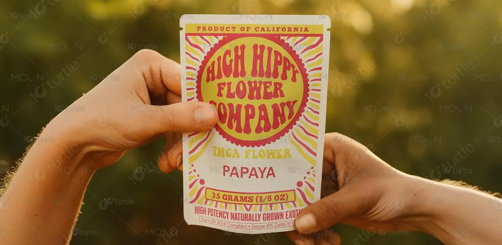
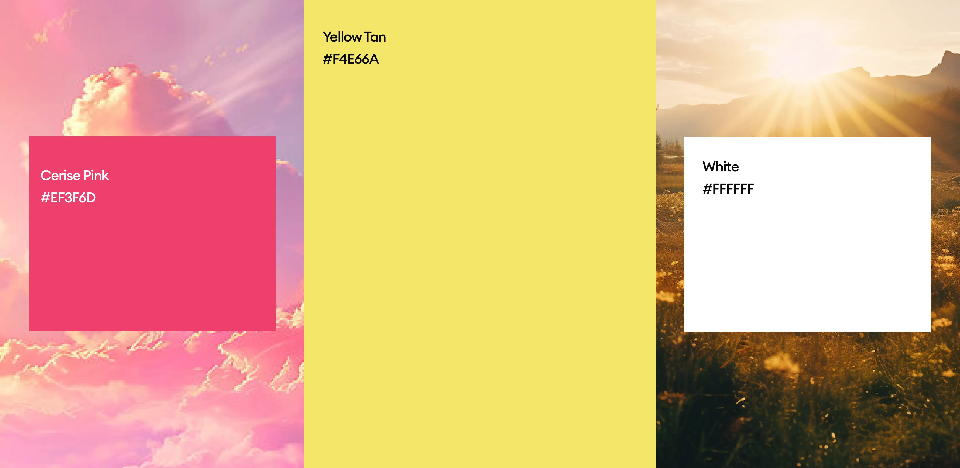
The bright bubblegum pink and sunny yellow combo evokes positivity, warmth, and fun. Pink suggests friendliness and creativity, while yellow brings energy and optimism—together they reflect the product’s mood-enhancing qualities. The white background keeps the overall look clean and modern, allowing the central elements to pop. This palette aligns perfectly with the brand’s free-spirited, feel-good identity, making it inviting, energetic, and instantly noticeable on both physical and digital shelves.