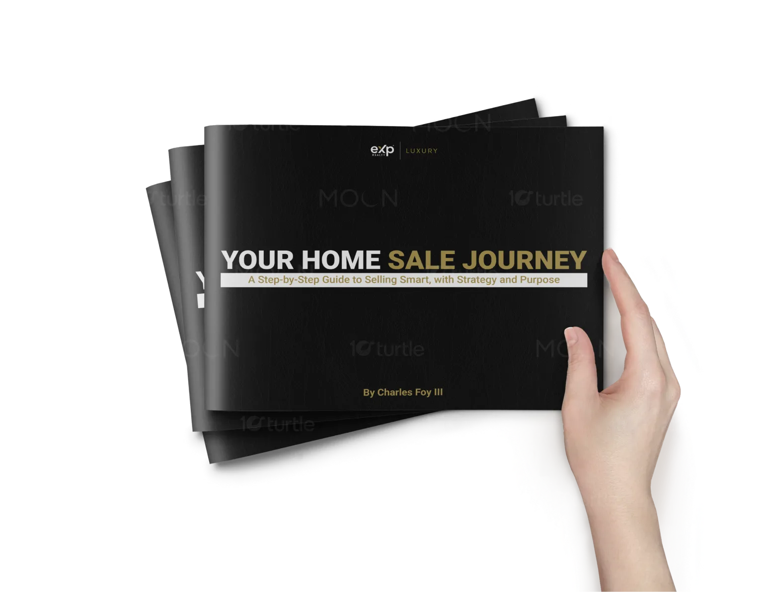
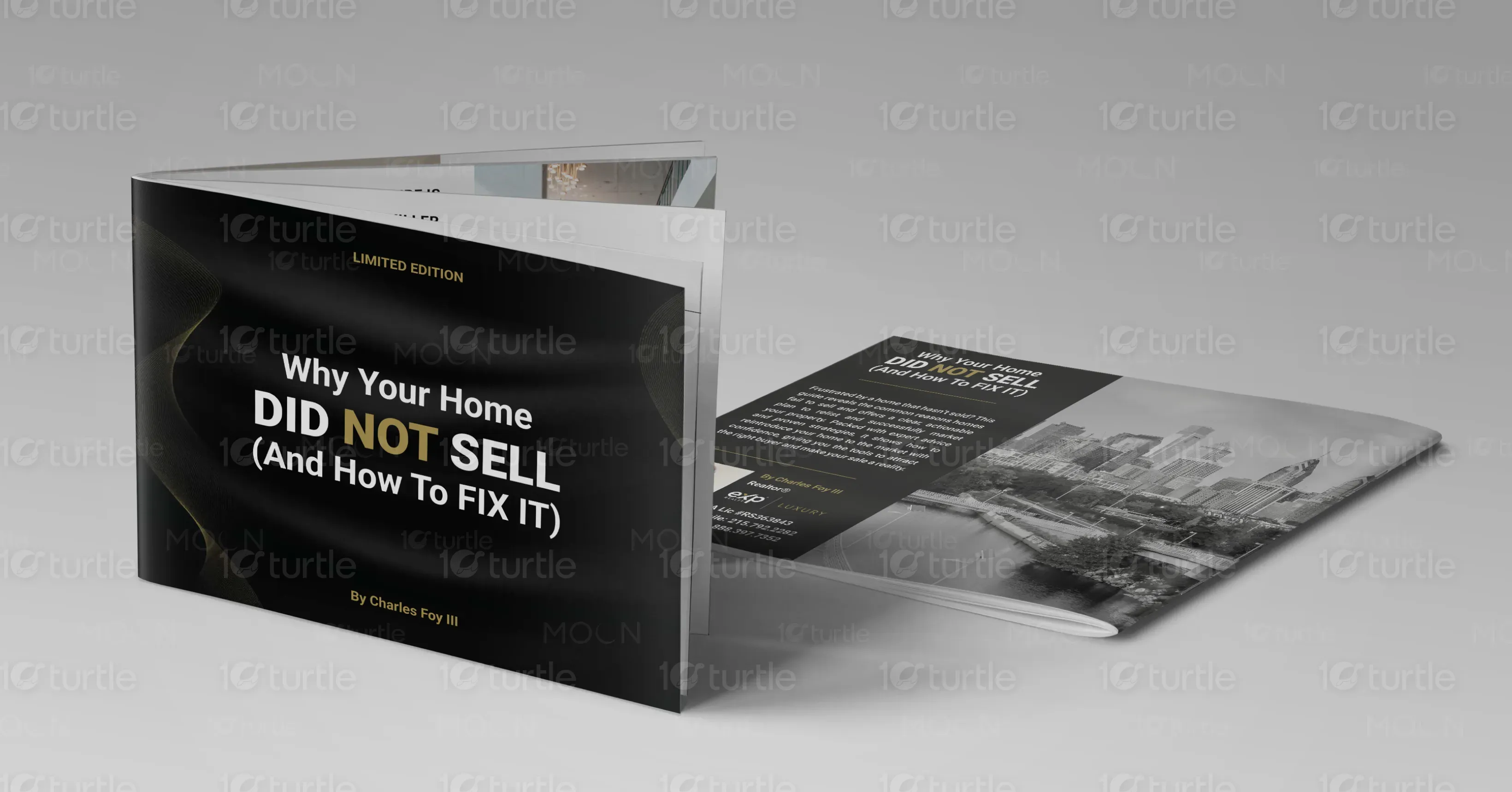
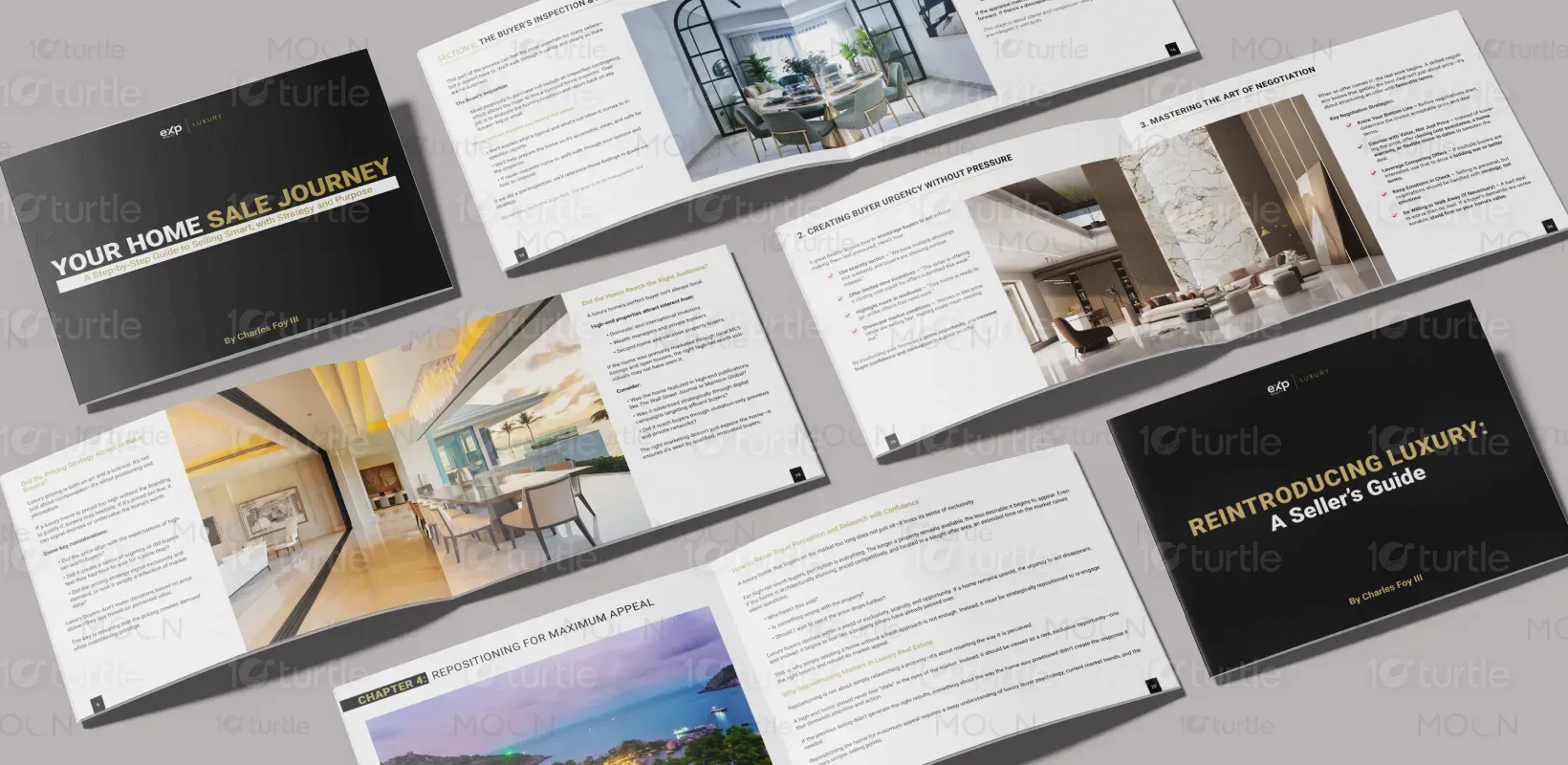
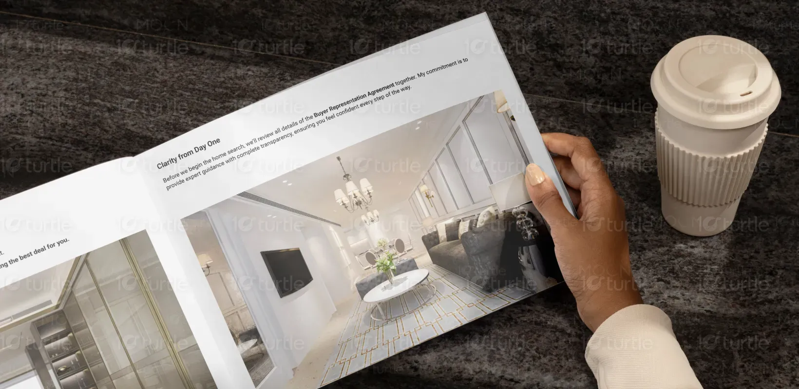
This guidebook design fuses elegance with clarity, combining clean typography, a minimal yet luxurious layout, and purposeful color accents. It embodies a premium feel aligned with the high-end real estate market while maintaining functional simplicity. The design uses white space, intentional hierarchy, and elegant serif fonts to enhance readability and create a refined, trustworthy aesthetic. It reflects the brand’s strategic and empathetic approach to selling homes—presenting each page as a thoughtfully curated step in the client’s journey.
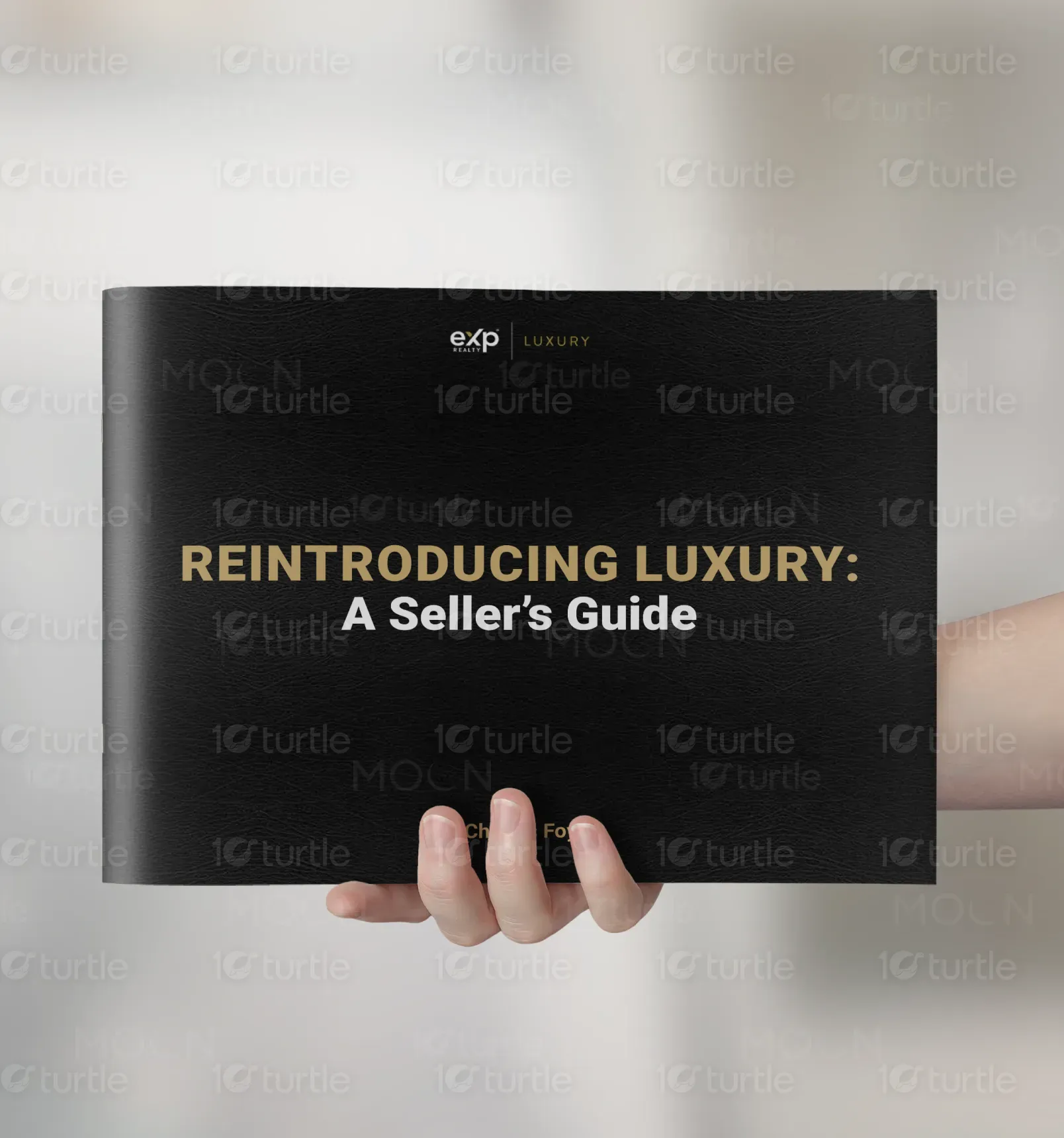
Guide Book design
Graphic design
Industry
Property, Construction & Real Estate
Tools we used


Project Completion
2025
Key Market
Global
The guidebook is a comprehensive seller resource designed to educate and empower homeowners through every phase of the selling process. From pricing strategy to property tours and closing, it offers strategic insights with clarity and professionalism. What sets it apart is its humanized, story-driven tone and the high level of detail, backed by sophisticated branding. The product is more than a brochure—it's a roadmap that builds confidence, making it an essential tool for sellers seeking a premium experience.

Industry
Property, Construction & Real EstateWhat we did
Guide Book designGraphic designPlatform
-Traditional seller guides are often generic, text-heavy, or overly promotional. Many fail to connect with sellers emotionally or guide them through the process with clarity. For luxury or discerning homeowners, these templates fall short in design sophistication, personalization, and strategic depth—resulting in lost engagement and diminished trust. The lack of cohesive branding and thoughtful UX often makes the content feel overwhelming rather than empowering.
This guidebook addresses those gaps by blending emotional intelligence with premium design. Its clean layout and elegant typography support narrative storytelling, making complex information digestible and approachable. Every page is thoughtfully structured with headers, summaries, and callouts that enhance navigation. The tone is empathetic yet strategic—guiding the reader with warmth and confidence. It redefines real estate branding by delivering not just information, but a curated, trust-building client experience.
The long-term vision is to elevate real estate communication into an art form—where every touchpoint reinforces professionalism, empathy, and strategic excellence. This guidebook is the foundation for a broader suite of branded materials aimed at luxury clients, including digital experiences and interactive proposals. The goal is to redefine how clients perceive real estate service—through design that communicates trust, intention, and prestige, creating a lasting impression that turns transactions into relationships.


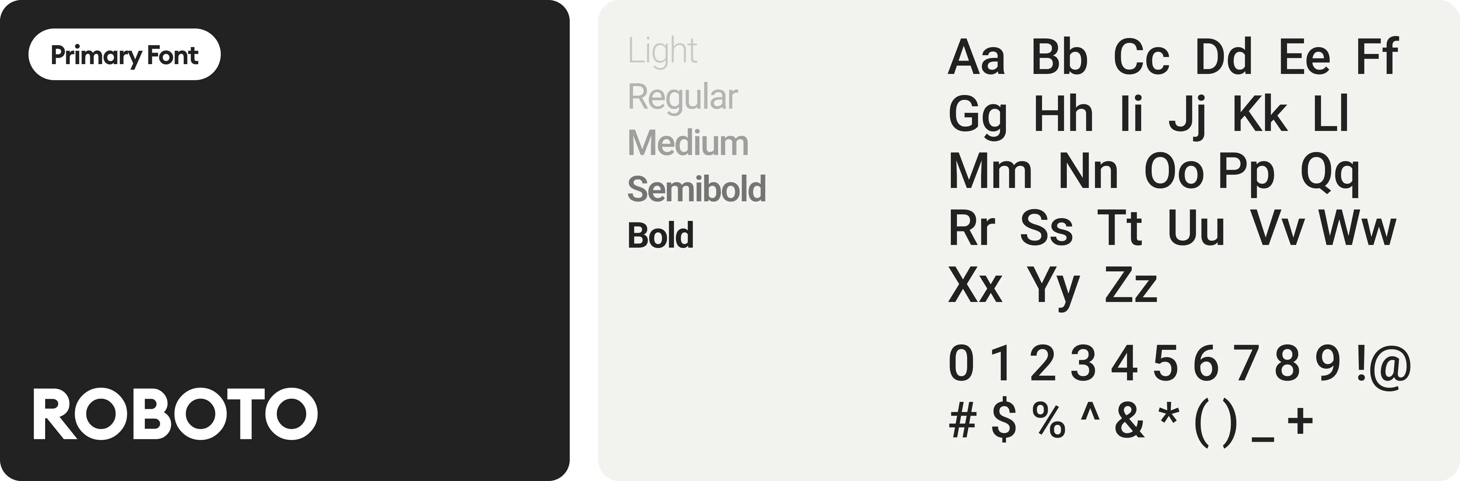
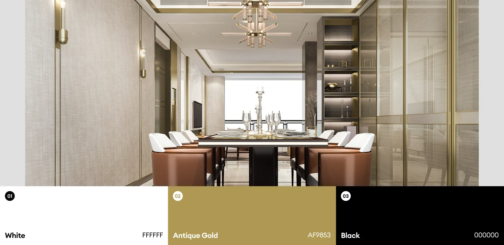
The color palette balances soft neutrals with rich, confident accents. Muted whites and warm grays provide a calming foundation, while deep navy and gold convey sophistication and authority. This contrast evokes trust, exclusivity, and professionalism without overwhelming the content. The tones align with the brand’s premium positioning and mirror the emotional journey of selling a home—serene, strategic, and ultimately, successful.