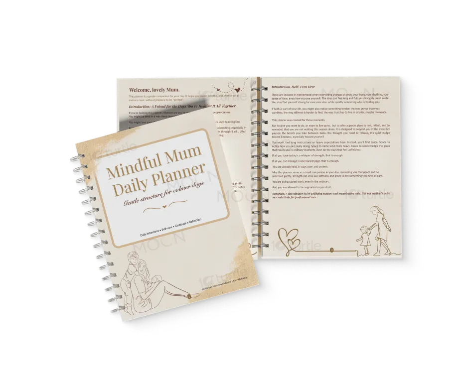
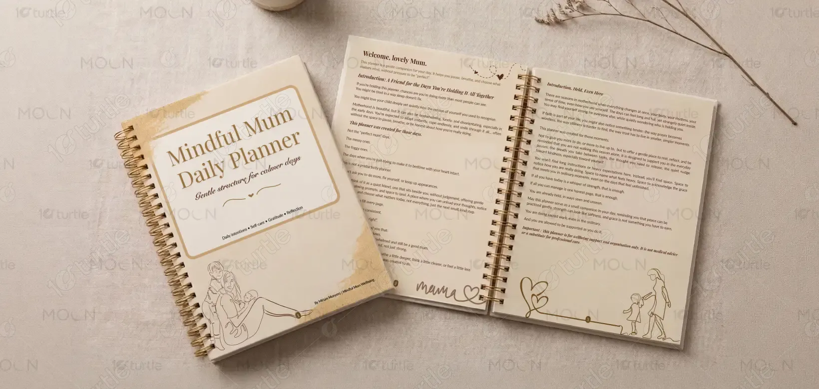
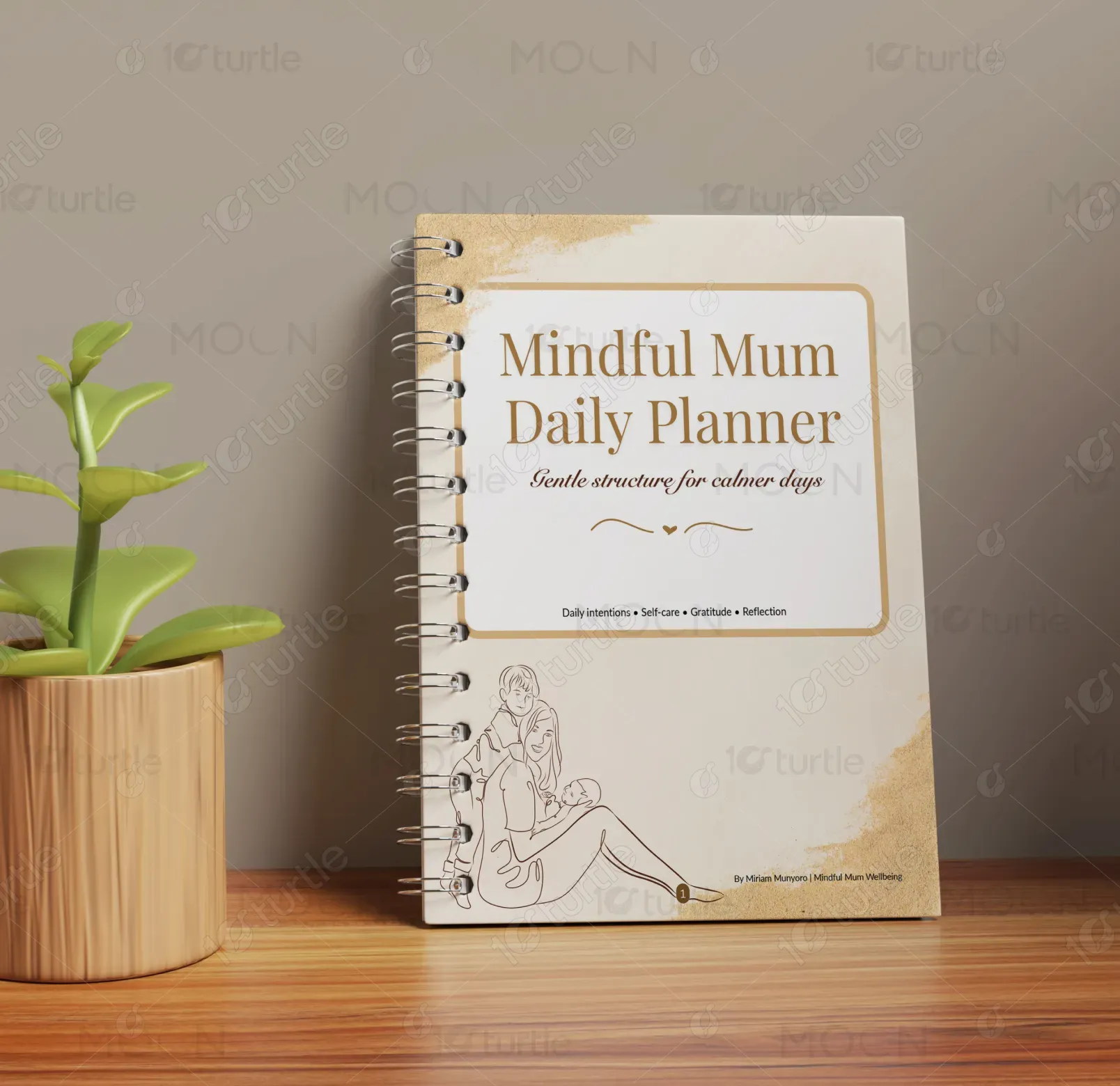
The design follows a soft, minimal, and emotionally comforting aesthetic that prioritizes clarity and calmness. Neutral tones, breathable layouts, and gentle typography create a non-overwhelming user experience. The concept moves away from rigid productivity systems and instead embraces flexibility and emotional support. White space is intentionally used to allow mental pause, while subtle visual hierarchy guides the user naturally. The overall direction is nurturing, human-centered, and reflective, making the planner feel like a supportive companion rather than a task-driven tool.
Brochure Design
Daily Planner Design
Graphic Design
Industry
Healthcare & Wellness
Tools we used


Project Completion
2025
Key Market
Global
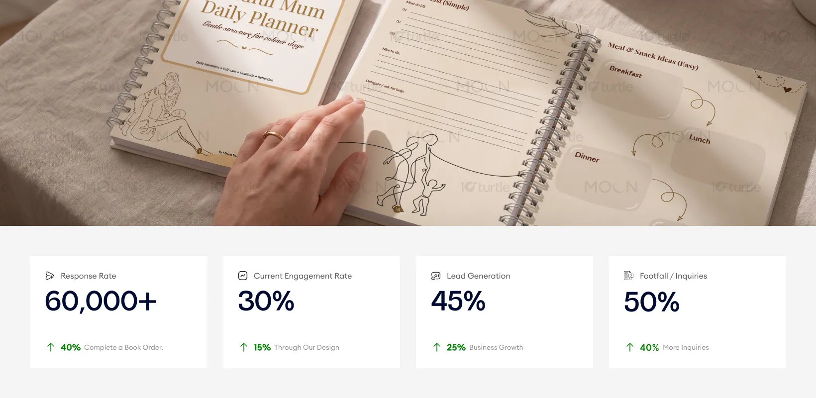
The Mindful Mum Daily Planner is a wellbeing-focused planning tool designed specifically for mothers navigating busy, emotionally demanding days. Unlike traditional planners, it emphasizes mental clarity, self-care, and realistic goal-setting rather than productivity pressure. It includes guided prompts for reflection, gratitude, emotional check-ins, and gentle prioritization. Its unique selling point lies in its empathetic tone and flexible usage, making it ideal for modern mothers seeking balance, calm, and emotional support alongside daily organization.

Industry
Healthcare & WellnessWhat we did
Brochure DesignDaily Planner DesignGraphic DesignPlatform
-Most planners in the market are productivity-driven, demanding consistency, structure, and high output. This creates pressure, especially for mothers managing unpredictable routines, emotional fatigue, and mental overload. Traditional designs often ignore emotional wellbeing, leading users to feel guilty when they cannot keep up. For example, new mothers or working mums may struggle with rigid schedules, making standard planners feel overwhelming rather than helpful. This gap highlights the lack of compassionate, adaptable planning tools tailored to real-life challenges.
This planner addresses the issue by introducing a flexible, wellbeing-first approach. It replaces strict task systems with gentle prompts, emotional check-ins, and realistic goal-setting. Features like “one small step,” gratitude sections, and reflection pages encourage progress without pressure. The design promotes self-compassion, allowing users to engage at their own pace. By combining mindfulness principles with light structure, it transforms planning into a supportive ritual rather than a demanding routine, helping users feel grounded, not overwhelmed.

The design prioritizes a calming and minimal user experience, creating a sense of emotional support for the user. Its subtle visual hierarchy and gentle typography encourage engagement without being forceful. Real-world performance would likely see an increase in conversions and user engagement due to the design’s non-overwhelming approach. Metrics such as lead generation and inquiries could show an uplift due to the natural flow and user-friendly design encouraging more interactions and conversions.
The vision is to build a holistic wellbeing ecosystem for mothers, where planning meets emotional support. The brand aims to expand into guided journals, digital tools, and community-driven platforms that normalize slow living and self-care. Long-term, it aspires to redefine productivity for mothers—shifting from “doing more” to “feeling better.” By creating safe, supportive design experiences, the brand seeks to empower women to embrace balance, self-worth, and mindful living in every stage of motherhood.
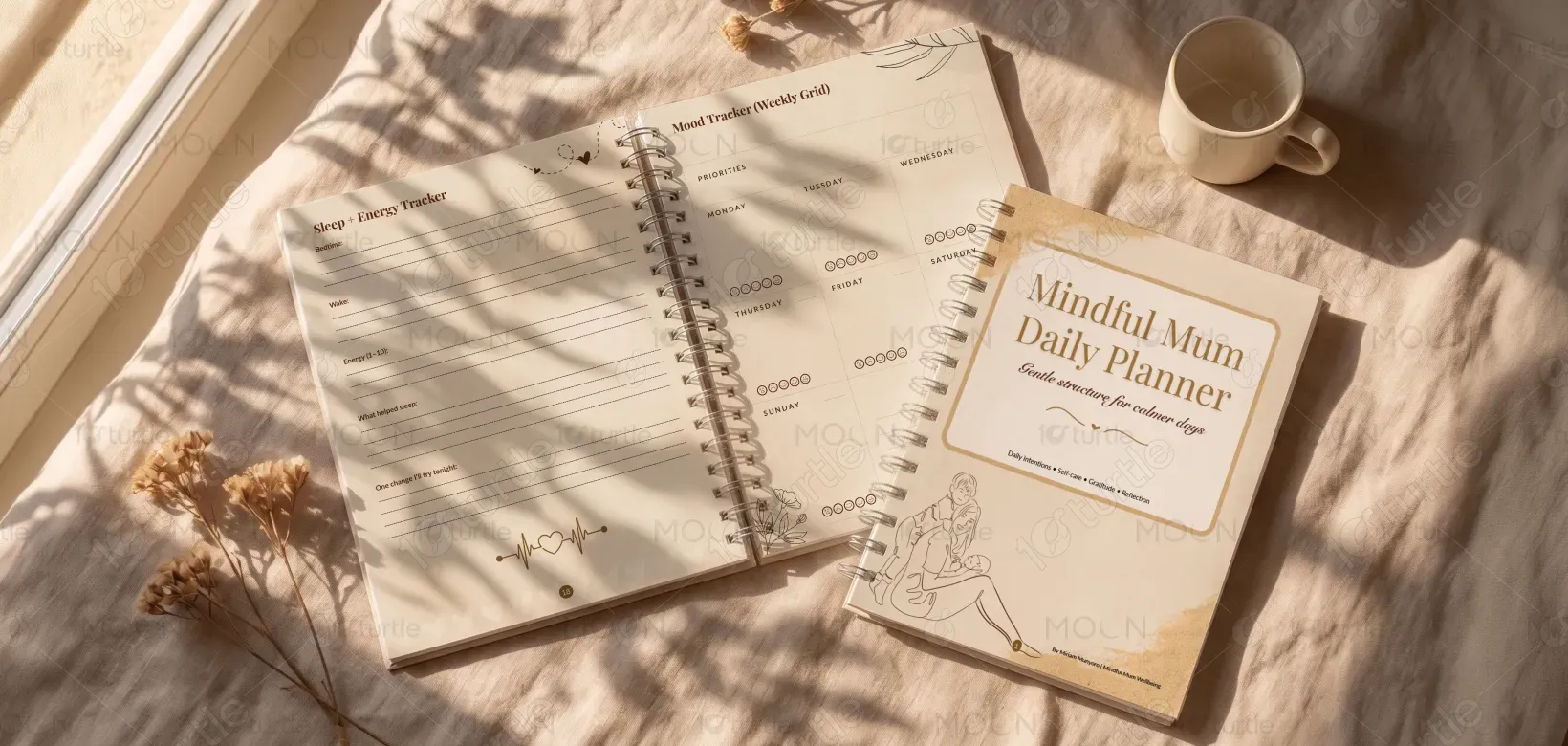


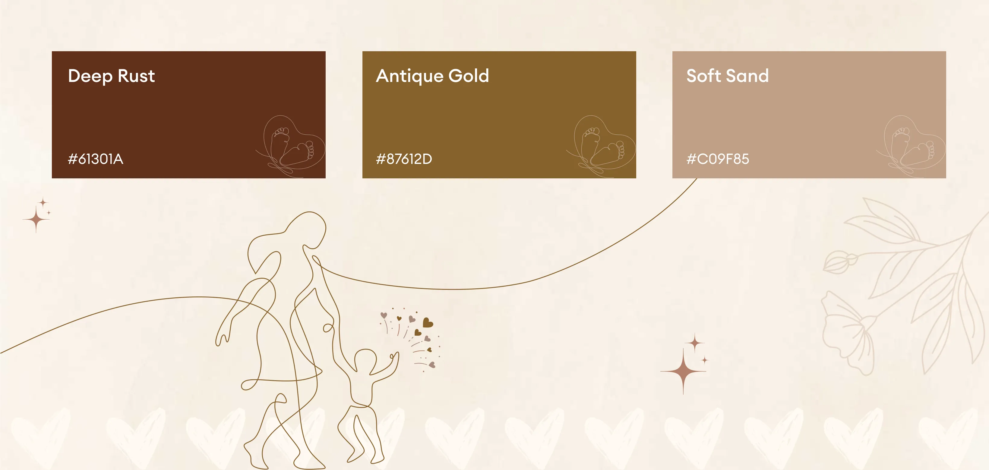
The color palette is rooted in soft neutrals and warm, calming tones such as beige, cream, muted peach, and gentle greys. These colors evoke peace, safety, and emotional warmth, aligning with the planner’s nurturing purpose. The subdued palette reduces visual stress and enhances readability, while maintaining a premium, aesthetic appeal. It avoids high contrast or overly vibrant shades, ensuring the experience feels soothing and approachable—perfectly reflecting the brand’s focus on calmness, mindfulness, and gentle support.