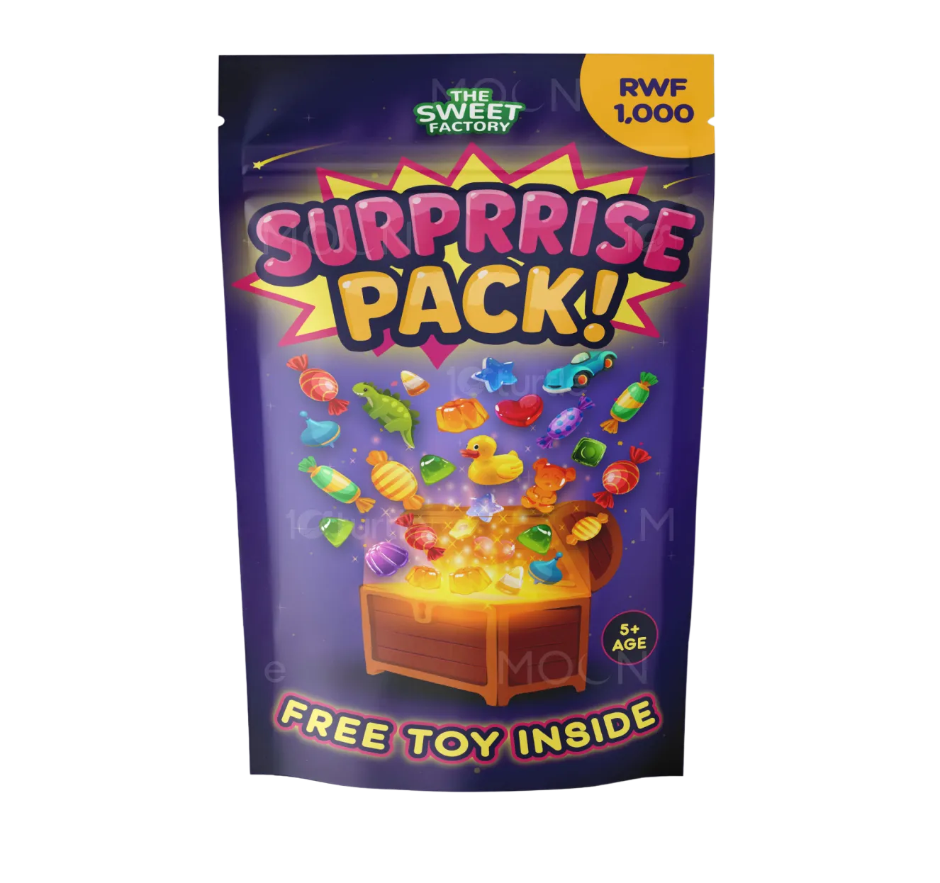
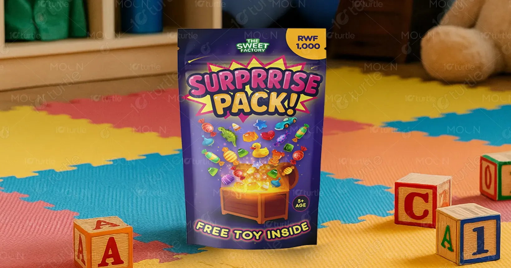
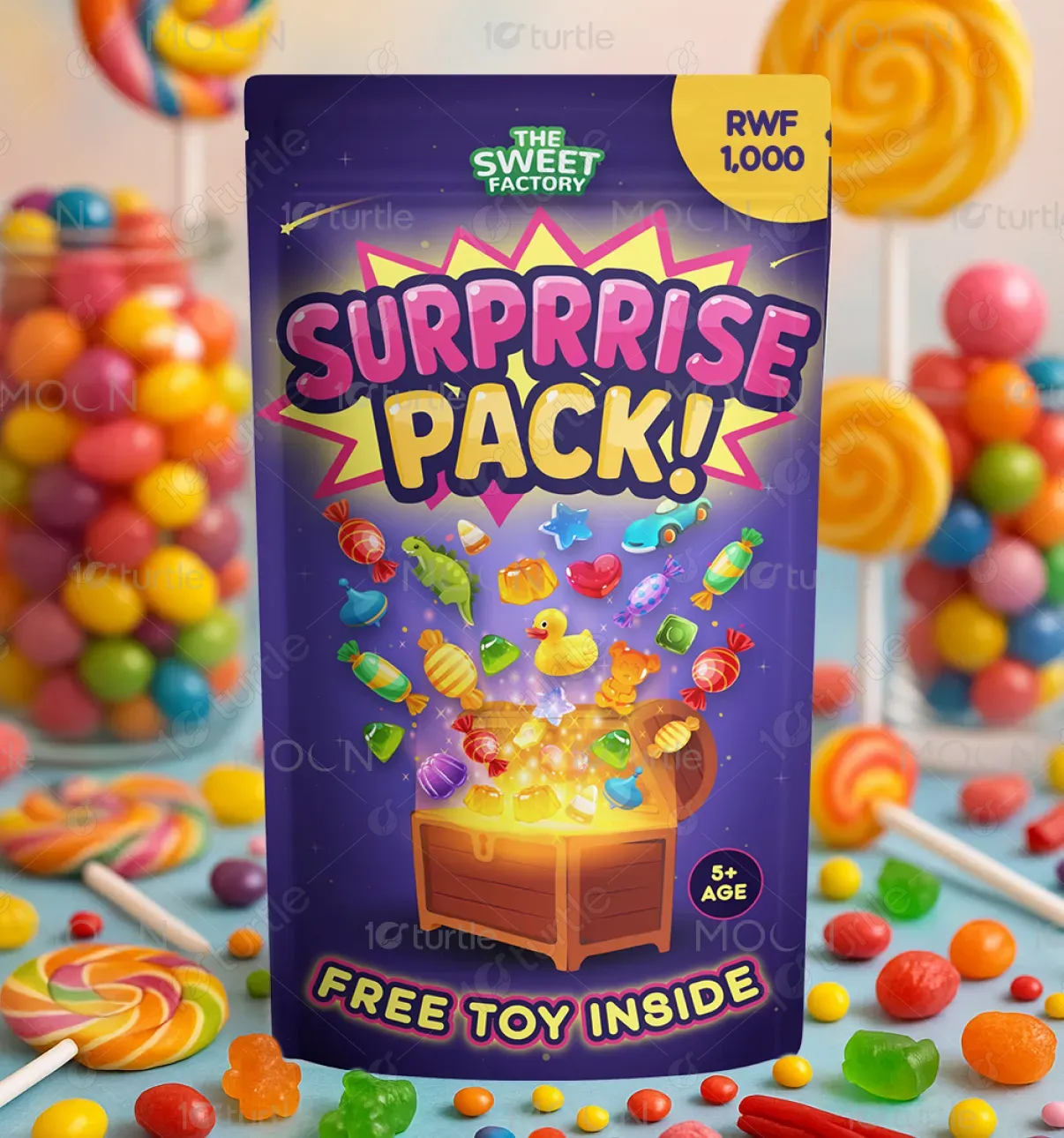
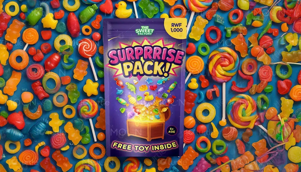
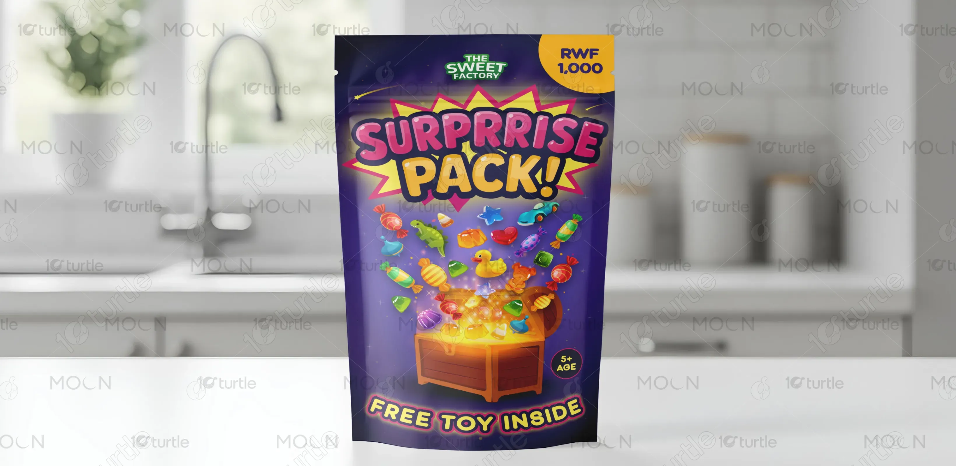
The design embraces a vibrant and energetic style, blending playful illustrations with a colorful explosion of toys and candies erupting from a glowing treasure chest. The bold lettering, purple backdrop, and dynamic layout evoke curiosity and joy. Positioned in a toy store or kid-friendly setting, the packaging is made to captivate children instantly. Elements like the price tag (RWF 1,000), "FREE TOY INSIDE," and age icon (5+ Age) are clearly communicated to appeal to both kids and parents.
Packaging Design
Graphic Design
Industry
Food, Beverage & Hospitality
Tools we used

Project Completion
2025
Key Market
Global
The “SURPRISE PACK!” is a fun, affordable product targeting young children, combining sweet treats and a mystery toy in a single pouch. Offered at a pocket-friendly price, it taps into the excitement of unboxing and surprise culture. Its eye-catching design ensures high visibility in retail environments, especially in toy and candy aisles. The glow, treasure chest, and bursting icons symbolize delight and curiosity—key selling points that set this product apart from ordinary candy packs.
Industry
Food, Beverage & HospitalityWhat we did
Packaging DesignGraphic DesignPlatform
-In saturated toy and candy markets, brands often fail to capture short attention spans or communicate value instantly. Many packages blend into shelves or lack emotional connection. Moreover, separate packaging for toys and candies can overwhelm retail space and limit cross-selling potential. The challenge was to combine these elements into one exciting product while maintaining a safe, kid-friendly, and informative design.
The “SURPRISE PACK!” solves this with a single compact, vibrant pouch that merges fun and reward. Visually, it draws the child’s eye with energetic graphics and iconography. Functionally, it offers both candy and a toy—bundling two product categories. The treasure chest concept adds a narrative layer, turning the product into an experience. The clear pricing, age suitability, and promise of a toy enhance transparency and parental trust.
The long-term vision is to expand the Surprise Pack line into theme-based editions (e.g., animals, space, holidays), enabling collectability and seasonal relevance. The Sweet Factory aims to become a household name in affordable, joy-driven products for children. By maintaining a balance of quality, creativity, and accessibility, the brand aspires to dominate in impulse-buy sections across stores and eventually introduce licensed characters or educational tie-ins.
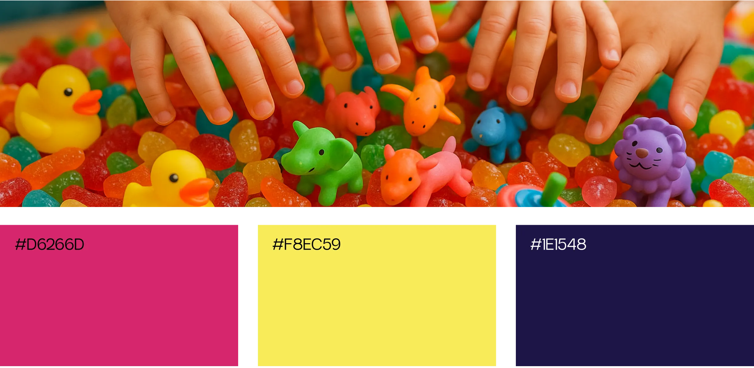
Purple (Background): Represents magic, creativity, and imagination—core themes for children. Yellow & Orange (Treasure Chest & Text): Evokes happiness, warmth, and energy, signaling excitement and reward. Pink & Red (SURPRISE Text & Toys): Attracts attention and adds playful vibrancy. Neon Green (Logo): Communicates freshness and is associated with playful, youthful vibes. Accent Multicolors (Toys & Candies): Ensure diversity, inclusivity, and visual stimulation for children.