

Visual Identity
Brand Strategy
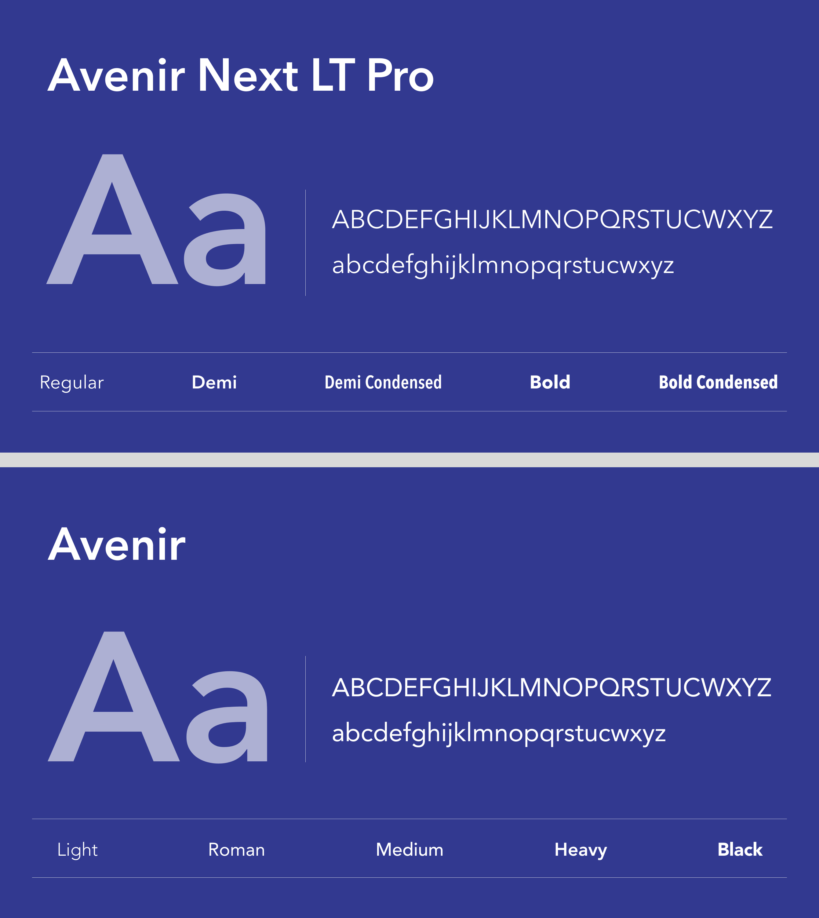
Typography System
Overview
We designed a high-performance visual identity system for Apex, a premier technology professional services advisory firm. The system pairs extreme structural discipline with modern aesthetics to command executive authority across all communication channels. The final deliverable unifies print collateral, digital platforms, and comprehensive brand guidelines under a cohesive system.
The Challenge

The client operated in a high-stakes technology market but lacked a unified visual system to match their sophisticated advisory services. Standard tech templates felt too casual, while traditional corporate identities felt slow and outdated. The brand required a meticulous, elite-level visual language that could present complex data-heavy strategies with absolute structural clarity.
The Solution
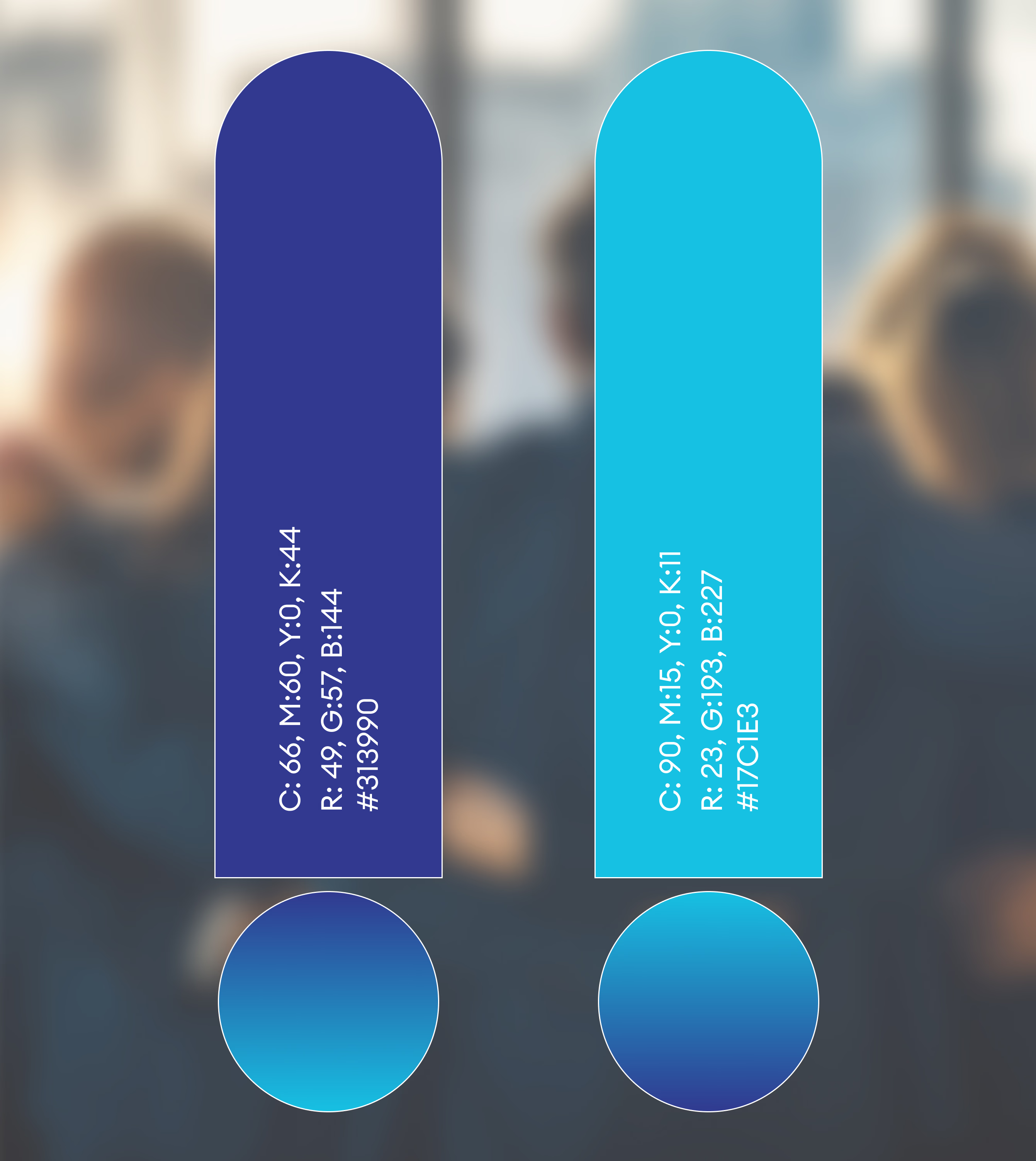
We built a bespoke visual identity system anchored on a highly structured grid and a high-contrast color palette of obsidian black, white, and a functional cobalt blue. By pairing a clean geometric emblem with high-contrast, multi-column typography layout rules, we created an authoritative framework for digital and physical touchpoints. This system guarantees that every presentation, report, and digital interface communicates precision and premium value.
The Impact
The newly implemented visual identity system has transformed how the firm presents its high-level technical advisory services to enterprise clients. The unified presentation templates and premium physical touchpoints have noticeably accelerated corporate client conversion rates. Moving forward, the highly scalable brand guidelines ensure complete visual alignment across all regional executive teams.








Every brand touchpoint engineered to establish immediate executive trust
Visual Identity
Typography System
Color System
Brand Guidelines
Stationery Design
Brand Strategy