The DC Spot logo smartly integrates iconic Washington, D.C. landmarks — the Capitol dome, Washington Monument, and a stylized building silhouette — forming a cohesive visual of the city’s essence. The red and blue palette nods to the American identity, while the clean, minimal lines reflect modernity and trust. The playful airplane icon above symbolizes travel, discovery, and tourism. It encapsulates the brand’s role as a local navigator for residents and tourists alike.
Flyer Design
Graphic Design
Industry
Arts, Culture & Entertainment
Tools we used


Project Completion
2025
Key Market
Global
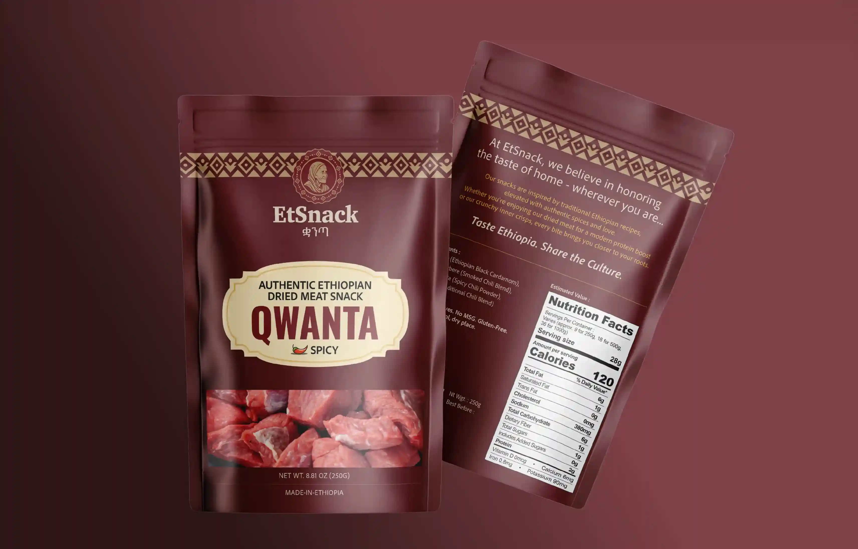
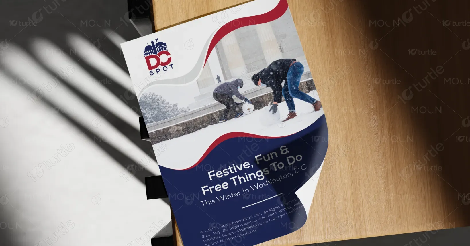
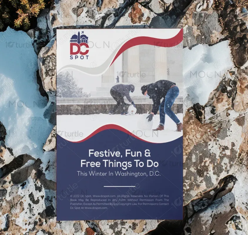
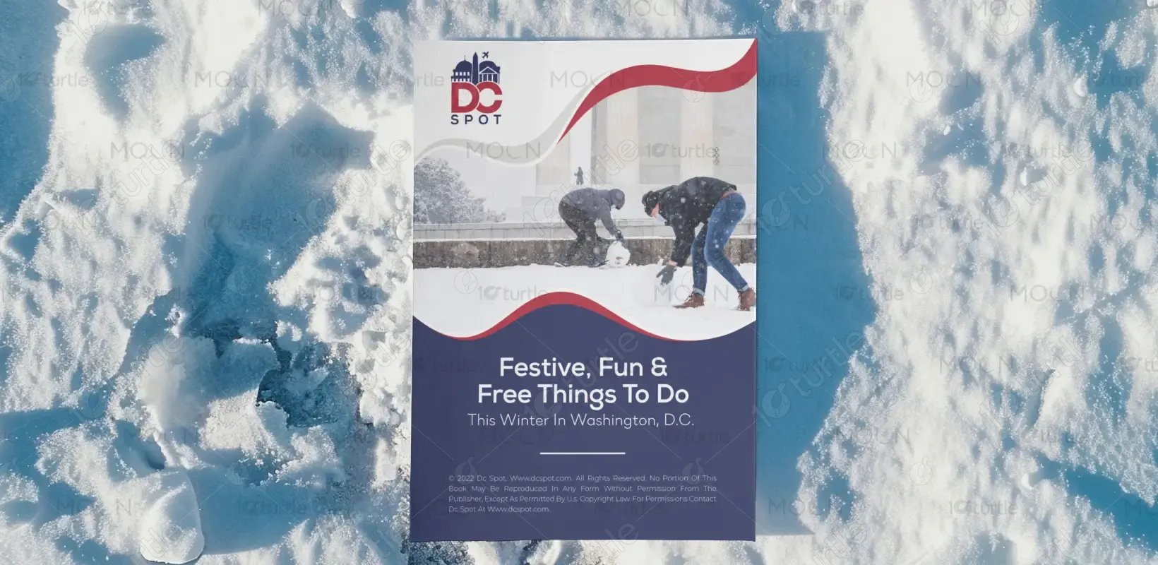
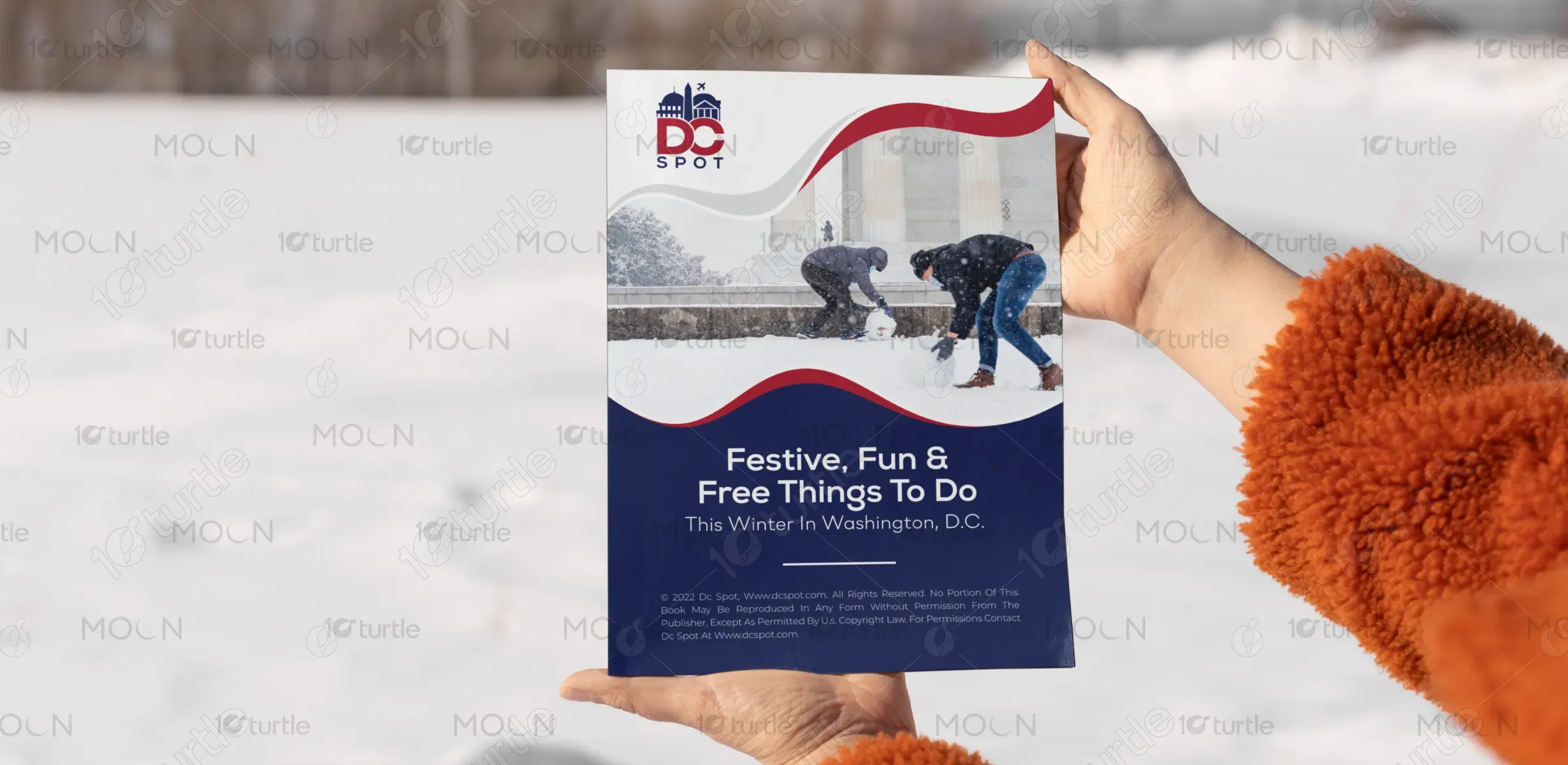
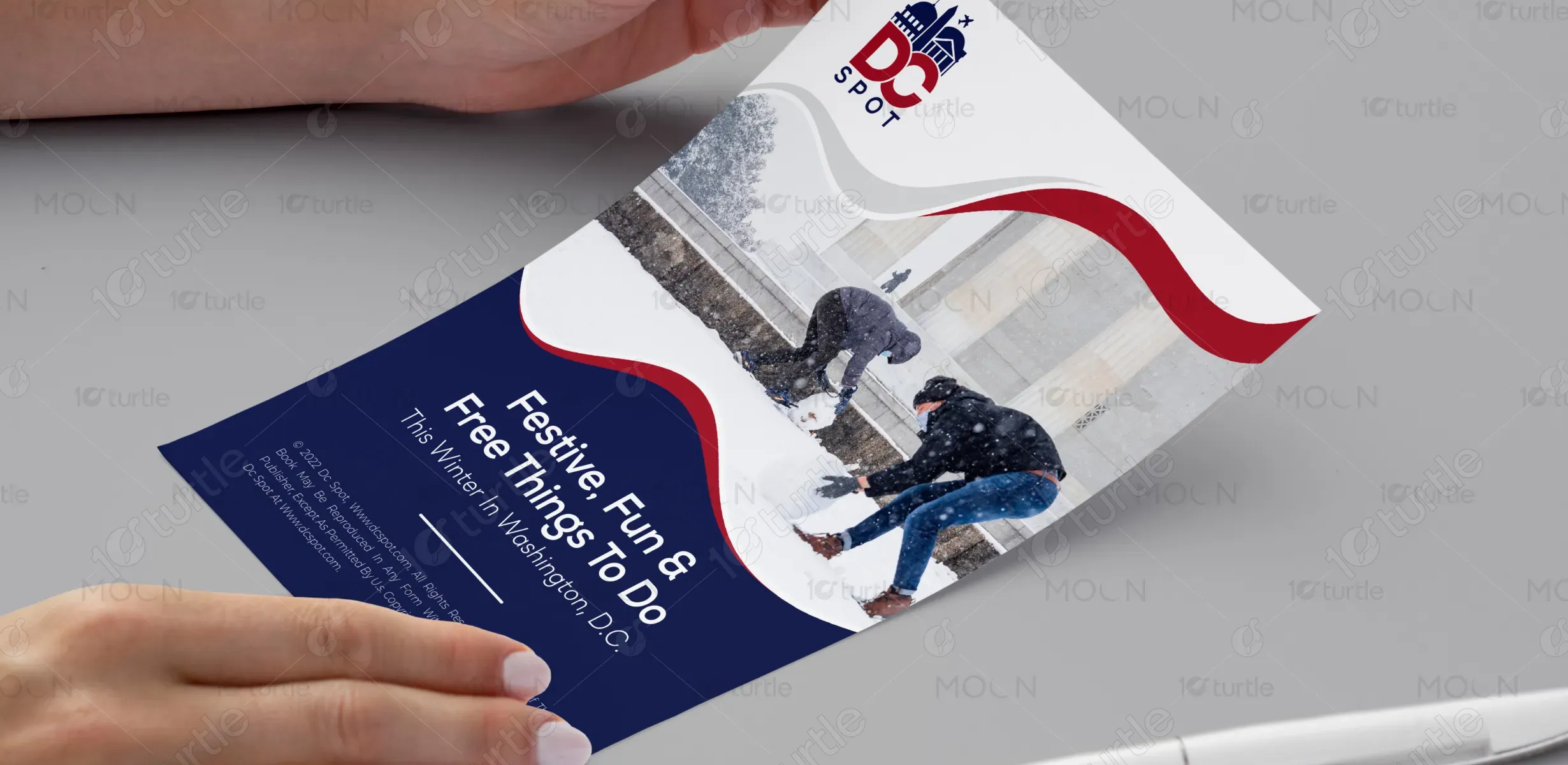
This flyer promotes DC Spot’s seasonal guide highlighting free and festive activities around Washington, D.C. Aimed at both locals and visitors, it serves as a curated resource for experiencing winter in the city affordably. Its unique selling point lies in blending editorial-quality recommendations with a hyperlocal focus. With an inviting aesthetic and user-friendly messaging, the flyer encourages exploration while reinforcing DC Spot’s identity as a go-to platform for discovering D.C.’s hidden and headline gems — all without spending a dime.

Industry
Arts, Culture & EntertainmentWhat we did
Flyer DesignGraphic DesignPlatform
-Many tourism marketing materials focus heavily on paid experiences, often excluding or underrepresenting free events — especially during off-peak seasons like winter. This creates a barrier for budget-conscious travelers and locals seeking entertainment without high costs. Additionally, many seasonal flyers fail to capture warmth and inclusivity in their visuals, leaning too corporate or generic, which limits user engagement and emotional connection.
The DC Spot flyer bridges that gap by emphasizing free, festive activities while using authentic, emotionally resonant imagery of people enjoying winter in D.C. The clear, warm typography paired with the inviting color flow sets a friendly tone. It’s inclusive, cost-conscious, and visually relevant — speaking directly to the needs of everyday users who want enriching, low-cost city experiences. The blend of editorial design and community-first messaging makes it more relatable than traditional tourist brochures.
DC Spot aims to become the premier local discovery platform in Washington, D.C., spotlighting the city's pulse through free events, hidden attractions, and cultural highlights. Long-term, it envisions expanding into a digital-first hub, with seasonal print and digital guides, interactive maps, and community storytelling. The brand’s focus on accessibility, authenticity, and connection seeks to redefine how cities promote tourism — not just through landmarks, but through lived, local experiences.

The chosen gradient of blue to purple reflects a modern, futuristic, and digital-first identity. Blue symbolizes trust, professionalism, and stability, while purple represents creativity, innovation, and ambition. The combination creates a visually appealing contrast that is both engaging and memorable. This color palette aligns well with tech-driven industries, creative agencies, and forward-thinking brands that aim to inspire confidence and innovation.