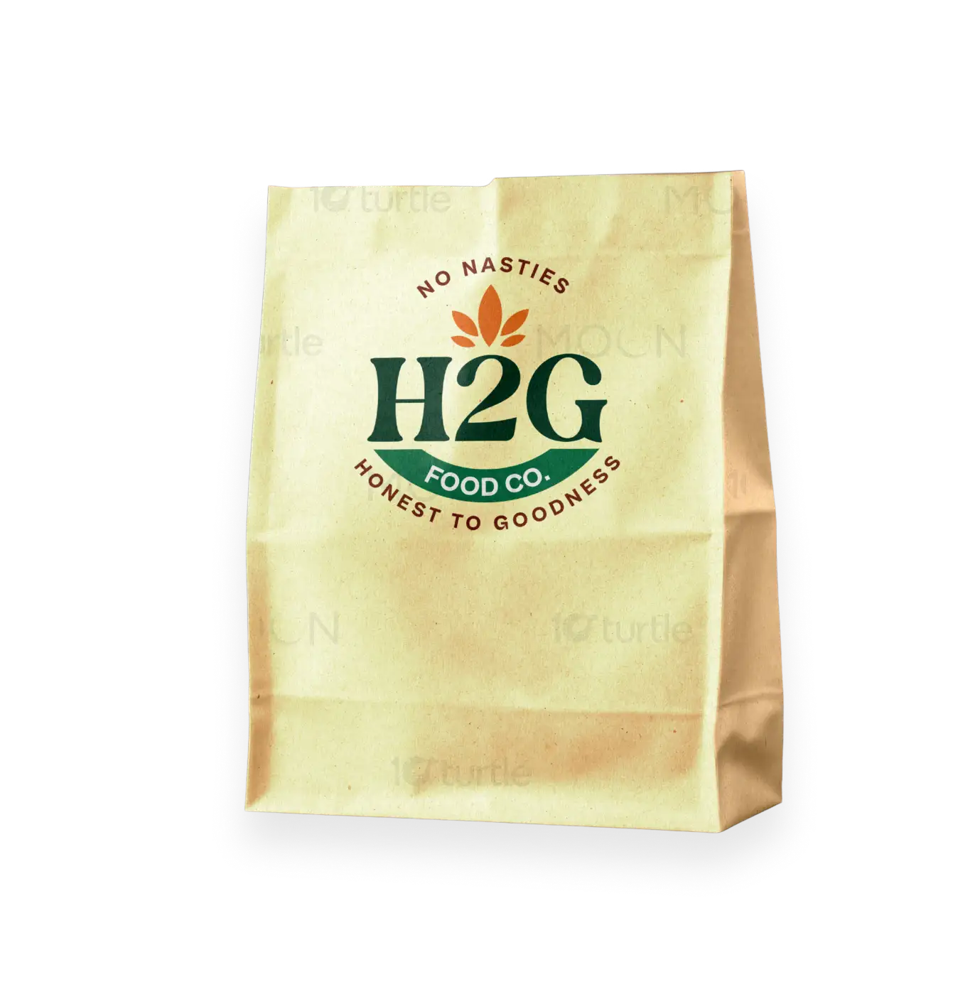
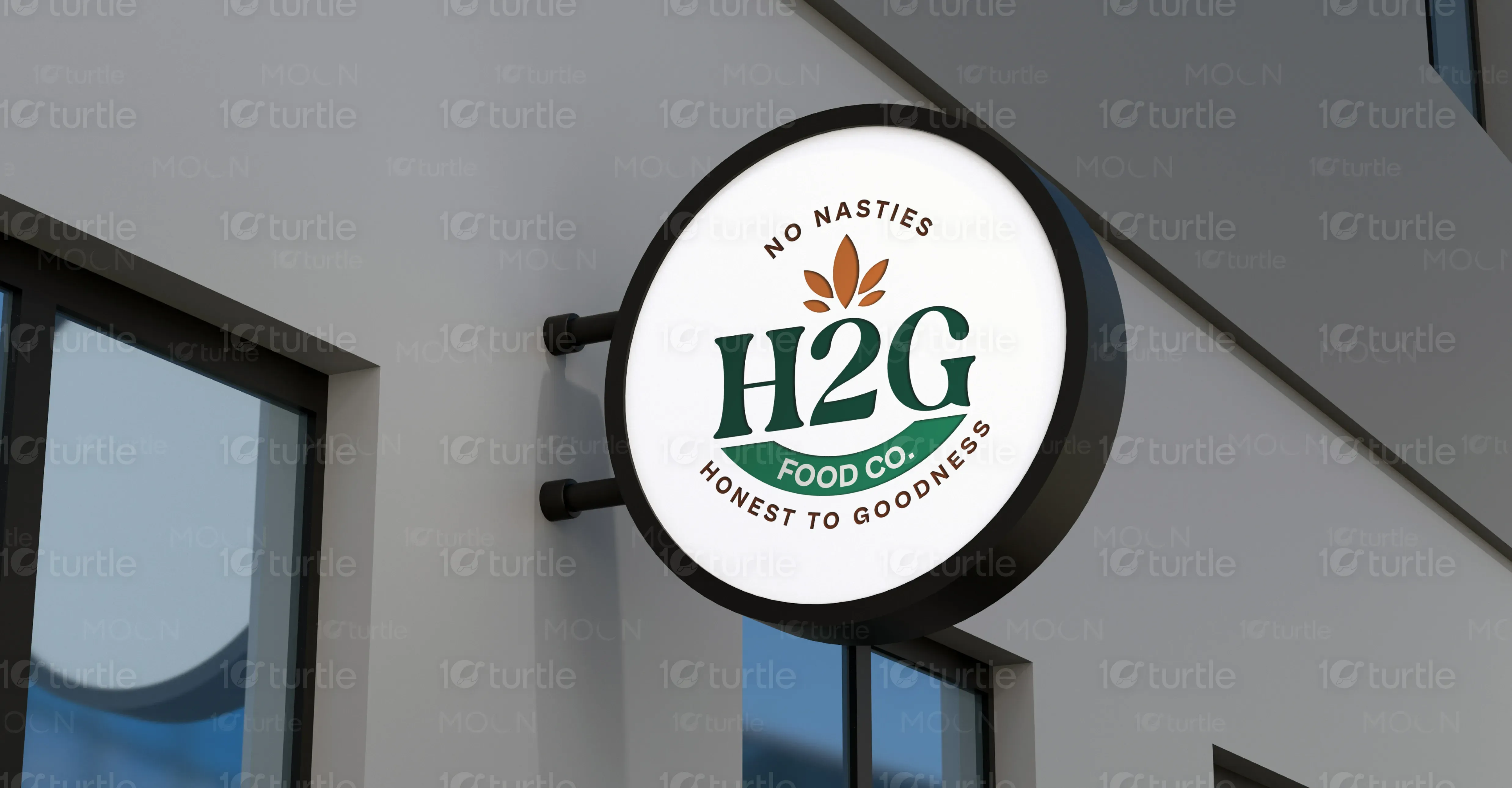
The H2G logo design combines natural elements with bold typography to represent purity and transparency. The rustic green and earthy brown palette reinforces its organic roots, while the clean circular layout ensures versatility across signage and packaging. The inclusion of a sprouting seed icon symbolizes freshness and growth. The balanced serif font reflects both trust and tradition, making it ideal for a health-forward food brand. The tagline “No Nasties” and “Honest to Goodness” reinforces its ethical commitment and appeal to conscious consumers.
Logo Design
Graphic Design
Industry
Food, Beverage & Hospitality
Tools we used


Project Completion
2025
Key Market
Global
H2G FOOD CO. is a clean-label food brand focused on delivering natural, additive-free products to health-conscious consumers. Built on the ethos of transparency and purity, the brand eliminates harmful ingredients (“No Nasties”) and promotes wholesomeness in every bite. With a strong visual identity that aligns with organic and sustainable values, H2G caters to a growing demand for ethical, nutritious, and trustworthy food products. Its functional yet stylish branding helps it stand out in a crowded market full of generic health foods.
Industry
Food, Beverage & HospitalityWhat we did
Logo DesignGraphic DesignPlatform
-The current health food market is saturated with brands that claim to be “natural” but often include hidden preservatives, artificial flavors, or vague labeling. This undermines consumer trust and creates confusion. Additionally, many health brands lack a memorable visual identity, making them blend into store shelves. Shoppers seeking truly honest, clean products often struggle to differentiate trustworthy options from marketing gimmicks.
H2G FOOD CO. addresses this gap by creating a transparent, visually appealing identity that clearly communicates its values—“No Nasties” and “Honest to Goodness.” The clean, bold logo with natural iconography instantly signals trust, while the earthy color palette reinforces its organic roots. By combining ethical commitment with professional branding, H2G stands as a beacon of authenticity in the health food sector, helping consumers make informed, confident choices without second-guessing ingredient labels.

H2G aims to become a household name synonymous with trust and integrity in the clean food space. The long-term vision includes expanding into diverse product lines while maintaining its core promise of transparency and quality. H2G envisions reshaping food shopping habits by setting new standards for clarity in labeling, sustainable practices, and honest marketing—ultimately becoming a movement, not just a brand.
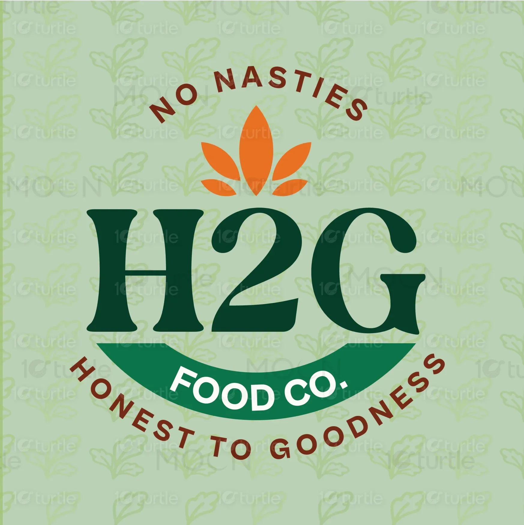
The H2G Food Co. logo embodies a fresh and wholesome approach to food with its vibrant, nature-inspired design. The deep green "H2G" symbolizes the brand's commitment to quality, while the bright orange leaf above reflects its focus on natural ingredients and purity. The tagline "No Nasties" reinforces the brand’s dedication to offering clean, honest, and healthy food. The playful yet professional typeface adds a modern touch, aligning with the company’s mission of providing food that is both delicious and good for you.
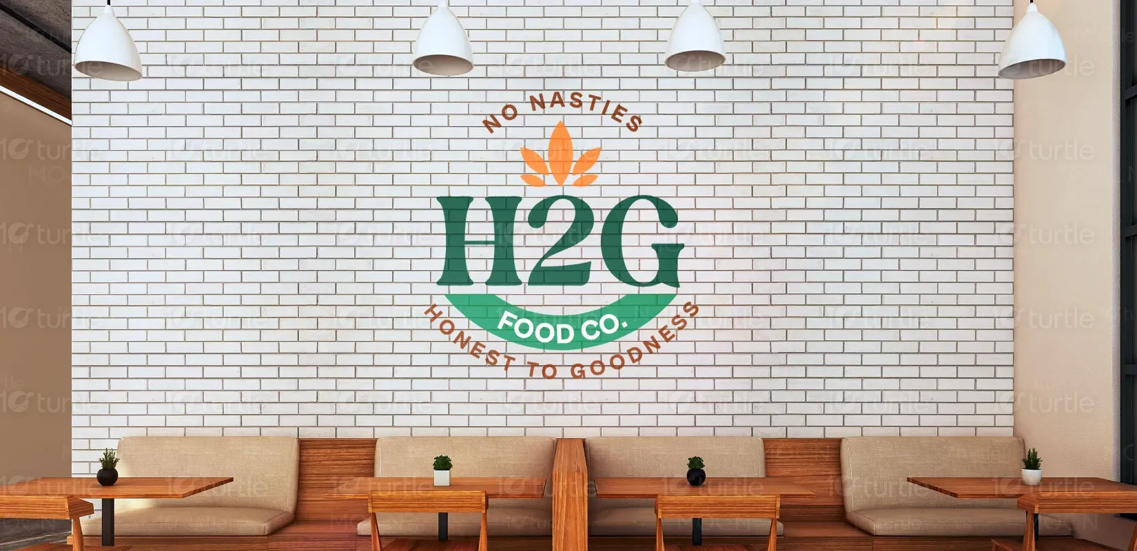

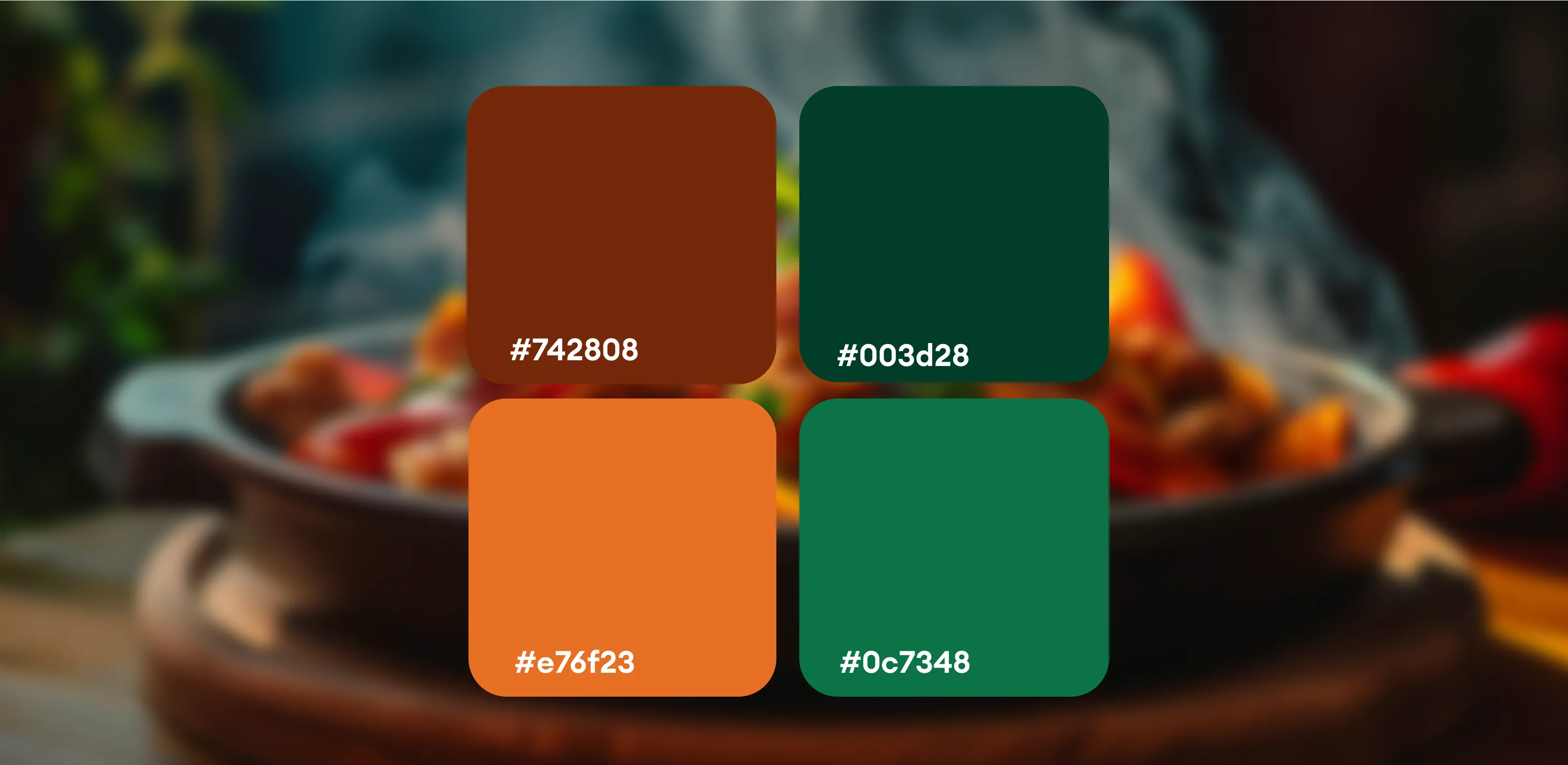
Forest Green (#2F5D3F): Represents health, freshness, and sustainability—evoking trust in natural origins. Earth Brown (#914D29): Suggests groundedness, warmth, and the earth-to-plate philosophy. White Background: Offers purity, simplicity, and cleanliness—echoing the brand's “No Nasties” stance. These colors not only reflect the brand’s mission but also resonate with eco-conscious consumers, enhancing shelf visibility and emotional connection.
