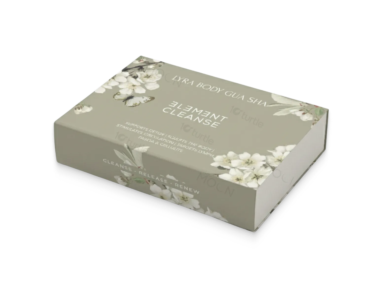
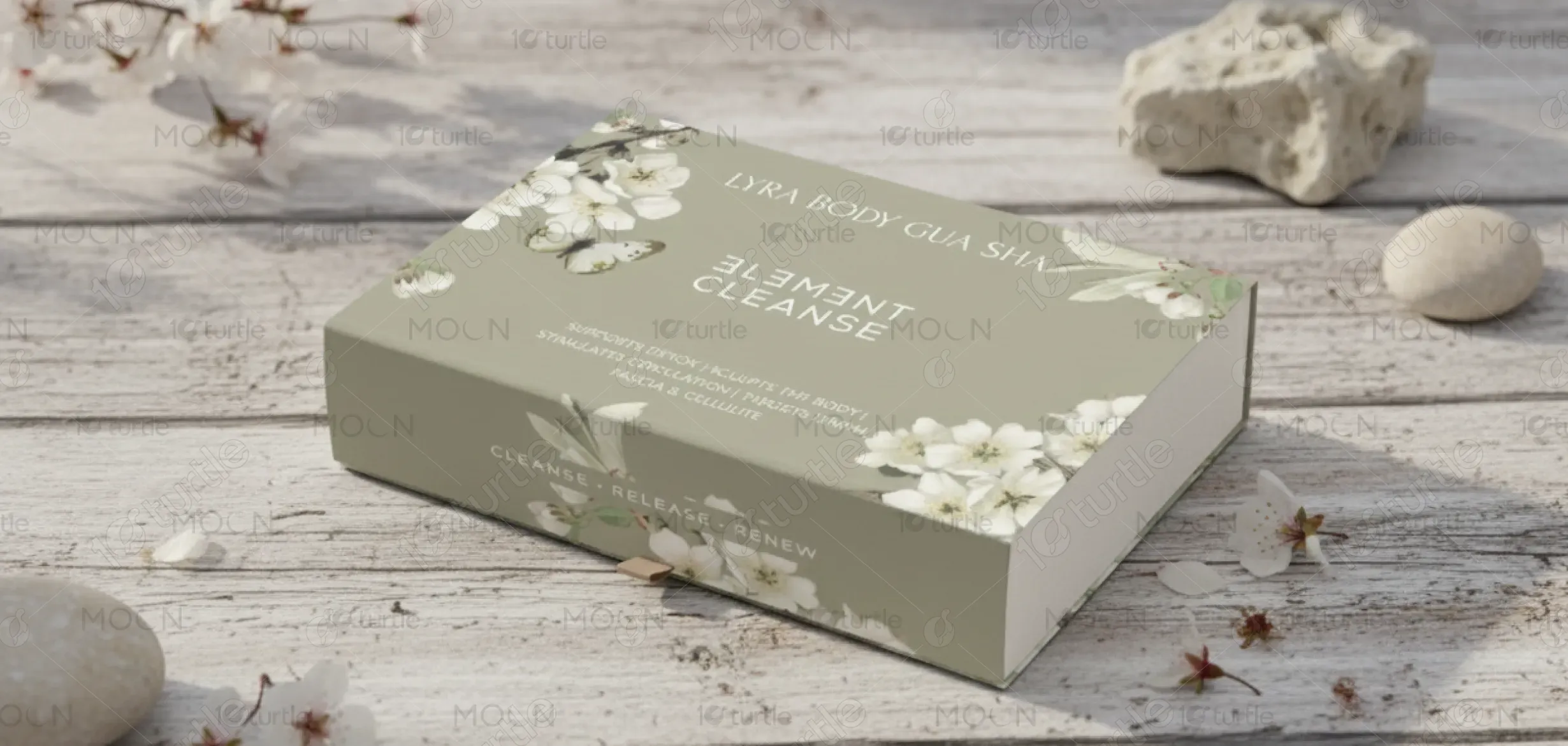
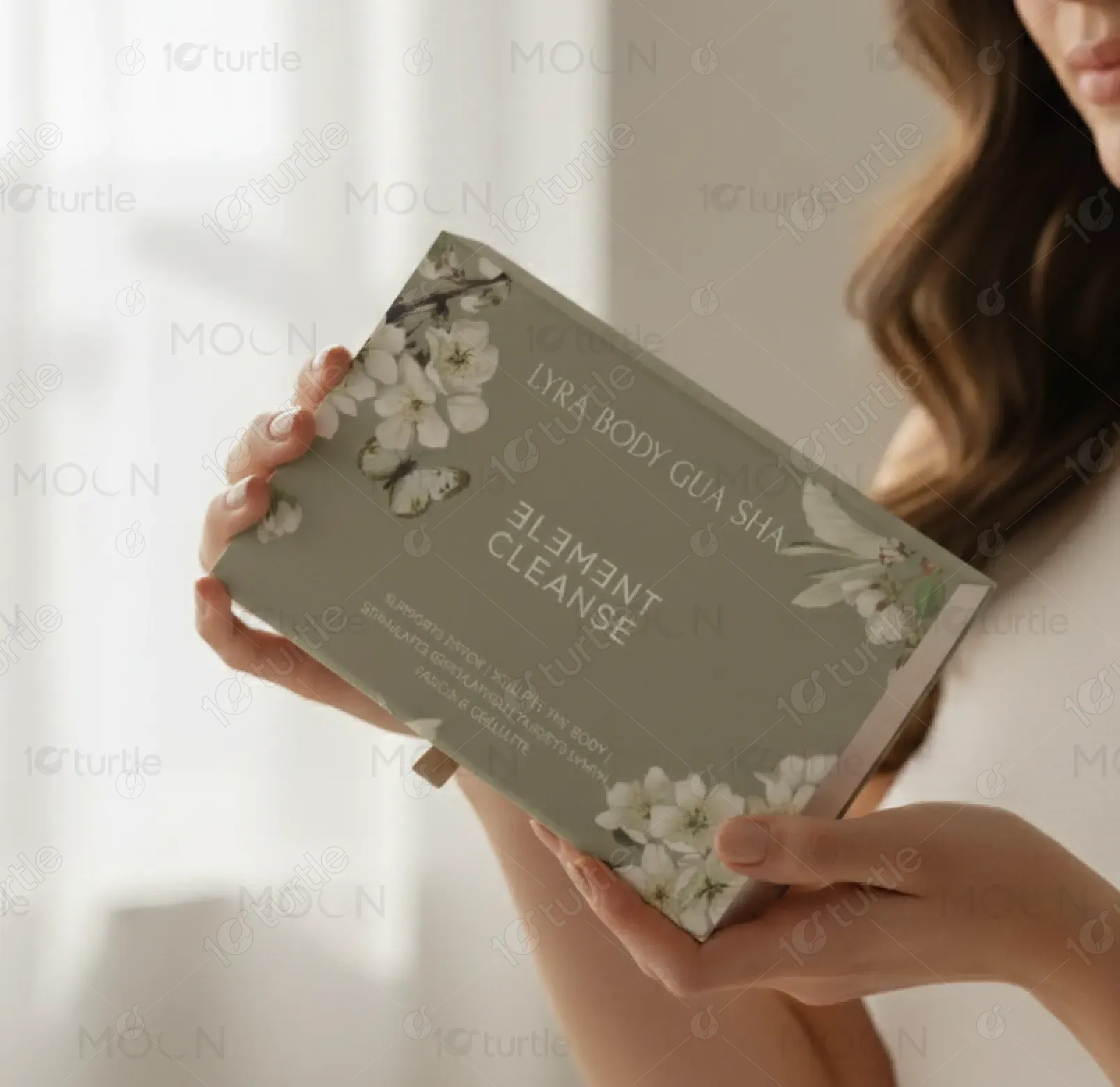
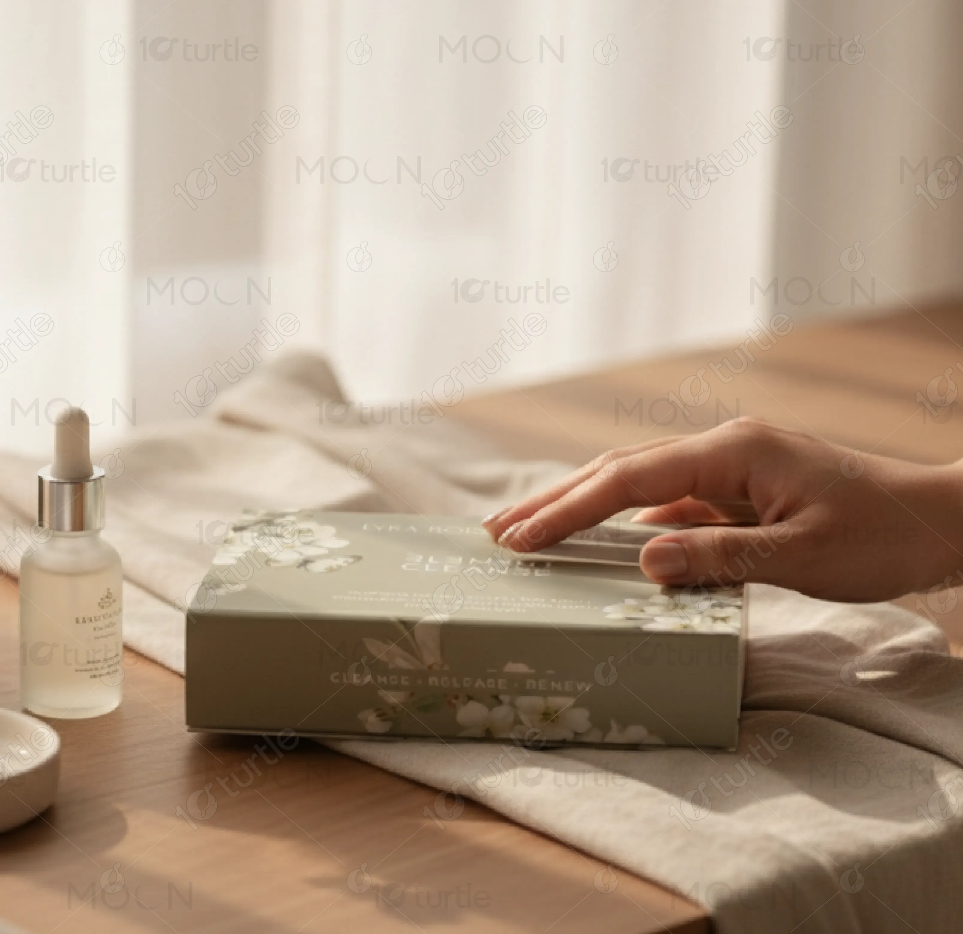
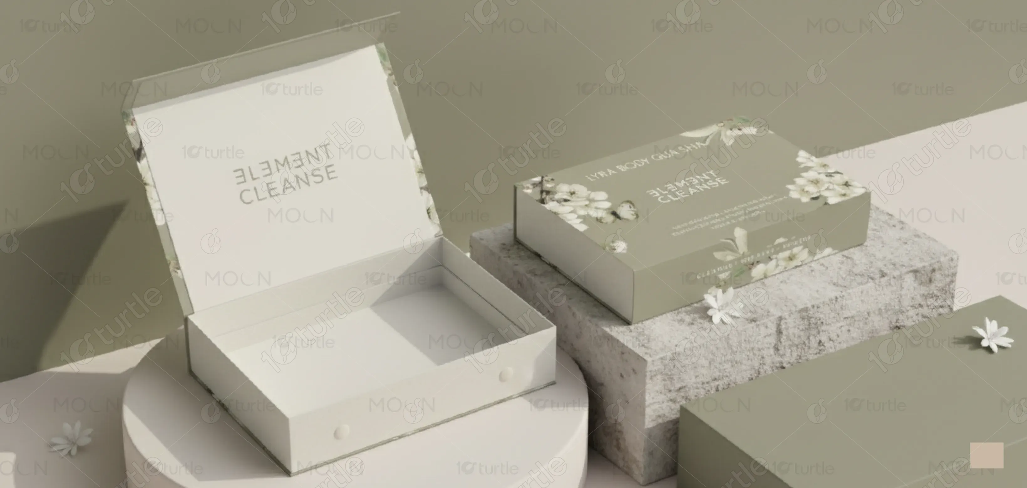
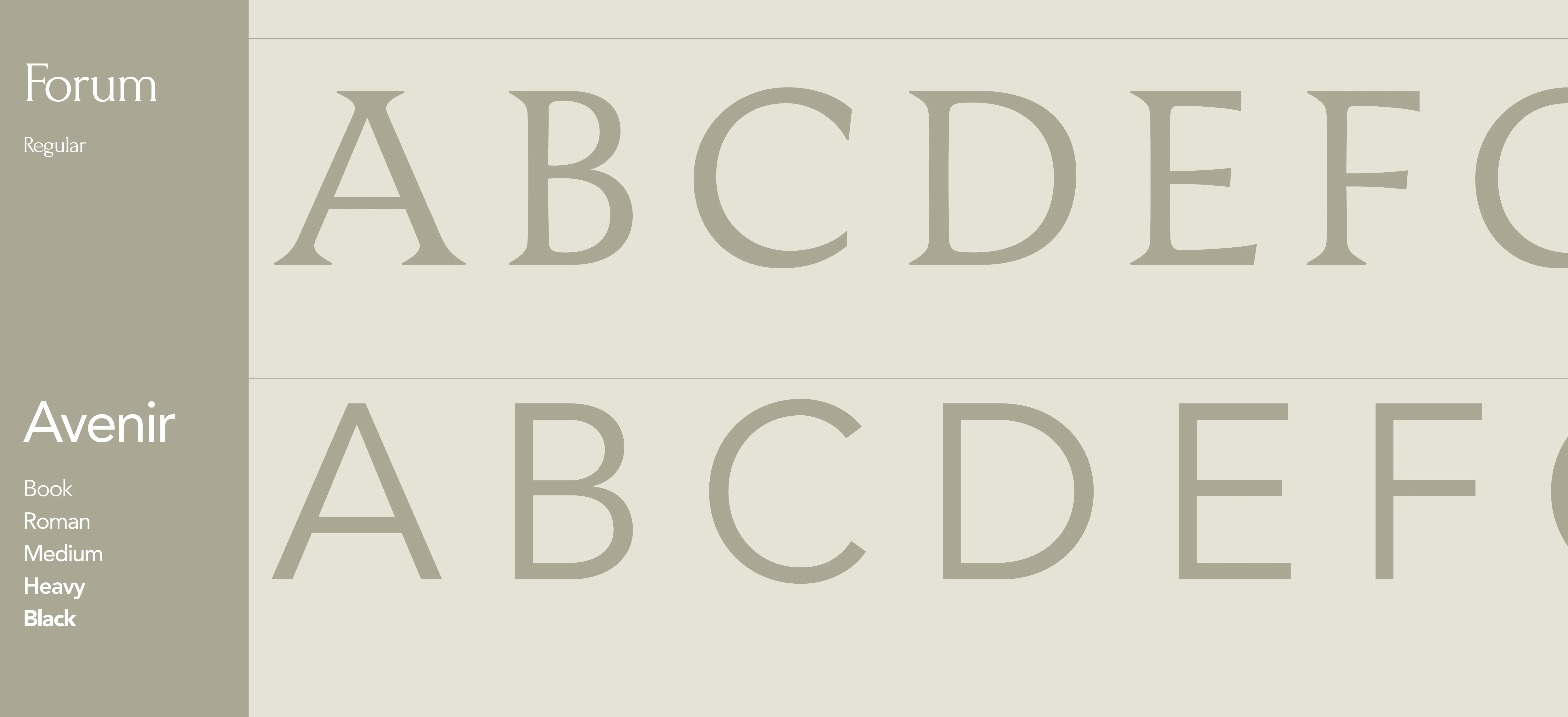
The design captures a calm, nature-inspired elegance rooted in holistic wellness. Soft sage tones blend with delicate white florals and butterfly motifs, evoking purity and rebirth. Minimal typography in white provides a modern yet serene balance, emphasizing sophistication and clarity. The overall aesthetic bridges organic luxury and therapeutic beauty, symbolizing the harmony between body and nature. Every element—from layout to imagery—reflects rejuvenation and mindfulness, creating an immersive unboxing experience that aligns with LYRA’s restorative brand ethos.
Packaging Design
Graphic Design
Industry
Healthcare & Wellness
Tools we used


Project Completion
2025
Key Market
Global
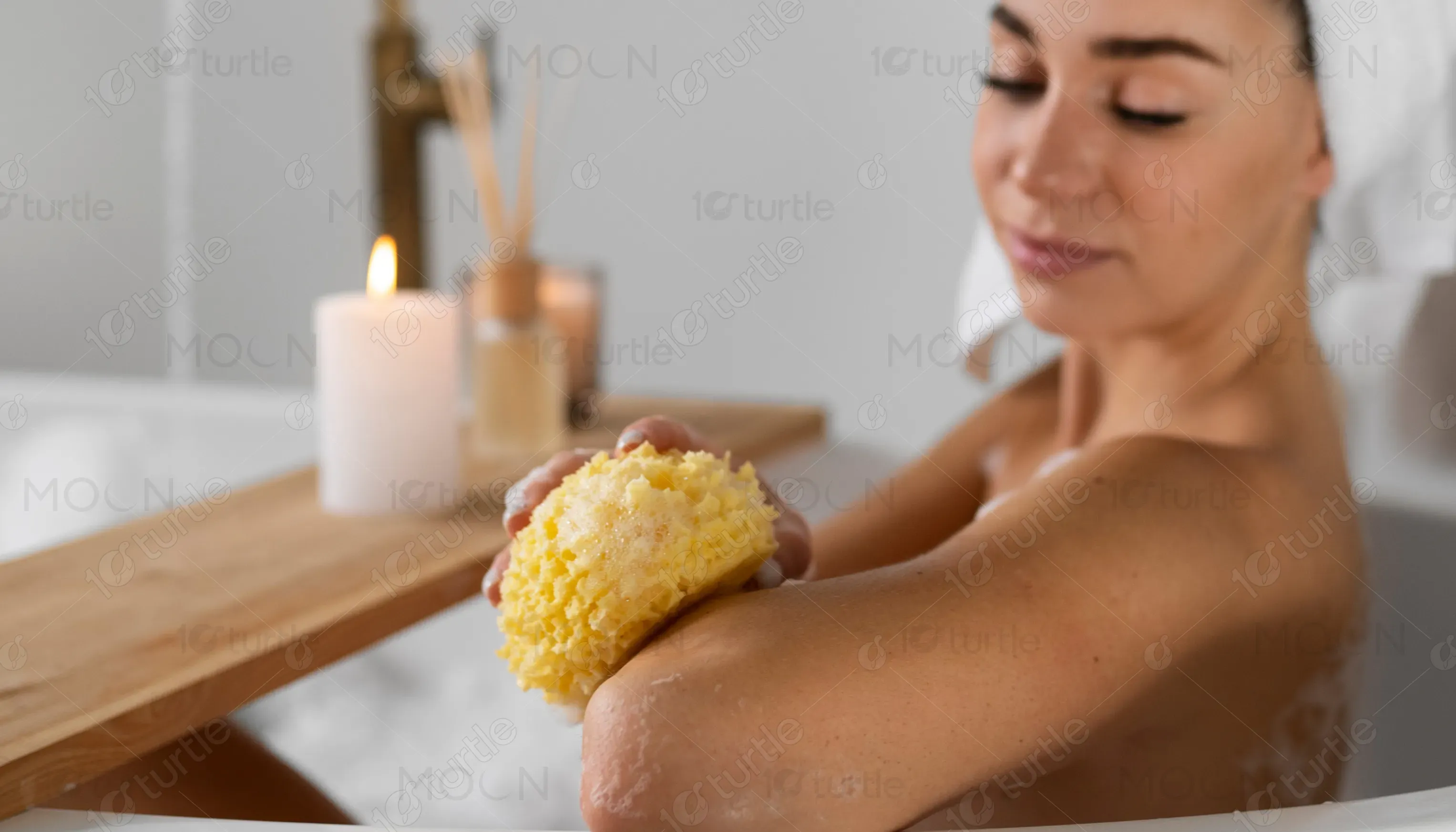
The LYRA Body Gua Sha “Element Cleanse” set is a premium wellness product designed to support detoxification, stimulate circulation, and sculpt the body naturally. It targets lymphatic flow, fascia, and cellulite, blending ancient healing traditions with modern self-care rituals. Positioned in the holistic skincare market, its packaging mirrors the brand’s philosophy—refined, calm, and nature-connected. The elegant floral design and soft hues convey purity and rejuvenation, making it a perfect fit for conscious consumers seeking luxury with purpose.
Industry
Healthcare & WellnessWhat we did
Packaging DesignGraphic DesignPlatform
-Many wellness and skincare products in today’s market rely on overly clinical or overly decorative packaging—often disconnecting from the emotional, natural essence of self-care. This gap leaves mindful consumers craving authenticity and balance in both product and presentation. The challenge was to create a design that embodies tranquility without appearing sterile, and luxury without losing touch with nature. LYRA needed packaging that instantly communicates rejuvenation, purity, and inner harmony—visually expressing its holistic philosophy.
The design integrates botanical illustrations and soft, muted tones to create a soothing yet luxurious aesthetic. Minimal typography ensures elegance while emphasizing the brand’s modern sensibility. The nature-inspired visuals form an emotional connection, inviting users to embrace the detox ritual as a sensory experience. The box’s layout and subtle texture enhance the feeling of calm sophistication, helping LYRA stand apart in a cluttered market with a design that speaks directly to wellness-focused, design-conscious individuals.
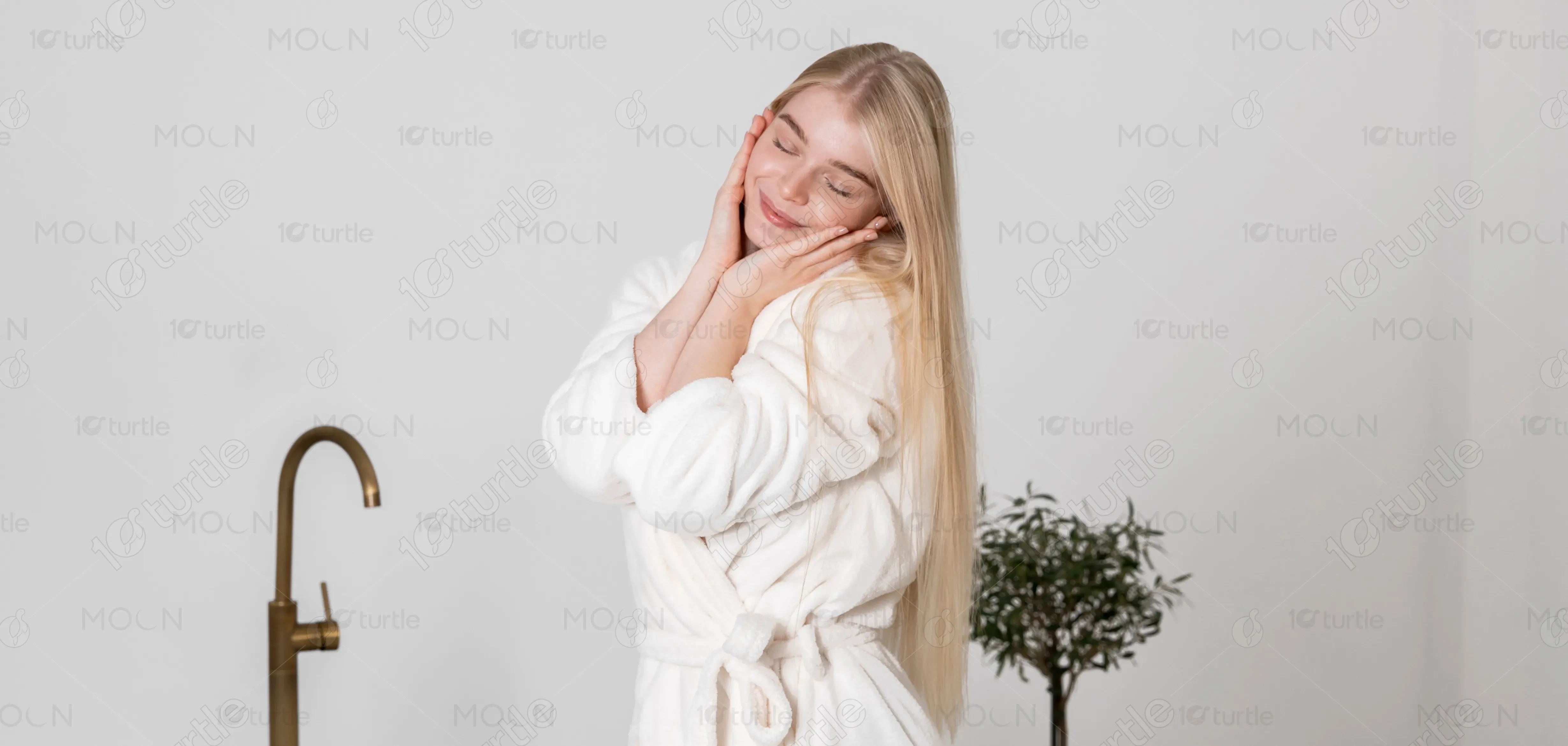
LYRA envisions becoming a trusted symbol of mindful beauty—where nature, design, and ritual coexist harmoniously. The brand aims to redefine wellness aesthetics, merging ancient practices with contemporary minimalism. Its long-term vision includes expanding into a holistic self-care ecosystem of thoughtfully designed products that promote balance, rejuvenation, and self-love. Every LYRA creation, including “Element Cleanse,” aspires to inspire conscious living, nurturing both body and soul through design that feels timeless and intentional.
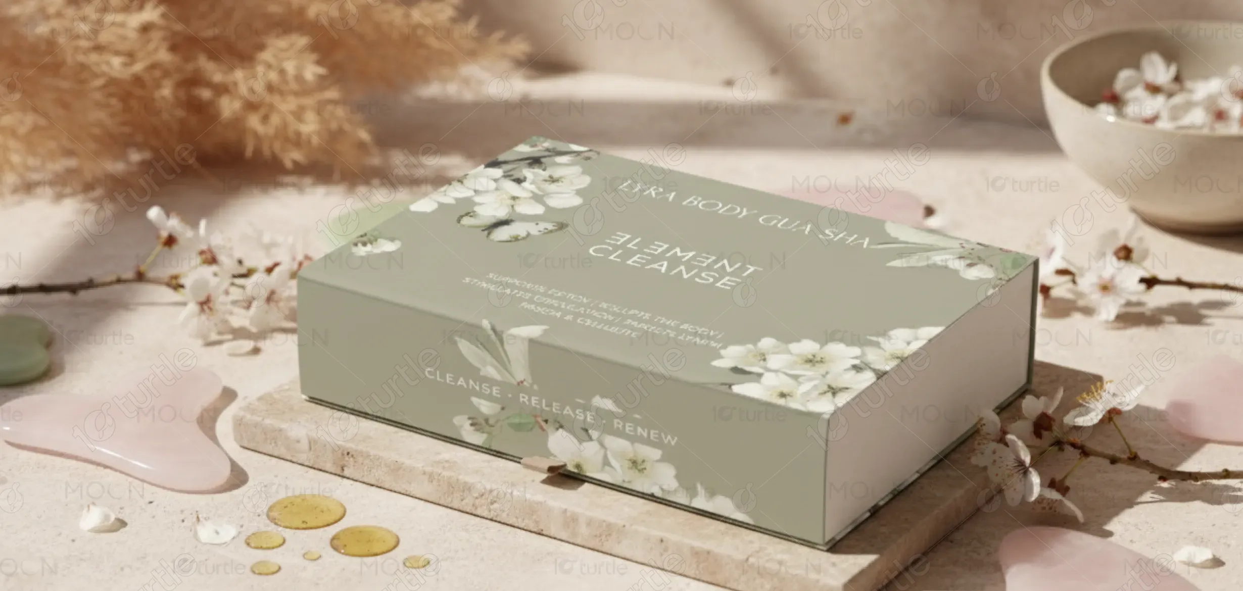
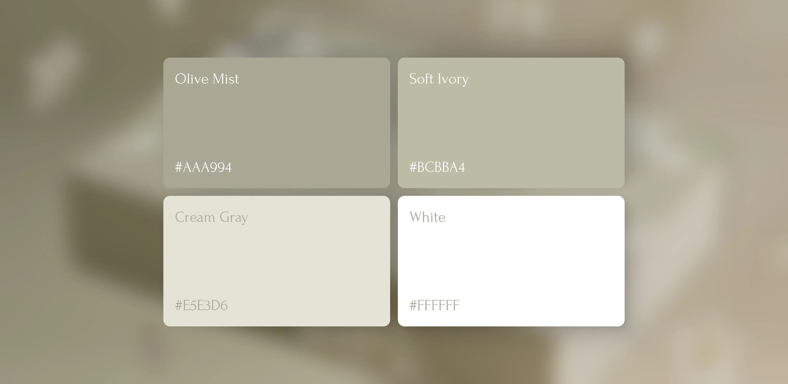
The palette revolves around muted sage green, soft ivory, and natural beige—tones associated with purity, balance, and tranquility. Sage represents grounding and renewal, while ivory evokes simplicity and elegance. These gentle hues harmonize beautifully with the white floral accents, reinforcing LYRA’s natural identity. The overall color scheme promotes serenity and sophistication, aligning with the brand’s message of cleansing and renewal. This palette not only soothes the senses but also builds an aura of quiet luxury and trust.