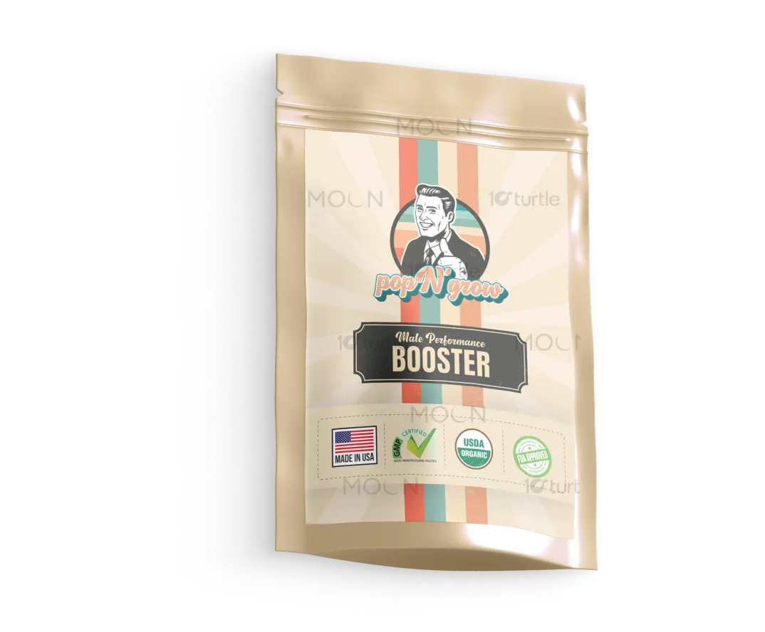
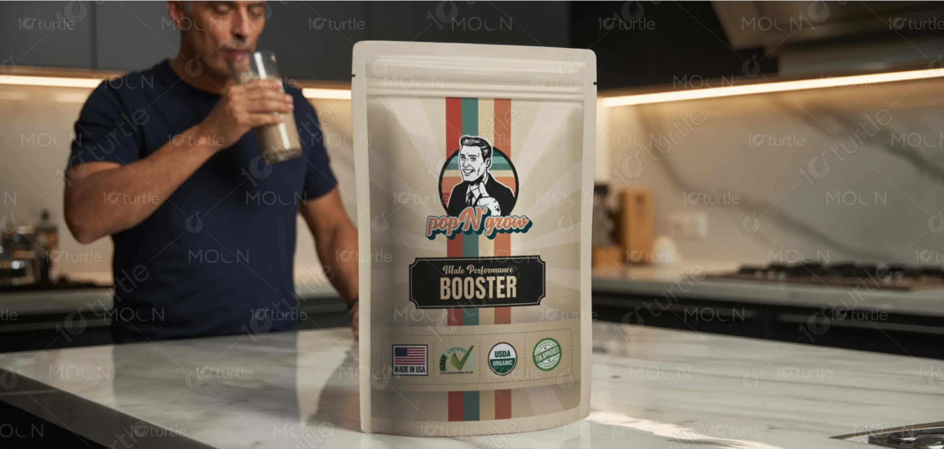
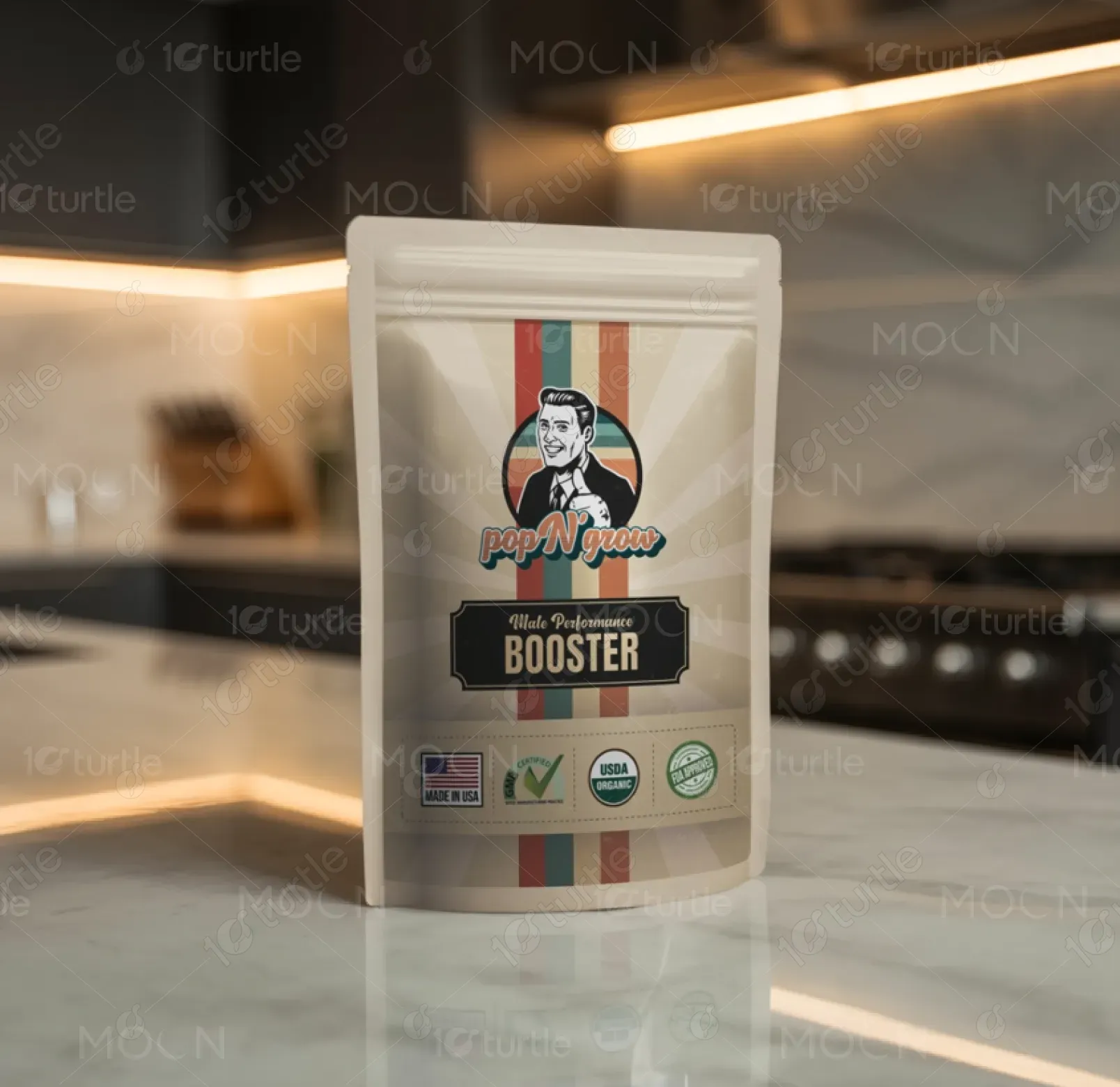
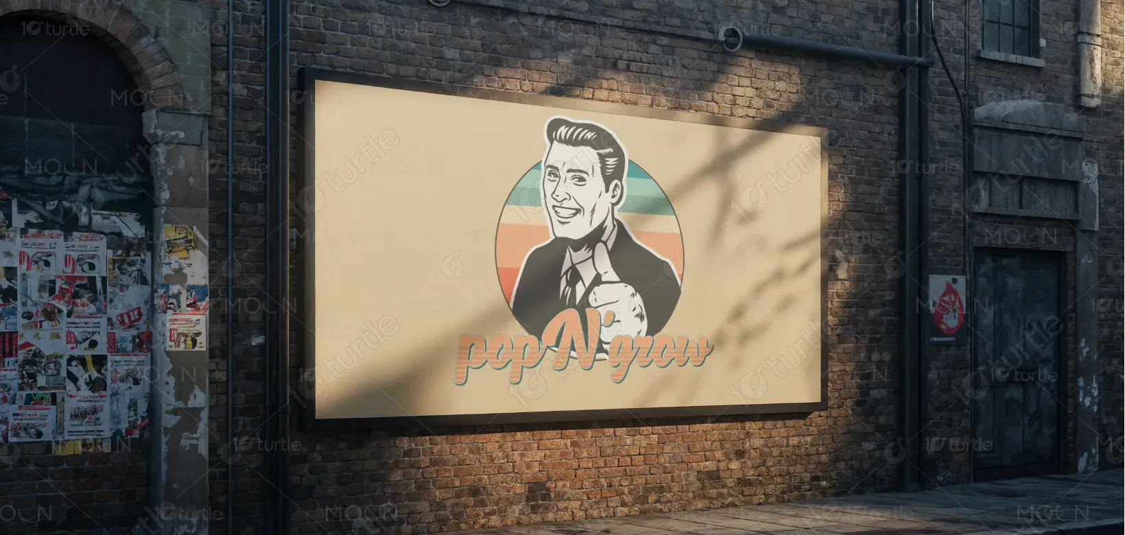
The design combines a vintage, retro aesthetic with a modern twist. Bold, vibrant colors like teal and orange are used to highlight the brand’s energetic and dynamic vibe. The central character, a confident man with a thumbs-up gesture, adds a playful touch. The typography is a balance of bold and elegant, evoking a sense of masculinity and strength. The clean layout, alongside visible certifications and product benefits, reflects trustworthiness and quality, capturing the product’s premium positioning.
Label Design
Graphic Design
Industry
Food, Beverage & Hospitality
Tools we used


Project Completion
2025
Key Market
Global
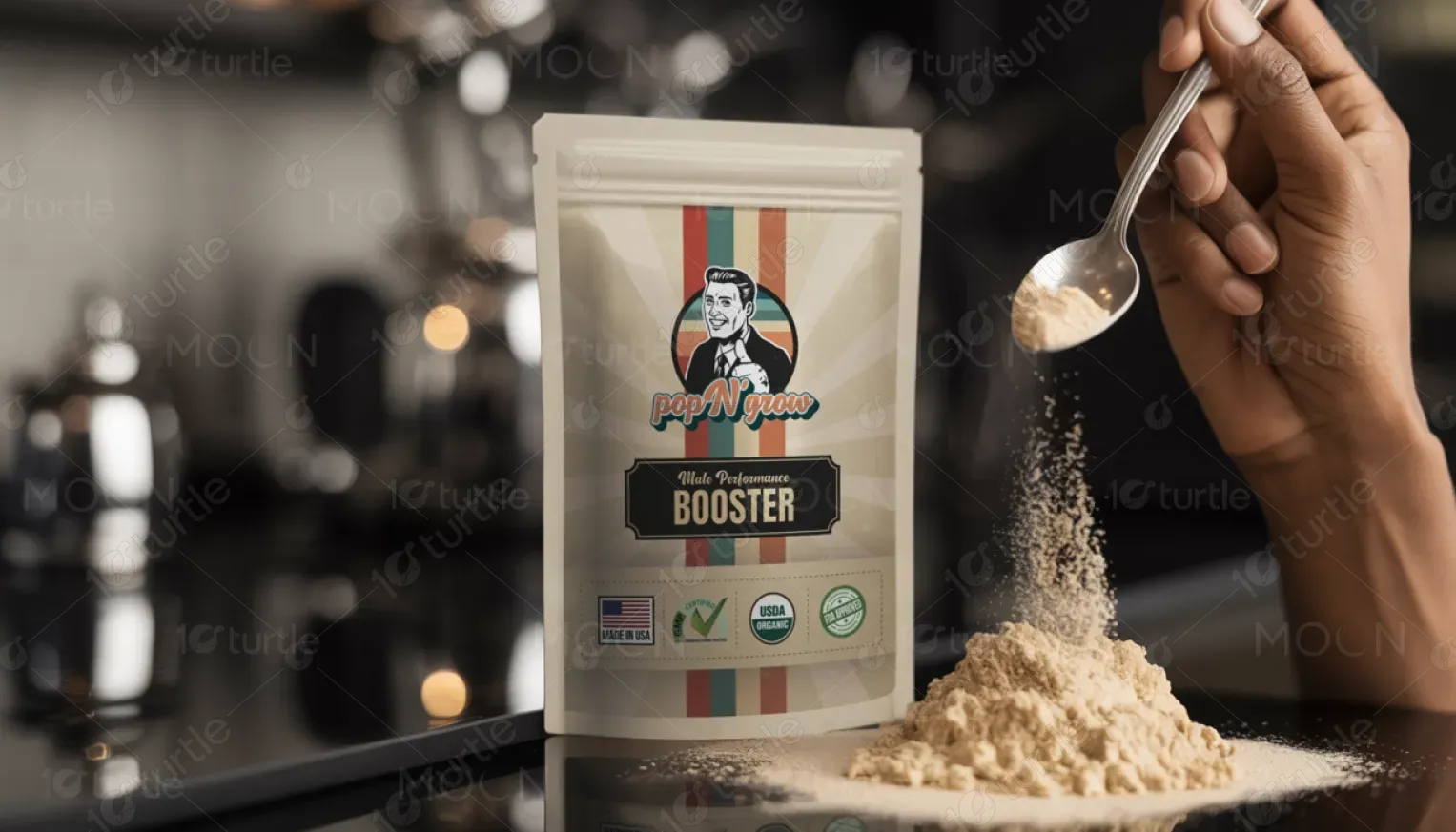
Pop N' Grow is a male performance booster designed to enhance strength and vitality. It combines natural ingredients like Ashwagandha, Ginseng, and Beet Root Extract to offer a fast-acting solution for boosting performance. The product stands out in the health and wellness market due to its organic certifications (USDA Organic, FDA-approved) and its effective, clean formula. The packaging uses a retro-inspired design to appeal to men who value both strength and authenticity.

Industry
Food, Beverage & HospitalityWhat we did
Label DesignGraphic DesignPlatform
-In a market flooded with performance boosters, many products offer vague promises and use synthetic, untrustworthy ingredients. This creates consumer skepticism, especially for those seeking natural and effective solutions. The lack of clear, trustworthy branding and certifications on many products makes it difficult for consumers to distinguish quality options from unreliable ones.
Pop N' Grow offers a solution by combining a powerful, natural ingredient blend with clear, visible certifications that enhance consumer trust. The clean, professional design emphasizes transparency, making it easy for potential users to recognize its premium quality. The retro-style design adds a layer of authenticity and appeal, giving the product a unique identity in the market that connects with health-conscious men.
Pop N' Grow aims to become the leading brand for men’s performance boosters, known for its commitment to natural ingredients and trusted certifications. The brand will expand its range of products while staying true to its promise of premium quality and effective performance enhancement. The goal is to foster long-term loyalty by establishing a reputation for reliability and excellence, positioning the brand as the go-to choice for health-conscious, performance-driven individuals.
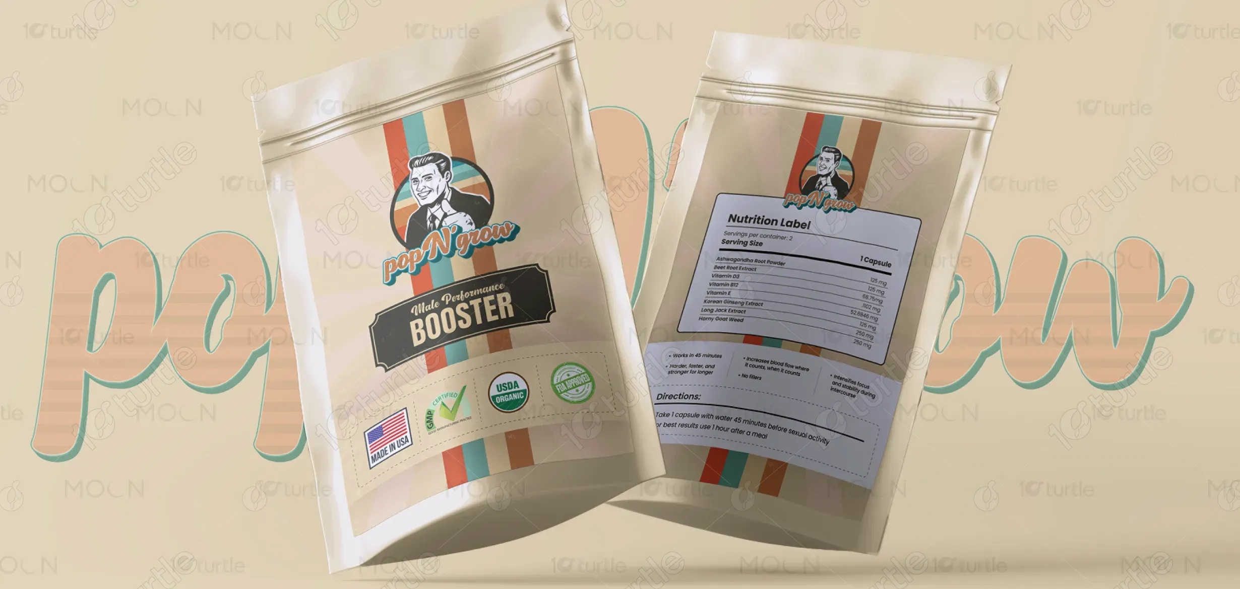
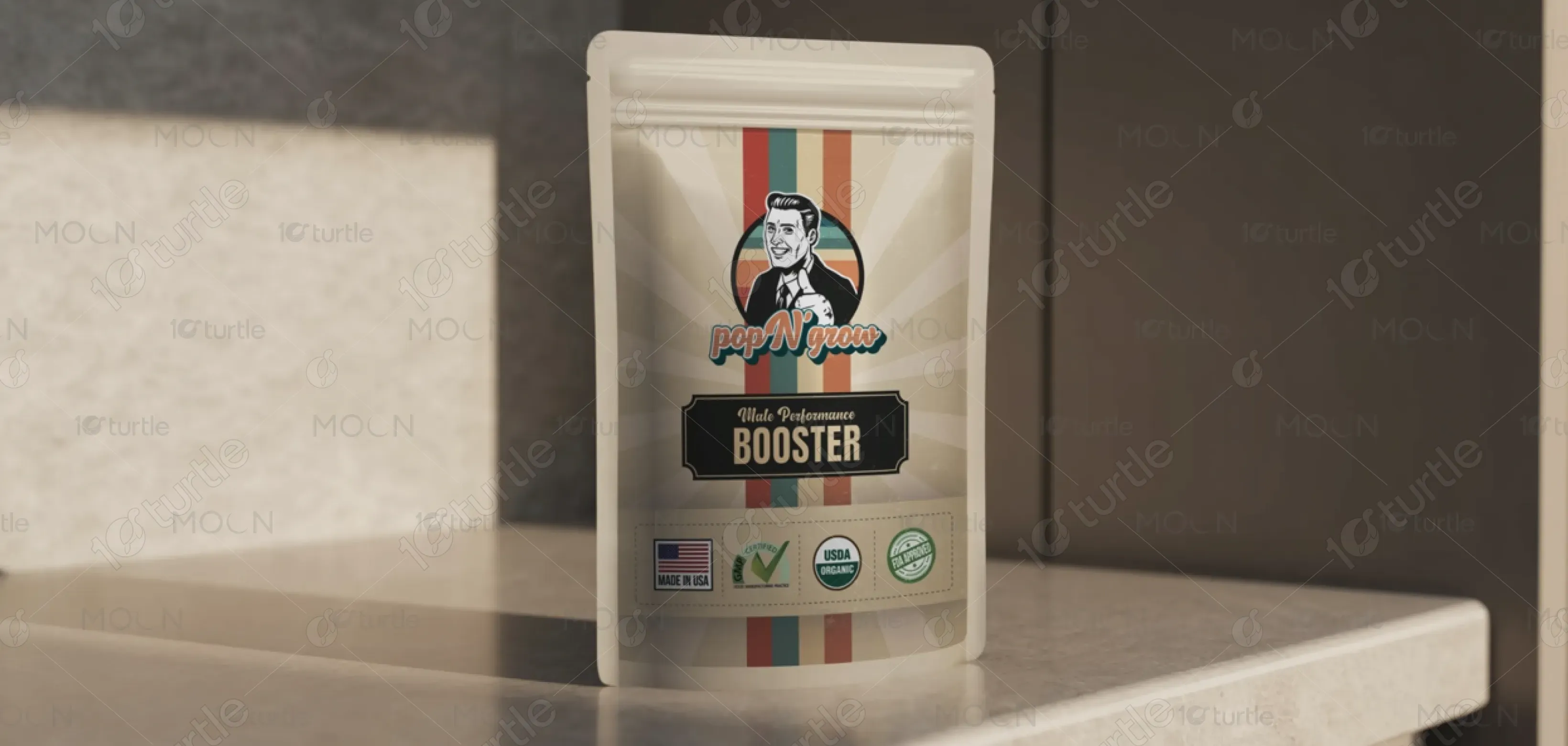
The color scheme of teal, orange, and beige is both energizing and grounding. Orange evokes energy and enthusiasm, while teal adds a sense of balance and calm. Beige provides a vintage, timeless feel, reflecting the product’s classic yet modern appeal. Together, these colors convey a sense of vitality, trustworthiness, and strength, reinforcing the brand's identity as a reliable and powerful solution for men’s performance enhancement.