
Overview
This education brochure collection brings together three child-focused print designs across bi-fold and tri-fold formats. The visuals cover activity programs, screen-time learning, and habit-building education for kids. Each brochure uses playful illustration, simple content blocks, friendly colors, and clear fold-based storytelling to guide parents, schools, and learning communities.
The Challenge

Education brands for children need to communicate value to both parents and young learners. Poor brochure design can feel too childish for parents, too text-heavy for kids, or too unclear for schools and caregivers. Learning programs, apps, and child development resources must explain benefits quickly while still feeling warm, safe, and trustworthy. The challenge is to balance playful visual language with organized educational messaging.
The Solution
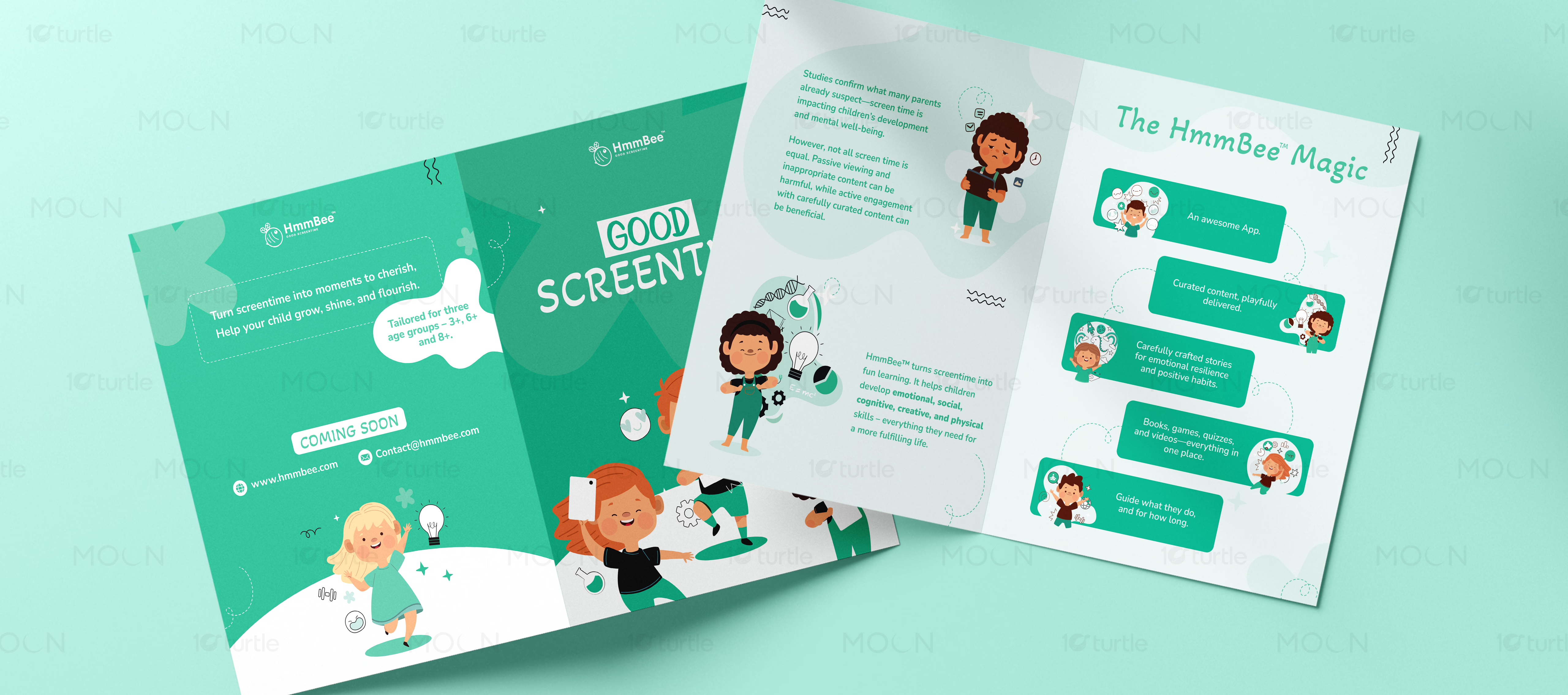
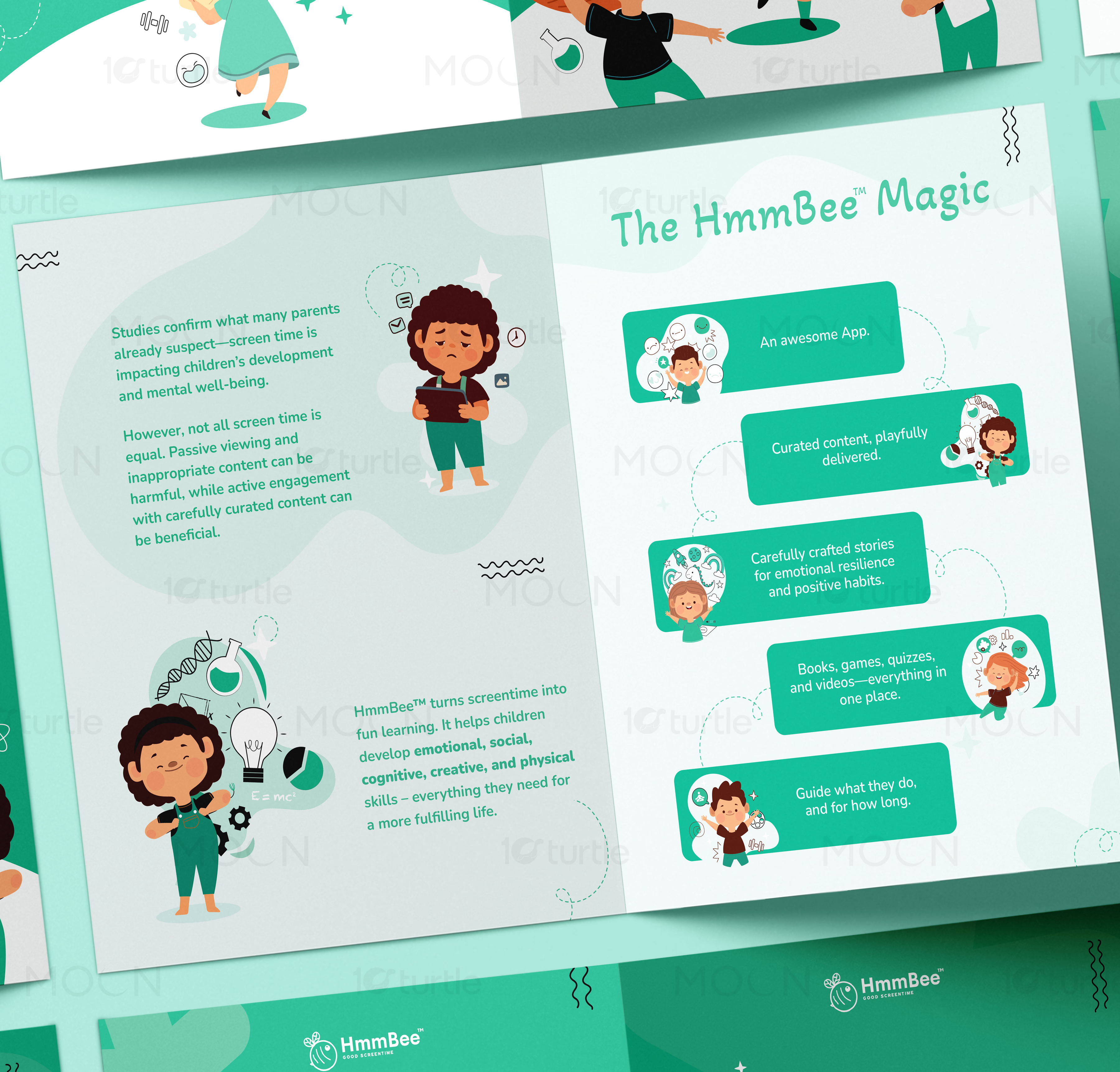
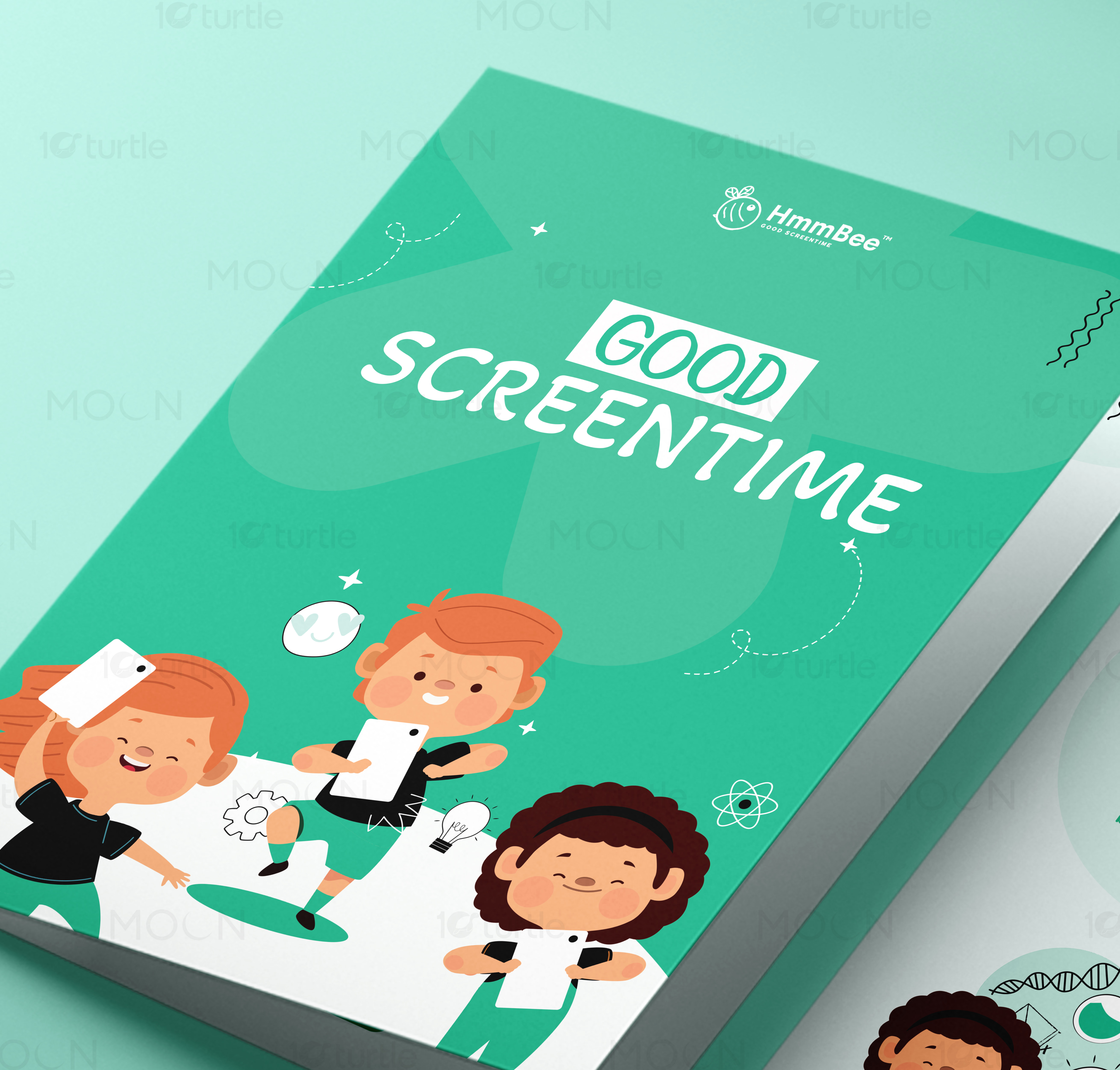
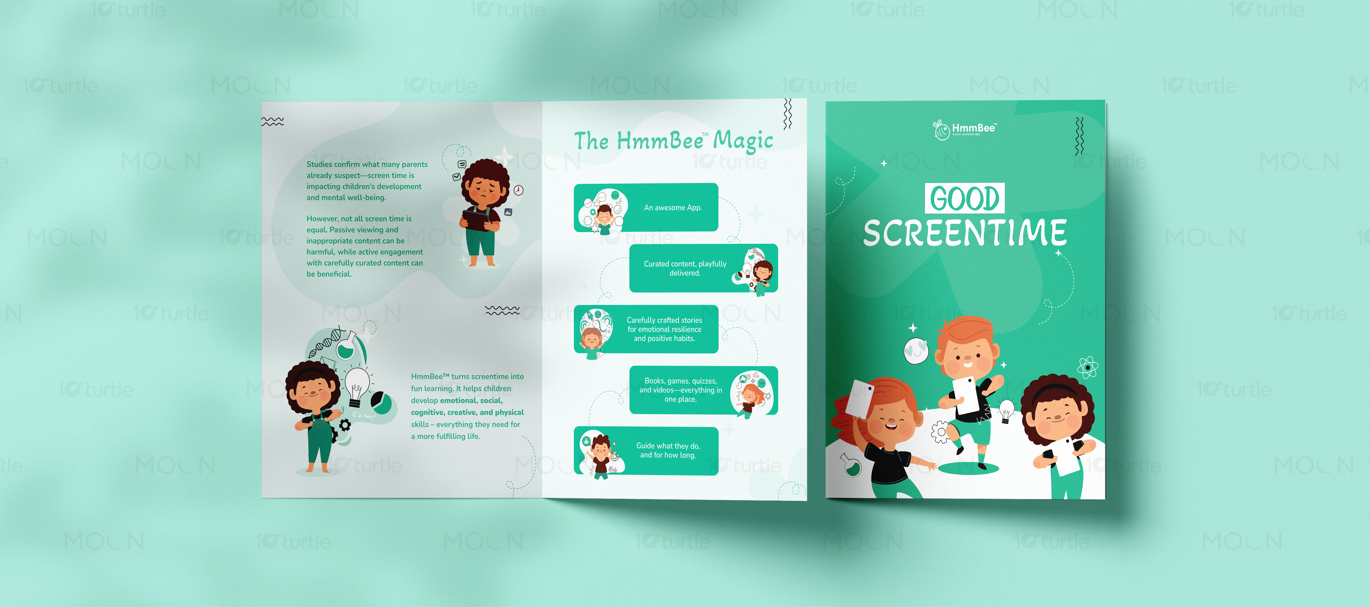
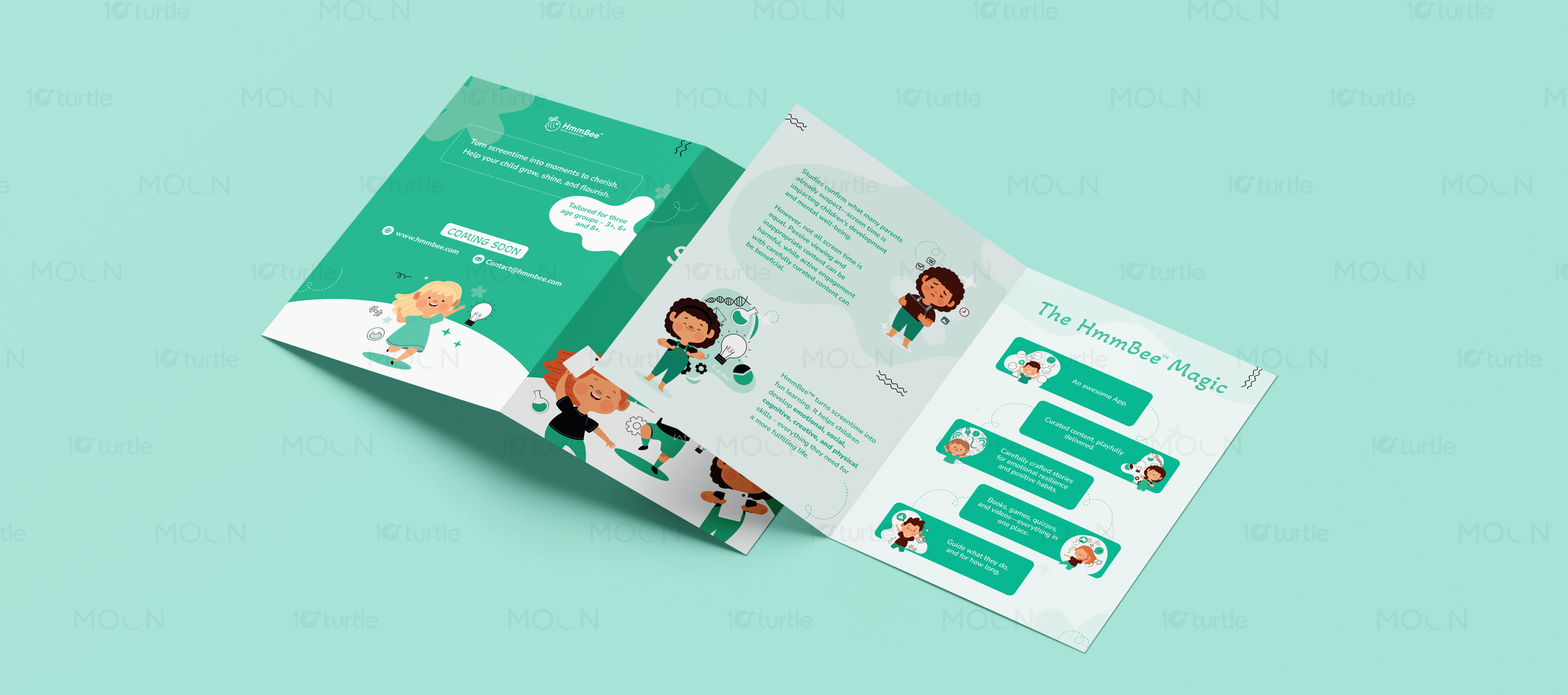
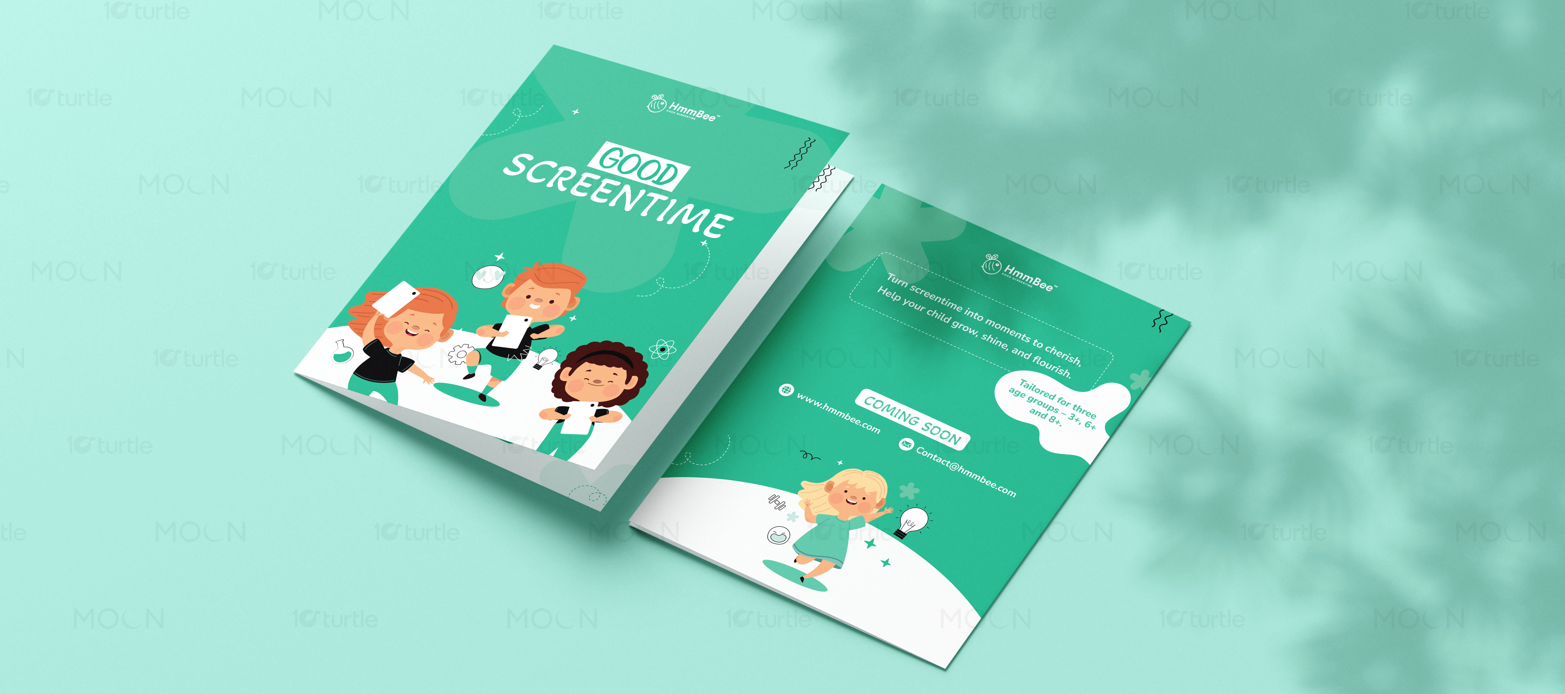
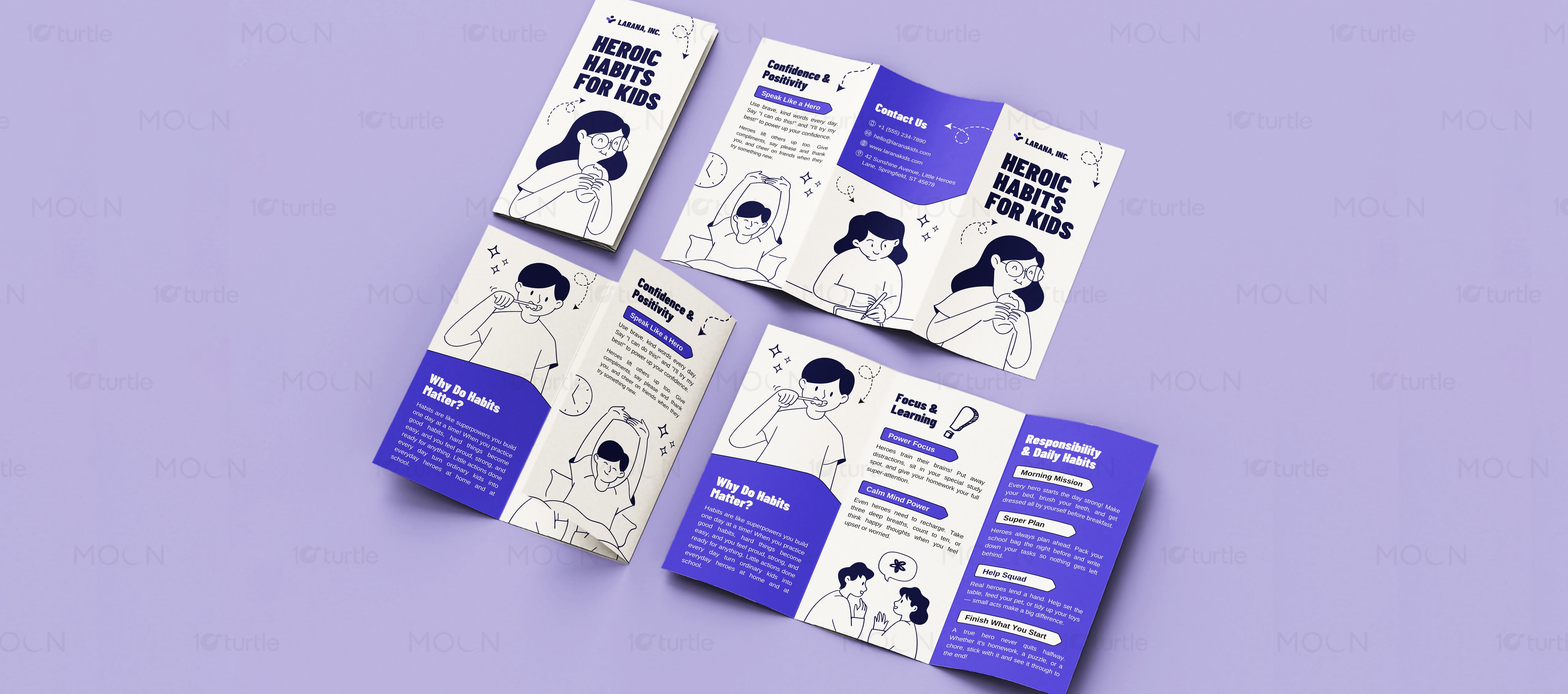
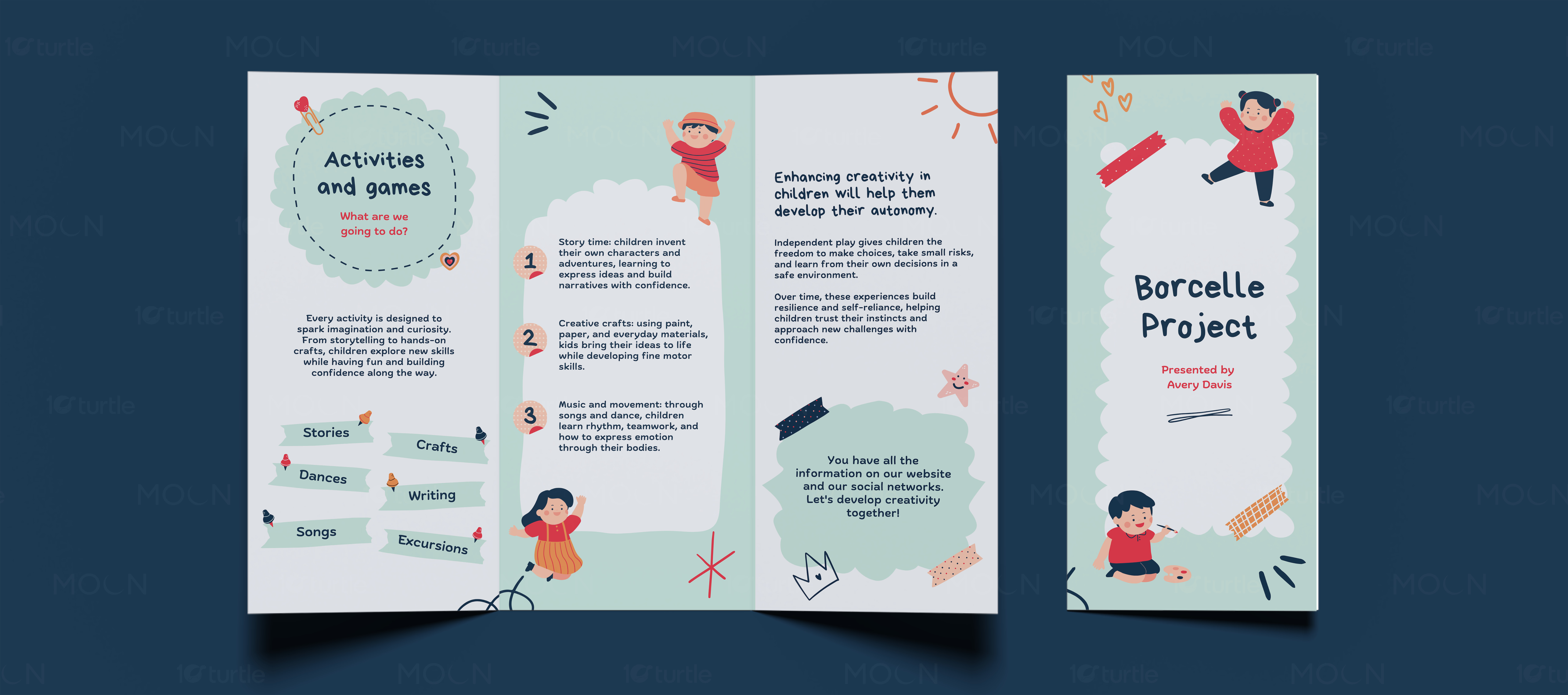
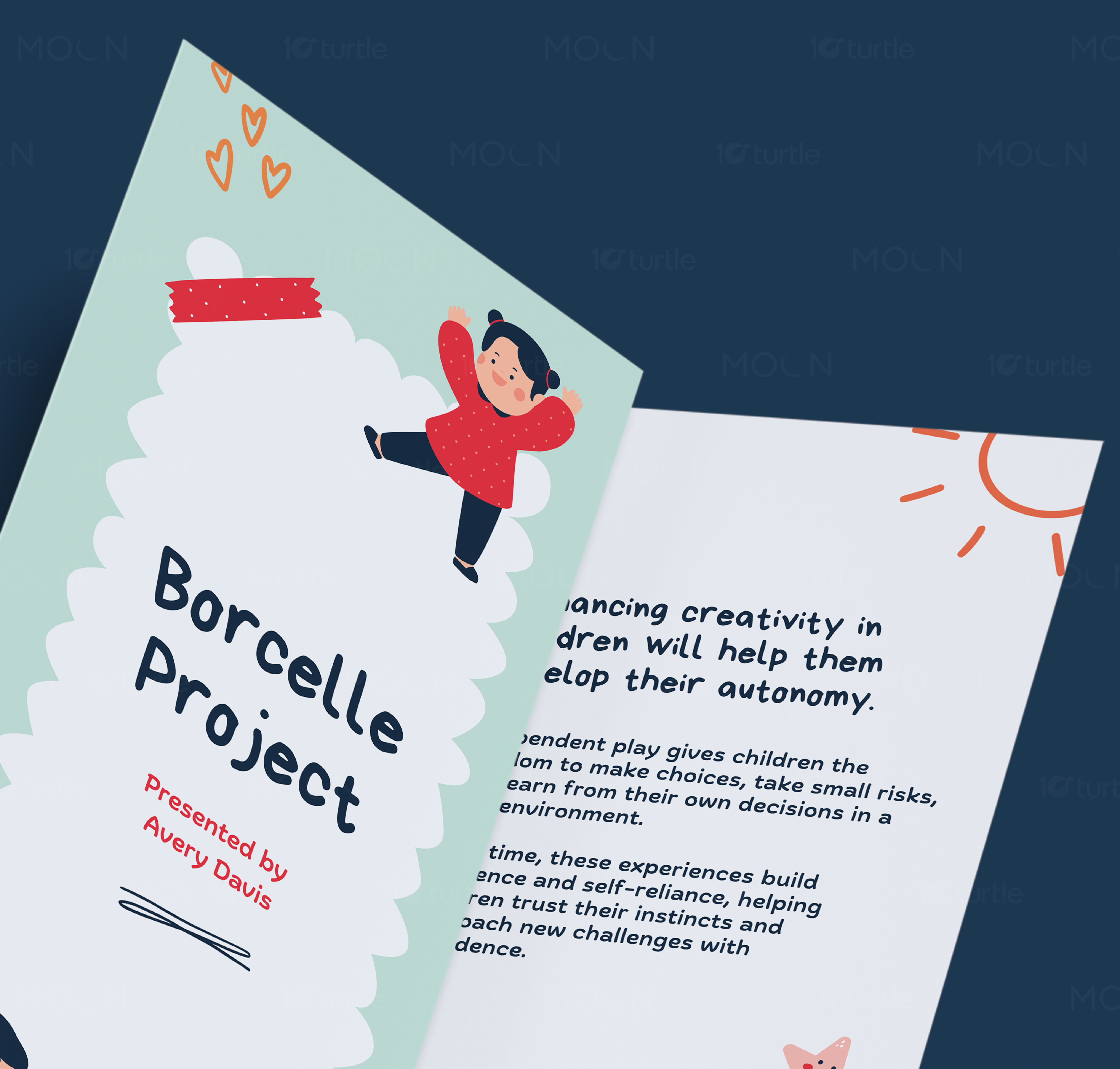
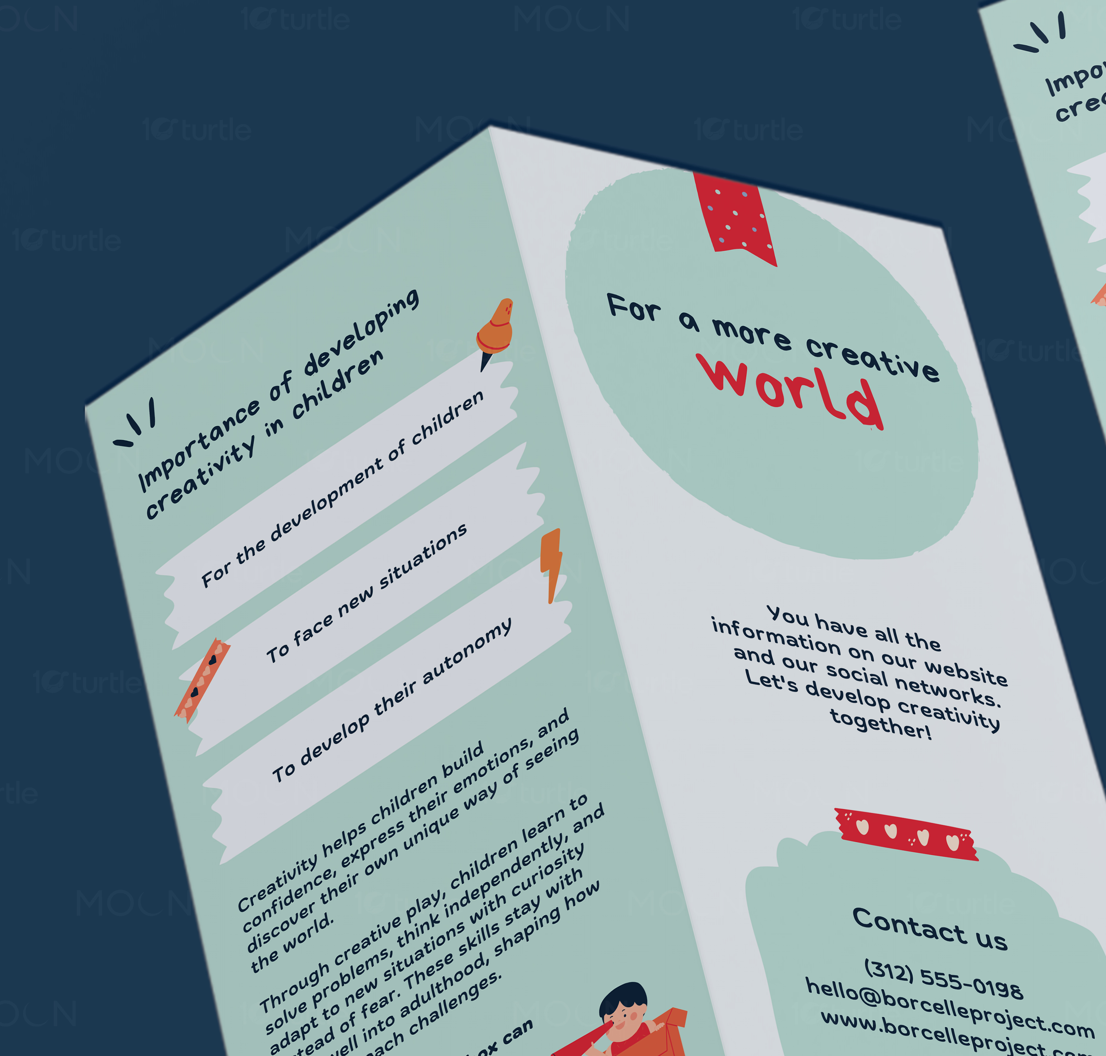
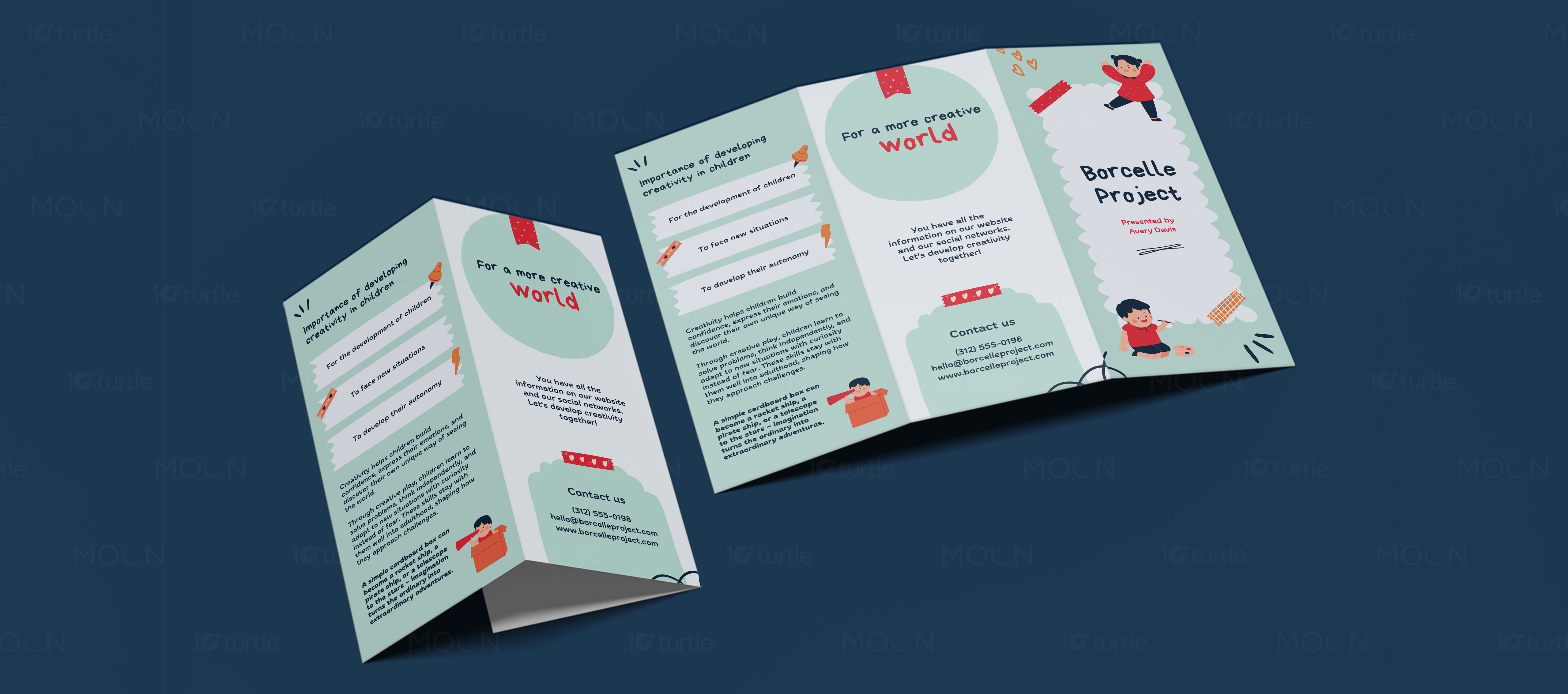
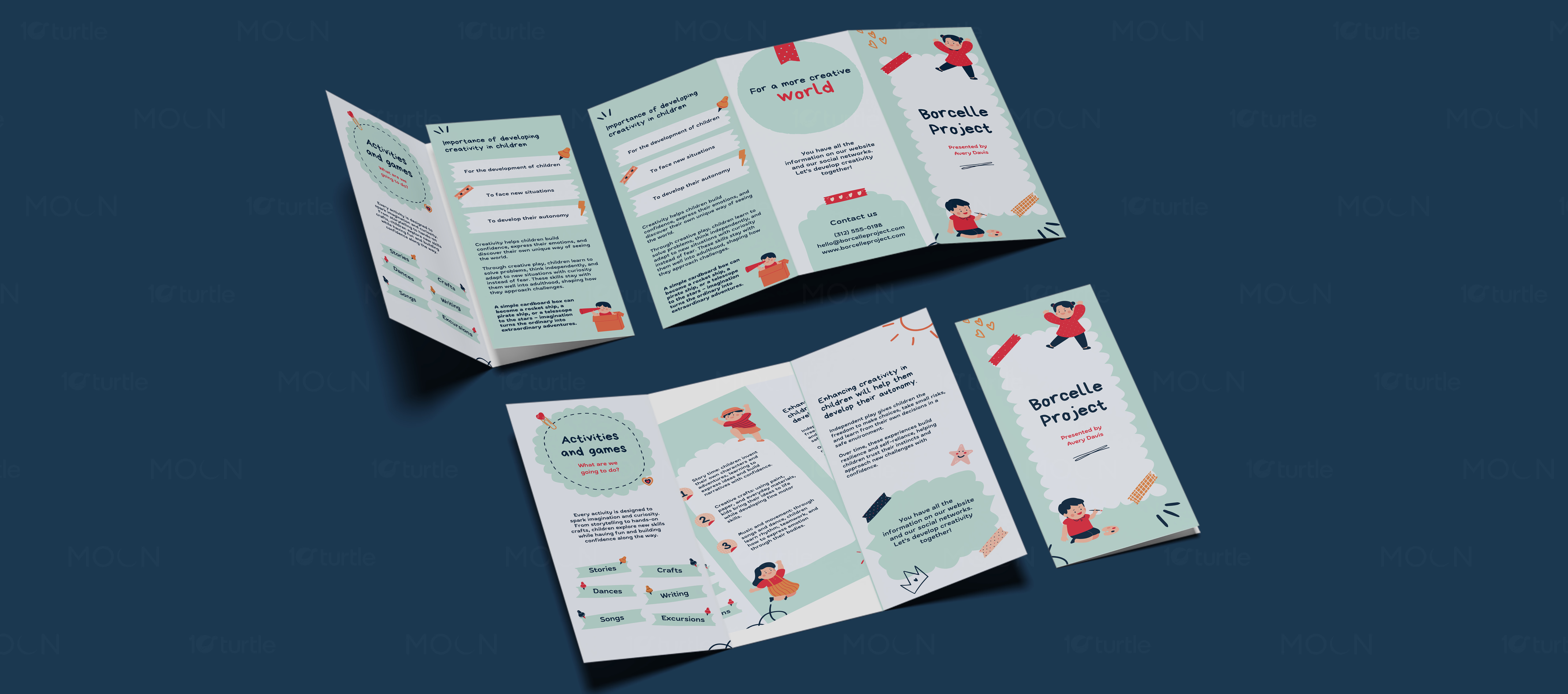
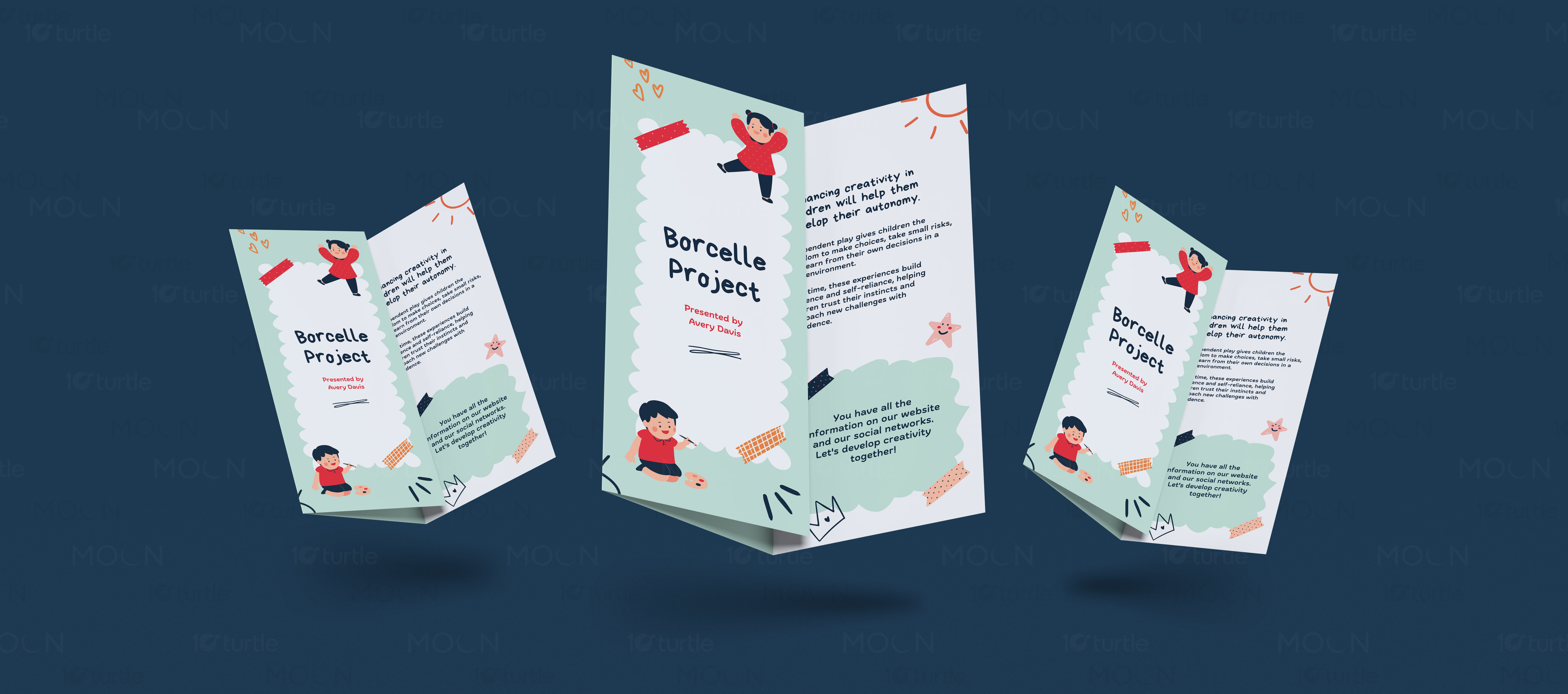
This collection solves that by using bright but controlled visual systems tailored to child education. The Borcelle Project brochure uses soft mint panels, rounded shapes, hand-drawn accents, and cute character illustrations to present activities and games. The HmmBee brochure uses green tones, app-style content cards, child illustrations, and curved dotted paths to explain positive screen-time learning. The Heroic Habits brochure uses bold blue panels, simple line art, and structured sections to make daily habits feel clear and motivating.
The Impact
These brochures help education brands present their programs in a more approachable and memorable way. Parents can quickly understand the benefits, structure, and purpose behind each learning resource. The playful illustration style makes the content feel inviting without losing clarity. Long-term, this kind of print collateral supports stronger trust, easier program promotion, and better communication between brands, schools, parents, and children.
Education brochure design for children’s programs requires a careful balance between playfulness and clarity. The audience is often mixed: parents need to understand the value, schools need organized information, and children respond best to friendly visuals. A brochure that looks too corporate can feel distant, while a design that is too playful can lose credibility with decision-makers. This case study brings together three education brochure designs as one print collateral project, showing how bi-fold and tri-fold formats can support learning-focused communication.
The first direction, created for the Borcelle Project, uses a soft and cheerful visual style built around activities and games. Mint panels, rounded scallop shapes, small tape graphics, child illustrations, stars, hand-drawn marks, and friendly typography create a craft-inspired education feel. The layout explains storytelling, crafts, music, movement, writing, dances, songs, and excursions in a simple folded structure. This makes the brochure suitable for child development programs, school activity promotions, or creative learning workshops.
The HmmBee design focuses on screen-time learning and app-based education. Its green palette, playful child characters, dotted paths, and rounded content boxes make the brochure feel digital, active, and child-friendly. The messaging explains how curated content can support emotional, social, cognitive, creative, and physical skills. The tri-fold format works well here because it breaks the app’s benefits into quick sections, helping parents understand how the platform turns screen time into a more guided learning experience.
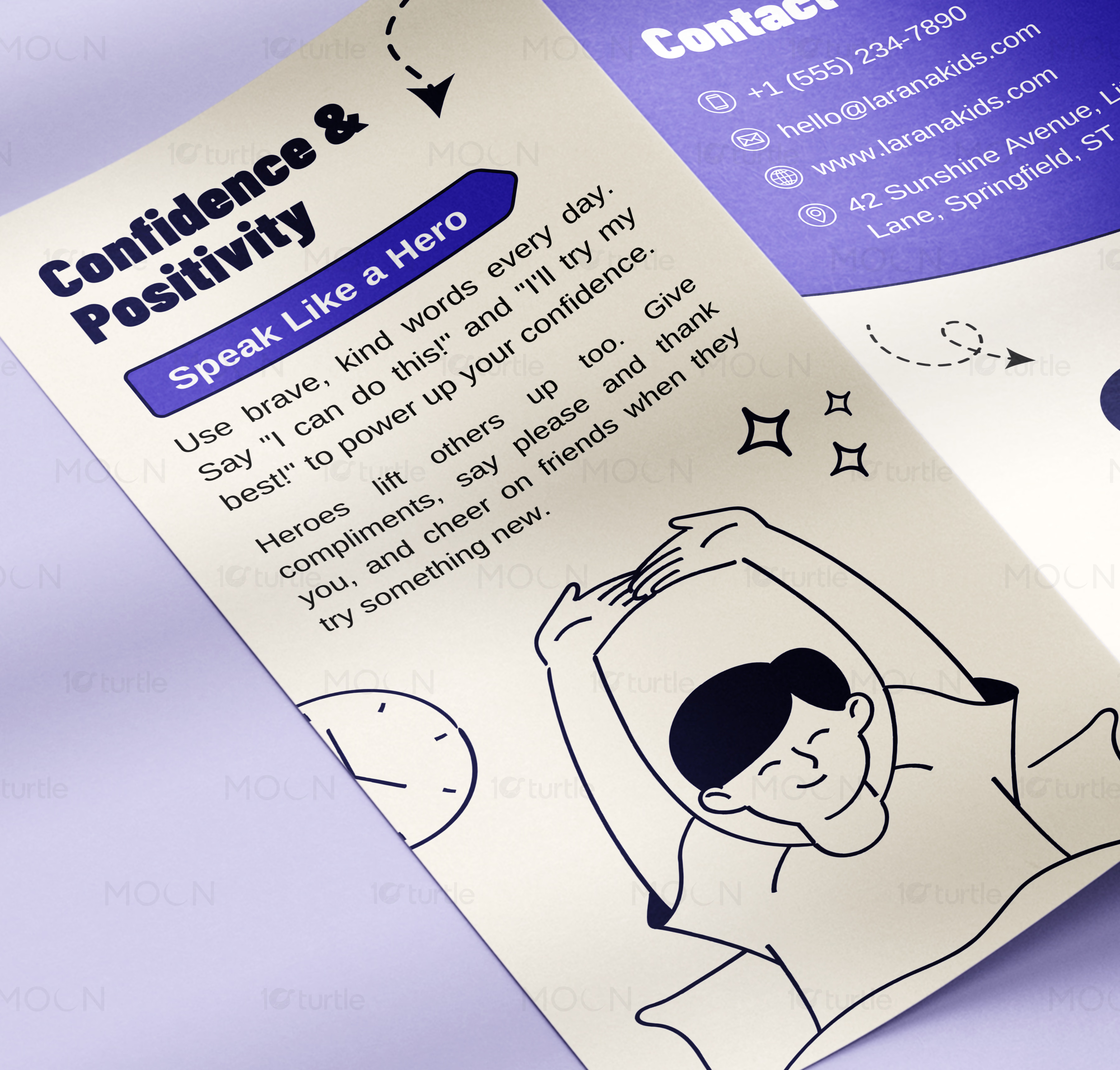
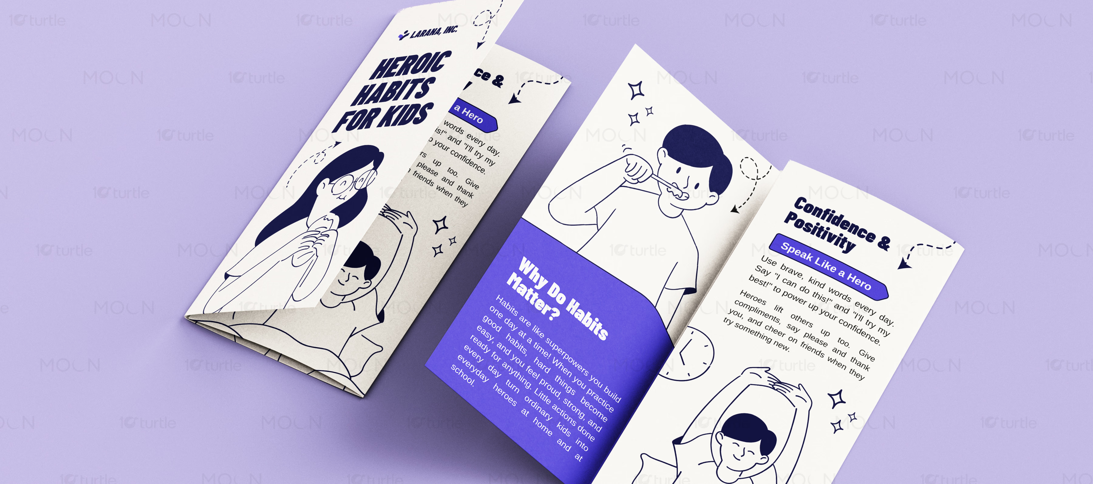
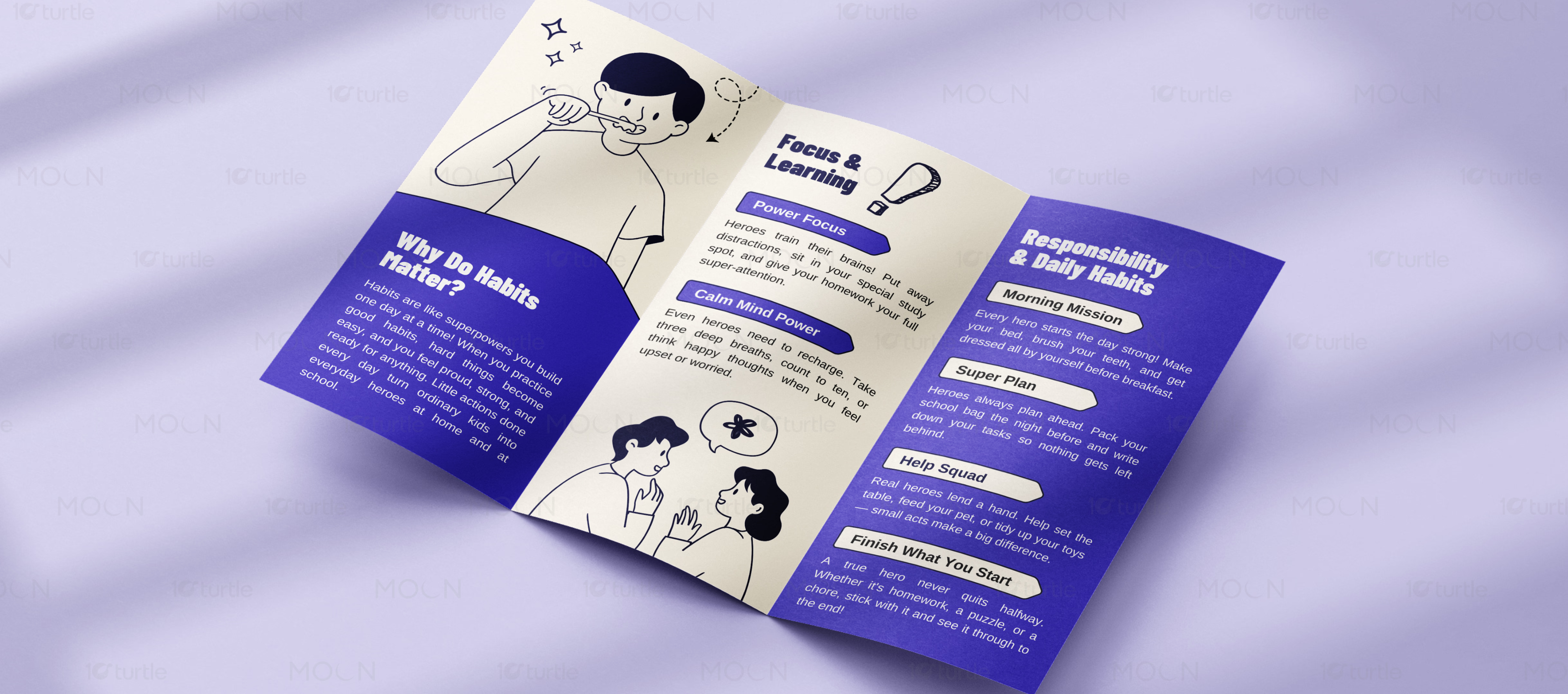
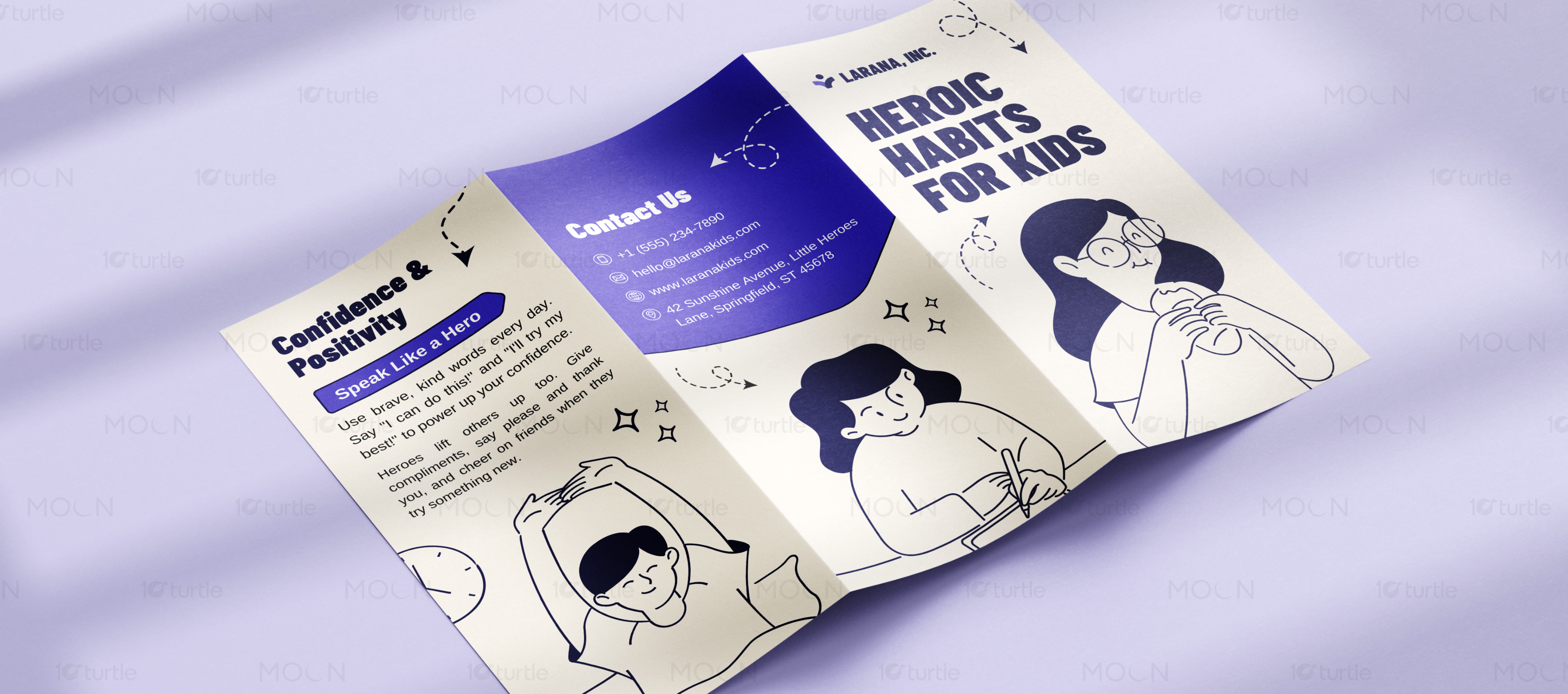
The Heroic Habits brochure takes a more bold and structured approach. Its blue-and-white palette, comic-style line illustrations, thick typography, and clear content panels make the topic of habits feel energetic and motivational. Sections such as confidence, positivity, focus, responsibility, and daily routines are organized into easy-to-read panels. This makes the design useful for children’s behavior programs, school resources, coaching materials, or youth development campaigns.
As a full education print design collection, the project shows how brochure formats can adapt to different learning messages while keeping the same goal: making information easier to understand and more enjoyable to read. Each design uses illustration as a storytelling tool, but the tone changes based on the subject. Activity-based learning feels soft and crafty, screen-time education feels modern and app-led, and habit development feels bold and motivational.
Long-term, strong education brochure design helps brands communicate with parents and institutions more effectively. It creates trust, improves program presentation, and gives educators a tangible tool for explaining benefits. Whether used in schools, events, parent meetings, onboarding kits, or promotional campaigns, these brochures turn child-focused learning ideas into clear, visual, and engaging print communication.
children brochure design
tri-fold brochure design
bi-fold brochure design
kids program marketing
print collateral design