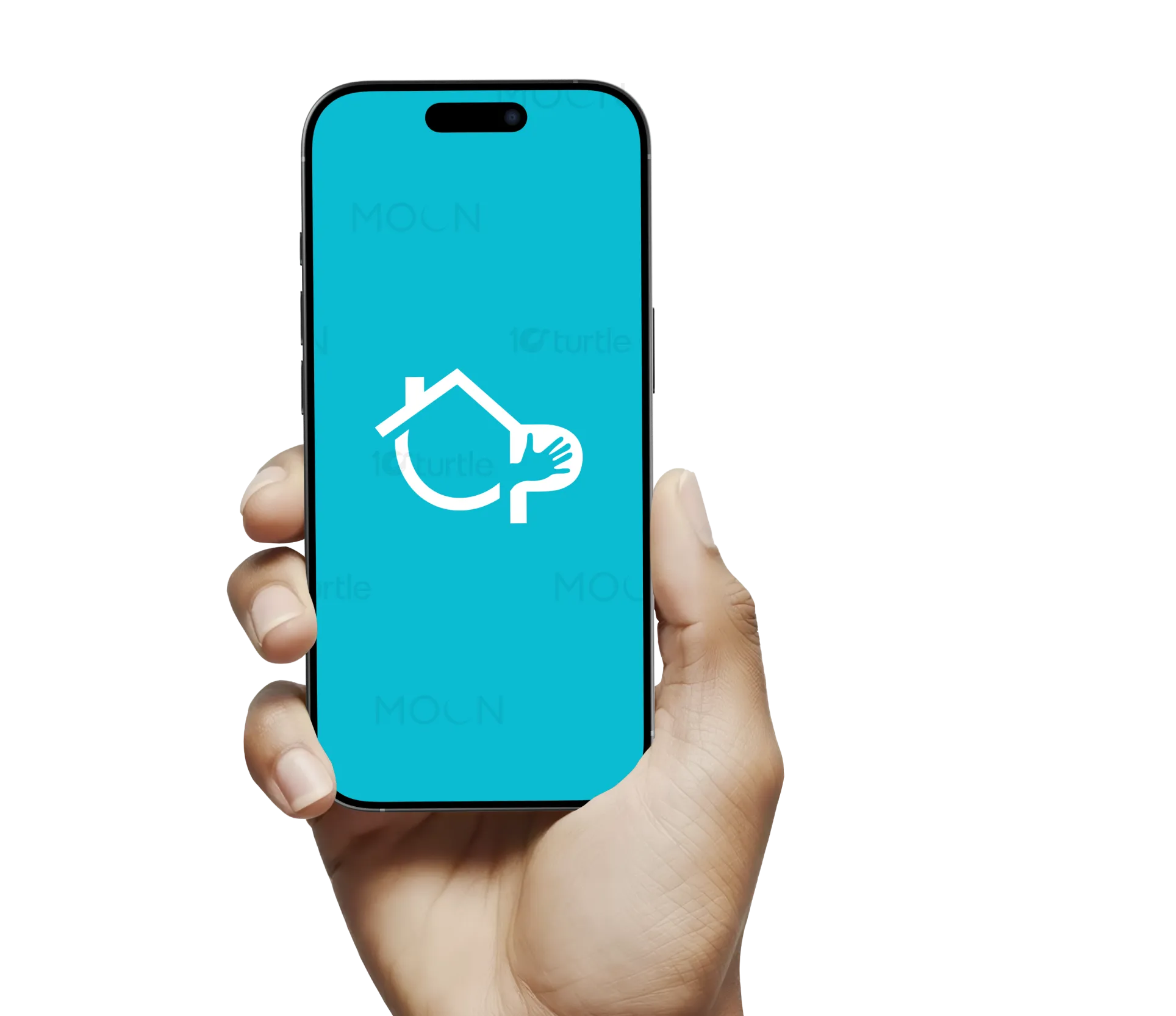
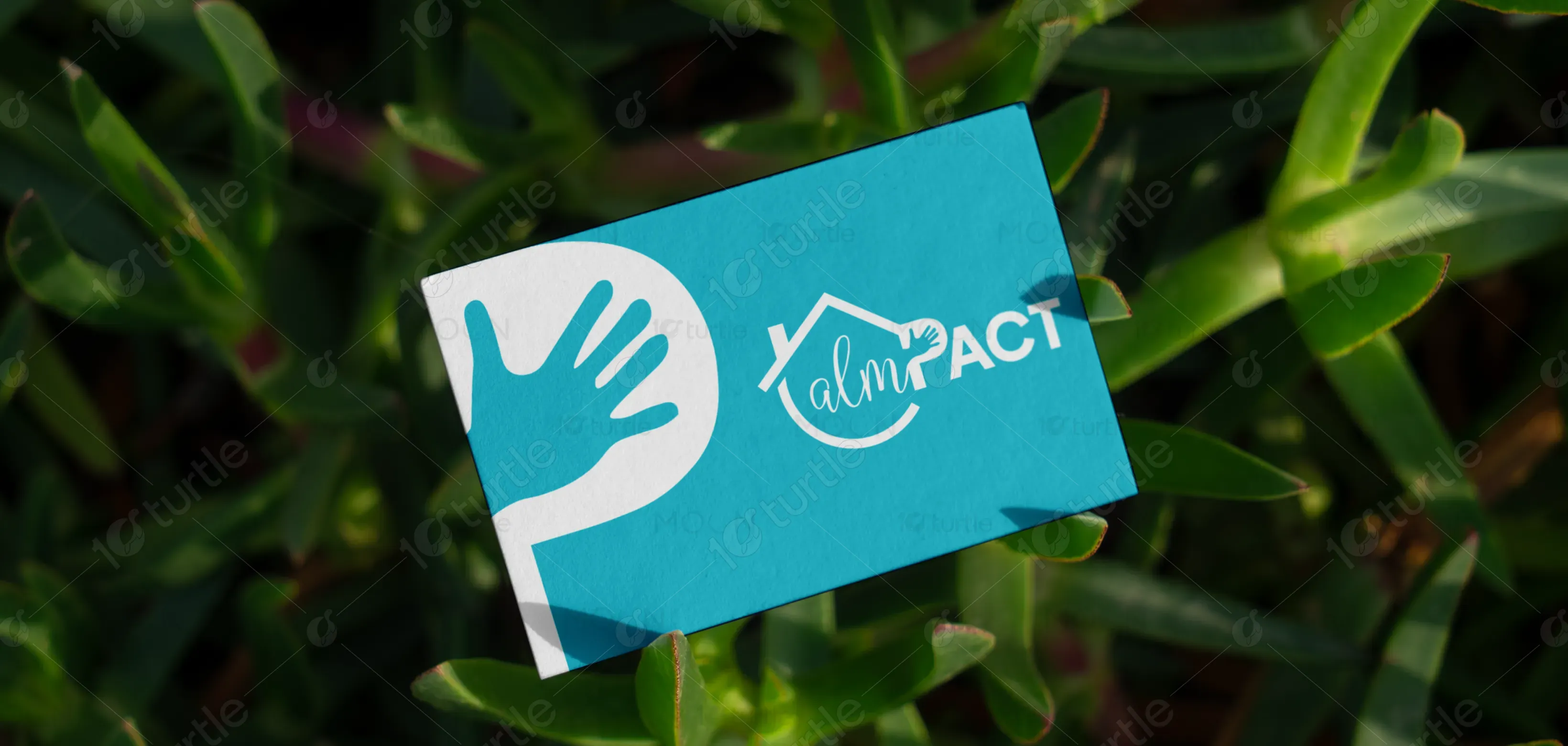
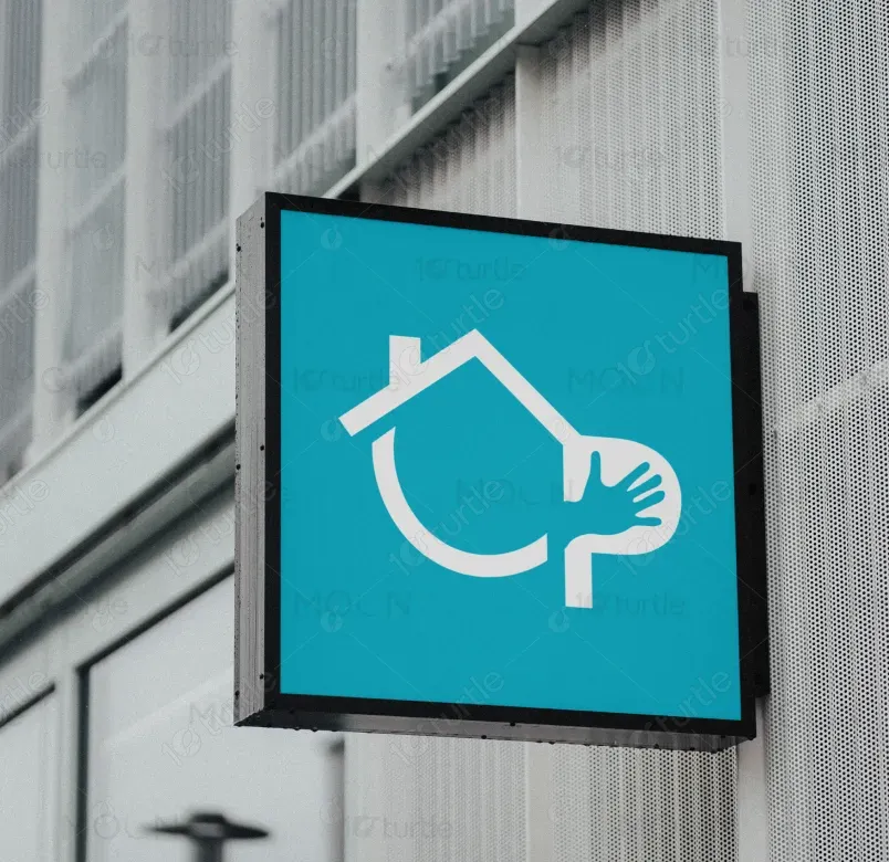
The Calmpact logo combines warmth, community, and purpose through a clean, modern design. The house outline symbolizes safety and shelter, while the stylized “P” with an embedded hand emphasizes human touch, compassion, and support. The flowing script “alm” softens the design, adding approachability and care, while the bold “PACT” establishes strength and credibility. The circular base element ties everything together, representing inclusivity and continuity. Overall, the design balances trust, empathy, and professionalism in a visually cohesive identity.
Logo Design
Graphic Design
Industry
Professional & B2B Services
Tools we used


Project Completion
2025
Key Market
Global
Calmpact represents a community-driven initiative or organization focused on creating real, tangible change in people’s lives. The logo highlights its mission of providing support, protection, and empowerment through collective efforts. Unlike traditional brand marks, this design uses symbolic storytelling—shelter, a helping hand, and unity—making it instantly relatable and memorable. Its unique selling point lies in its fusion of empathy and professionalism, perfectly positioning the brand to connect with audiences seeking trust, care, and impactful solutions.

Industry
Professional & B2B ServicesWhat we did
Logo DesignGraphic DesignPlatform
-Many organizations and initiatives in the social impact, non-profit, or community-service sectors struggle with branding that communicates both warmth and reliability. Logos often skew too corporate, losing emotional connection, or too playful, losing credibility. This gap creates challenges in gaining trust from donors, partners, and communities alike. For example, a charity logo that feels too cold may alienate supporters, while one that is overly casual may not be taken seriously in competitive grant or funding markets.
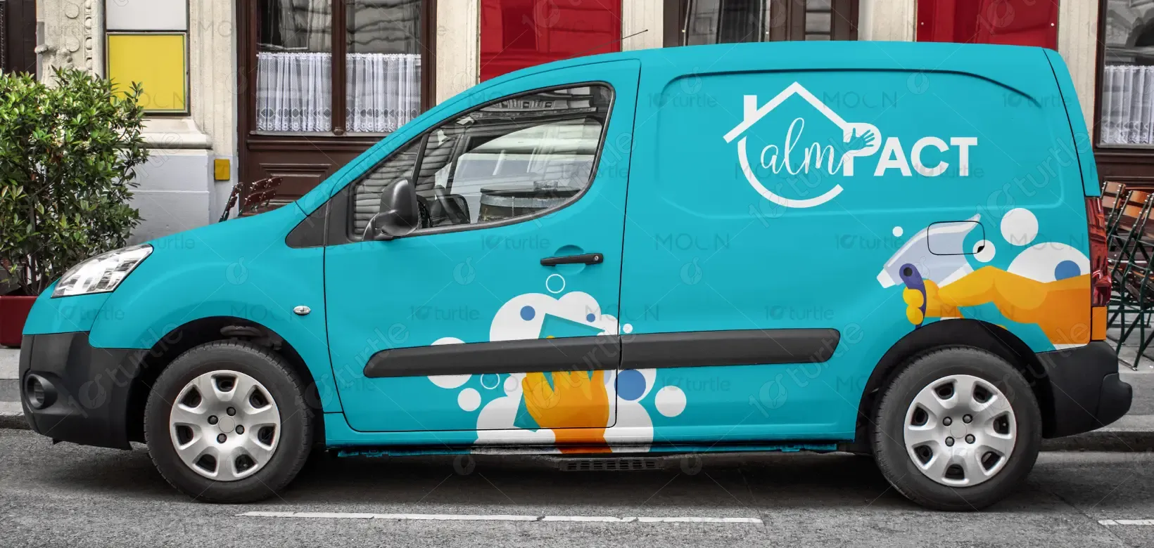
Calmpact bridges this gap by blending empathy with authority. The house outline conveys safety and community, while the hand inside the “P” serves as a universal symbol of support and humanity. The handwritten “alm” adds a personal, approachable touch, whereas the bold “PACT” reflects strength and dependability. This duality ensures the brand is both emotionally resonant and professionally trustworthy—capturing the attention of stakeholders, donors, and beneficiaries while inspiring confidence and connection.
Calmpact envisions becoming a symbol of hope, empowerment, and impactful change. Its long-term goal is to build strong, resilient communities where everyone feels supported and valued. As the brand grows, it aims to establish itself as a leader in community development and humanitarian initiatives, leveraging design and storytelling to inspire trust globally. Beyond just a logo, Calmpact aspires to be recognized as a movement—synonymous with lasting social impact and meaningful partnerships.


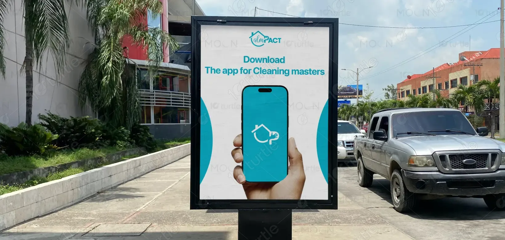
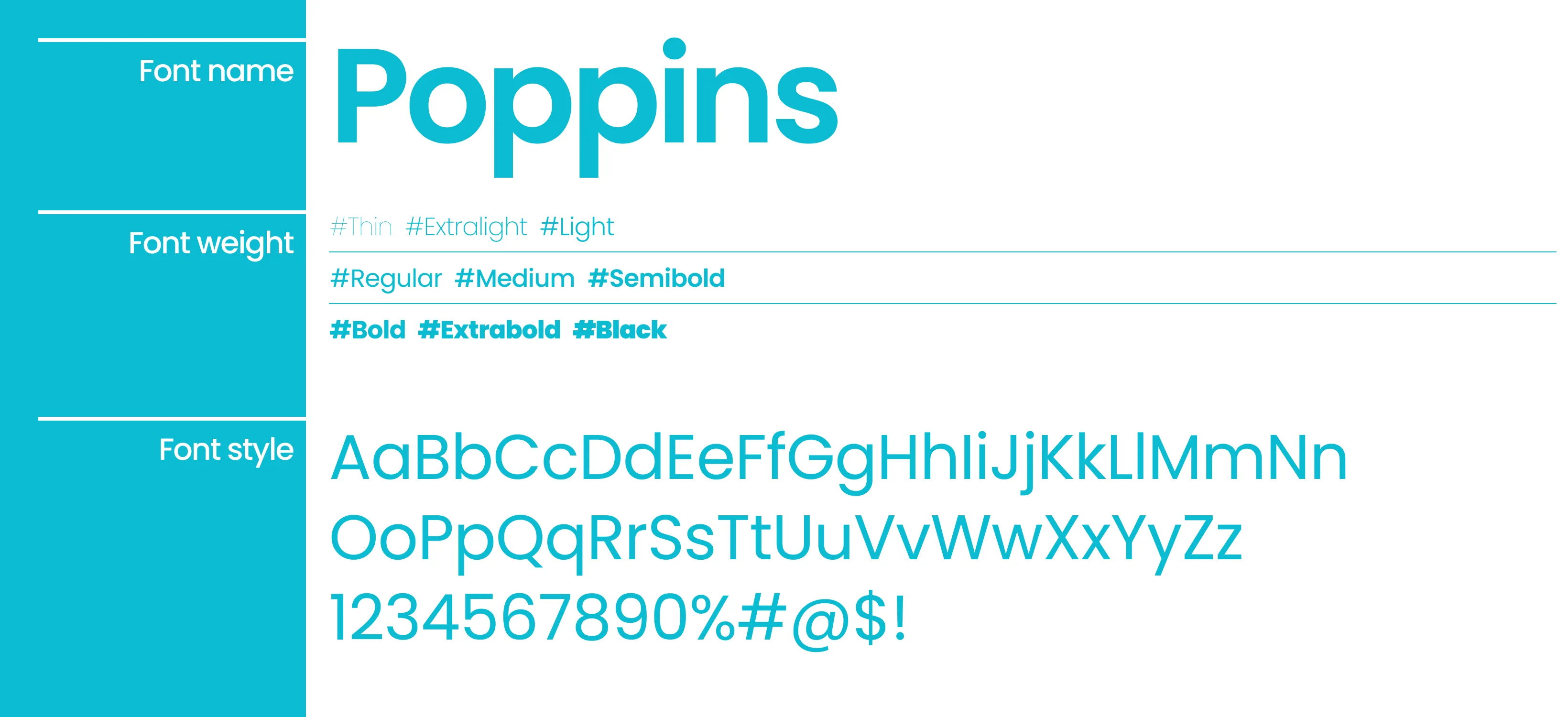
The logo uses a vibrant aqua blue (#00BCD4) as its primary color. This choice conveys freshness, trust, clarity, and a sense of calmness—ideal for representing compassion and community support. Blue also evokes dependability and professionalism, reassuring stakeholders. The white background creates contrast, reinforcing simplicity and transparency. Together, the palette establishes a modern, uplifting, and emotionally engaging identity that aligns with Calmpact’s mission of providing safe, supportive, and trustworthy solutions for people and communities.
