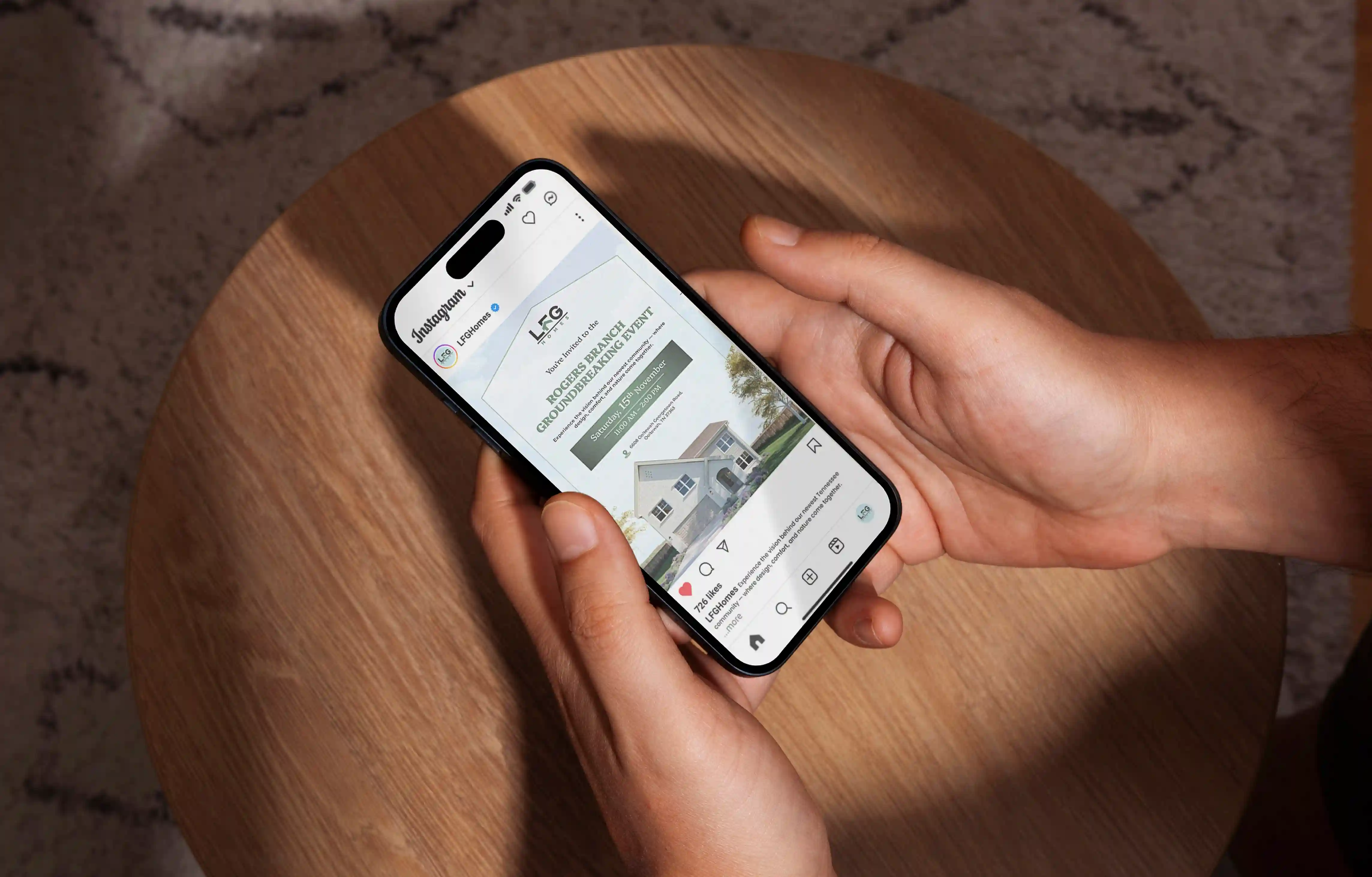
The IN:HOUSE logo is crafted as a refined, editorial wordmark that embodies clarity, confidence, and understated sophistication. The design combines soft, flowing letterforms with precise typographic structure, creating a balance between warmth and professionalism. Subtle contrast between “in.” and “house” introduces hierarchy while maintaining visual harmony. Inspired by modern publishing and luxury lifestyle brands, the approach avoids excess, focusing instead on timeless simplicity, spaciousness, and calm presence—reflecting the brand’s role as a thoughtful, embedded communications partner.
Logo Design
Graphic Design
Industry
Professional & B2B Services
Tools we used

Project Completion
2025
Key Market
Global
The IN:HOUSE logo is a typography-driven identity designed to represent a boutique communications and PR agency. It functions as a clean, versatile wordmark that adapts seamlessly across both digital and physical applications. The design emphasizes clarity and sophistication, aligning with the brand’s positioning as a premium yet approachable partner. Its minimalist execution ensures strong recognition while maintaining flexibility, making it suitable for everything from editorial layouts to environmental branding.
Industry
Professional & B2B ServicesWhat we did
Logo DesignGraphic DesignPlatform
-In the communications and PR industry, many brands struggle with overcomplicated identities that dilute their message. Agencies often rely on loud visuals or generic corporate styles, making it difficult to communicate trust, clarity, and premium positioning simultaneously. This creates a disconnect, especially for modern lifestyle brands seeking a more collaborative and integrated partner. The challenge was to design a logo that avoids visual noise while still conveying authority, creativity, and a sense of embedded partnership.
The solution was to create a minimal, typography-led logo that communicates through precision rather than decoration. By focusing on a clean wordmark, the design ensures versatility across all applications—from editorial layouts to real-world branding. The subtle distinction between “in.” and “house” reinforces the concept of integration and collaboration. Balanced spacing, soft letterforms, and a restrained aesthetic create a calm yet confident identity, allowing the brand to feel both premium and approachable in every interaction.
The IN:HOUSE logo performs exceptionally well in establishing a strong, trustworthy identity that resonates with both users and investors. The sophisticated wordmark emphasizes professionalism and reliability, driving higher brand recall and engagement. To further enhance these metrics, leveraging the logo across strategic touchpoints and incorporating more dynamic brand storytelling could increase investor interest and conversion rates.
The vision for the IN:HOUSE identity is to establish a timeless and adaptable brand that evolves with the modern communications landscape. As the agency grows, the logo is designed to remain relevant across digital, experiential, and global touchpoints. It aims to become synonymous with trust, clarity, and elevated creative thinking. Long-term, the identity will support a cohesive brand system that strengthens recognition, enhances client perception, and positions IN:HOUSE as a leading boutique agency in the lifestyle and communications space.
This logo is designed to embody clarity, integration, and quiet confidence. It combines refined typography with editorial precision to reflect a seamless partnership between strategy and creativity.
The color palette is anchored by a deep forest green, symbolizing stability, sophistication, and calm confidence. Complementary soft greys and neutral tones introduce balance, creating a refined and contemporary visual language. These colors reflect the brand’s editorial nature while maintaining warmth and approachability. The restrained palette avoids visual excess, allowing the typography to take focus. Together, the colors create a cohesive identity that feels premium, timeless, and versatile across both digital and physical brand applications.