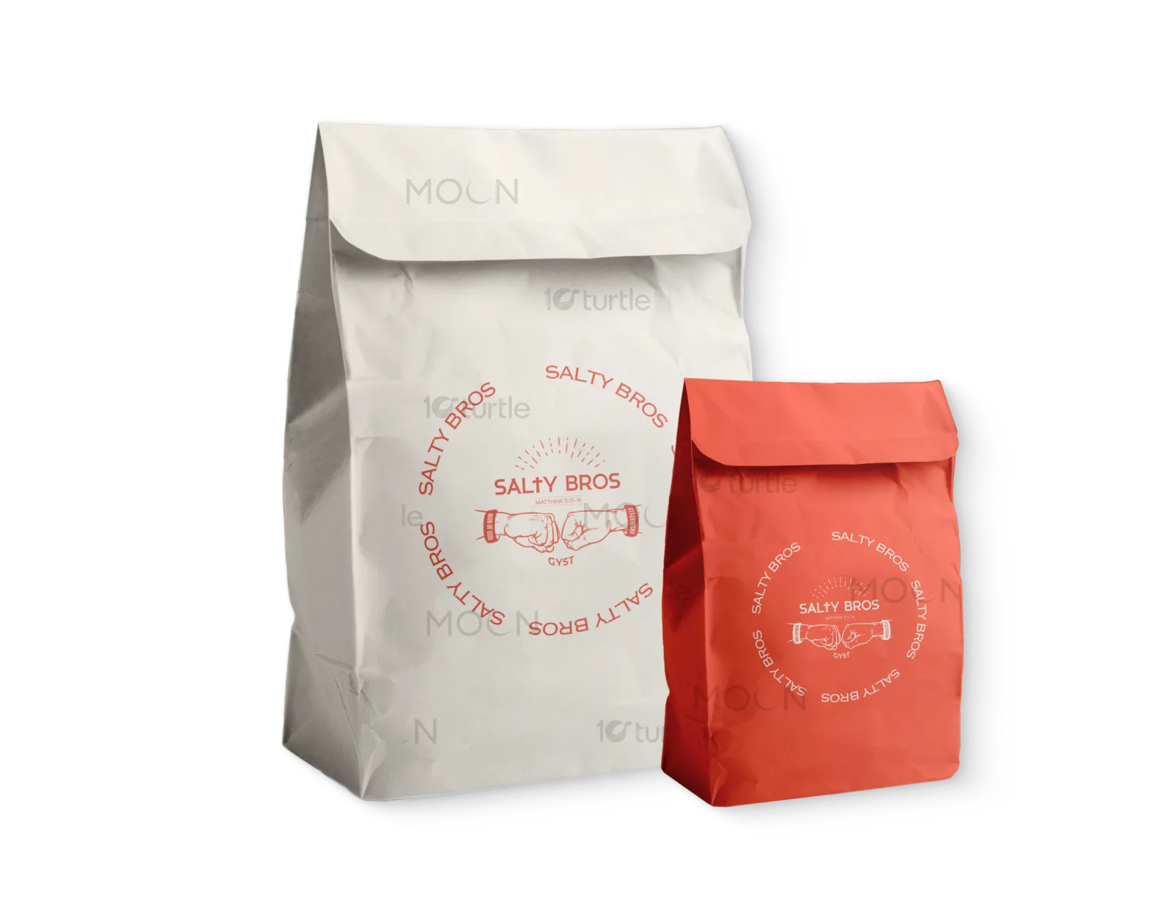
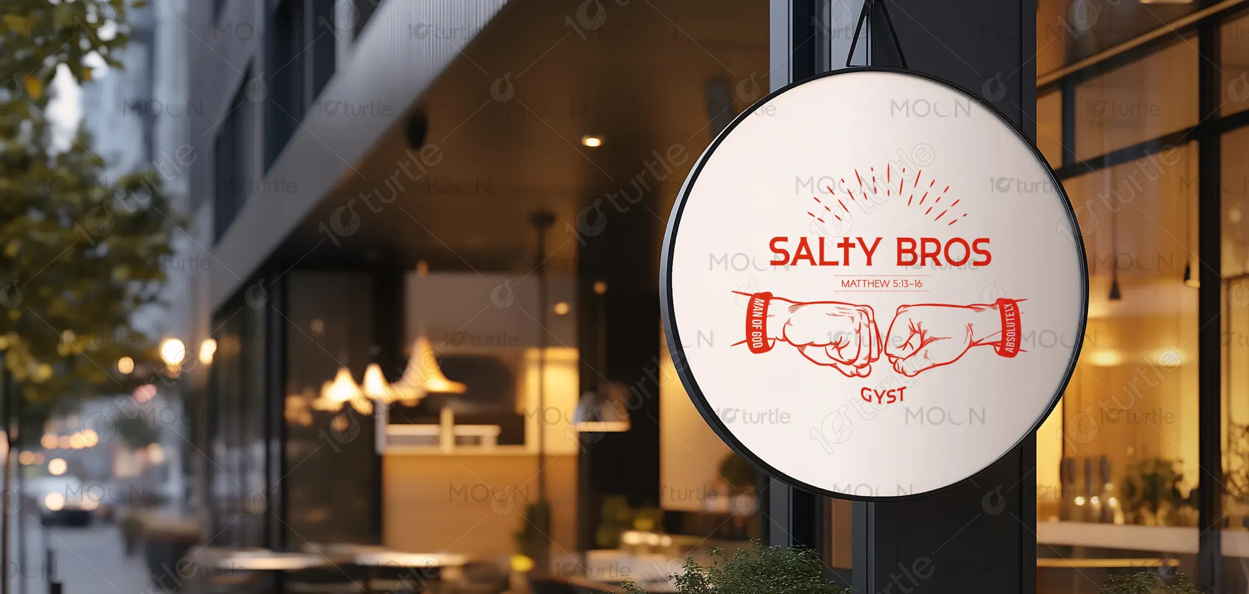
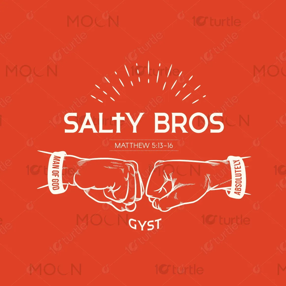
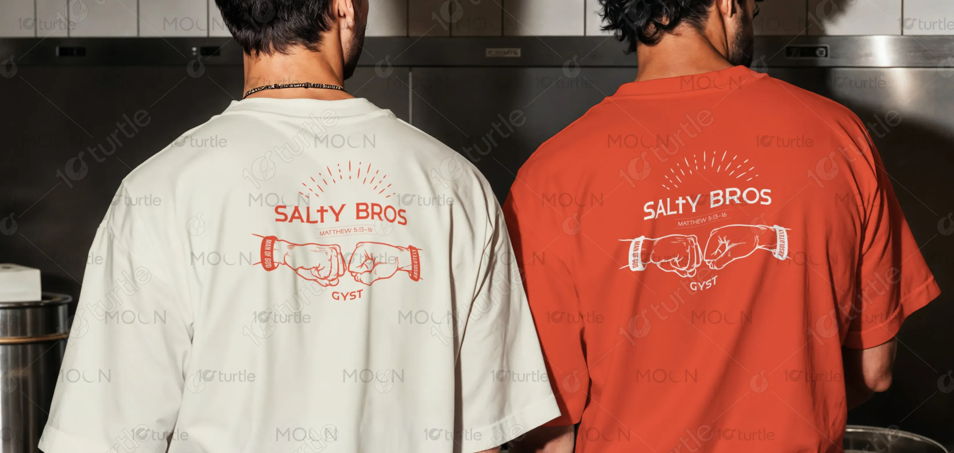
The Salty Bros logo embraces a bold and dynamic visual identity, combining modern minimalism with symbolic illustrations. The two fist-bumps reflect unity, strength, and camaraderie, while the cross subtly incorporated in “SALTY” reinforces faith-inspired values. The clean circular layout ensures versatility for signage and packaging, with striking red typography adding energy and memorability. Overall, the design balances approachability with impact, creating an emblem that resonates with both youthful and family-oriented audiences, while maintaining a strong, trustworthy brand presence.
Logo Design
Graphic Design
Industry
Food, Beverage & Hospitality
Tools we used


Project Completion
2025
Key Market
Global
Salty Bros is a food brand built around fellowship, flavor, and faith-driven values. Positioned to connect with community-driven customers, it brings together quality food with a strong brand story that emphasizes togetherness and authenticity. The logo conveys a sense of energy and modern appeal, setting the brand apart from competitors by merging bold visuals with deeper meaning. This mix of symbolic design and relatable identity enhances its appeal, making it ideal for a socially engaging, lifestyle-driven food experience.

Industry
Food, Beverage & HospitalityWhat we did
Logo DesignGraphic DesignPlatform
-The food industry is saturated with repetitive branding that often relies on generic symbols like plates, cutlery, or food icons, which fail to stand out or resonate emotionally. Many brands overlook the importance of storytelling and cultural relevance, creating weak connections with their target audience. Additionally, younger consumers increasingly value brands that represent shared identity and values, rather than just products. This gap highlights the challenge: building a food brand identity that is unique, memorable, and emotionally engaging.
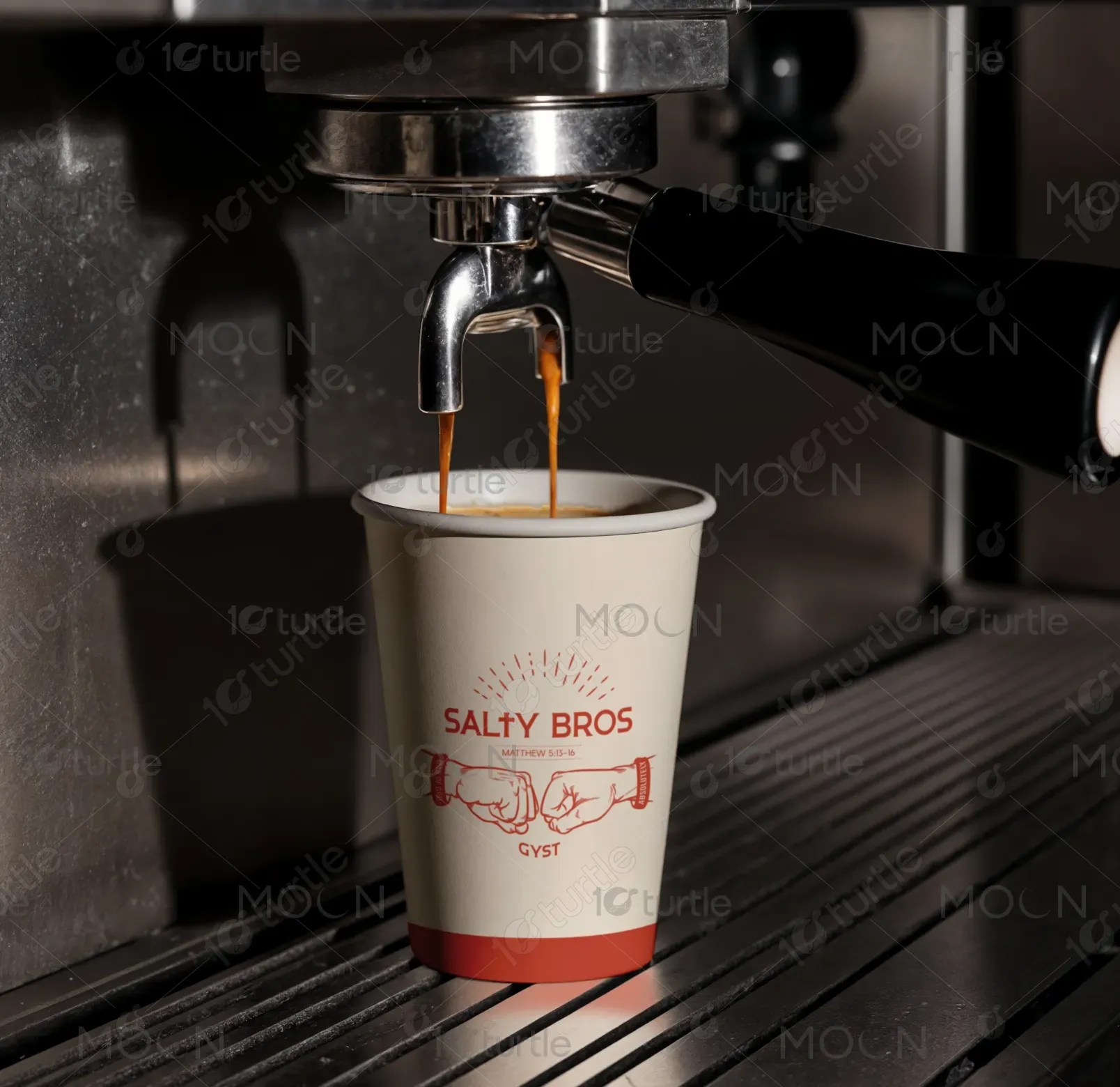
The Salty Bros design addresses these gaps through a creative blend of symbolism and simplicity. By featuring fist-bumps, it reflects camaraderie and brotherhood, making the brand relatable and human-centered. The cross integrated in the typography and reference to Matthew 5:13–16 adds depth, aligning the brand with values of faith and authenticity. The minimal red-and-white aesthetic ensures high visibility, easy reproduction across packaging and signage, and a bold, modern appeal. This innovative storytelling approach strengthens brand recognition and loyalty.
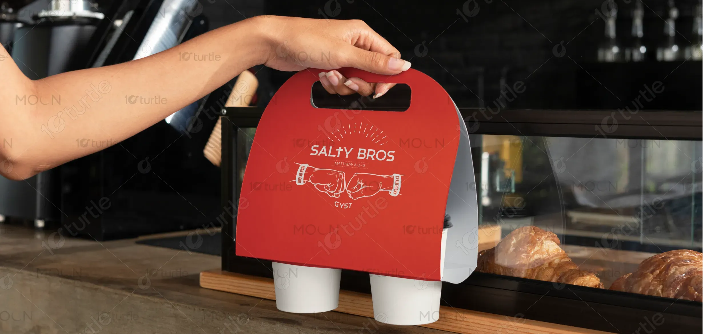
The long-term vision for Salty Bros is to evolve into a lifestyle-driven food brand that represents more than just taste—it embodies community, resilience, and shared values. The design aspires to create a lasting cultural imprint, becoming instantly recognizable across diverse platforms, from store signage to digital media. By maintaining its unique symbolism and storytelling, Salty Bros can expand beyond food into merchandise and community initiatives, reinforcing its identity as a brand that nourishes both body and spirit.
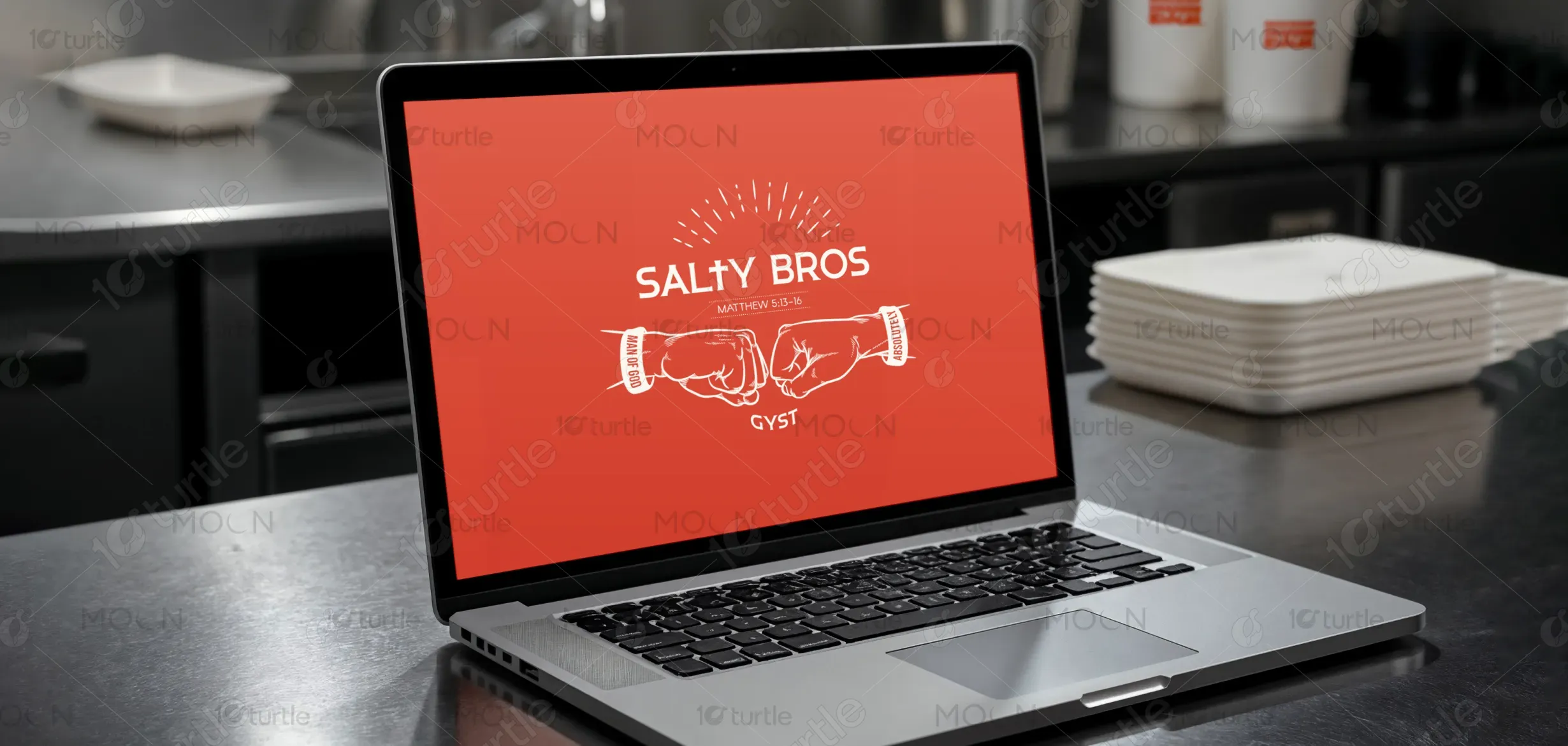
The Salty Bros logo embodies unity, strength, and purpose through its bold fist-bump symbol, radiant burst, and faith-inspired details. The red-orange background conveys energy and passion, while the clean white typography ensures clarity and balance. The design blends modern appeal with timeless values, making it a strong, versatile identity for packaging, merchandise, and community branding.
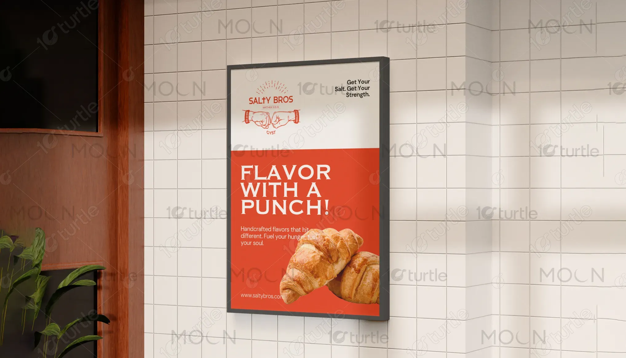
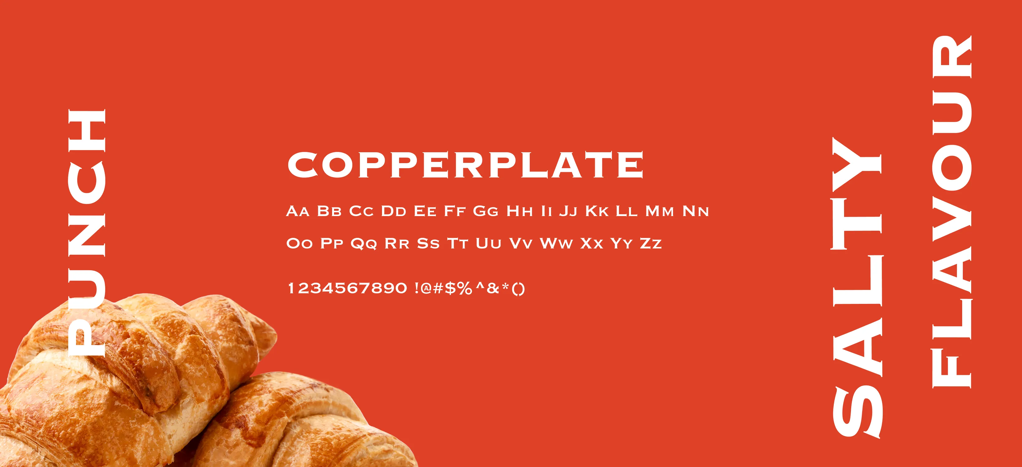
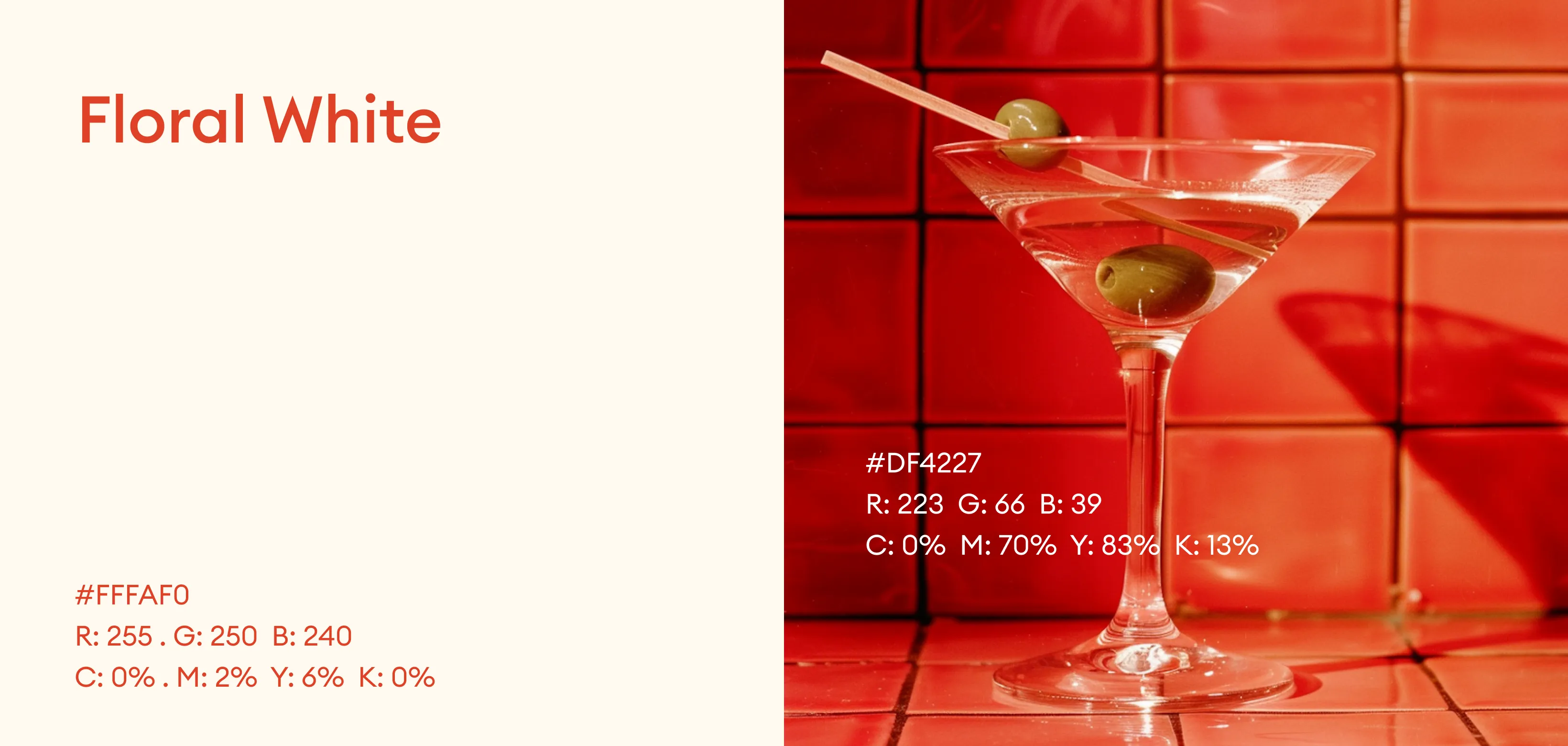
Fiery Orange: Represents passion, energy, and strength. It stimulates appetite and reflects boldness, making it ideal for a food brand that thrives on vibrancy and connection. Floral White: A soft, warm neutral that balances the intensity of red. It conveys cleanliness, approachability, and simplicity, ensuring the design feels fresh and modern.
