
Dental Healthcare Branding Case Study
A friendly dental identity designed to make care feel more approachable.
The Challenge
Dental healthcare branding needs to communicate expertise without making patients feel uncomfortable or overwhelmed. A heavily clinical identity can appear cold, while an overly playful approach may reduce perceived professionalism and trust. Go Care Clinic needed a visual identity that could bridge these two expectations and remain consistent across different patient-facing touchpoints.
The Solution
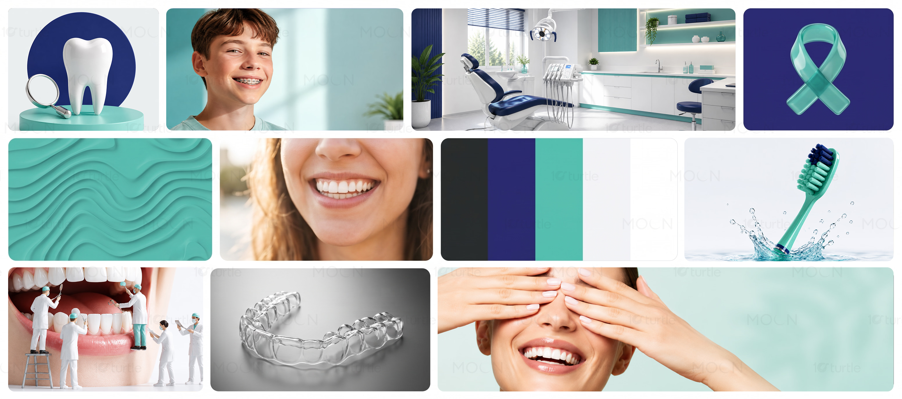
We built the Go Care Clinic brand identity from scratch around a balance of professionalism, warmth, and accessibility. The visual system uses a cohesive combination of typography, color, graphic elements, and branded applications to create a recognizable clinic presence. Each asset follows the same visual principles, ensuring the identity remains connected across both physical and digital communication.
/ Project Information
Go Care Clinic was developed from the ground up as a complete dental healthcare brand identity. The system brings together a professional yet approachable visual direction across core branding applications. Every element was designed to create recognition, communicate reliability, and reduce the intimidating perception often associated with dental services while giving the clinic a polished, consistent presence.