The design embodies a clean, modern aesthetic, focusing on clarity and ease of navigation. The use of intuitive layouts, harmonious color schemes, and user-centered elements enhances both function and visual appeal. Strategic whitespace ensures readability and reduces clutter, while bold typographic choices add personality. The design prioritizes accessibility and responsive design, ensuring a seamless experience across all devices. The overall creative direction aims to balance sophistication and simplicity, delivering a premium yet approachable user experience.
PPT Design
Graphic Design
Industry
Technology, SaaS & Startups
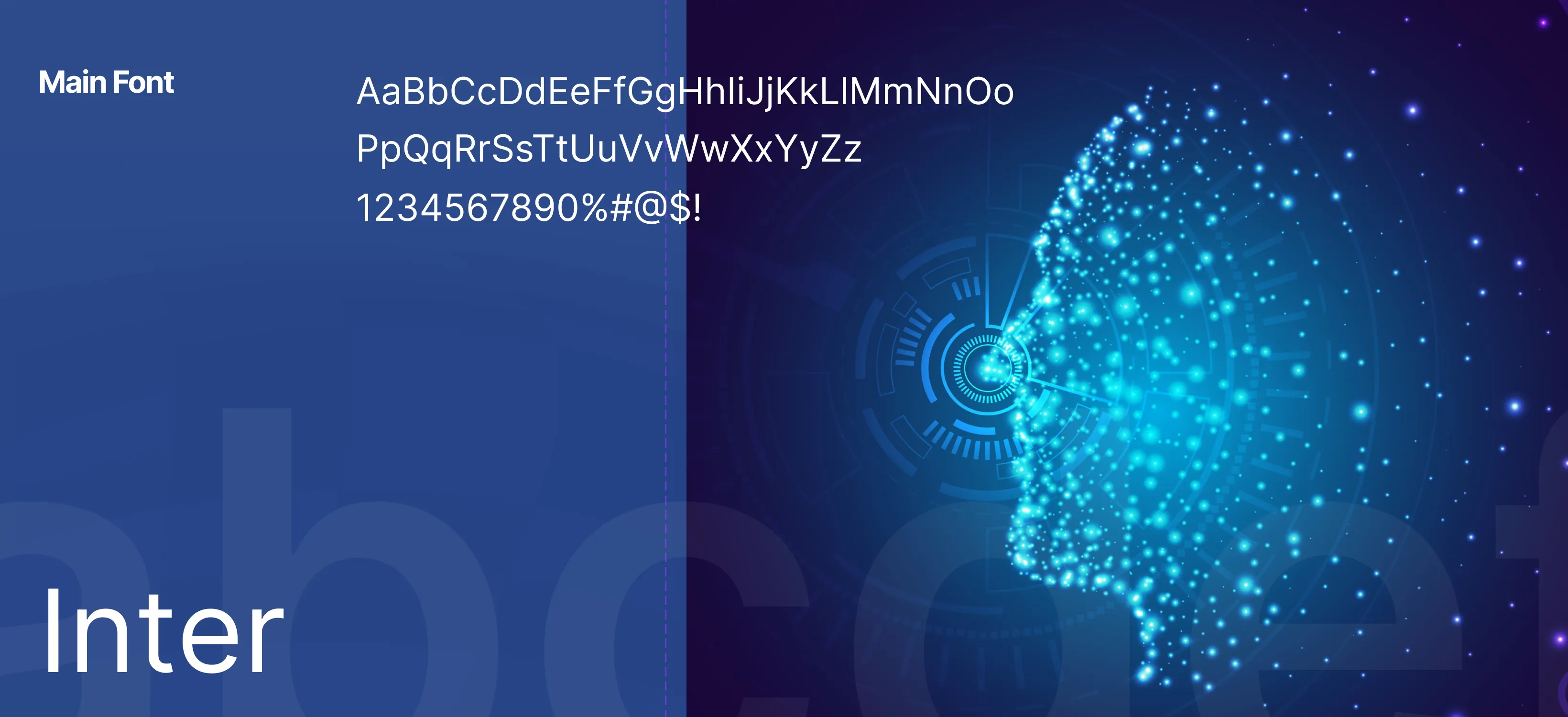
Tools we used


Project Completion
2025
Key Market
Global
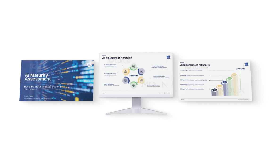
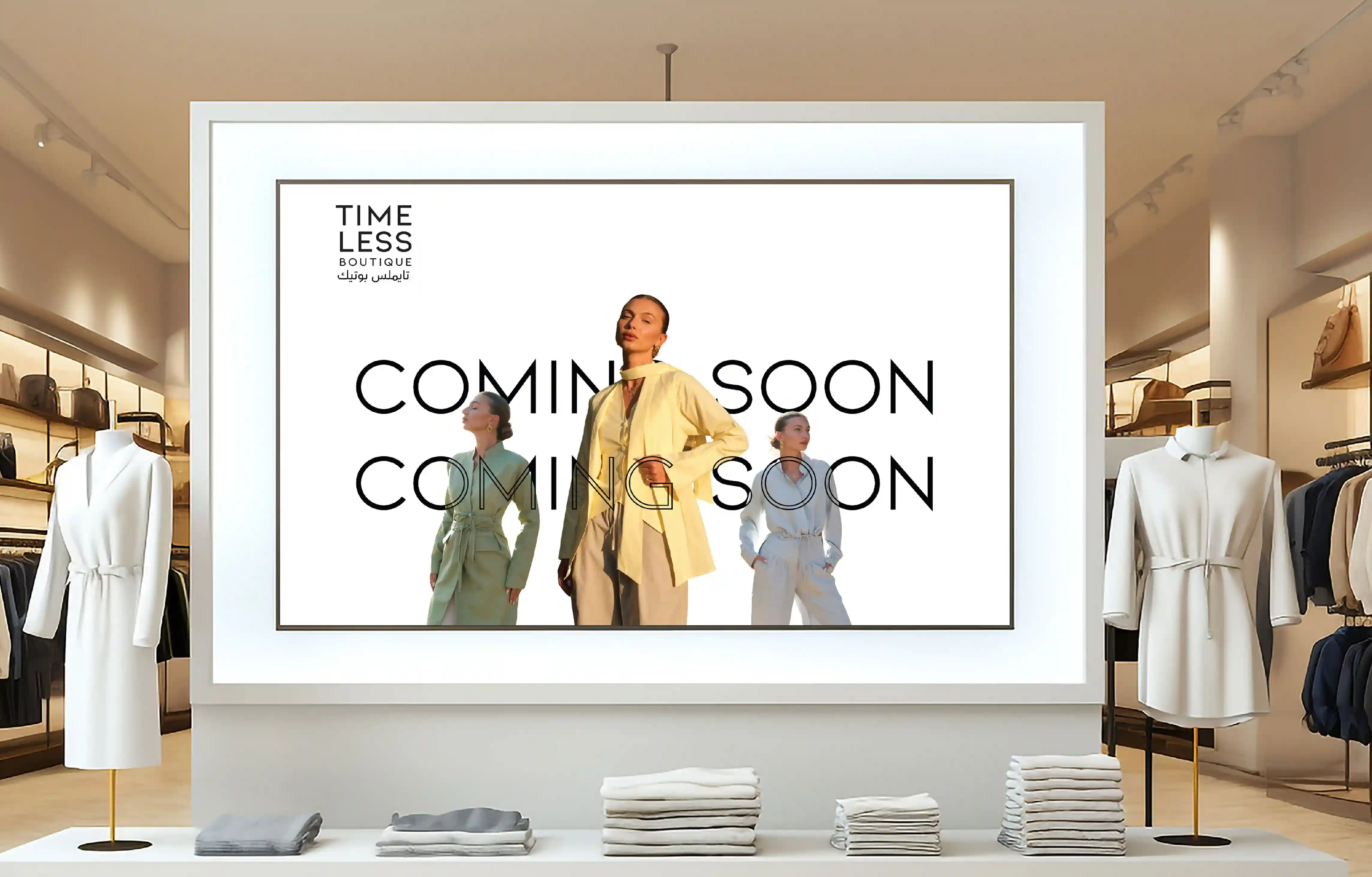
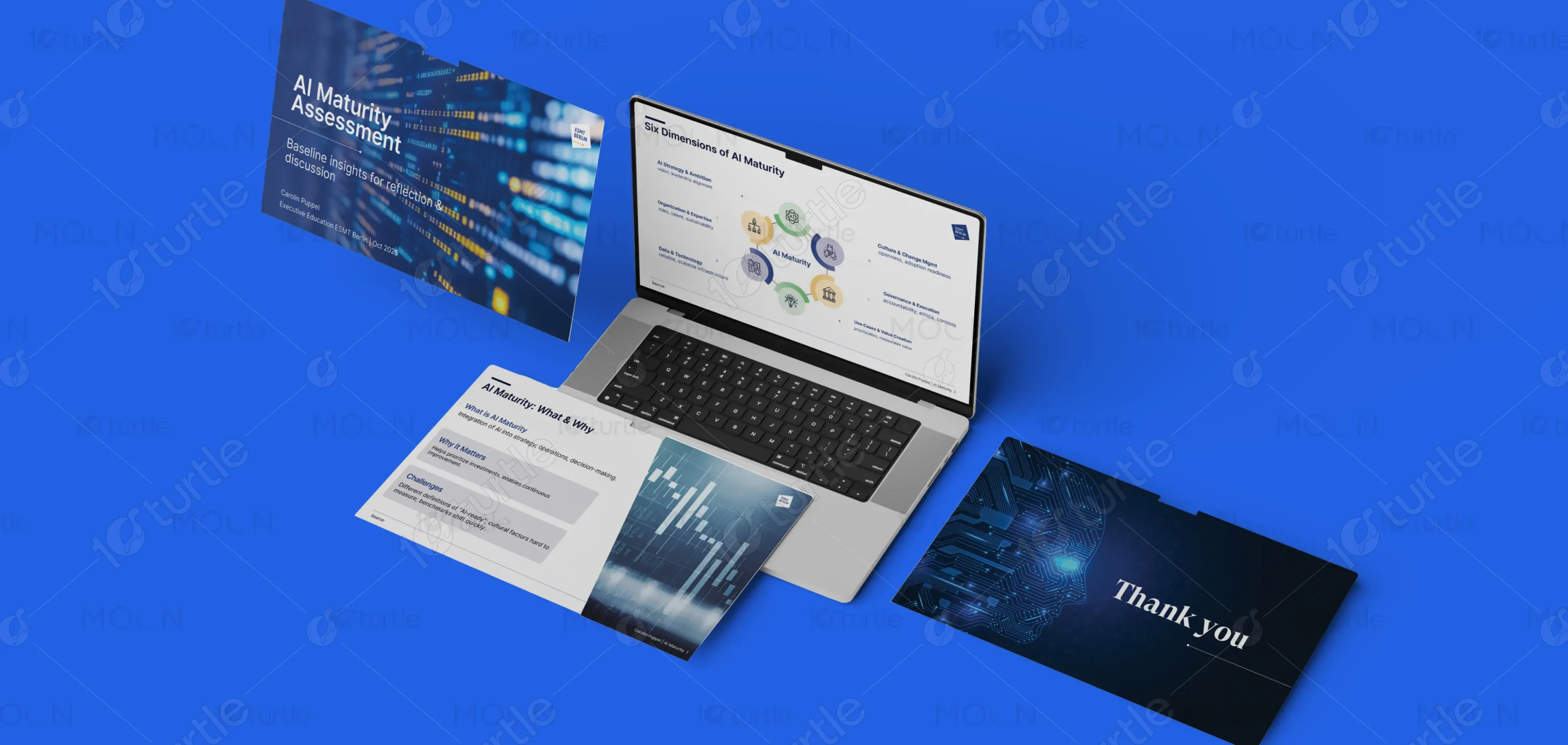
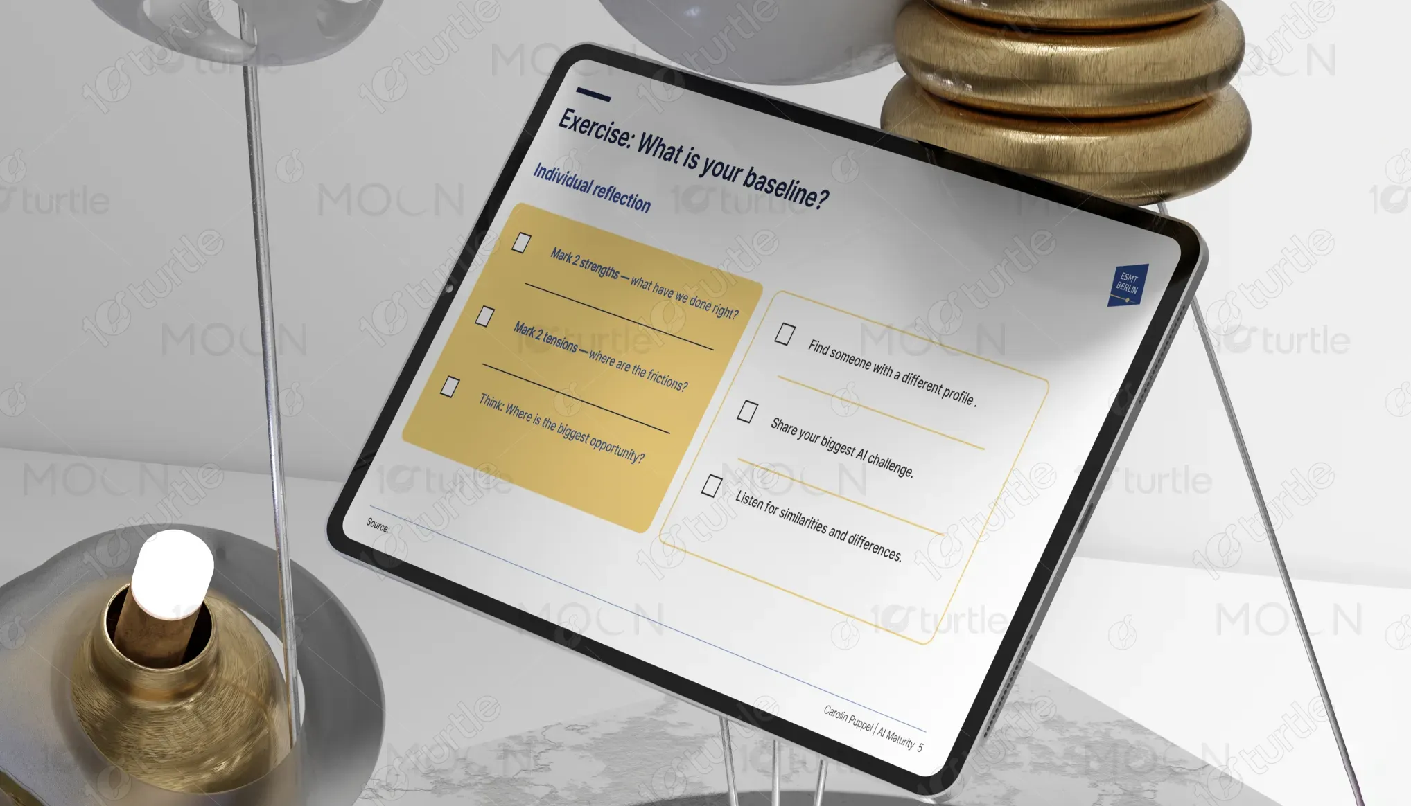
This design concept focuses on delivering a user-friendly and visually striking interface that appeals to the target market’s need for efficiency and clarity. It highlights the core features of the product or service with intuitive navigation and engaging visuals. The design's minimalist approach ensures that users can easily access information while maintaining an elegant and professional look. The functional appeal lies in its responsive design, which adapts seamlessly to various devices, creating a smooth experience across platforms.
Industry
Technology, SaaS & StartupsWhat we did
PPT DesignGraphic DesignPlatform
-A key issue in the market is the over saturation of overly complex interfaces that hinder user experience. Many platforms overwhelm users with cluttered layouts, slow navigation, and non-intuitive elements. These design flaws often lead to frustration and higher bounce rates. Additionally, users frequently struggle with sites that are not mobile-responsive, making the experience disjointed on different devices. This issue affects user retention and engagement, particularly in competitive markets where ease of use is paramount.
The design addresses these issues by focusing on simplicity and user-centric elements. It employs a minimalist approach that reduces visual noise while making the most important features easily accessible. The responsive layout ensures a smooth experience across devices, addressing mobile usability concerns. Interactive elements are carefully placed to guide users through their journey, while intuitive navigation structures eliminate frustration. This approach guarantees that users can easily navigate and interact with the platform, enhancing overall satisfaction.
The long-term vision for this brand/product is to set a benchmark in its industry by continually evolving its digital presence. The goal is to create a lasting impact through innovative design, which not only adapts to trends but also anticipates future user needs. By consistently focusing on seamless user experiences and technological integration, the brand aims to build trust and loyalty among its customers. As the product evolves, it will position itself as an industry leader in user experience and accessibility, ensuring sustained growth and a positive user relationship.

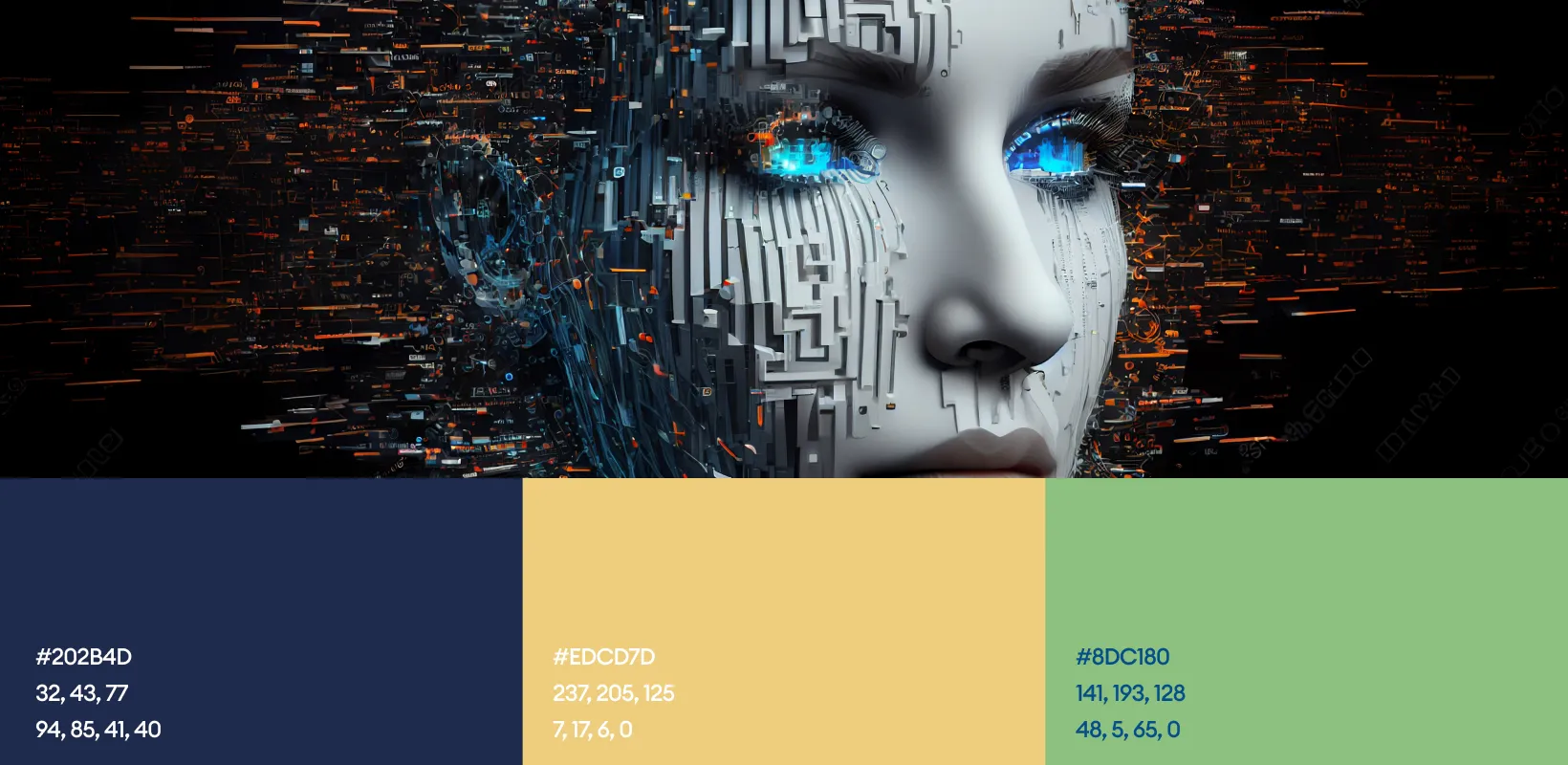
The chosen color palette combines soft grays, whites, and deep blues/teals to create a clean, professional aesthetic. The neutral tones provide clarity and simplicity, while the deep blue/teal evokes trust and stability, aligning with the brand’s identity of dependability. Accents of warm gold or light brown add a sense of luxury and approach ability , creating a welcoming atmosphere. Together, these colors not only enhance the overall design’s sophistication but also evoke emotions of comfort, confidence, and exclusivity, reinforcing the brand's high-quality presence.