Religious Community Event Graphics - Whimsical Design Strategy
Religious Community Event Graphic Design Complete Brand System
This religious community event graphic design project was completed for a local market based organization entering the family event segment. We developed a comprehensive suite of materials that included custom illustration, premium flyer design, digital invitation assets, postcard layouts, a specialized typography system, and a cohesive color palette. The goal was to establish a high level of professional quality that would differentiate this gathering from other local events while maintaining a warm and approachable feel for families. By focusing on a master layout approach, we ensured that the visual story remained consistent across every touchpoint from the initial save the date through the day of the event.
Why Religious Community Brands Need Strategic Design
The landscape for religious community events has shifted significantly as families now have a vast array of high quality entertainment and educational options to choose from. In this competitive environment, the visual presentation of an event serves as the first point of contact and a critical indicator of the care and safety provided by the organization. When a community brand invests in strategic design, it signals to the audience that the experience will be intentional and professional. This builds immediate trust with parents who are looking for wholesome and well organized opportunities for their children. Strategic design helps to elevate the perceived value of the gathering, moving it from a standard church function to a highly anticipated highlight of the annual calendar.
Effective design within this industry solves the challenge of communication by creating a clear hierarchy of information while simultaneously evoking an emotional response. The best brands in this space understand that they are not just promoting a date and time but rather inviting families into a story. By using sophisticated imagery and a refined aesthetic, these organizations stand out against generic and dated clip art often associated with local community groups. This design imperative ensures that the message reaches the target audience with clarity and resonates on a deeper level, encouraging participation and fostering a sense of belonging before the event even begins.
Our Approach to Religious Community Brand Design
Our strategic foundation began with a deep discovery phase to understand the specific dynamics of the father and daughter bond that this event aimed to celebrate. We researched historical and contemporary storybook aesthetics to find a balance that felt both magical and timeless. This research allowed us to move beyond superficial themes and instead focus on the core feelings of wonder and elegance. By understanding the audience expectations for a premium religious community experience, we were able to define a creative direction that prioritized emotional resonance and visual sophistication.
Before any design work began, we established a strategic framework that focused on the concept of enchantment as a bridge for community connection. We made key decisions regarding the level of detail in the illustrations and the mood of the color palette to ensure it appealed to both young daughters and their fathers. This stage of the process involved defining how the brand would communicate its message across various formats without losing its core identity. We focused on the idea of a nature inspired sanctuary where every element felt intentional and cohesive.
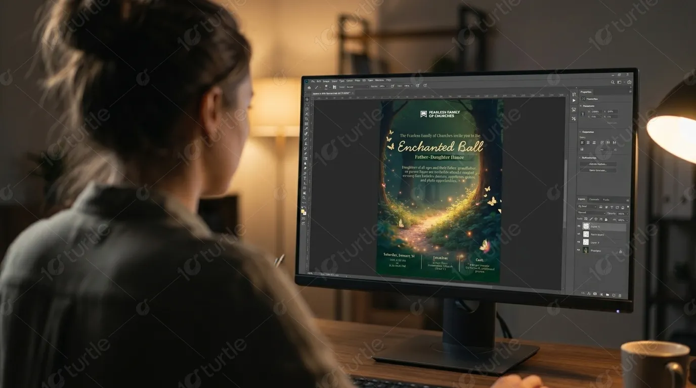
In the execution phase, the strategy was transformed into a visual direction that leveraged soft earthy tones and delicate lighting elements. We focused on the technical aspects of the design to ensure it functioned perfectly in both print and digital environments. The thinking behind the layout was to create a strong central hero section that commanded attention while being framed by decorative elements that added depth and character. This process ensured that the final system was not just beautiful but also strategically aligned with the goals of the organization and the expectations of the attendees.
Building a Religious Community Brand System That Performs
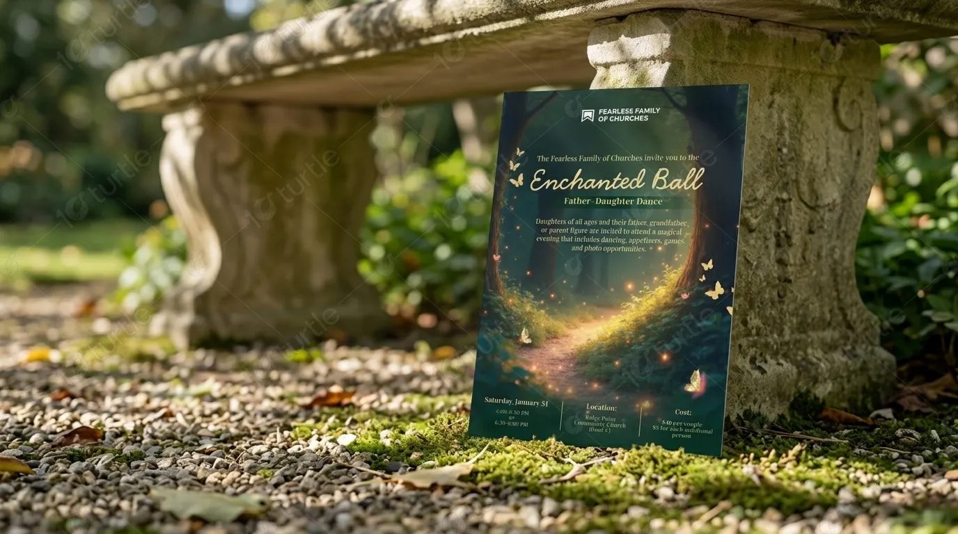
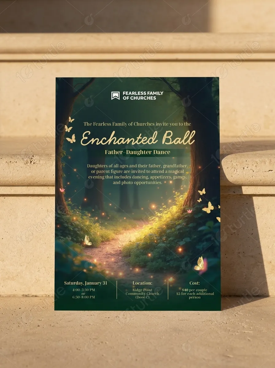
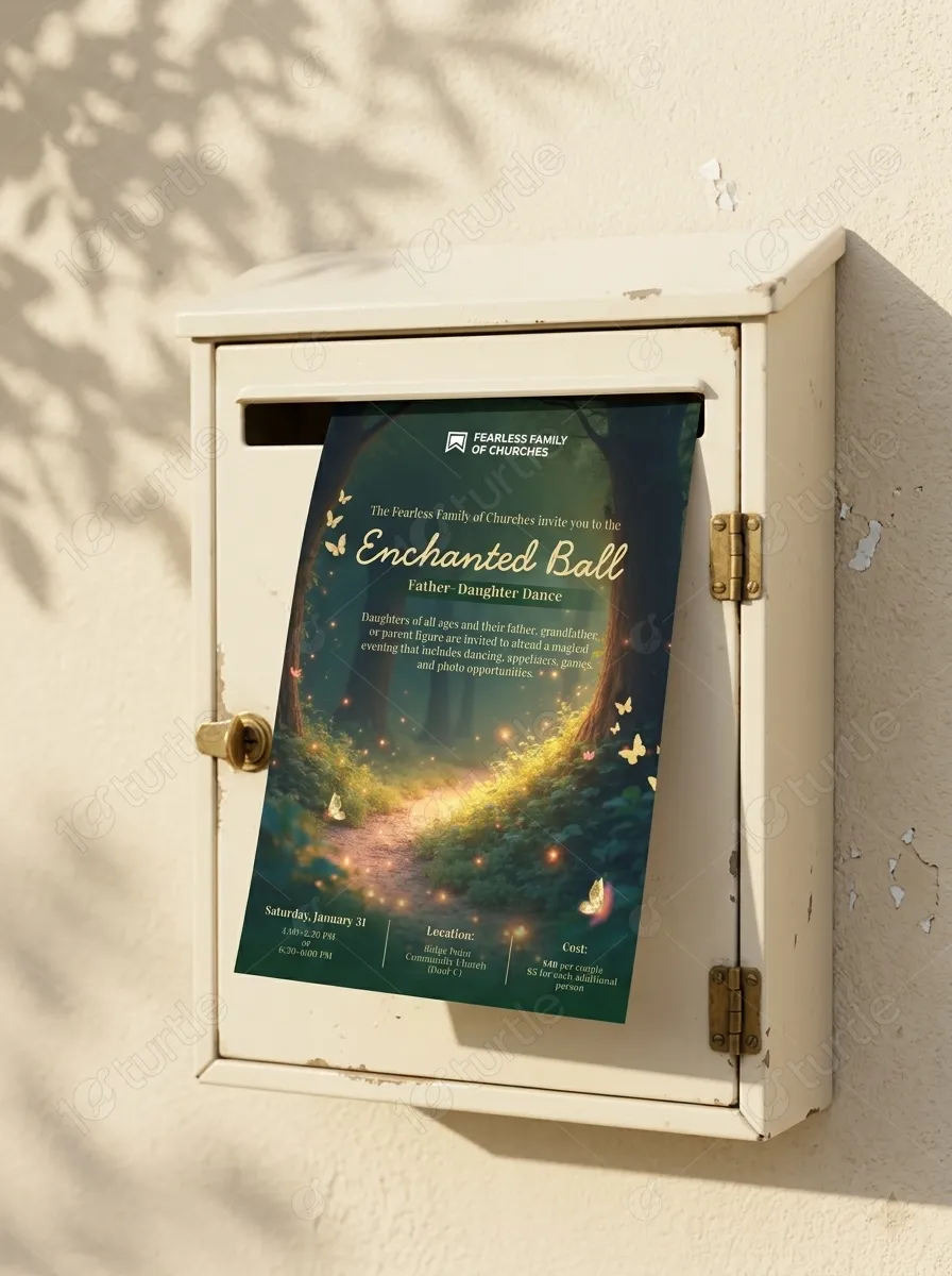
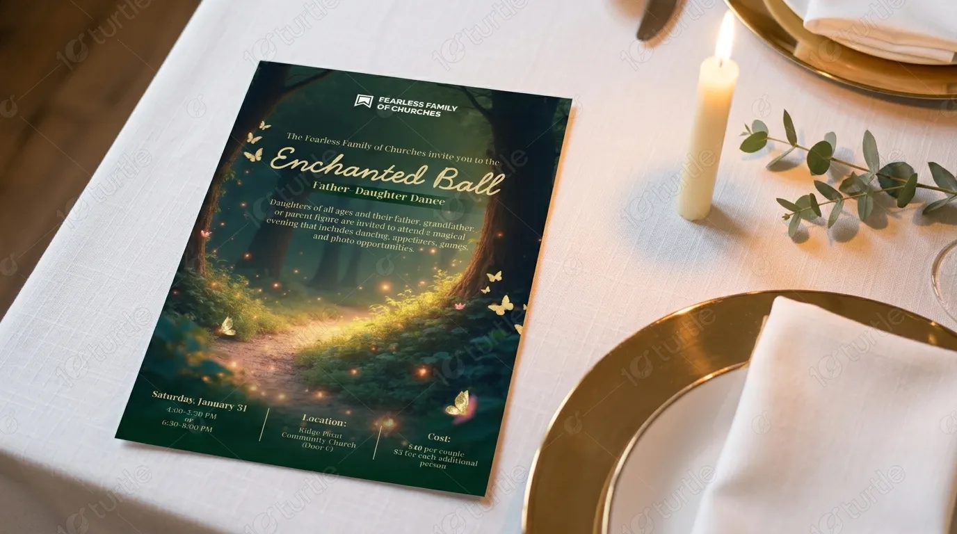
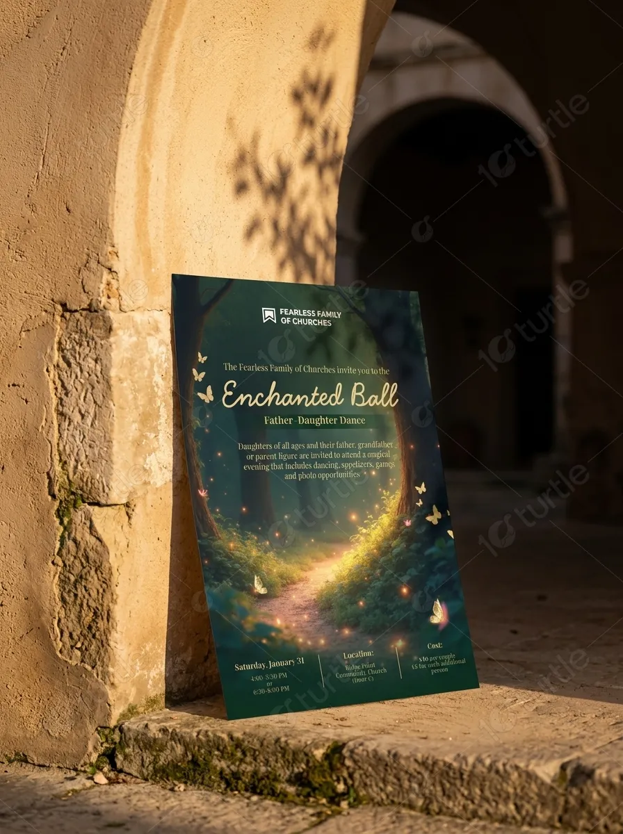
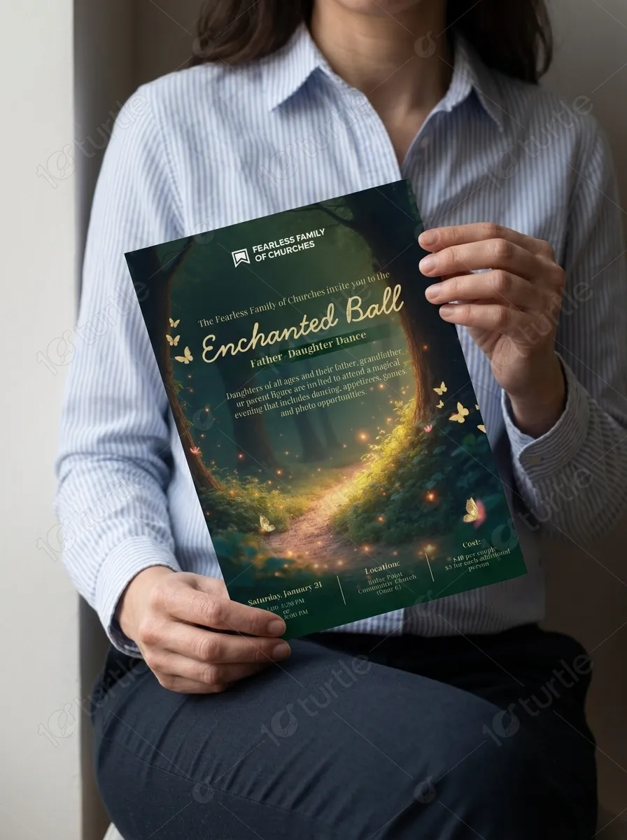
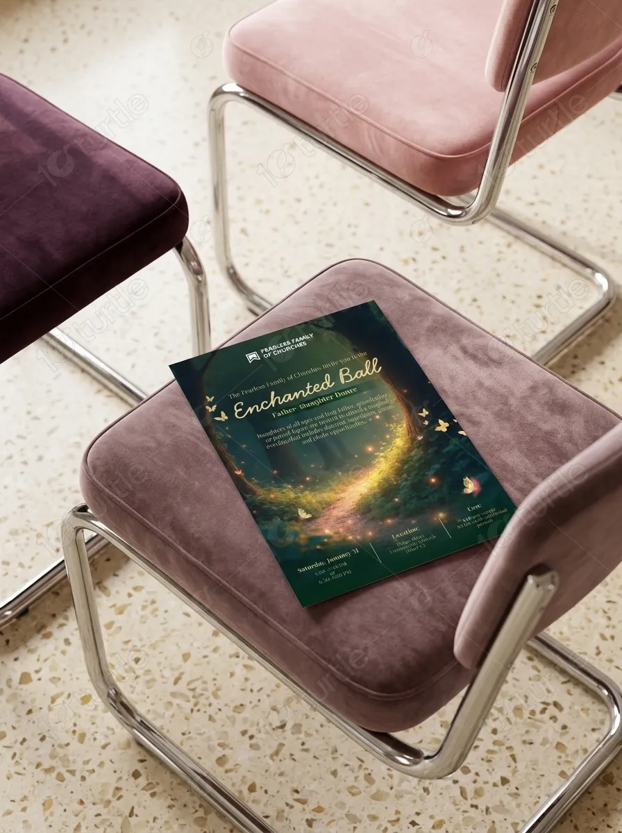
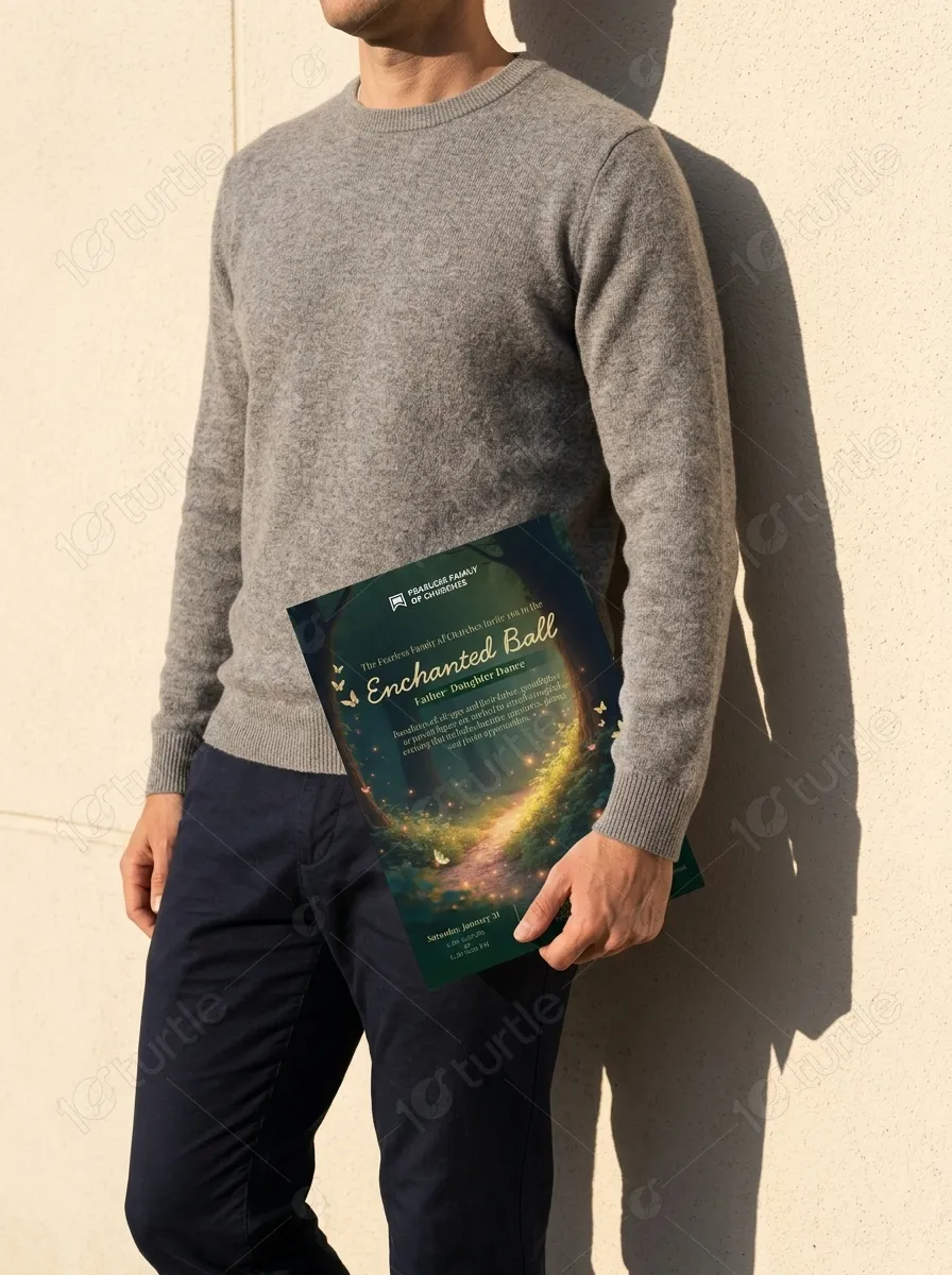
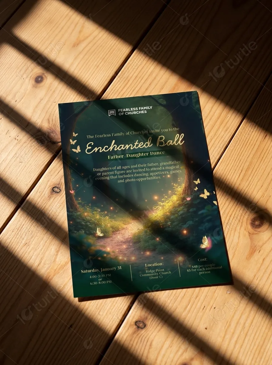
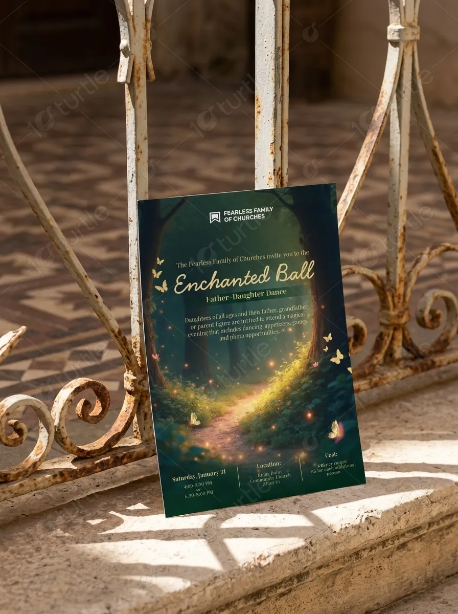
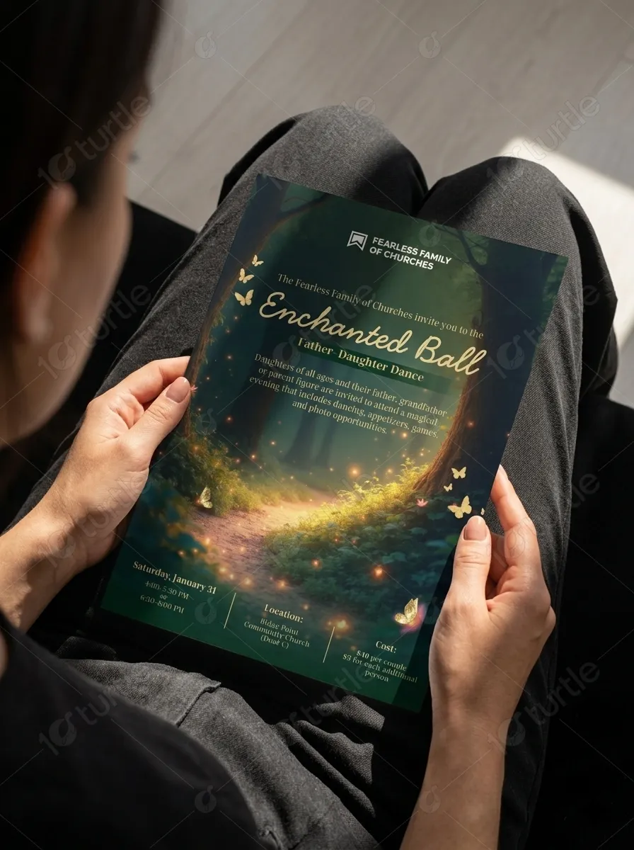
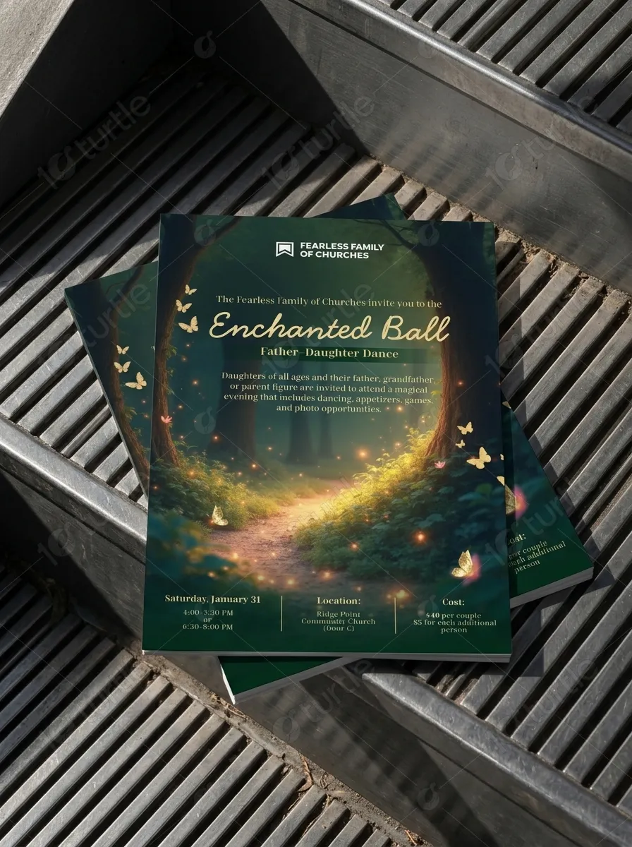
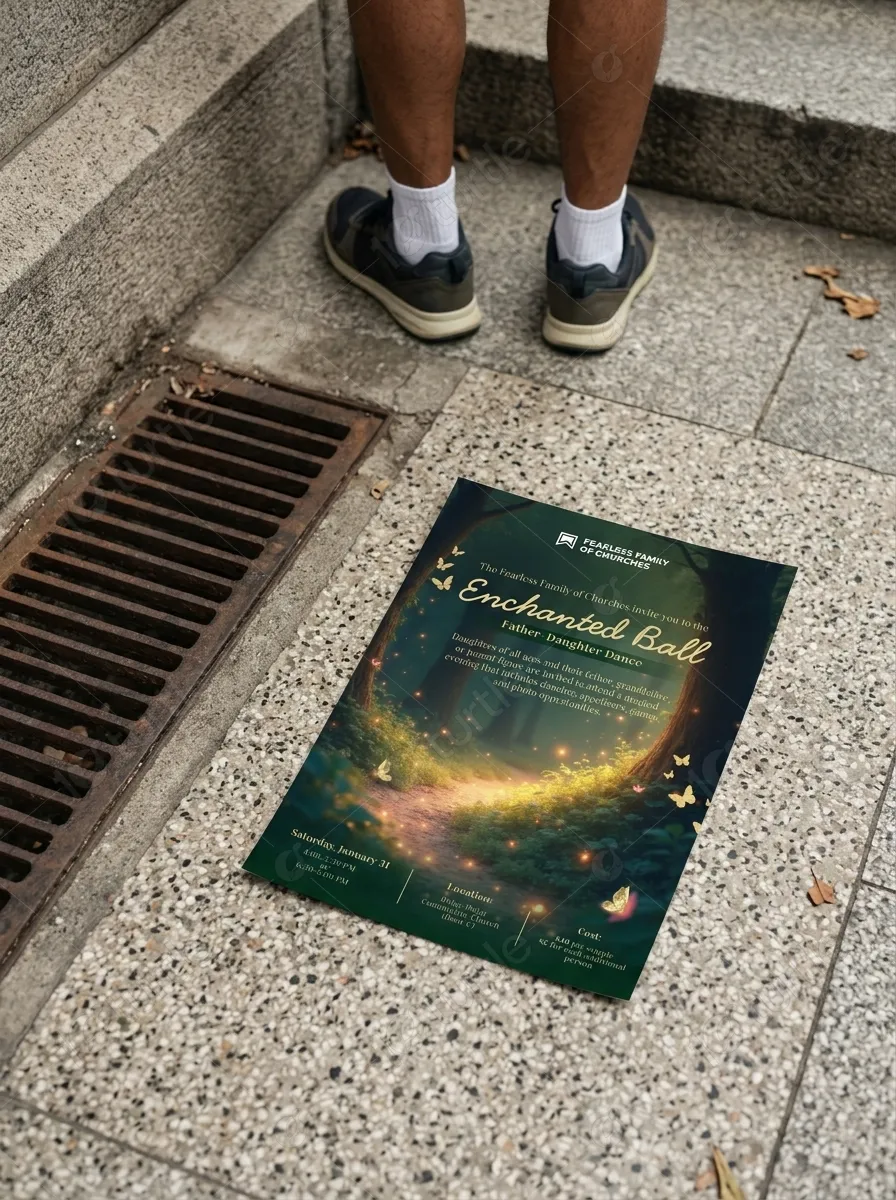
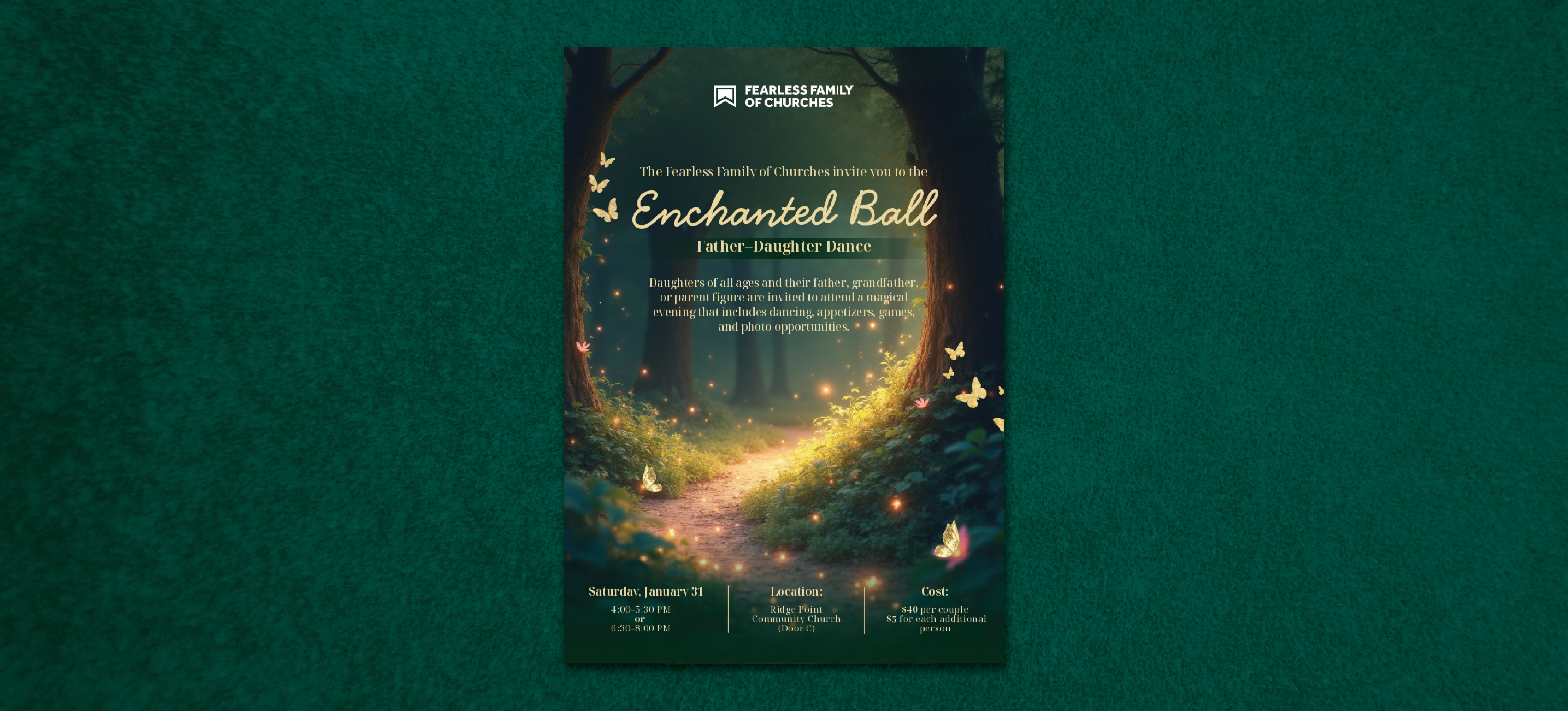
The visual identity was crafted to capture a sense of wonder through a custom forest illustration that felt both whimsical and refined. We avoided overly childish motifs in favor of a sophisticated storybook aesthetic that provided a premium feel for the attendees. This identity serves as the anchor for the entire event experience, creating a recognizable and memorable presence that distinguishes the brand in the local community market. Every element of the identity was designed to support the overarching theme of a magical journey.
For the color and typography system, we selected a palette of muted greens and warm neutrals accented by soft golden highlights. This choice was intended to create a calming yet elegant atmosphere that felt grounded in nature. The typography combined a graceful serif headline for the event name with a clean sans serif for supporting details to ensure maximum readability and a clear hierarchy. This balance of styles allowed for a modern feel that still respected the traditional nature of the community organization.
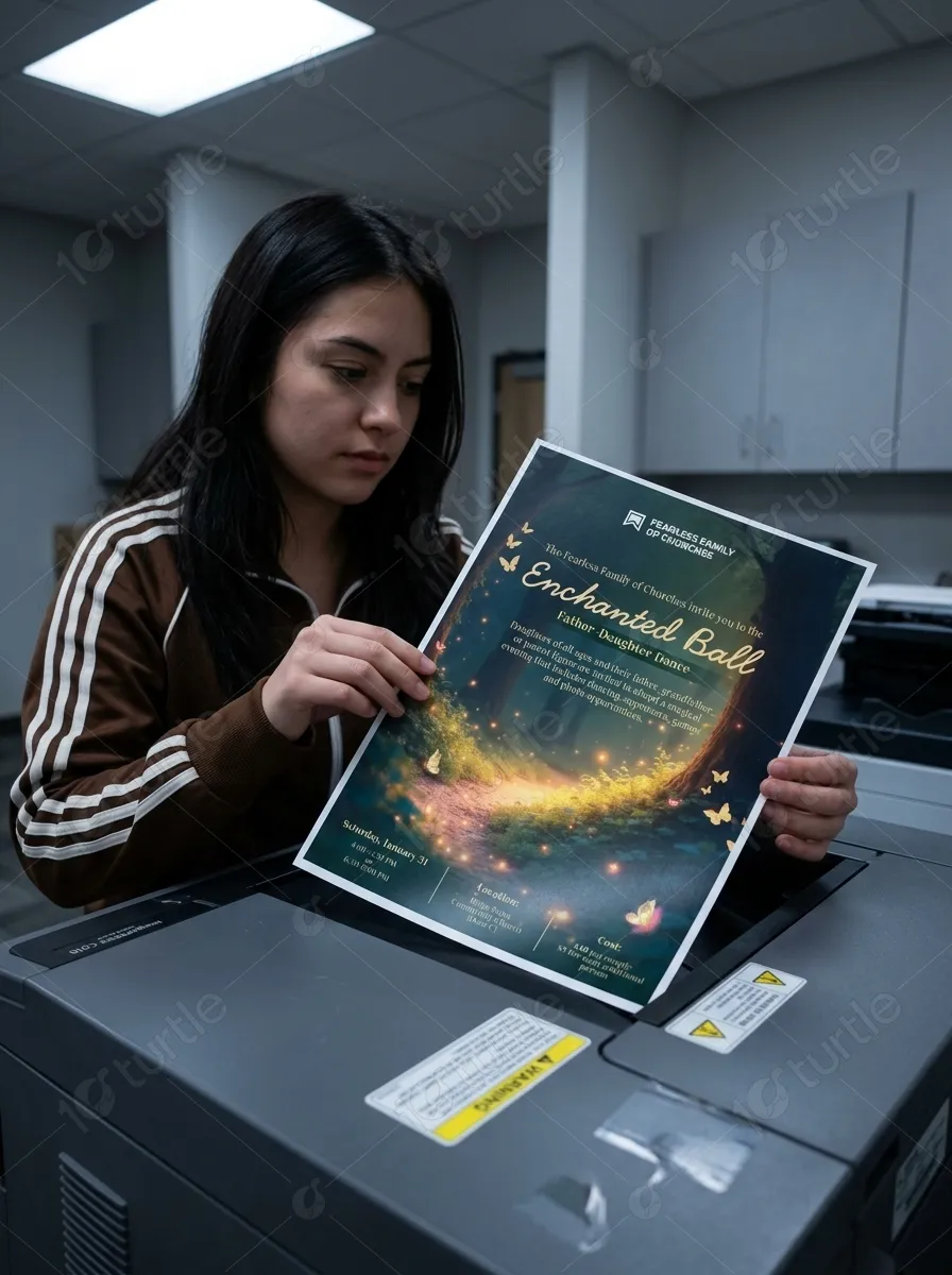
The print and collateral deliverables were developed using a master layout approach to ensure visual continuity across all physical touchpoints. This included high quality flyers, postcards, and event signage that utilized the full range of the color and typography system. Each piece of collateral was designed to be a keepsake, extending the life of the event brand beyond the day of the dance. The use of subtle textures and light flares added a sense of depth to the printed materials, enhancing the overall magical theme.
Digital assets were optimized to maintain the same level of elegance and impact on smaller screens as they did in large format print. This involved creating social media graphics and digital invitations that used the primary hero elements effectively while ensuring text remained legible. The digital system allowed for rapid communication and easy sharing within the community, helping to drive registration and build excitement. By maintaining consistency between the digital and print worlds, we created a seamless experience for every guest.
The Impact of Strategic Religious Community Branding
The implementation of this strategic brand system resulted in a significant increase in community engagement and a higher level of perceived value for the event. By providing a professional and magical visual identity, the organization was able to communicate its commitment to quality and detail. This led to increased ticket sales and positive feedback from families who felt that the event was a truly special experience. The brand system provided a foundation for future events, allowing the organization to maintain a consistent and trusted voice within the community. Looking forward, this design approach has set a new standard for religious community gatherings in the region.
Frequently Asked Questions About Religious Community Brand Design
What does religious community event design include. This service includes the creation of a full visual identity that encompasses logo design, custom illustration, and a typography system. It also covers the development of various print materials such as flyers, postcards, and signage along with digital assets for online promotion. The goal is to create a cohesive look that spans all marketing and day of event materials.
How much does religious community branding cost. The cost of a branding project for this industry depends on the scope of deliverables and the complexity of the custom creative work required. Agencies typically provide tiered pricing or custom quotes based on the specific needs of the organization and the level of strategy involved. Investing in professional design ensures a higher return through increased participation and brand trust.
How long does religious community brand design take. A comprehensive event branding project usually takes between four to eight weeks from discovery to final delivery of assets. This timeline allows for deep research, strategic development, and multiple rounds of creative refinement to ensure the final product meets all goals. Planning well in advance of the event date ensures a smooth rollout of marketing materials.
Why is custom illustration important for religious community brands. Custom illustration provides a unique and proprietary visual language that generic stock imagery cannot match. It allows the brand to tell a specific story that resonates with its unique audience and values. This level of customization builds a stronger emotional connection and helps the organization stand out in a crowded market.
How do I choose a branding agency for my religious community business. You should look for an agency that demonstrates a strong understanding of community dynamics and has a portfolio that shows a range of refined, strategic work. It is important to find a partner that values storytelling and can balance professional quality with a warm, approachable tone. A good agency will focus on your long term goals rather than just delivering a single flyer.
More Brand Identity Work
Our agency specializes in creating meaningful visual systems that help community organizations grow and connect with their members. We invite you to explore our portfolio of print design and visual identity projects for various sectors. Whether you are launching a new community initiative or rebranding an established religious organization, our strategic approach ensures your message is heard. Each case study demonstrates our commitment to high quality design and measurable results for our clients.
Related Categories
Religious Events, Graphic Design, Event Branding, Print Design, Illustration, Community Outreach, Family Events