
Visual Identity
Brand Strategy
Brand Guidelines
Overview
We designed a premium visual identity system and cohesive brand guidelines for Vertex, a technology executive coaching consultancy. The system uses a high-contrast palette of deep slate and electric cobalt blue to capture both scientific rigor and elite visionary guidance. The resulting brand provides a powerful platform for modern leadership development.
The Challenge

The client operated with a fragmented, generic visual brand that failed to resonate with analytical technology founders and C-suite leaders. Inconsistent slide decks, uninspired typography, and a lack of a strong visual system diluted their professional credibility, making it difficult to justify premium advisory rates.
The Solution
We developed a structured, tech-forward visual identity that pairs a high-contrast editorial serif font with an absolute geometric layout grid. By designing a custom monogram, robust slide templates, and premium business cards with edge-painted finishes, we created an image of undeniable executive authority.
The Impact
The new visual identity immediately unified the consultancy's presence across all digital and physical touchpoints, increasing client onboarding efficiency. The professional look and strategic design system allowed Vertex to securely command premium retainer rates, establishing them at the peak of the market.
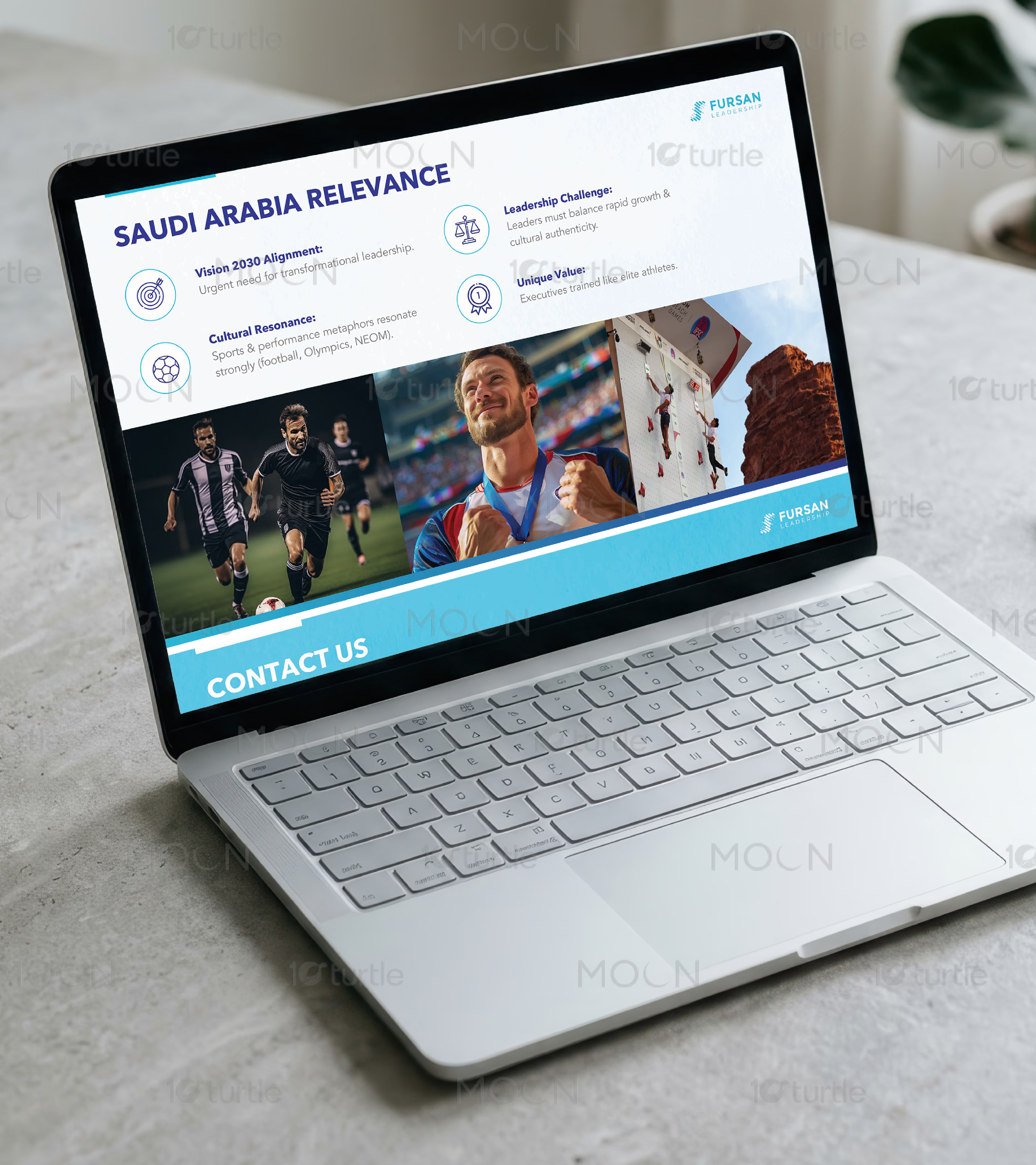

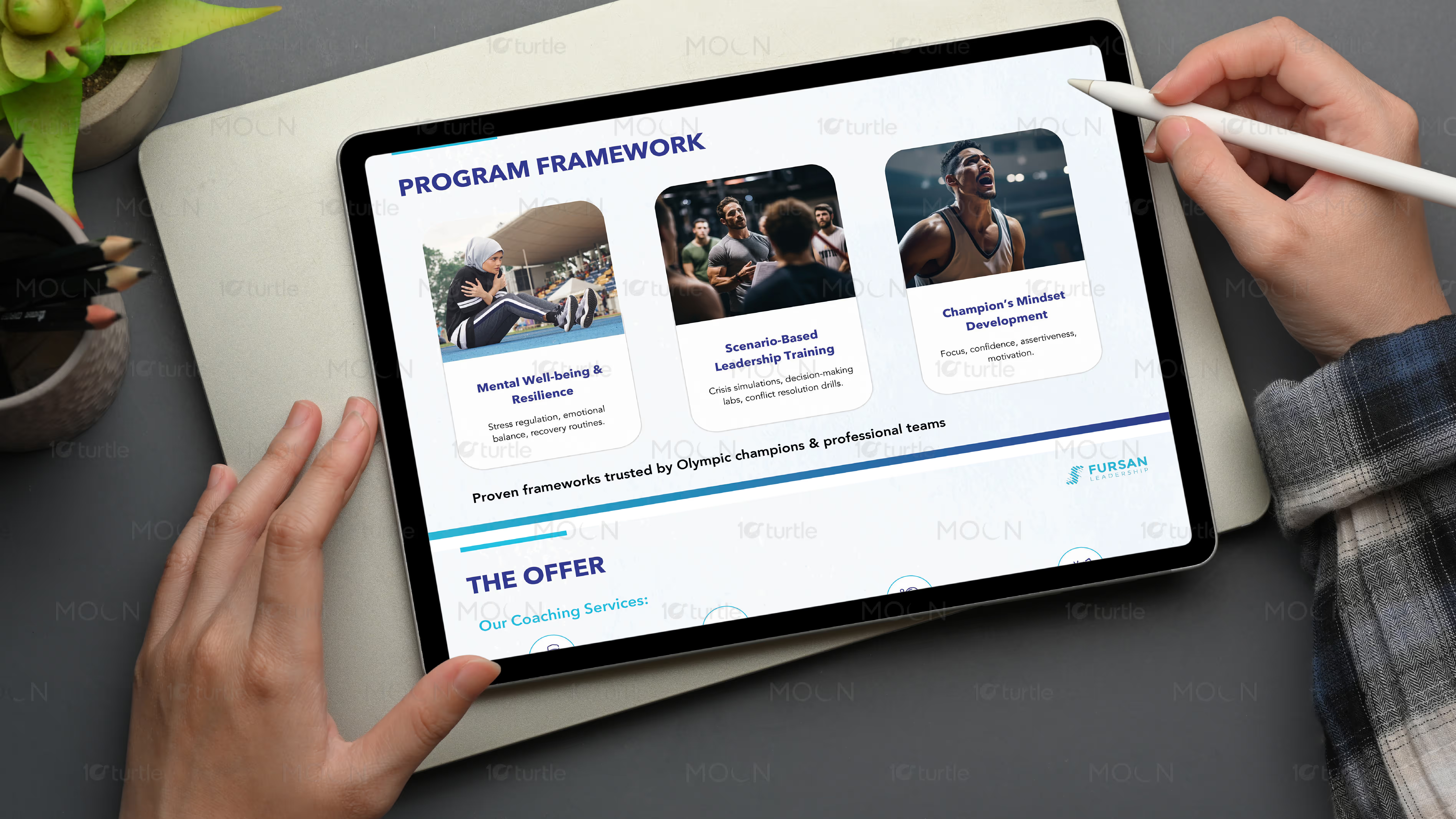


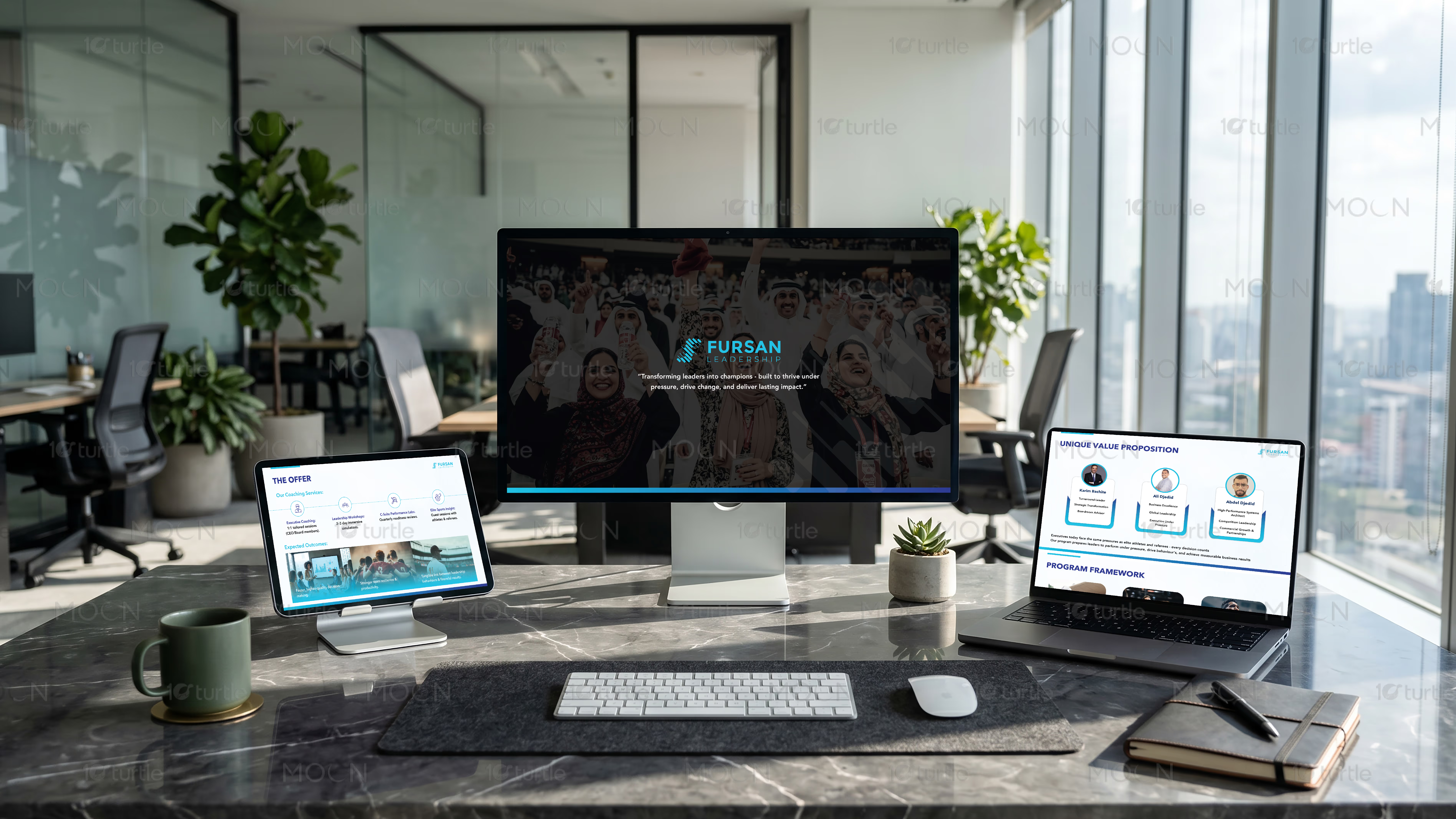
Executive coaching thrives on deep trust and intellectual clarity. For an elite technology executive coaching practice, visual identity design is not merely decorative; it is the physical and digital translation of leadership capability. A high performance brand system must communicate sophisticated expertise, high cognitive performance, and modern authority at a glance. In this project, we designed a comprehensive executive coaching visual identity centered on these exact principles, establishing a cohesive design system that positions the coach as an indispensable partner to top-tier technology founders and executives.
The foundation of our design strategy began with an in-depth exploration of how visual communication influences executive decision-making. High-level corporate leaders, venture capitalists, and technology executives interact with thousands of interfaces daily. They are trained to spot low-value signals instantly. A generic, template-driven coaching brand with soft pastel gradients or cliché motivational icons immediately signals amateurism. To break through this noise, we crafted a high-contrast visual identity for Vertex that balances the intellectual depth of classic editorial publishing with the clean, energetic precision of modern technology platforms.
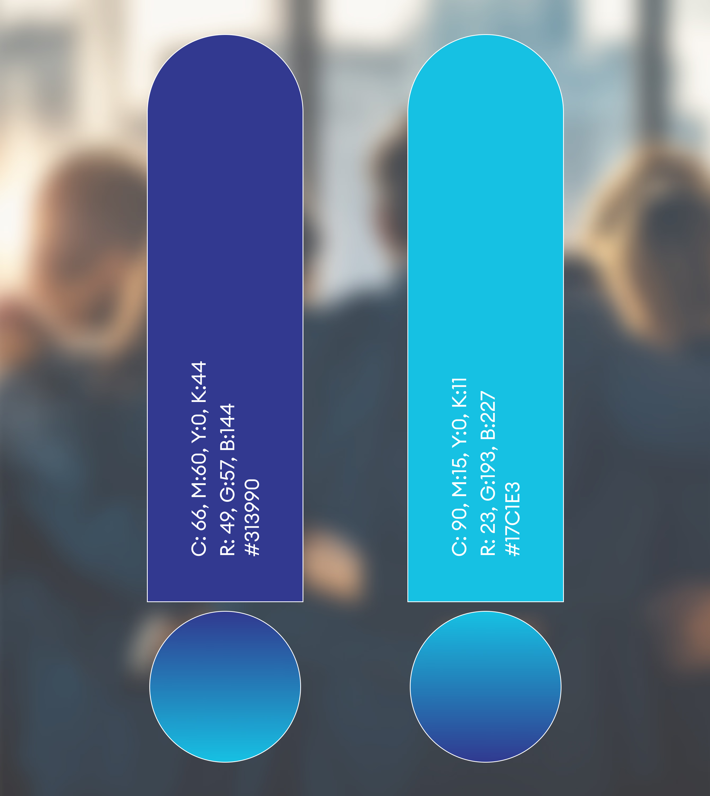
The color system we designed reflects this balance of intellectual authority and technological energy. We chose a commanding primary palette of deep charcoal and midnight black to anchor the brand, establishing an immediate sense of gravity, seriousness, and premium positioning. Instead of relying on standard corporate blues, we introduced an ultra-vibrant electric cobalt blue as the core accent color. This neon highlight provides an energetic spark that represents technological innovation, fast-paced performance, and breakthrough strategic insights. To complete the palette, we incorporated refined platinum and metallic silver tones, which add a sophisticated, premium finish to both physical stationery and digital slide decks.
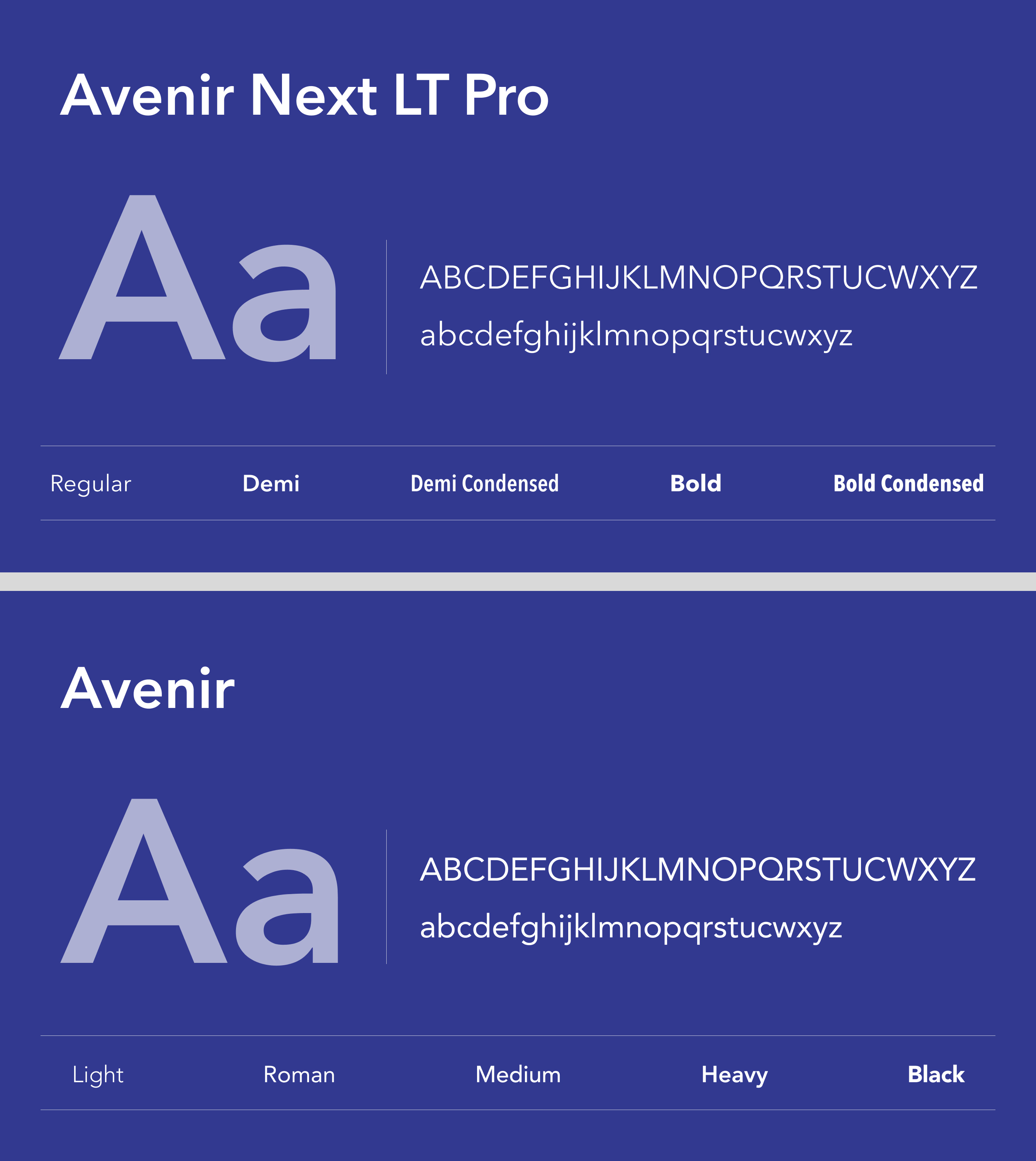
Typography is the voice of any brand identity, and for an elite leadership coach, that voice must sound both highly intellectual and forward-looking. We established a dual-typeface typographic system that pairs a razor-sharp, high-contrast serif with a clean, low-contrast geometric sans-serif. The editorial serif is utilized for primary headlines, pulling inspiration from classic financial journals and luxury editorial design to convey wisdom, legacy, and analytical depth. For body copy, technical data, and system labels, we selected a highly readable, geometric sans-serif that speaks to efficiency, software interfaces, and modern technology frameworks. This juxtaposition ensures that the brand feels both timeless and innovative.
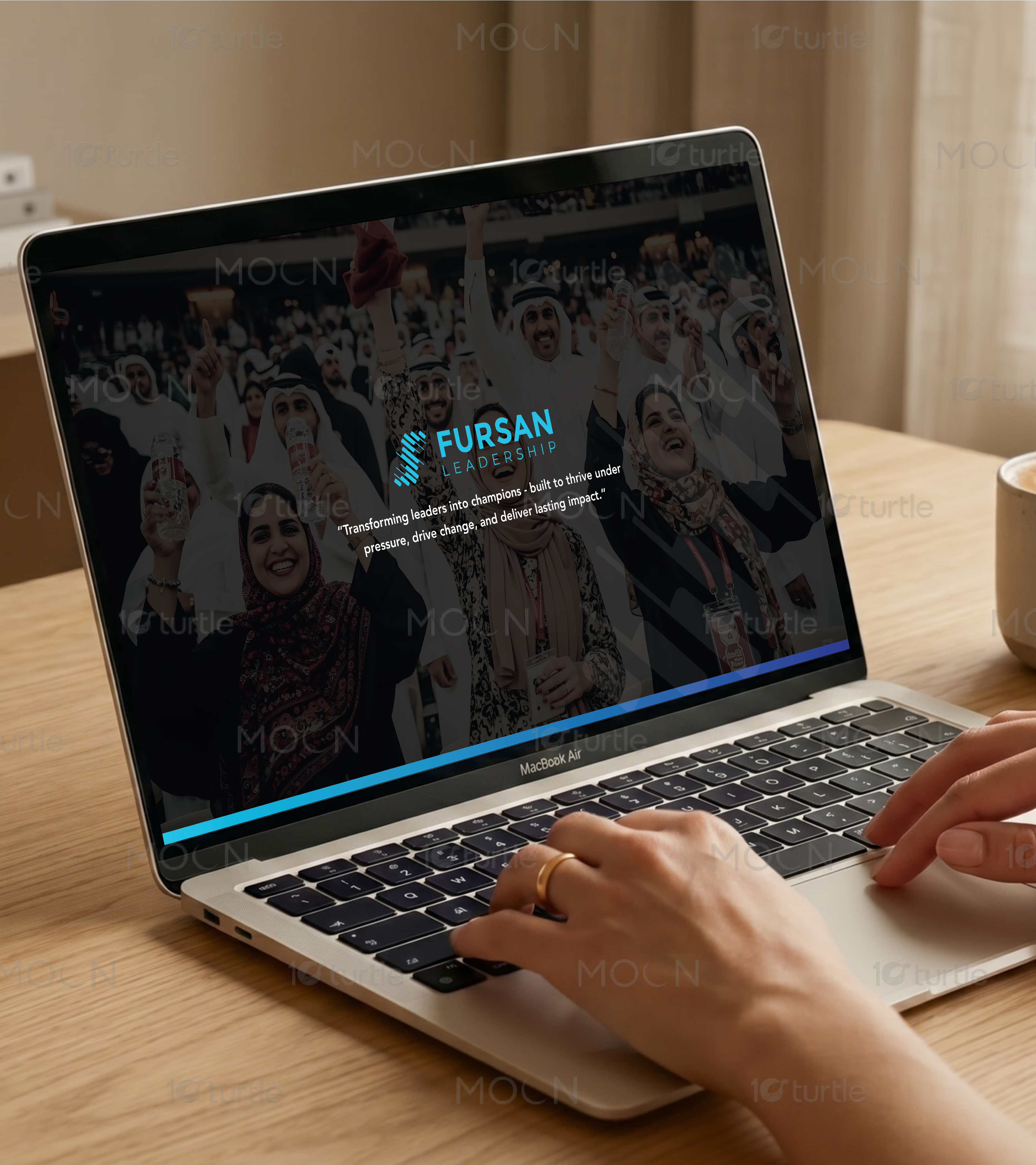
A key deliverable in this visual identity system was the architecture of the primary brandmark. Moving away from traditional coaching motifs like compasses, trees, or stepping stones, we designed a minimalist, geometric monogram. The mark is built on a precise isometric grid, forming an abstract representation of upward trajectory and strategic alignment. The sharp, structural lines of the emblem reflect analytical thinking and mathematical precision, matching the high-IQ mindset of tech founders and C-suite leaders. This monogram is engineered to scale flawlessly, from a favicon on a mobile screen to an embossed gold stamp on premium cotton business cards.
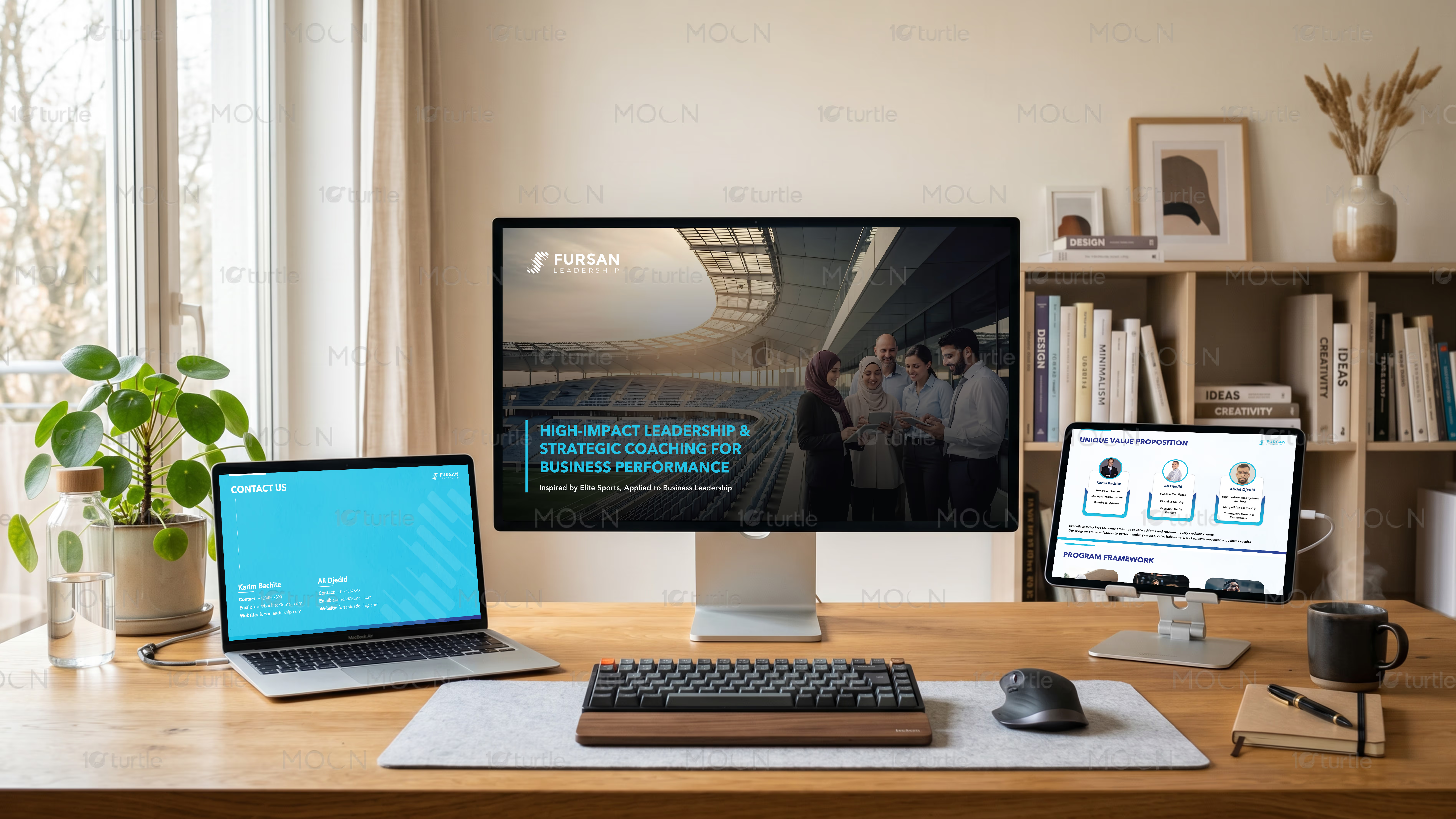
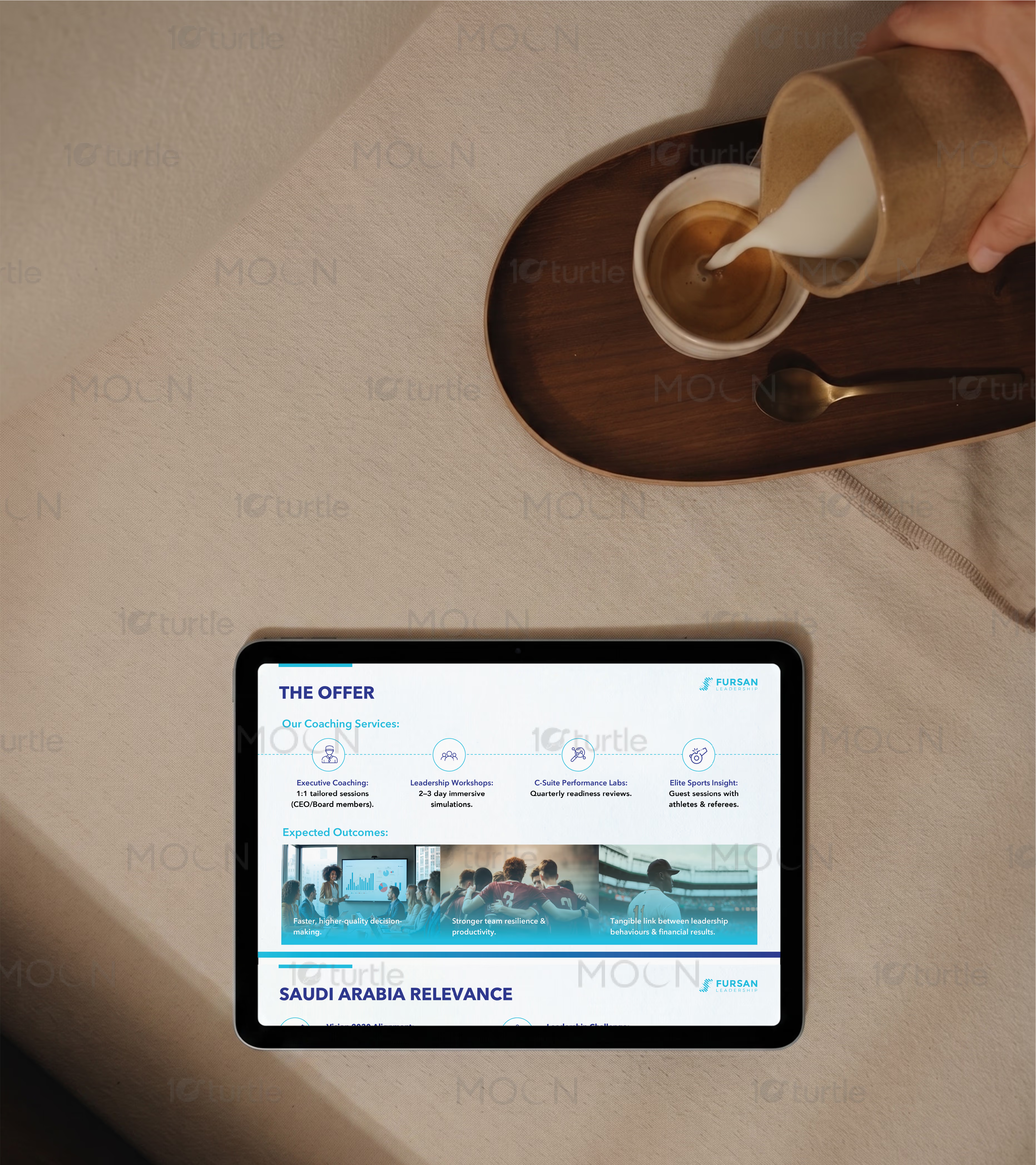
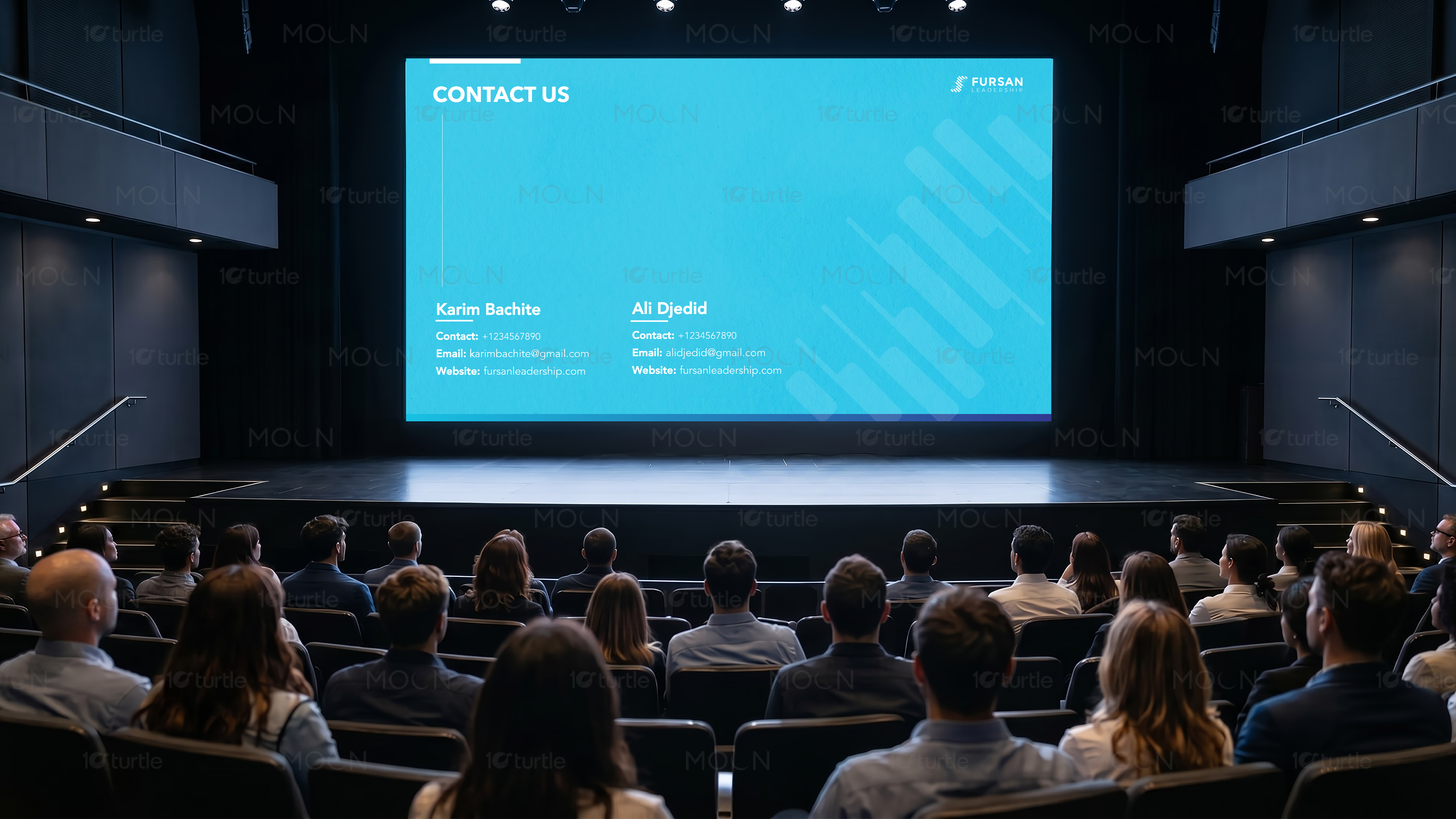
To ensure the new visual identity could be easily deployed across various media touchpoints, we developed an extensive digital and physical collateral suite. For an executive coach, slide presentations and digital whiteboards are critical tools of the trade. We designed a comprehensive library of custom presentation templates in a widescreen aspect ratio. These templates utilize the deep dark background strategy to reduce eye strain during long-form strategic workshops while maintaining a strict grid system that beautifully frames complex frameworks, matrices, and text-heavy slide layouts.
Physical touchpoints are equally vital for offline networking and high-level trust building. We designed custom-crafted stationery, including heavy-weight, triple-ply business cards with a deep-charcoal core and edge-painted details. Letterheads and executive report folders were specified on premium uncoated cotton stocks to provide a tactile, high-end experience that digital screens cannot replicate. This deliberate focus on physical materials reinforces the premium nature of the coaching services and commands attention in the physical office space of a busy corporate executive.
Ultimately, this executive coaching visual identity design bridges the gap between expert human coaching and cutting-edge corporate strategy. By prioritizing high-performance visuals, meticulous typographical hierarchy, and tactile material specifications, we built a brand system that stands out in the technology consulting landscape. The resulting visual system provides Vertex with a powerful business tool that commands premium rates, simplifies sales conversations, and projects unquestioned authority from the very first impression.
executive coaching visual identity
leadership brand identity design
technology executive branding
corporate visual identity design
executive coach brand strategy
premium brand guidelines