Microsurance is Europe’s first regulated crypto insurance provider, offering tailored protection to blockchain companies and crypto assets. The brand is built on trust, expertise, and security—helping businesses mitigate risks in the fast-evolving decentralized space.
UX Design
UI Design
Websites Design
Industry
Finance, Legal & Insurance
Tools we used

Project Completion
2024
The project’s goal was to design a clean, intuitive, and trustworthy landing page that communicates Microsurance’s value clearly to potential clients. The client needed a site that could establish credibility, educate users on their offerings, and convert interest into action.

Industry
Finance, Legal & InsuranceWhat we did
User ResearchUI UX DesigningPlatform
-In the blockchain space, risk is high, trust is fragile, and education is critical. Existing insurance providers were either too generic or lacked the technical understanding of blockchain-specific vulnerabilities. Microsurance wanted to position itself as the go-to solution in this niche, but lacked a digital presence that reflected its domain authority and credibility.
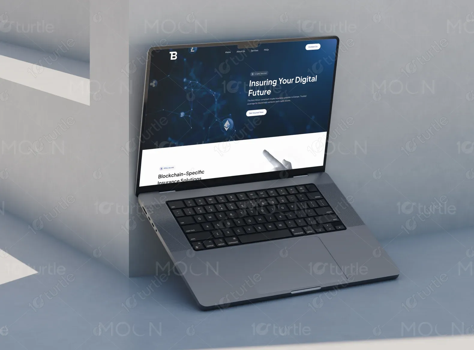
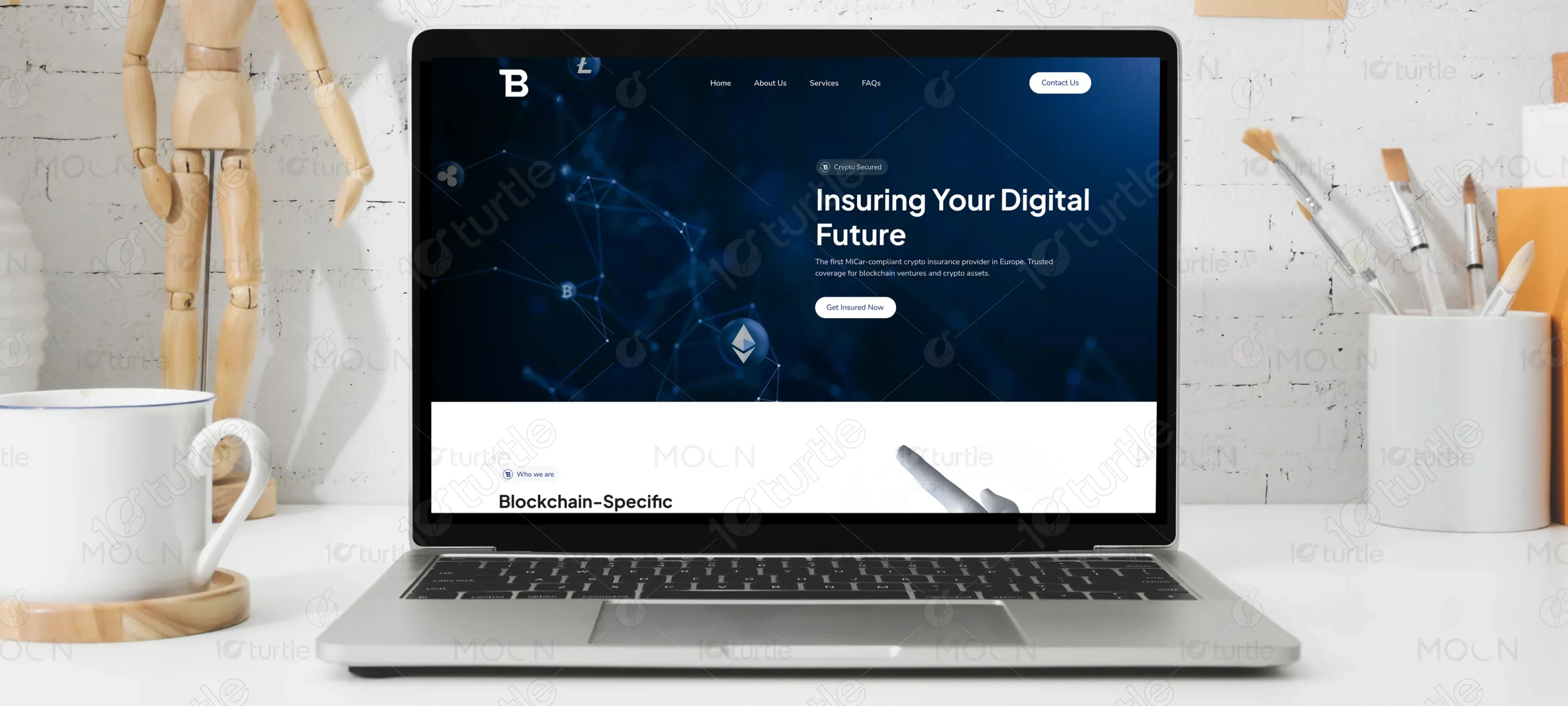
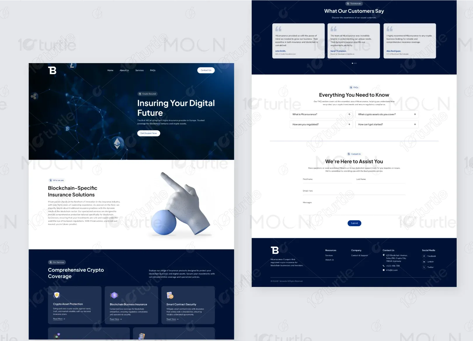
We designed a professional and structured landing page that clearly segments services for blockchain businesses, ensures easy navigation through strong visual hierarchy, and builds trust with testimonials, FAQs, and a secure aesthetic. Strategic CTAs guide users toward action, while the overall layout balances clarity and authority in this complex domain.

The client envisioned a modern, corporate-tech aesthetic that evokes trust, innovation, and safety. Inspirations were drawn from crypto-native brands like Chainalysis, Ledger, and Sandy (for the dark, immersive first-fold). They requested the integration of subtle blockchain-inspired patterns and a calm, secure color scheme.

The logo features a modern sans-serif "B" icon paired with clean typography. It symbolizes blockchain solidity, clarity, and bold leadership in the emerging insurance sector. The minimalist approach enhances professional appeal and recognizability.

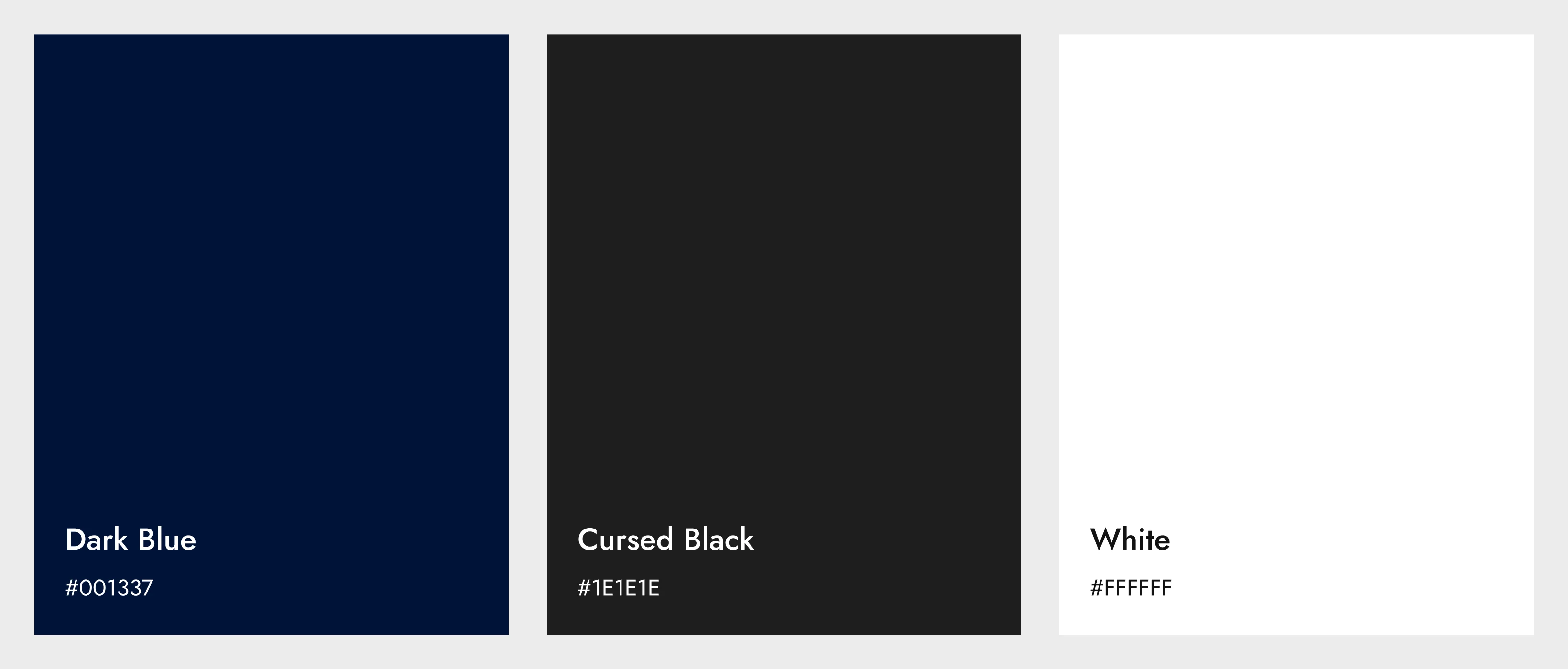
The color palette combines dark blue for trust and professionalism, white for clarity, and secondary tones like soft blue, accent purple, and neutral gray to bring calmness, modernity, and structure. Together, these colors reflect digital security, precision, and innovation.
The initial wireframes prioritized simplicity and clarity, featuring a bold hero section with a strong CTA, a modular grid layout for easy service scanning, strategically placed testimonials for social proof, and a bottom-placed contact form to reduce friction for high-intent users.