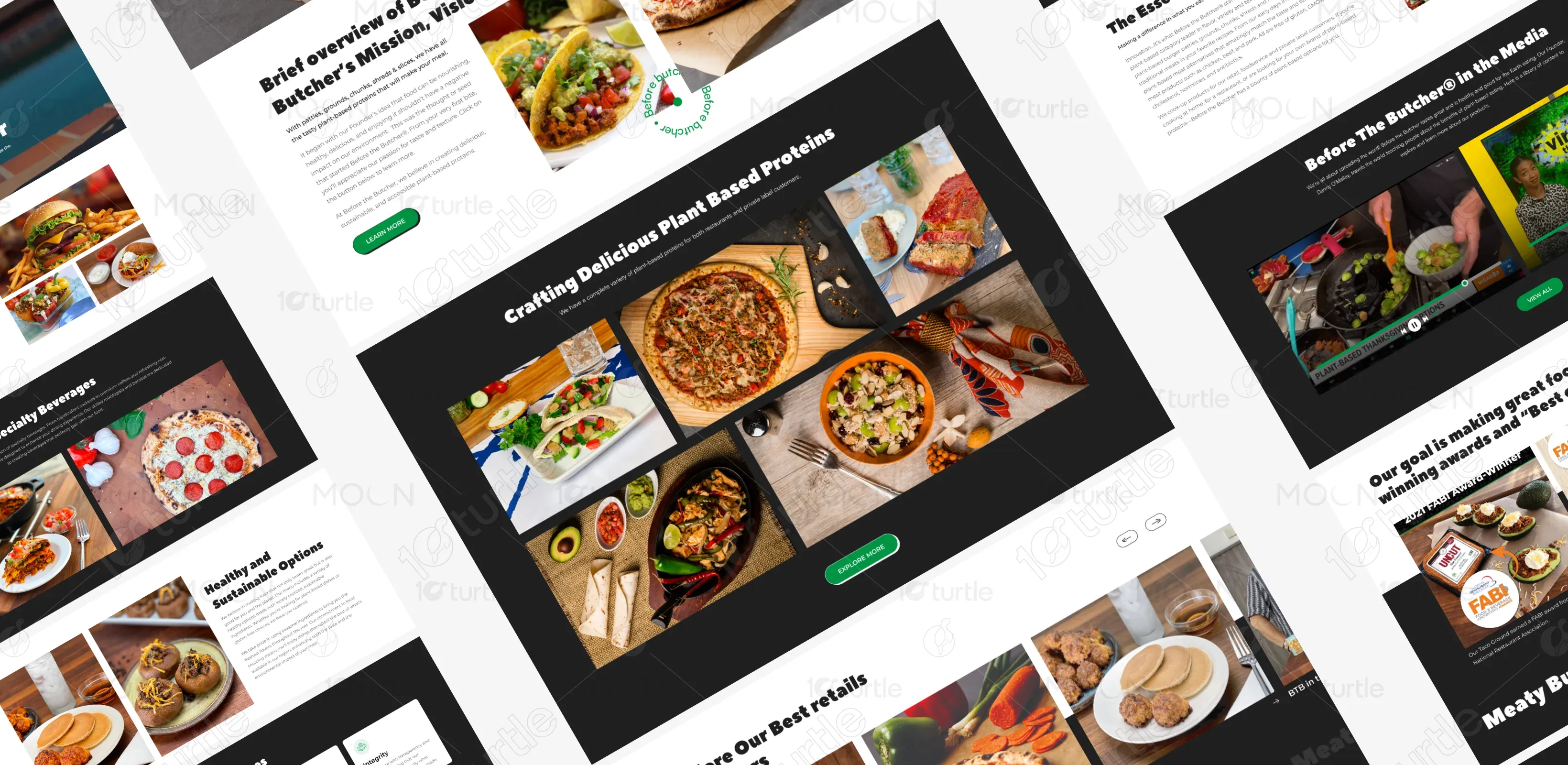
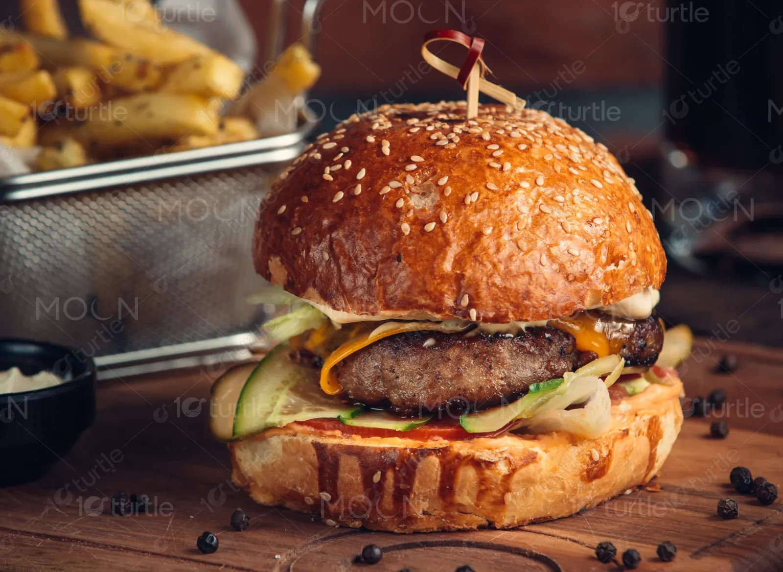
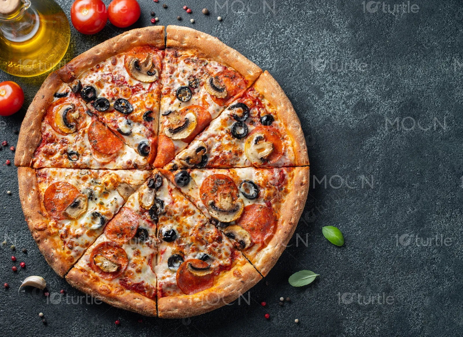
Before the Butcher (BTB) is a pioneer in the plant-based meat industry, providing a full range of protein-packed alternatives that taste and look like traditional meat products. From pepperoni pizza to gourmet burger patties and taco fillings, BTB aims to offer nutritious, delicious, and sustainable options for all eaters.
UX Design
UI Design
Research
Websites Design
Industry
Food
Tools we used


Project Completion
2024
The client needed a bold, engaging website that would reflect their mission, showcase their wide variety of plant-based products, and appeal to both retail consumers and food service clients. The site needed to communicate sustainability, quality, and brand values while guiding users toward product exploration and contact.
Industry
FoodWhat we did
User ResearchUI UX DesigningPlatform
-As plant-based options become more competitive, BTB's old web presence lacked the vibrancy and clarity to stand out. It didn’t sufficiently showcase their expansive range of offerings or communicate their bold brand personality and values.
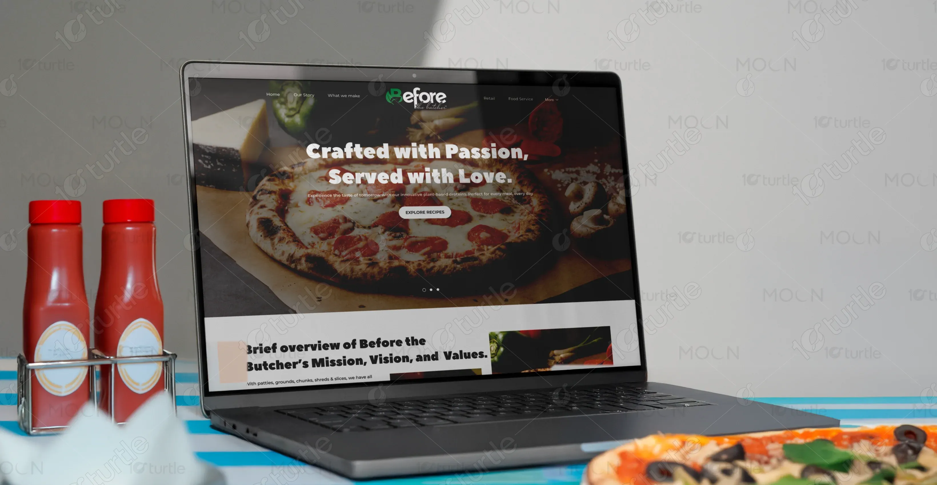
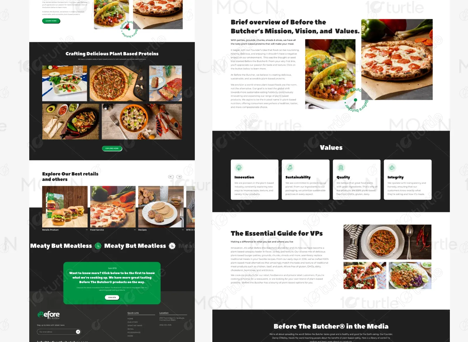
We developed a high-impact, visually rich website with a bold black-and-green color scheme, large food visuals, and friendly typography. The user journey emphasizes trust, education, and product exploration. Highlighted sections such as “What We Make,” “Food Service,” and “Join BTB” were built to engage both B2B and B2C users.
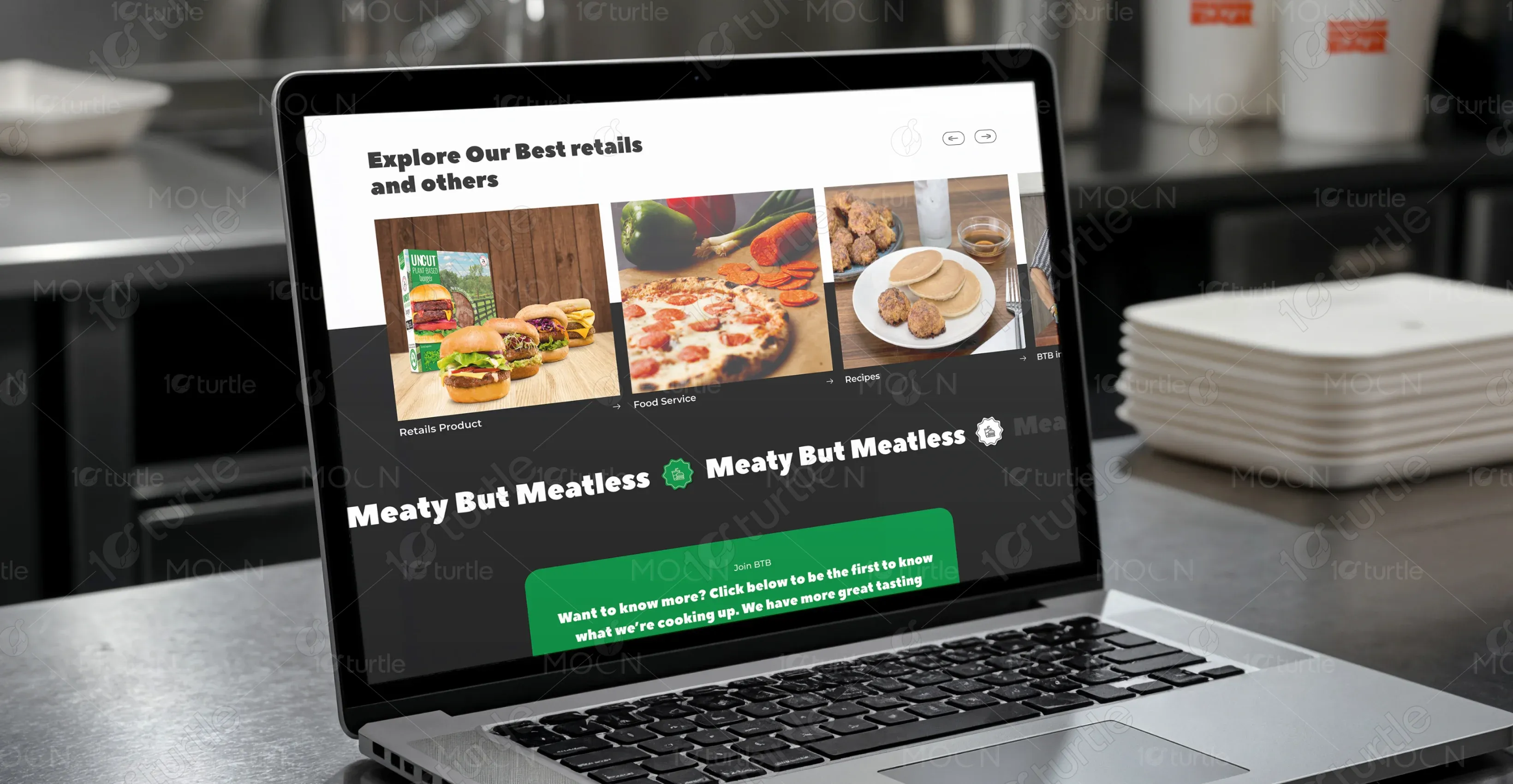
The client wanted a website that felt modern, energetic, and flavorful. Their vision included large imagery of delicious food, punchy messaging, and a confident color palette. They wanted to emphasize the message: "Meaty but Meatless," and make their values (Innovation, Sustainability, Quality, Integrity) clear and prominent.
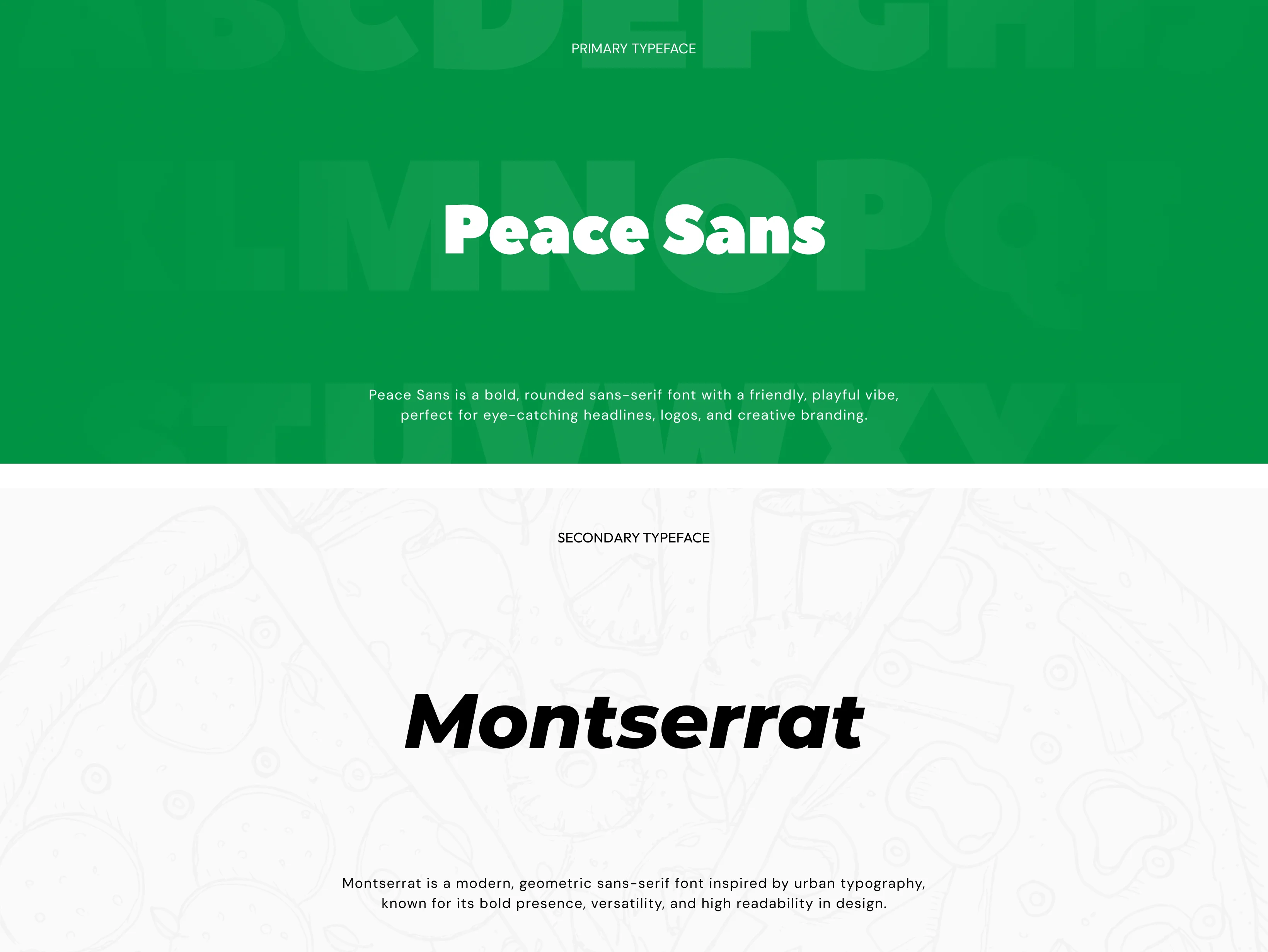
The logo is a combination of a green leaf and bold text that captures the essence of plant-based nutrition with personality. It reflects freshness and boldness while maintaining a playful tone.
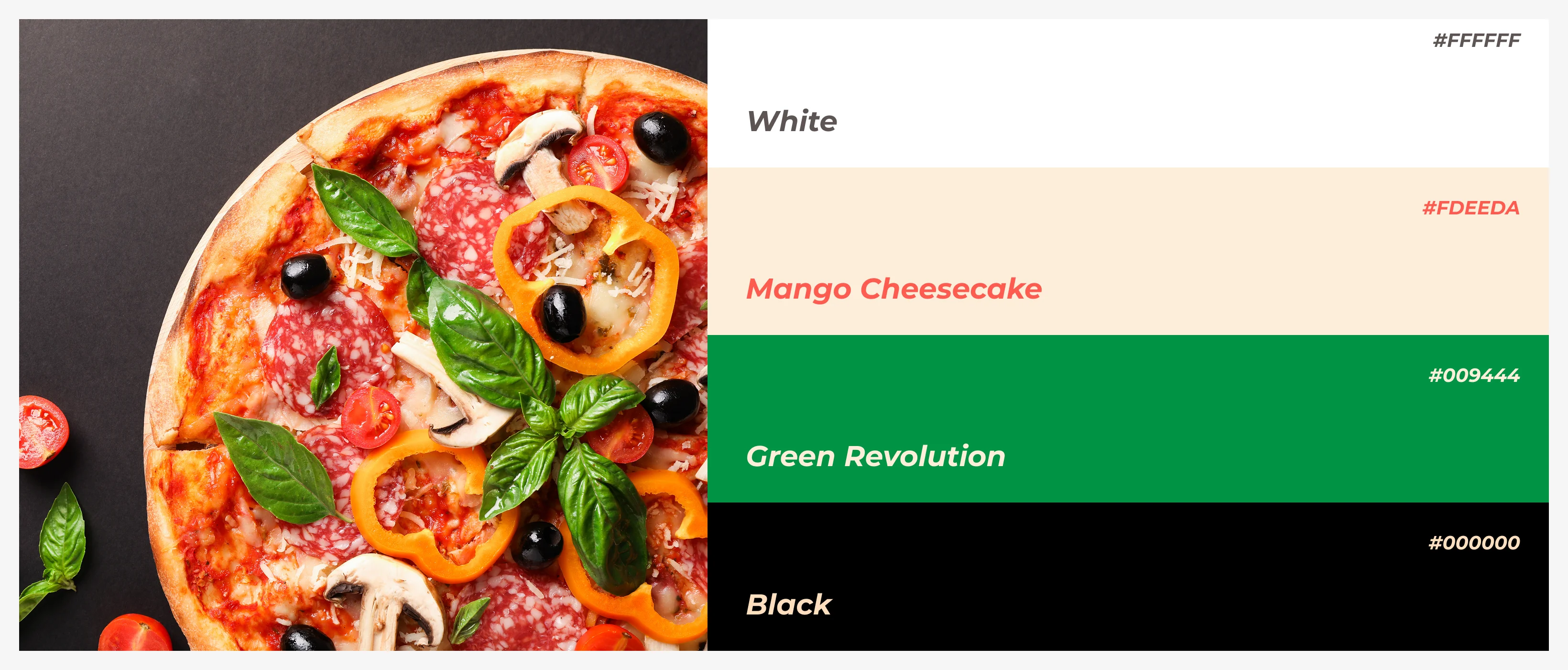
The site features a bold and appetizing palette, Primary : #000000, Secondary : #00B050, Pure White : #FFFFFF, Accent: #FFA500 (Warm Orange), Light Gray : #EEEEEE. These colors evoke health, energy, and confidence while highlighting food imagery effectively.
Wireframes were designed to prioritize clarity, accessibility, and conversion. Each section was planned to guide users toward actions: learn more, explore products, or get in touch. Consistent spacing, callouts, and image placement supported the site’s educational and promotional goals.