Leia Beauty offers premium beauty and treatment services aimed at revitalizing the skin and enhancing vitality. Known for its high-quality offerings, Leia Beauty stands at the intersection of relaxation and rejuvenation, providing clients with transformative beauty experiences.
UX Design
UI Design
Research
Websites Design
Industry
Beauty and Personal Care
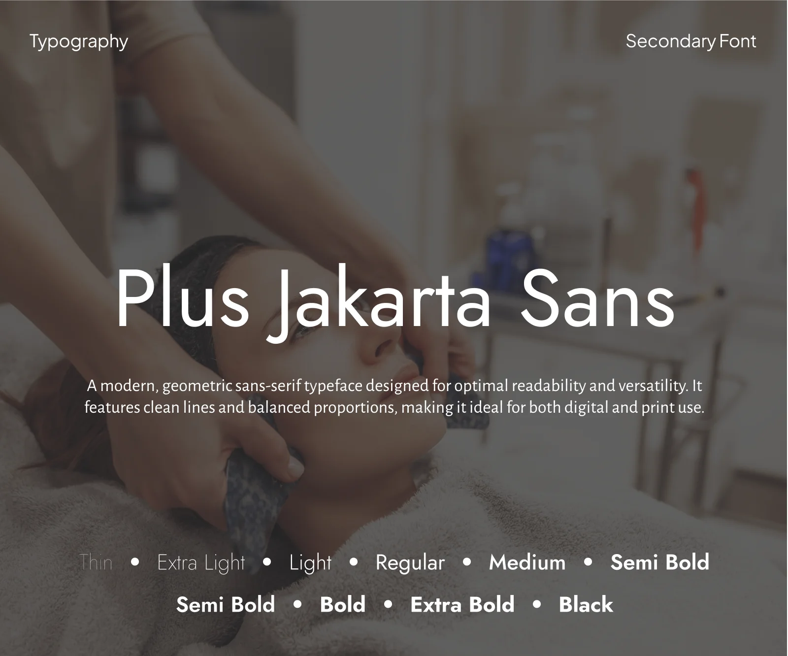
Tools we used

Project Completion
2024
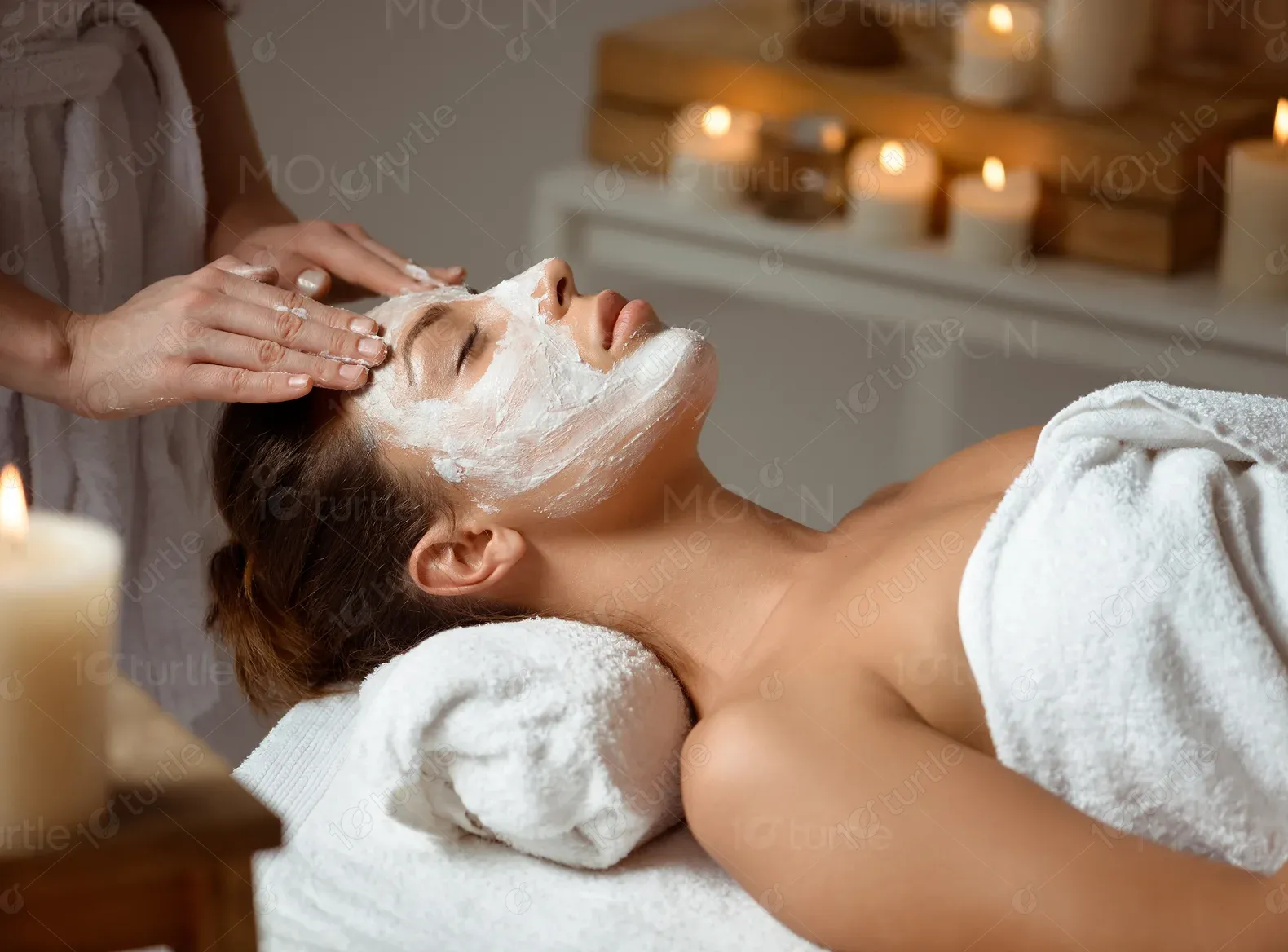
Leia Beauty specializes in offering a variety of high-end beauty treatments, with a focus on providing a luxurious experience for its customers. Their services range from body treatments to skincare, all designed to help clients feel pampered, relaxed, and rejuvenated. Leia Beauty places a high emphasis on affordability while maintaining superior service quality, making it the go-to destination for those looking to enhance their beauty and wellness.
Industry
Beauty and Personal CareWhat we did
User ResearchUI UX DesigningPlatform
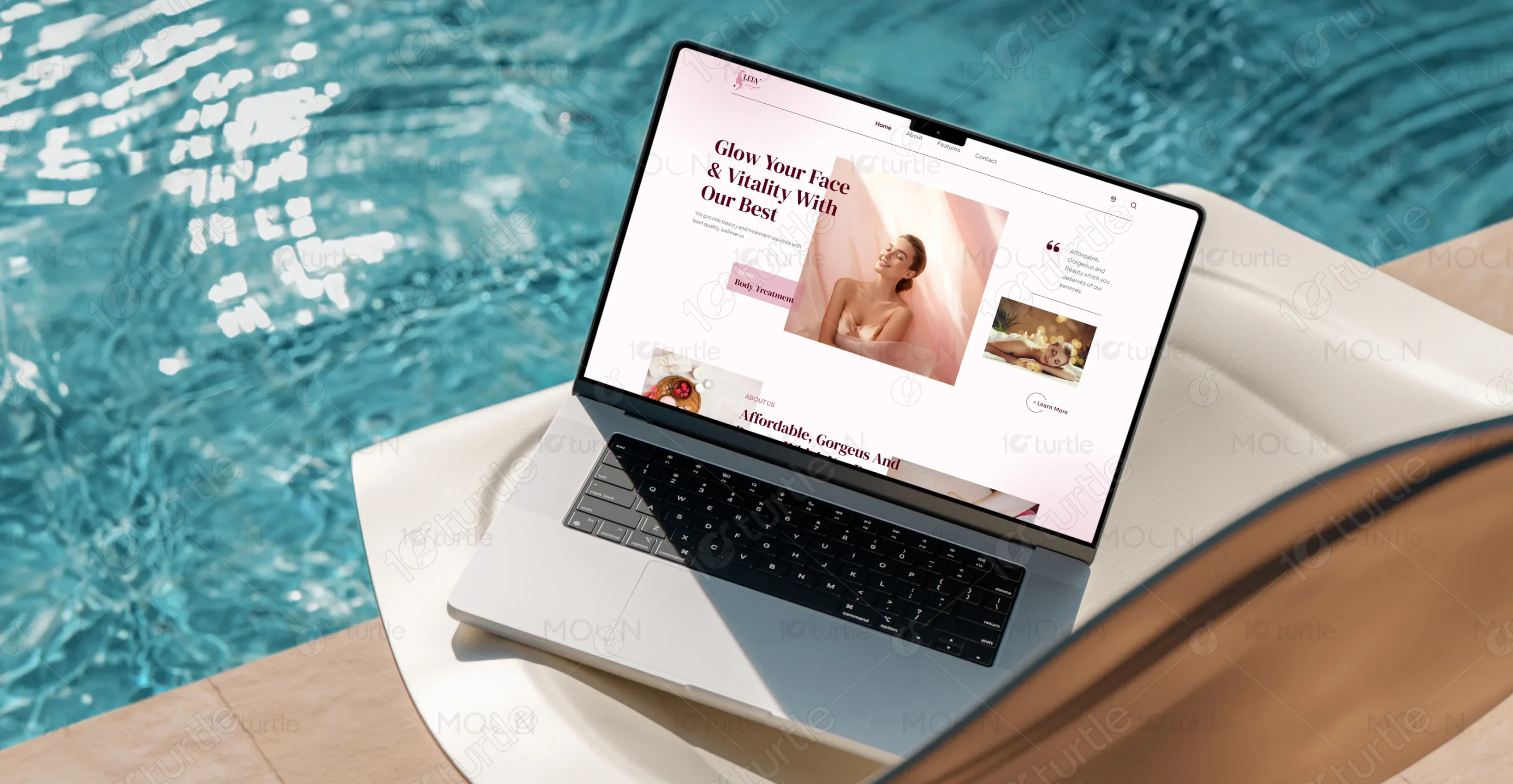
-Before the website redesign, Leia Beauty’s online presence lacked the visual appeal and functionality needed to captivate potential clients. Their website did not align with the luxury and quality their brand stood for, and the user interface was clunky and outdated. Customers had a hard time navigating through services and booking appointments.
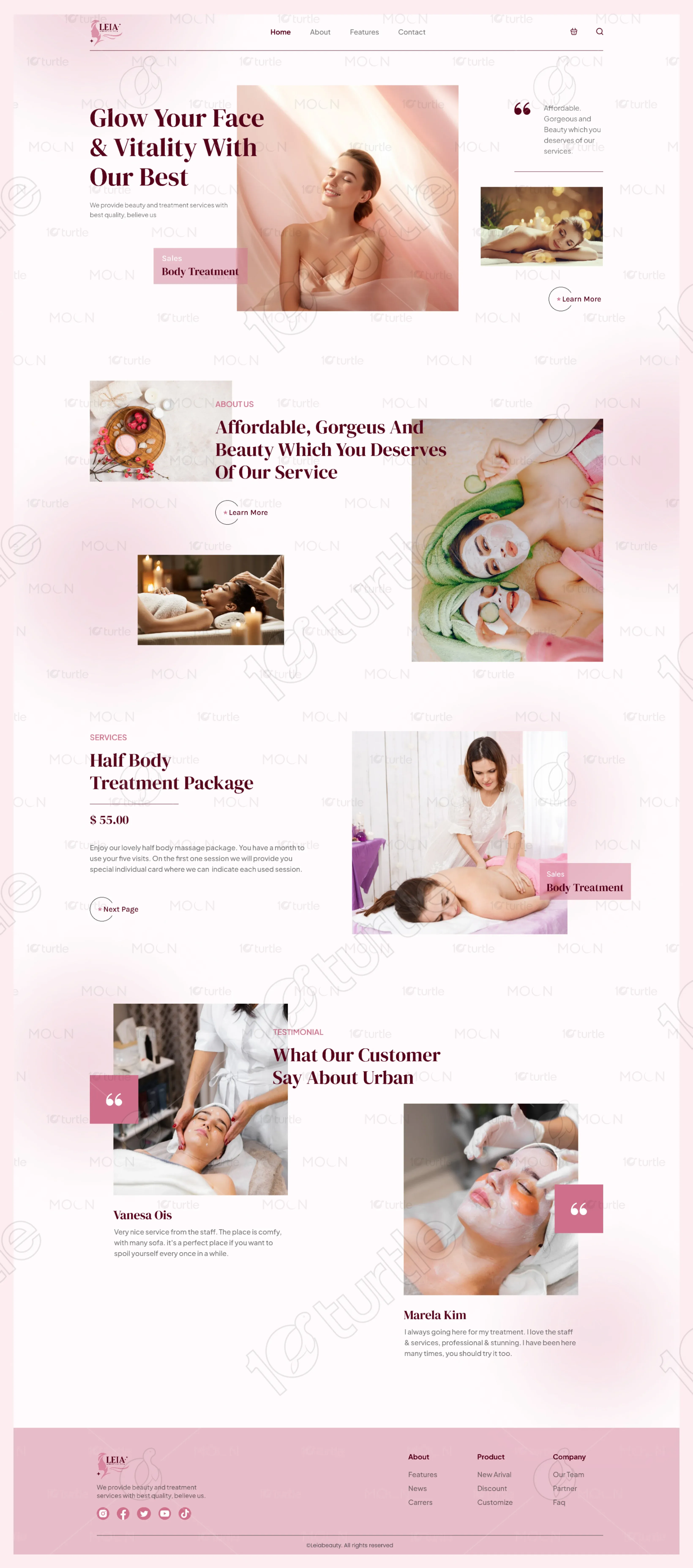
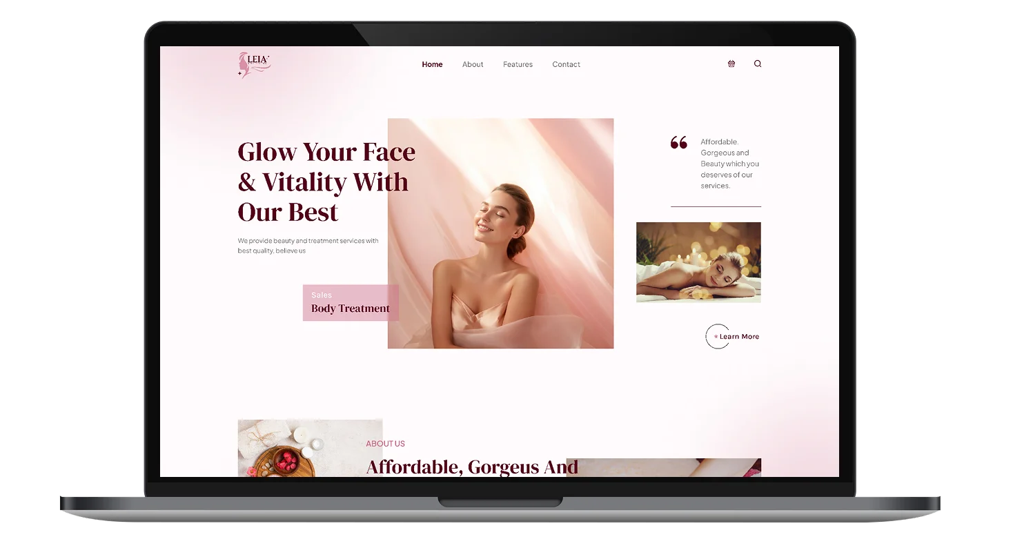
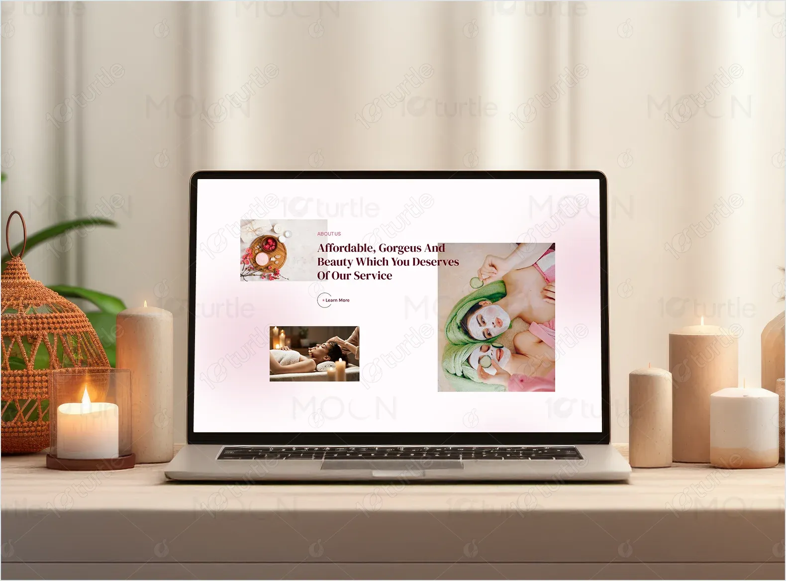
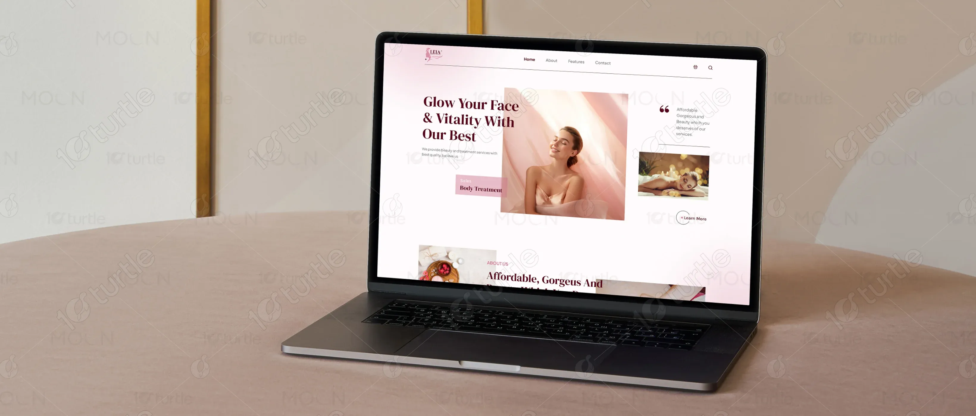
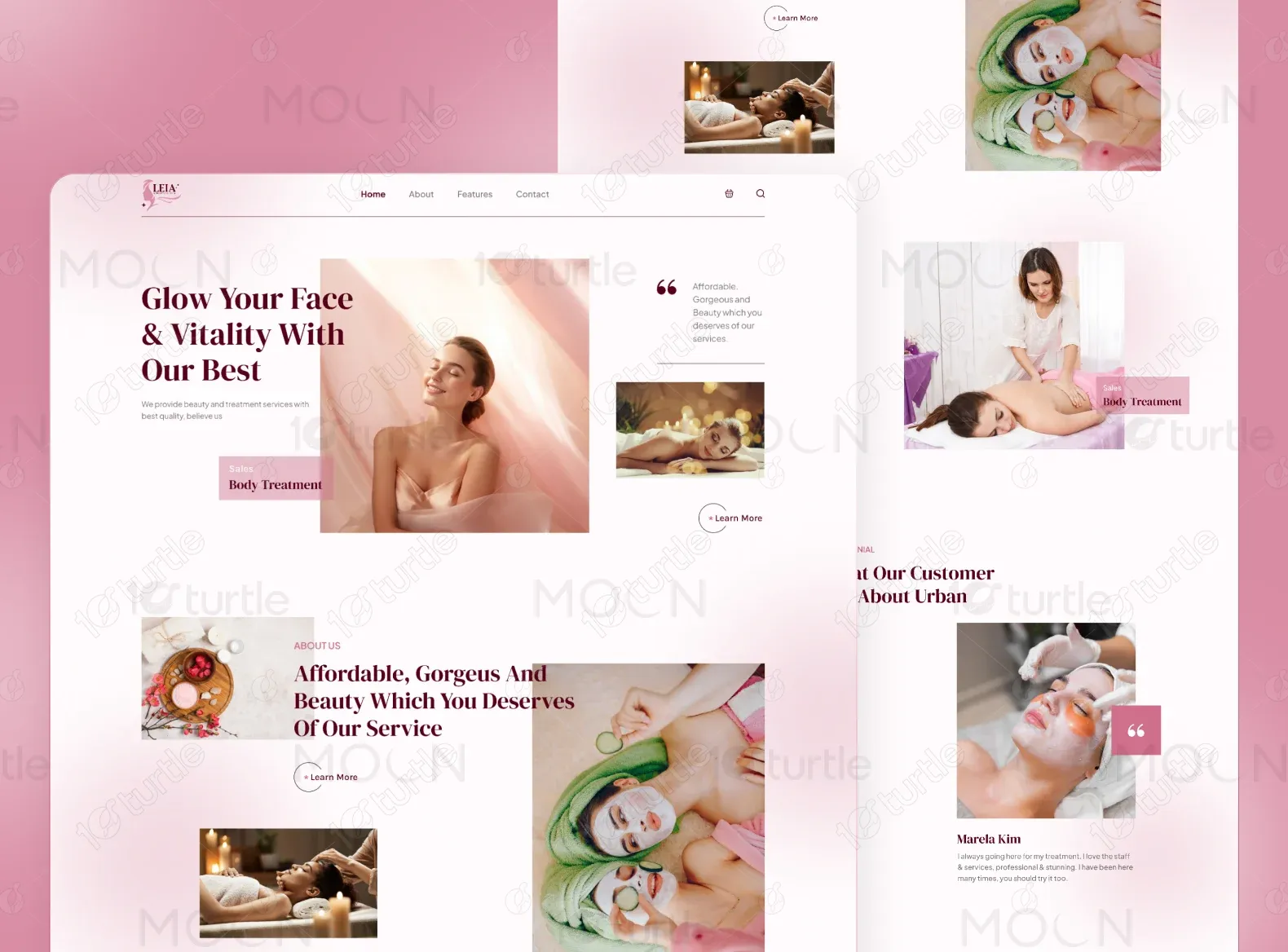
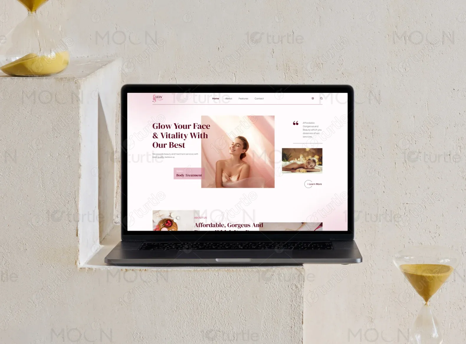
The solution involved a complete redesign focused on a warm, inviting aesthetic while maintaining elegance and professionalism. The website features a sleek homepage with a prominent hero section, visually striking images, and clear typography. Service pages provide easy-to-read treatment details, including pricing and descriptions. A testimonials section enhances credibility, and an intuitive booking system aligns with the company's offerings, ensuring a seamless user experience.
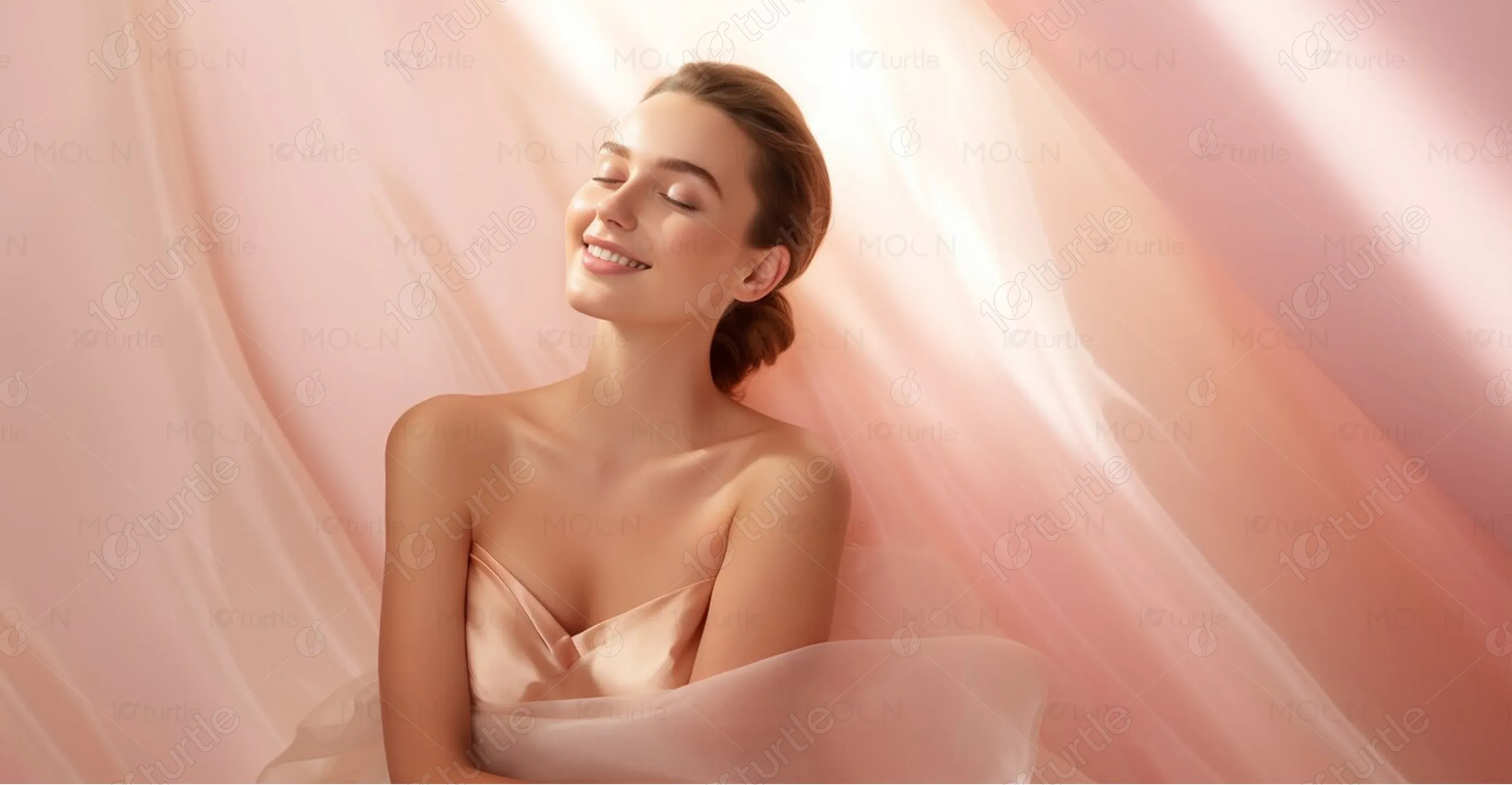
Leia Beauty’s design vision was to create a clean, minimalist layout that conveys both luxury and warmth. The client requested soft tones, elegant fonts, and imagery that reflects the relaxing and rejuvenating nature of their services. The color palette was to be delicate yet vibrant, aligning with their aesthetic of health, vitality, and beauty.
The Leia Beauty logo reflects the brand’s feminine, elegant aesthetic. It features a sleek, modern typeface paired with a subtle icon symbolizing beauty and vitality. The logo is clean and adaptable, working seamlessly across digital and print mediums.
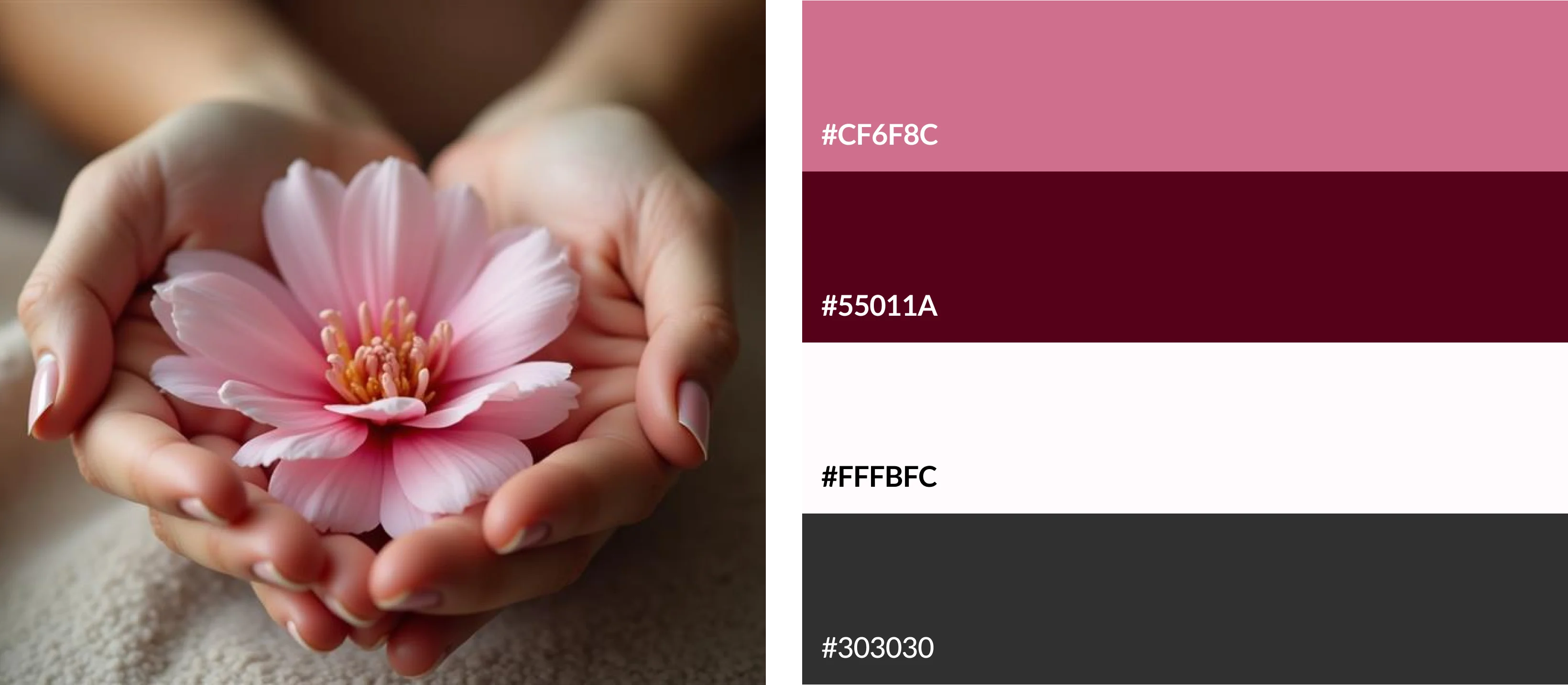
The primary color palette includes Soft Pink (#CF6F8C) for warmth and femininity, White (#FFFBFC) for a clean, light feel, and Dark Maroon (#55011A) for heading titles. The secondary color, Black (#F8F7F0), evokes relaxation and tranquility. These colors work together to create a calming and welcoming atmosphere, reflecting the soothing services of Leia Beauty.
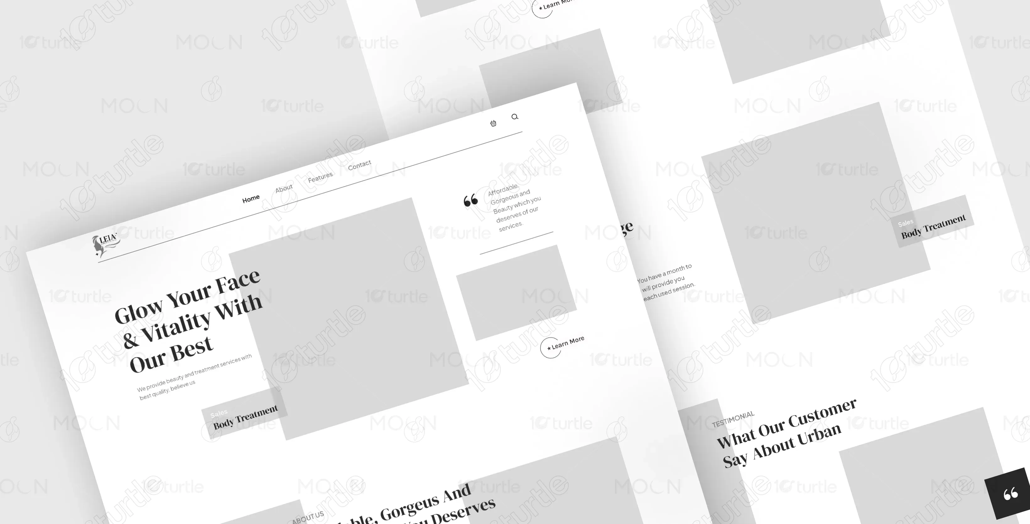
The initial wireframes featured a clean layout with clear sections for services, testimonials, and a booking button. The structure ensured the most important features were visible above the fold, while other content, like the About section and testimonials, were placed further down the page for easy discovery.