A supplement e-commerce landing page that conveys trust and quality. It combines lifestyle imagery with product storytelling, balancing emotional appeal and clarity. The design boosts credibility and improves browsing flow in the wellness market.
Brand Identity
Product Positioning
E-Commerce UX Optimization

Industry
Healthcare & Wellness
Tools we used

Project Completion
2025
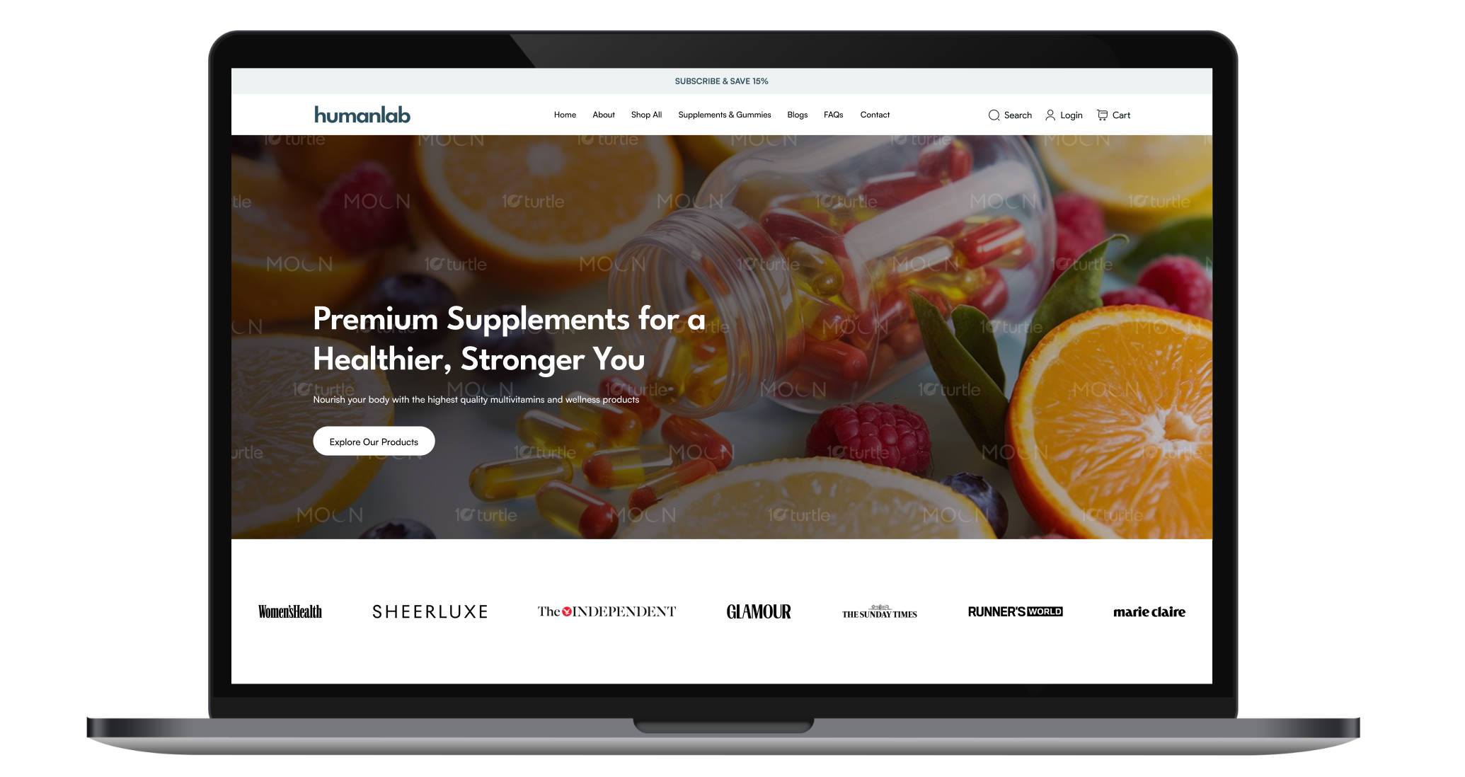
The design combines bold hero imagery, minimal typography, and structured content blocks to create a refined shopping experience. Soft neutral backgrounds contrast with vibrant product visuals, guiding attention naturally. Clear CTAs, brand mentions, and product highlights reflect transparency, credibility, and a science-backed wellness identity.


Industry
Healthcare & WellnessWhat we did
User ResearchUI UX DesigningResponsive ExperiencePlatform
-The brand needed a landing page that stood out from generic supplement sites. Existing layouts lacked emotional appeal and credibility, leading to lower engagement and trust in a competitive health market.
The design features a strong hero section, trust logos, structured storytelling, and clear CTAs. Combining lifestyle imagery with minimal layouts enhances emotional engagement and improves navigation and trust.

The optimized layout, compressed imagery, and clean code structure reduced load time and improved performance metrics. Enhanced SEO structure increased visibility, while accessibility refinements improved usability for diverse audiences. Together, these improvements create a faster, smoother, and more engaging shopping experience that directly supports higher retention and conversions.

We enhanced premium perception through high-quality lifestyle imagery, generous white space, structured typography, and subtle color contrast. Trust badges, press mentions, and clear product explanations reinforce credibility. The clean layout eliminates clutter, making the brand appear confident, transparent, and science-driven while improving user navigation and conversion potential.


The logo reflects simplicity and trust, aligning with the wellness industry’s need for clarity and transparency. Clean letterforms and balanced spacing communicate professionalism, while minimal styling reinforces a modern, science-backed identity. The understated execution allows the brand name to stand confidently across packaging and digital platforms.

The palette blends soft neutrals with deep teal tones and natural product imagery. White backgrounds enhance clarity, while muted green-blue accents suggest health, trust, and sustainability. Warm citrus imagery in the hero adds vibrancy, balancing freshness with professionalism and reinforcing the brand’s natural supplement positioning.

The wireframe follows a structured vertical flow: Hero section, media credibility strip, About section, Bestsellers, and product highlights. Clear spacing separates content blocks, ensuring smooth scanning. CTA placements are strategically positioned after key storytelling sections to support conversion without overwhelming users.