food
#Food
#Menu
#Hospitality
Food Tech
Branding
Package Design
Overview
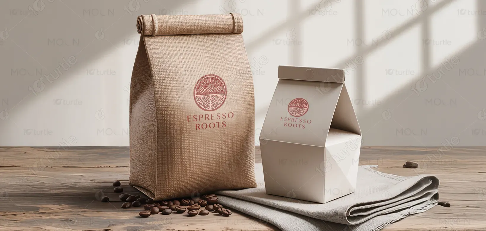
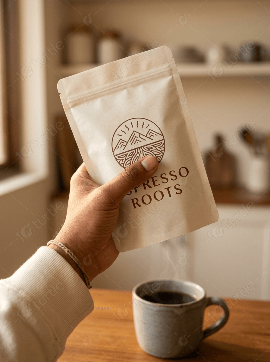
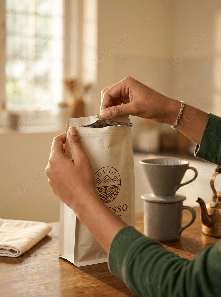
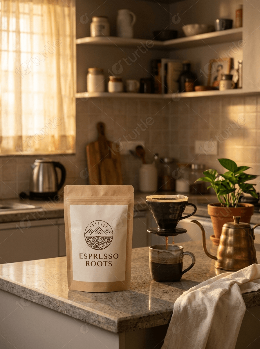
Espresso Roots is a premium coffee brand dedicated to delivering beans of the highest quality. We were tasked with a complete rebranding of their packaging to better align with their organic, artisan philosophy.
The Problem

The existing brand identity lacked the tactile, premium feel required to compete in the high-end coffee market. Customers were unable to distinguish the brand's quality from standard commercial competitors based on visual presence alone.
Our Solution
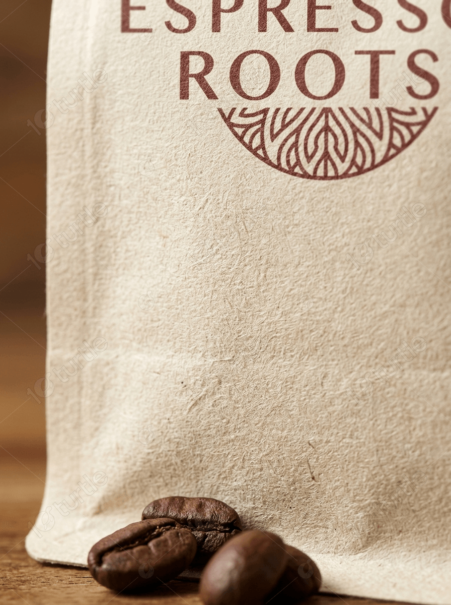
We introduced a minimalist aesthetic using kraft paper and burlap textures to evoke an earthy, grounded sensation. The new logo mockup and earthy color palette reinforce the brand's connection to its organic roots.
Impact & Results
The rebranding effort significantly increased shelf visibility and established a clear premium market position. By focusing on sensory textures and minimalist design, Espresso Roots successfully attracted a more discerning, eco-conscious audience.
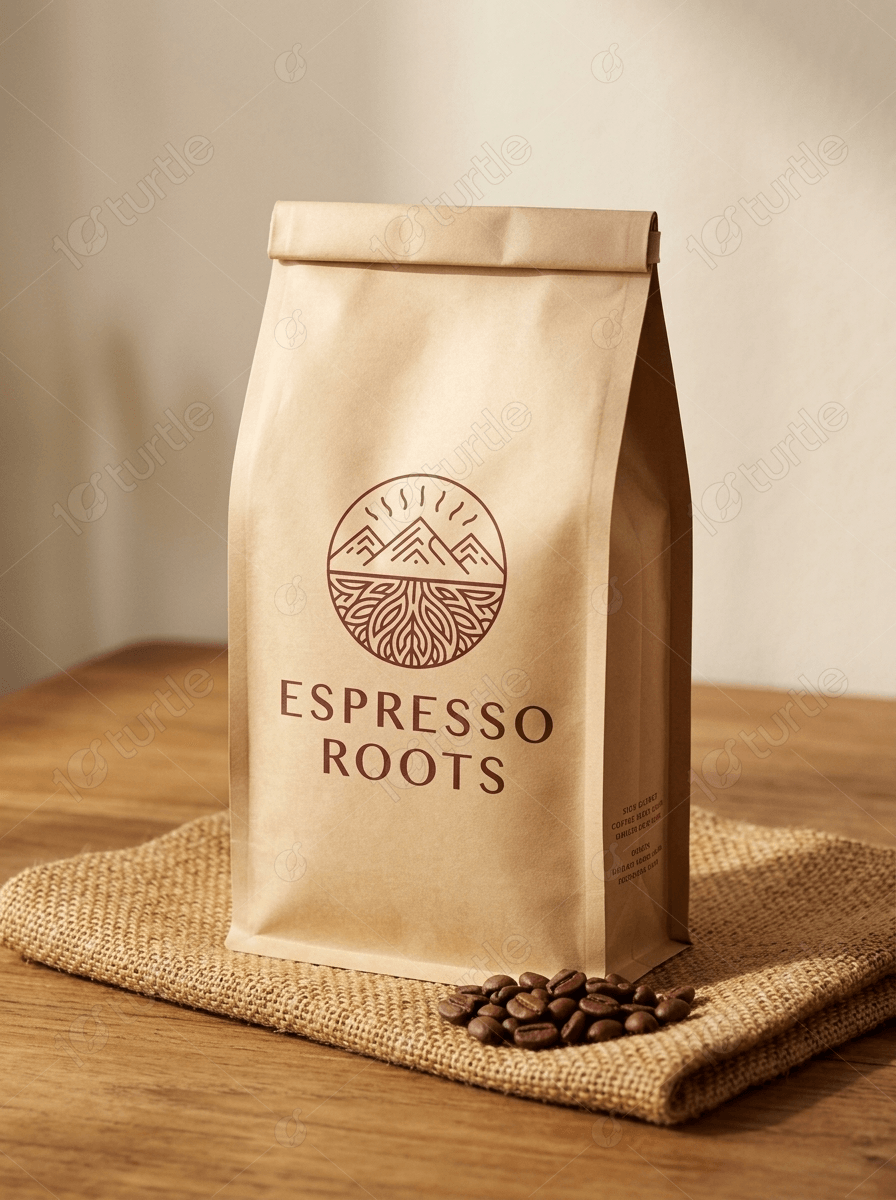
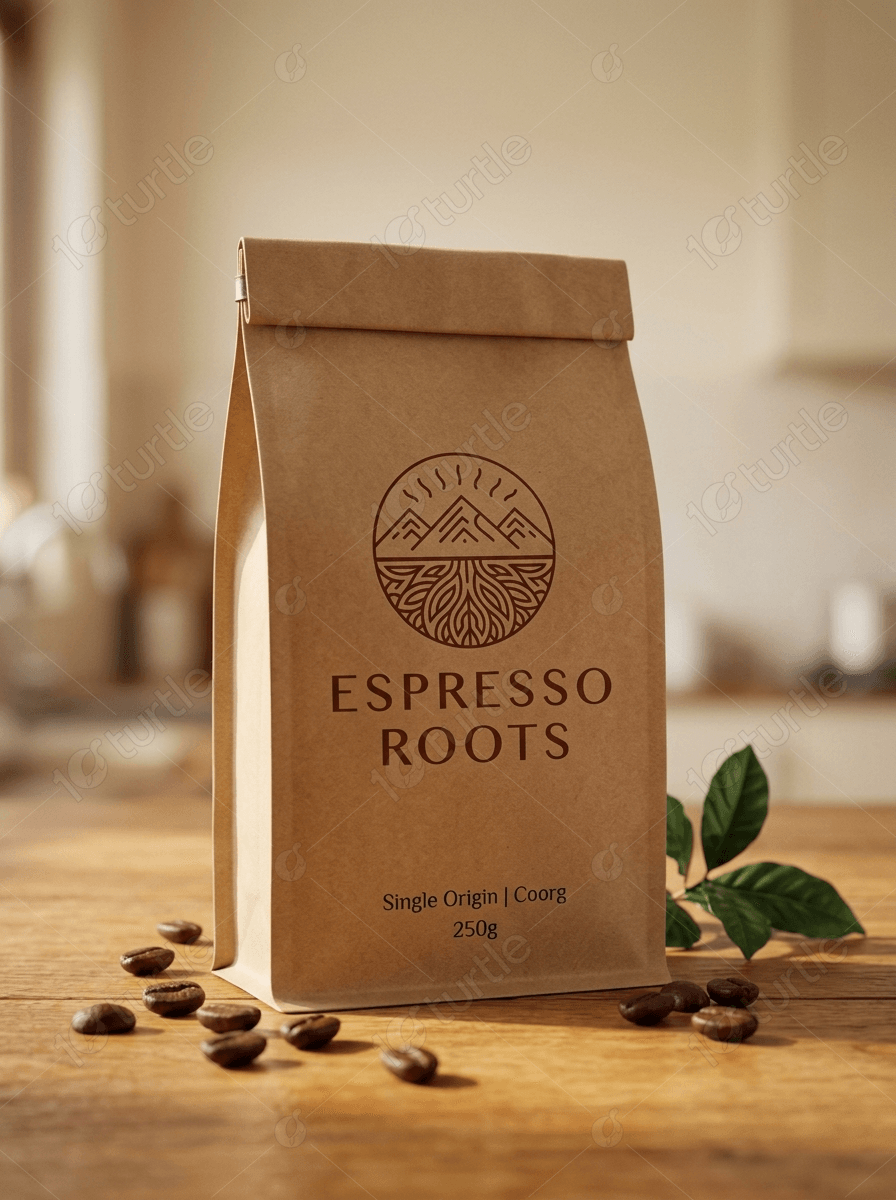
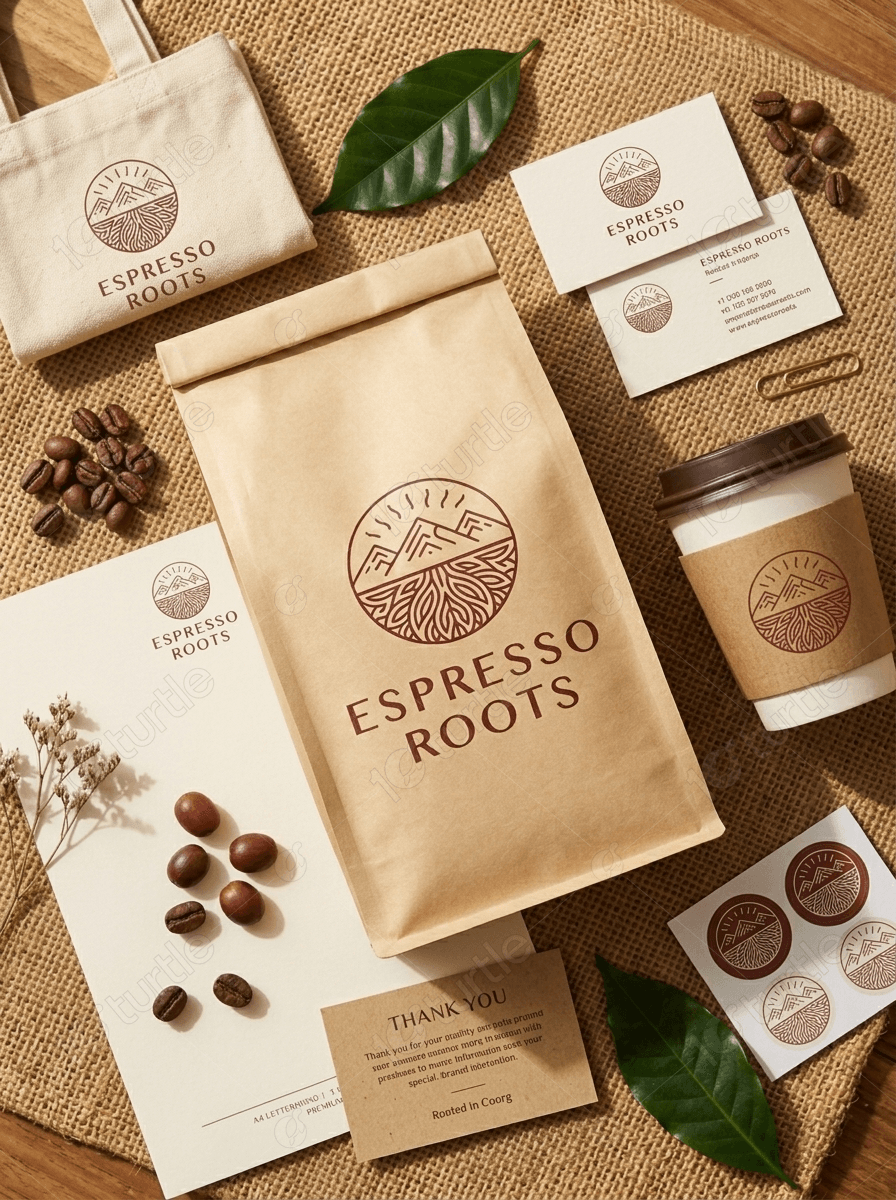

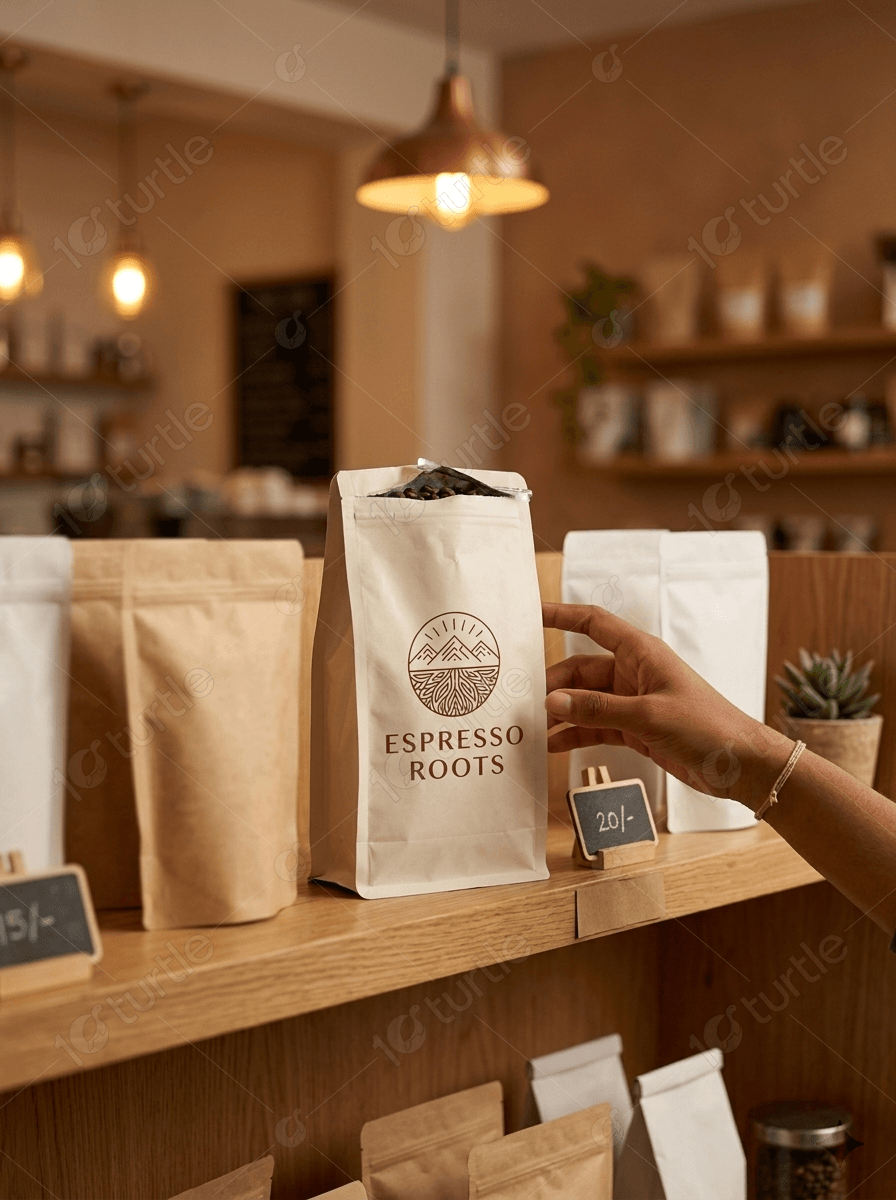
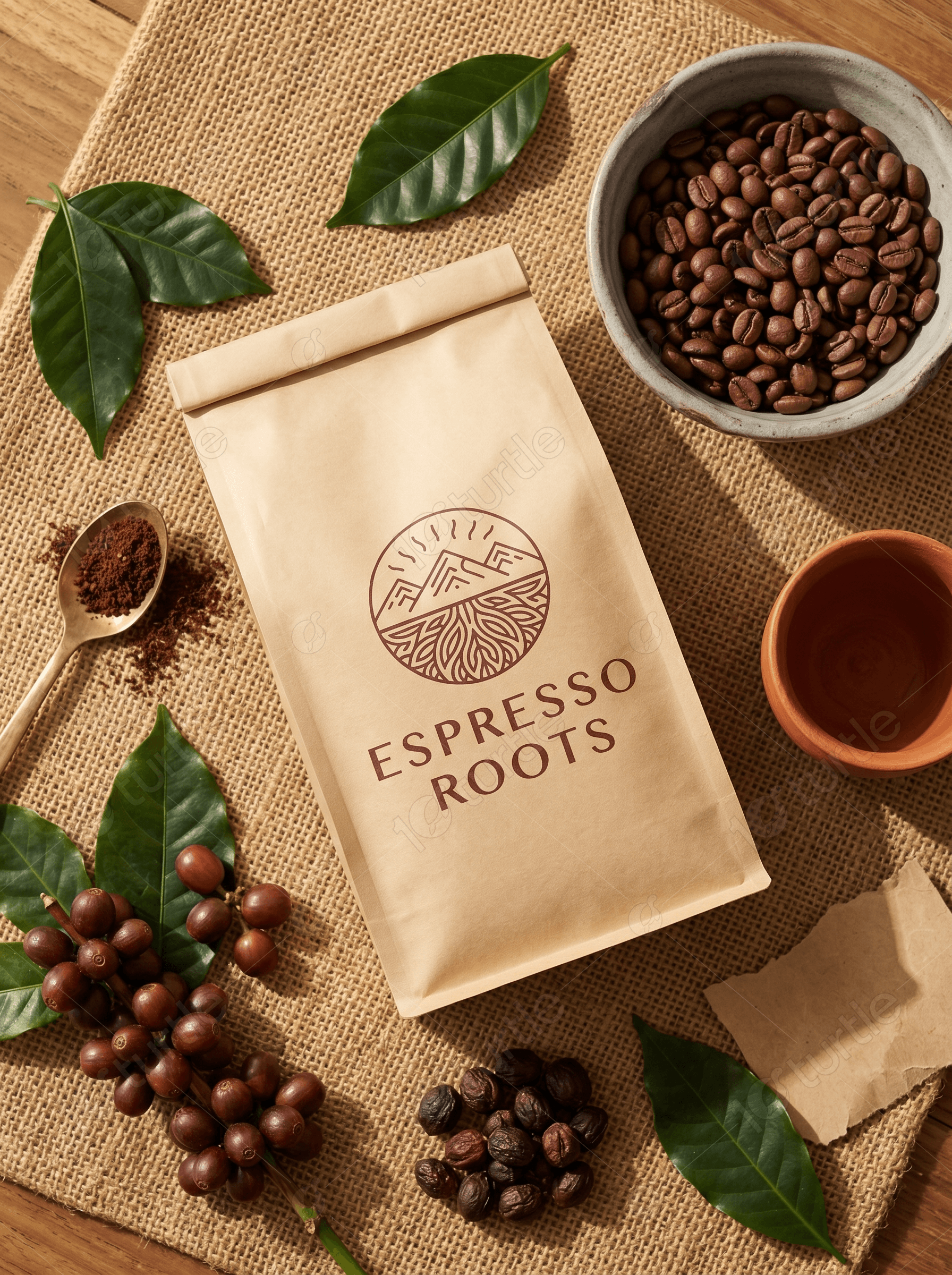
Coffee Packaging
Kraft Paper Design
Burlap Texture


