Home / Blog / Responsive Website Design Services: Why Mobile-First Design Matters
Mobile users now dominate web traffic, making responsive design a growth-critical decision. This blog explains responsive website design services and why mobile-first design matters for performance, SEO, and long-term business scalability especially for modern, growth-focused brands.
31 Dec, 2025

Web users no longer browse primarily on desktops. Mobile devices account for the majority of global web traffic, and search engines now prioritize mobile experiences first.
That shift has changed how websites must be designed. Responsive design is no longer optional and mobile-first design has become the foundation of high-performing websites.
Responsive website design services ensure that your website:
Instead of building separate desktop and mobile sites, responsive design creates one flexiblesystem that adjusts intelligently.
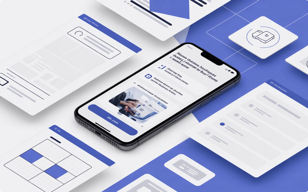
Mobile-first design means designing for mobile screens first, then scaling up to tablets and desktops not the other way around.
This approach prioritizes:
Google primarily evaluates the mobile version of your website for ranking and indexing.
Mobile-first layouts force clarity only essential elements make the cut. This improves usability even on larger screens.
Mobile-first sites are lighter by design, leading to:
Mobile-friendly forms, CTAs, and navigation directly impact lead generation and sales.

Responsive, mobile-first design is essential for:
If your website drives leads or revenue, mobile-first design directly impacts growth. A professional agency ensures: Responsive website design services built on a mobile-first approach are no longer a trend they’re a requirement. Businesses that prioritize mobile users gain faster websites, better rankings, and higher conversions. Mobile-first design isn’t about shrinking a desktop site. It’s about building smarter from the start.How Professional Responsive Design Services Help
Final Thoughts
A-1. Responsive website design services create websites that adapt smoothly across all screen sizes, ensuring usability, performance, and consistency.
A-2. Mobile-first design starts with designing for mobile devices first, then scaling the layout for larger screens to ensure optimal performance and UX.
A-3. Yes. Google uses mobile-first indexing, so mobile-optimized websites are more likely to rank better in search results.
A-4. Yes. Your website is often the first interaction users have with your brand, and it must perform well on mobile devices.
A-5. If your site loads slowly on mobile, has hard-to-click elements, or poor navigation, it likely needs a mobile-first responsive redesign.
Browse
Resources
