
Multi-Industry Flyer Design Case Study
Multi-Industry Flyer Design Case Studyarrow

Smart print layouts for clear service communication.

Flyer Design • Print Design • Promotional Design

Overview

This flyer design case study combines three different business communication needs into one polished print collection. The set includes a venture capital event invitation, a wellness breathing guide, and a warehouse pricing flyer. Each design uses strong hierarchy, organized content, brand-specific colors, and clear formatting to help audiences understand details quickly and respond confidently.

The Challenge

down-right

Multi-industry flyer design must make very different types of information feel clear, credible, and easy to act on. Event details, wellness instructions, and service pricing each require different reading behavior, so one generic layout style would not work. Poor flyer design can make important information feel confusing, overcrowded, or unprofessional. For B2B and service-based communication, that directly affects trust, attendance, inquiries, and purchase decisions.

The Solution

down-right

The collection solves this by giving each flyer its own visual system while keeping all layouts clean and functional. The venture capital invitation uses blue polygon gradients, a yellow date strip, and centered RSVP details to create a premium business-event feel. The wellness flyer uses warm peach tones, rounded content boxes, and a calm image to make breathing instructions approachable. The TYH Warehousing flyer uses bold blue and orange branding with structured pricing sections, making logistics costs easier to scan and compare.

The Impact

down-right

These flyer designs help businesses communicate faster without losing professionalism. Each layout supports a different action, from attending an investor event to learning a wellness technique or reviewing warehouse pricing. The collection shows how strategic flyer design can improve clarity across both consumer and B2B touchpoints. Long term, it strengthens brand trust, supports smoother sales conversations, and turns printed collateral into a useful communication tool.

02.avif03.avif
04.avif
06.avif05.avif
07.avif
08.avif09.avif
10.avif
11.avif
12.avif13.avif
14.avif
Branded Digital Flyer Design That Gets Attention

Flyer design is most effective when it respects the way people read information in real business situations. This multi-industry flyer design case study brings together three different communication formats: a venture capital event invitation, a wellness breathing guide, and a warehouse pricing flyer. Each piece serves a different audience, but all three share one goal: to make information clear, professional, and easy to act on.

The first flyer presents “An Exclusive Evening of New Zealand Venture Capital Insights” with a polished corporate style. The design uses a blue geometric gradient header, a yellow date and time banner, clean white space, RSVP information, co-host logos, and formal event copy. This structure works well for investor-facing communication because it immediately separates the event title, location, purpose, and response details. The flyer feels premium without becoming overly decorative.

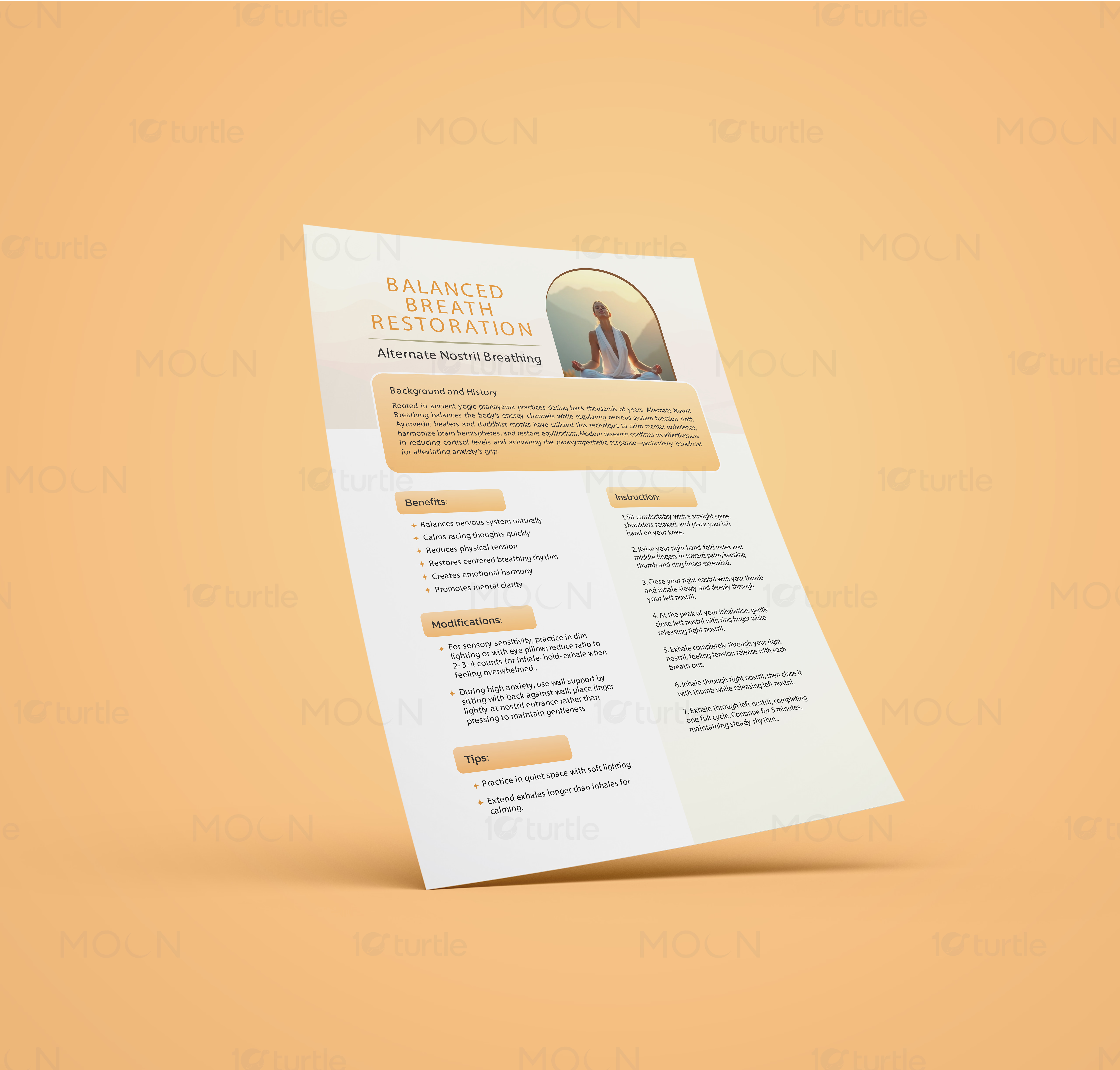
The second design, “Balanced Breath Restoration,” takes a softer wellness direction. Warm peach backgrounds, rounded orange content cards, gentle cream spacing, and a calm breathing image create a relaxed tone. The layout breaks down background information, benefits, modifications, tips, and instructions into clear sections. This is important for wellness flyer design because readers need the information to feel calming, instructional, and approachable rather than clinical or text-heavy.

The third design, TYH Warehousing & Fulfillment, focuses on service pricing and logistics communication. This flyer uses a strong blue and orange brand palette, clear section headers, boxed price callouts, and a structured two-column layout. Warehouse pricing includes many details, such as in/out fees, storage, labeling, packaging, cross docking, freight prep, bubble wrap, and fulfillment charges. Without strong hierarchy, this type of content can quickly become difficult to read. The design solves that by grouping related costs into clean sections, helping customers compare services faster.

As a collection, these professional flyer designs show how print marketing design can adapt across industries while still remaining focused on clarity. The visual language changes according to the audience: premium and formal for finance, warm and calm for wellness, and practical and structured for logistics. This flexibility is what makes the collection strong as business flyer design. Each flyer does more than present information; it guides the reader toward a specific next step.

For businesses, well-structured flyer design can support events, sales conversations, service explanations, and customer education. It gives teams a polished printed asset that can be handed out, emailed as a PDF, displayed digitally, or used in presentations. Whether the goal is attendance, learning, or pricing clarity, this collection proves that strong information design can make everyday business communication feel more trustworthy, organized, and action-ready.

#flyerdesign

#businessflyer

#printflyer

#eventflyer

#wellnessflyer

#logisticsdesign

#pricingflyer

#b2bmarketing

#printdesign

#promotionaldesign

#marketingcollateral

#informationdesign

Next Project

arrow

EXP Luxury

GUIDE BOOK DESIGN • POSITIONING • BRAND IDENTITY

EXP Luxury