
Skincare With a Splash of Fun
Vibrant skincare identities designed to turn everyday routines into visual experiences.
The Challenge
Gen Z skincare consumers encounter an increasingly crowded market where packaging often looks interchangeable, overly clinical, or visually predictable. Brands need to communicate product differences quickly while creating an identity that feels culturally relevant and visually shareable. Using too many disconnected colors or styles can weaken recognition, while overly traditional skincare aesthetics may struggle to create emotional appeal with younger audiences.
The Solution
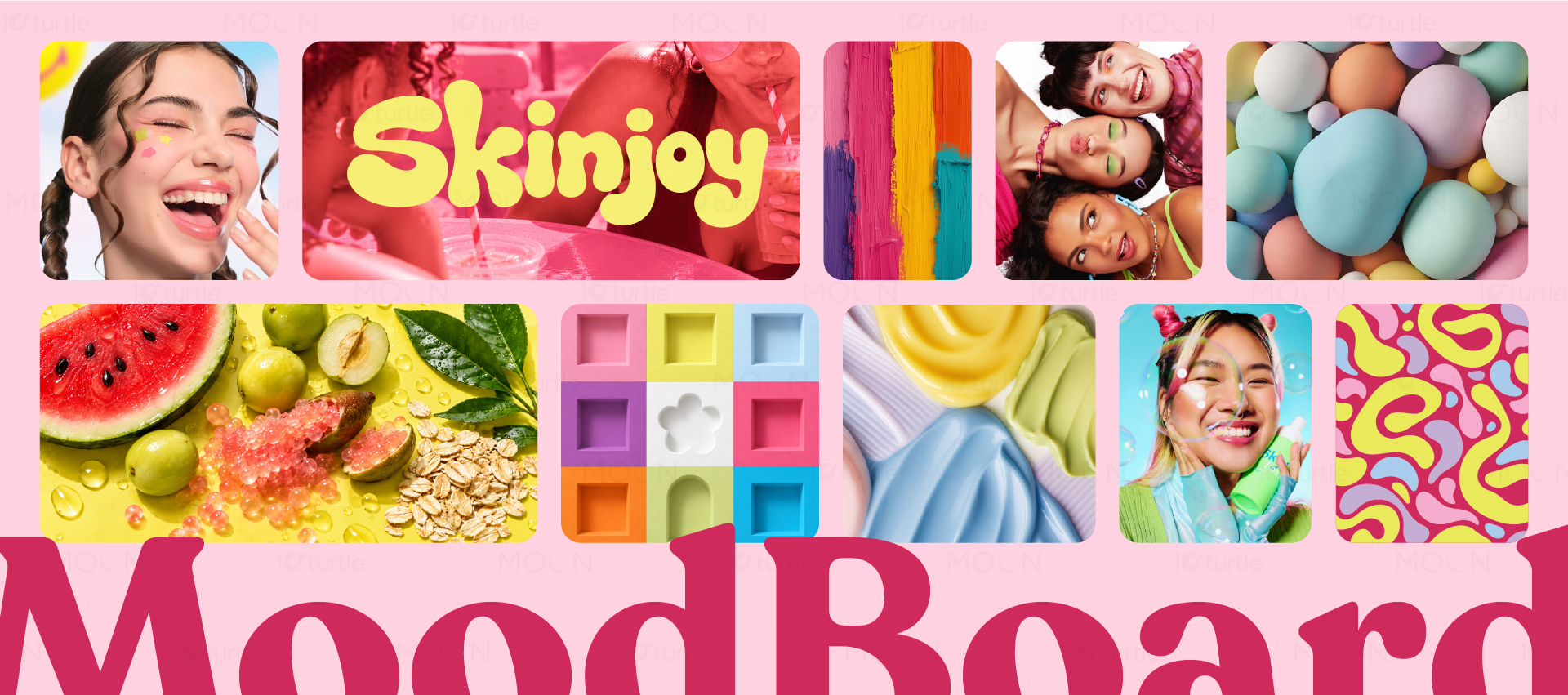
The branding system uses vibrant color identities and varied product silhouettes to give each skincare product its own visual character while maintaining a connected brand world. Typography, graphic elements, color relationships, and packaging treatments establish consistency across the collection. Instead of relying solely on clinical cues, the direction introduces a more expressive and approachable personality suited to Gen Z browsing habits. The flexible system allows individual products to stand apart without losing their relationship to the overall brand.
/ Project Information
This collection develops a complete skincare branding language across multiple products with different package shapes and vibrant color identities. Built for a Gen Z audience, the system moves beyond conventional clinical skincare aesthetics, using energetic visual cues, approachable typography, and distinctive product differentiation. The result is a cohesive shelf presence that feels contemporary, social-ready, and easy to recognize.