
A Fresh Take on Drinkware
A reusable drinkware identity designed for everyday style.
The Challenge
The reusable drinkware market is crowded with products competing through appearance, functionality, gifting appeal, and digital presentation. Hydrobody needed to appeal to Gen Z while remaining relevant to adults and children with different tastes and product preferences. Without a flexible identity, varied product styles can easily feel disconnected, weakening recognition across ecommerce and physical brand experiences.
The Solution
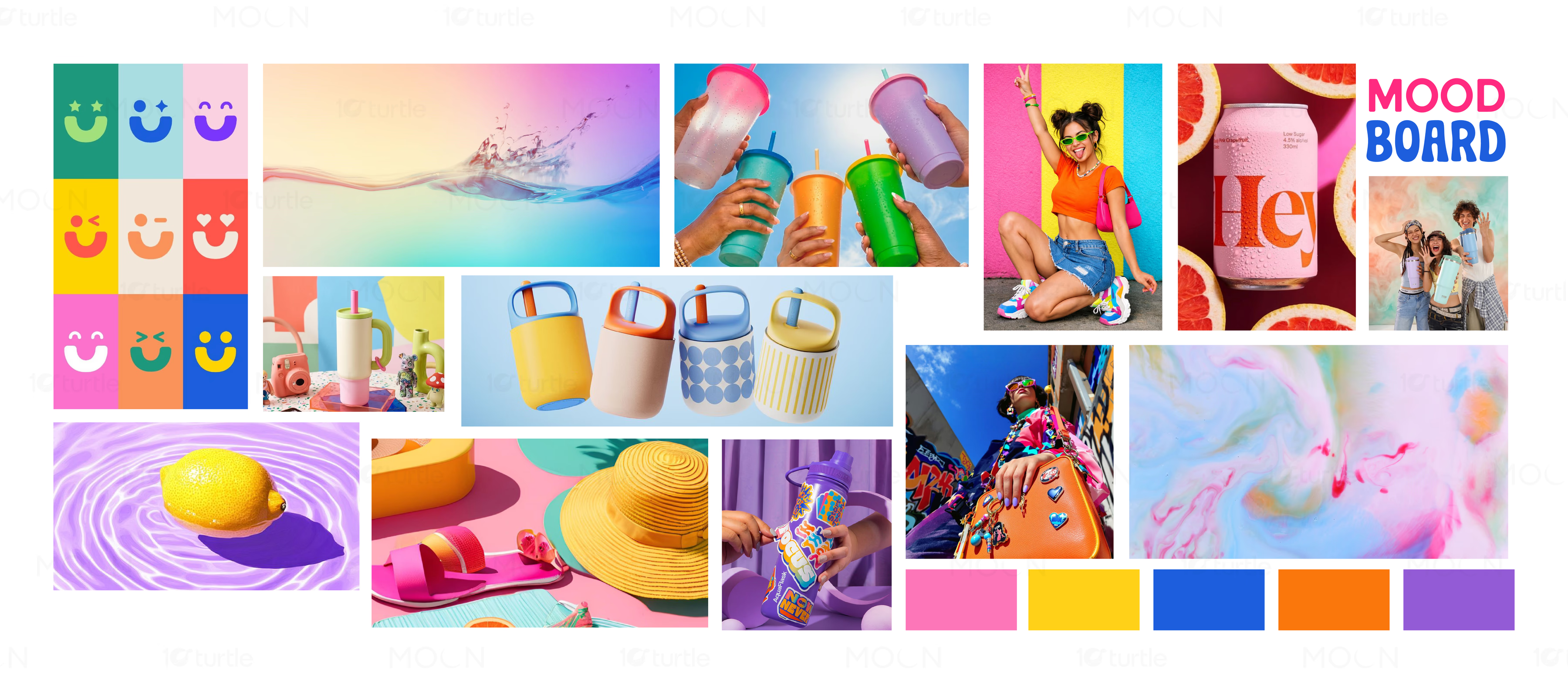
The branding system gives Hydrobody a recognizable visual foundation while allowing individual products to develop their own personalities. Vibrant colors, expressive typography, product-focused compositions, and adaptable graphic elements create a youthful lifestyle aesthetic without making every product look identical. Packaging, product listings, A+ content, gift sets, posters, billboards, cards, and stickers were designed as connected parts of one brand ecosystem. This creates consistency from digital discovery through purchase, gifting, and everyday product use.
/ Project Information
This case study brings Hydrobody’s complete brand expression into one connected system spanning reusable bottles, tumblers, packaging, gift sets, product listings, A+ content, posters, billboards, cards, stickers, and usage visuals. Designed for Gen Z and experience-led shoppers, the identity gives different products distinct personalities while keeping the brand recognizable, adaptable, and retail-ready.