
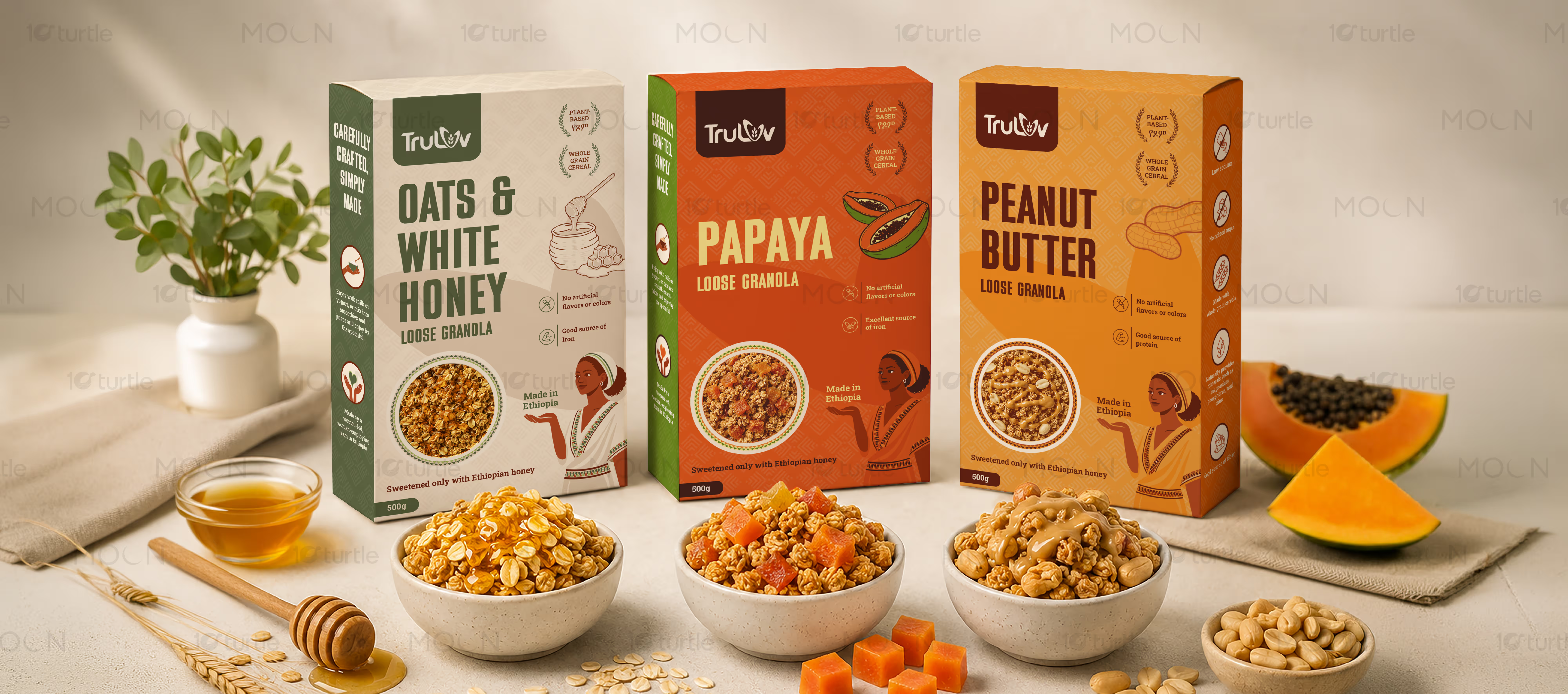
Elevating cultural heritage through a premium and shelf-ready cereal packaging system
Where modern Ethiopian identity meets global retail excellence
The Challenge
The existing packaging lacked the structured hierarchy and premium feel required for international expansion and high-end local retail. Competitive pressure in the food segment demands a design that communicates quality and origin instantly without looking cluttered or dated. The brand needed to modernize while maintaining its core identity.
The Solution
We developed a strategic packaging architecture that prioritizes readability and appetite appeal through bold typography and flavor-led colors. By establishing a structured composition for all panels, we created a cohesive family of products that are practical for production and visually dominant on the shelf. The design uses subtle cultural cues to anchor the brand's identity.
/ Project Information
Redefining the shelf presence of a premium Ethiopian cereal brand through a modern packaging system. We created a refined visual language that balances cultural roots with a premium, export-ready aesthetic. The final system ensures clear flavor hierarchy and high visibility in competitive retail environments.