
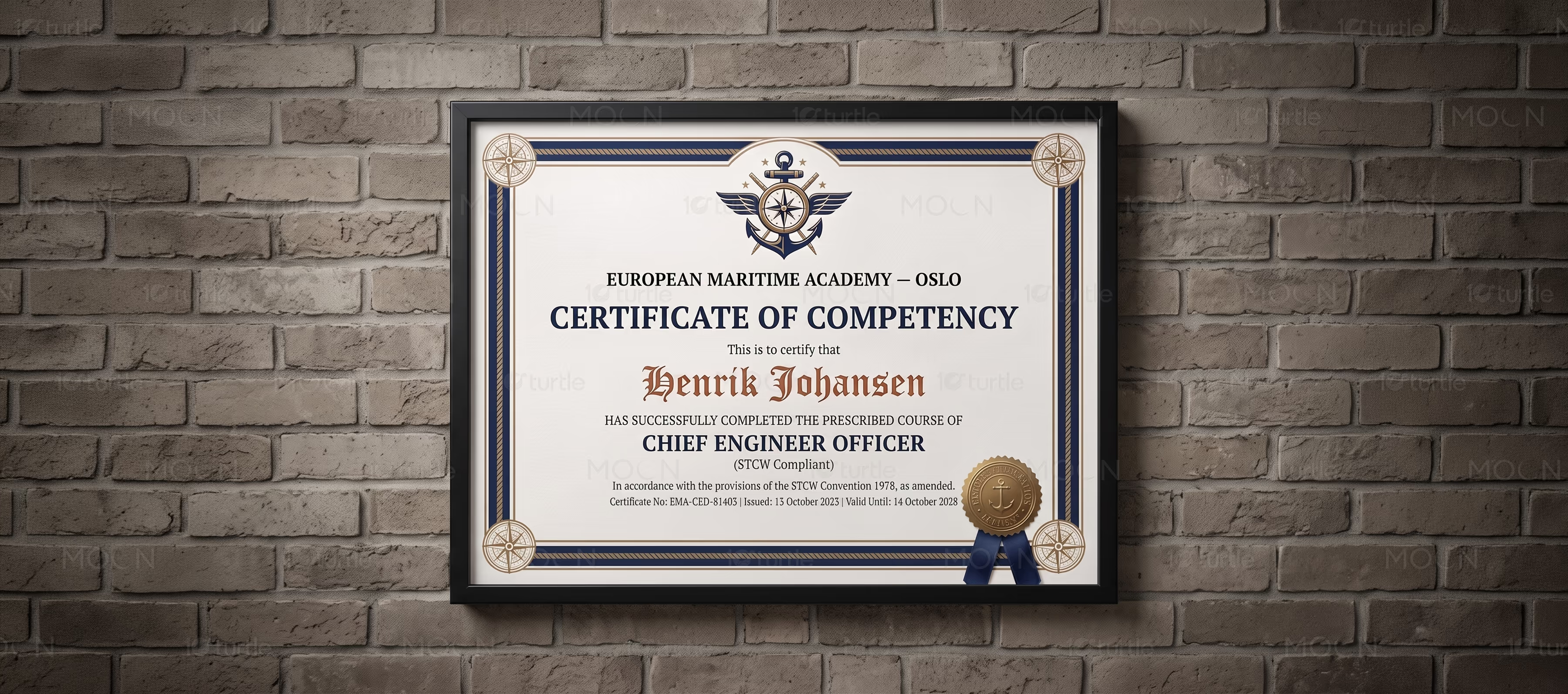
Certificate and Award Design Case Study
Elegant award systems for milestones, honors, and professional credibility.
The Challenge
Certificates and awards often look generic when they rely on basic templates, weak typography, or overcrowded layouts. This can reduce the perceived value of the achievement and make the issuing organization look less polished. Recognition materials also need to work across different industries, languages, events, training programs, and brand tones. The challenge was to create certificate and award designs that feel official, premium, readable, and emotionally meaningful.
The Solution
The design approach focuses on strong hierarchy, clean alignment, refined spacing, and intentional visual detailing. Minimal certificates use generous white space and elegant type pairings, while more creative designs use decorative borders, seals, color accents, and expressive layouts for stronger personality. Multilingual versions are structured carefully so different scripts remain balanced, readable, and visually consistent. Every design keeps key information such as names, titles, dates, signatures, and credentials clear.
/ Project Information
This certificate and award design case study presents a flexible recognition system for professional, educational, creative, and event-based achievements. The collection includes premium, minimal, multilingual, and expressive certificate directions, helping organizations present milestones with clarity, authority, and emotional value while creating designs recipients feel proud to display.