
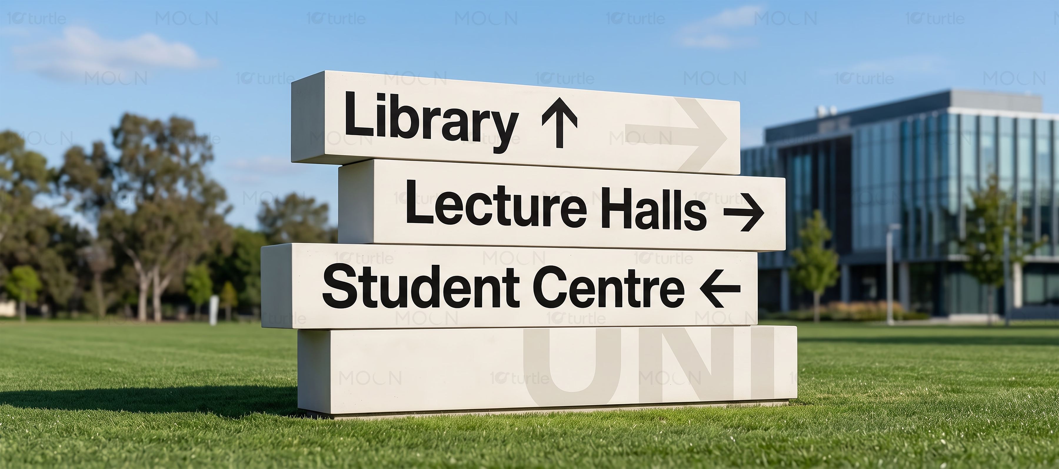
Multi Signage Design Case Study
Distinctive signage built to guide, attract, and define spaces.
The Challenge
Signage must communicate effectively within seconds, often while people are walking, driving, entering a building, or searching for directions. Different industries require different levels of visibility, professionalism, personality, and environmental integration. Poor typography, weak contrast, crowded information, or inconsistent branding can make spaces confusing and businesses appear less established. Generic signage also fails to reflect the distinctive character of each brand or location.
The Solution
The collection uses flexible visual systems tailored to the communication needs of different industries and physical environments. Strong typographic hierarchy, controlled colour contrast, recognisable brand elements, and carefully organised information improve readability from appropriate viewing distances. Each composition considers its architectural surroundings, intended placement, and audience movement. This creates signage that feels visually distinctive while remaining practical, scalable, and easy to understand.
/ Project Information
This signage design collection brings together varied visual directions created for retail, hospitality, corporate, service, and public-facing environments. Each concept balances brand expression with practical communication, ensuring messages remain clear from the intended viewing distance. Together, the designs demonstrate how customised signage can organise spaces, attract attention, support navigation, and create memorable physical brand experiences.