
Imposter Mobile Game App Design Case Study
Trust no one. Every player could be lying.
The Challenge
Social deduction and party-game apps live or die by first impressions — players decide within seconds whether a game feels fun, trustworthy, and worth downloading. Most party games in this space rely on generic icon packs, flat UI kits, and interchangeable mascots that fail to communicate tension or intrigue. Without a distinct visual identity, apps like Imposter risk blending into a crowded App Store category dominated by look-alike "guess who" and "find the liar" titles. Weak onboarding screens and inconsistent character art also increase drop-off before players ever reach their first game round.
The Solution
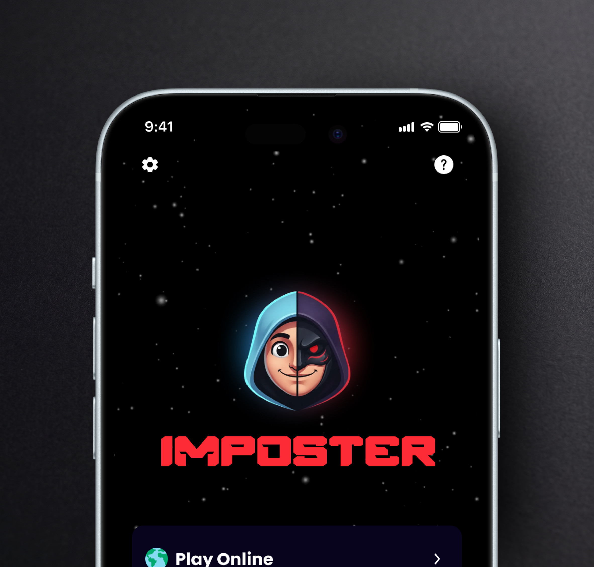
The Imposter identity system solves this through a cohesive dark-mode UI paired with a neon red-and-blue mascot that visually represents the game's core twist — someone in the group is not who they seem. App screens use bold blocky typography and starfield backgrounds to keep the mood tense yet approachable, while colorful character cards for each secret role add warmth and humor to balance the suspense. Lifestyle mockups showing friends reacting to the game together, plus branded hoodies and t-shirts, extend the identity beyond the screen into real social moments, reinforcing that this is a game meant to be played together.
/ Project Information
This collection covers Imposter's full mobile game identity: home screens, gameplay flows, brand typography, character illustrations, and real-world merchandise mockups. Built for casual party-game audiences, it captures the thrill of hidden-identity gameplay through a striking navy-and-neon palette, playful mascot design, and interface moments that make every reveal feel suspenseful, social, and shareable across devices.