
Custom Icons Design Case Study
custom icons for services, systems, and user journeys.
The Challenge
Brands across different industries often need to explain services, features, and processes quickly, but text-heavy communication can slow the viewer down. Generic stock icons can make a brand look common, inconsistent, or less professional. Poor icon design also creates confusion when symbols are too detailed, mismatched, or unclear at smaller sizes. The challenge is to create icons that feel simple, recognizable, and unique enough to support the brand identity.
The Solution
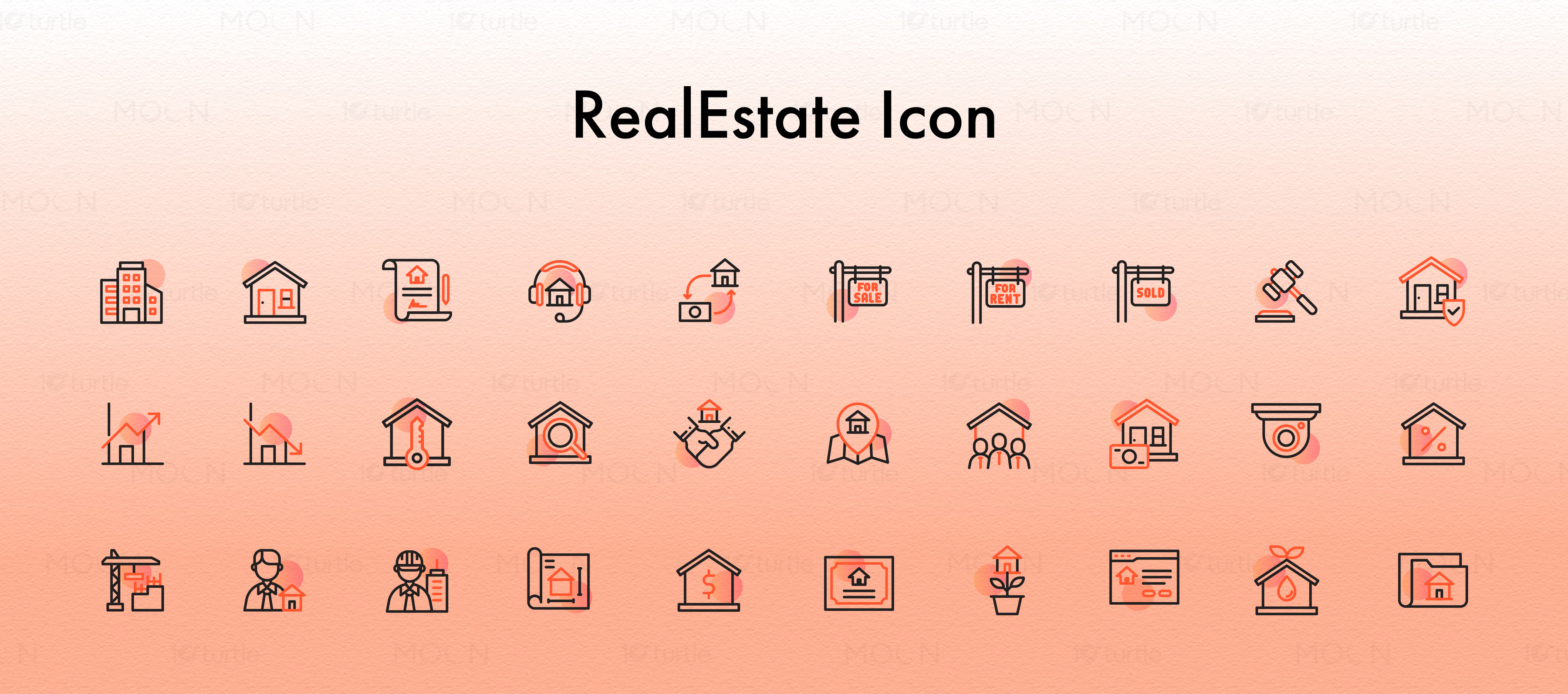
This custom icons collection solves the challenge through a consistent visual system built around clarity, scale, and meaning. Each icon is designed with simplified shapes, balanced line weight, strong spacing, and industry-relevant symbolism, so the message is understood quickly. The set can work across websites, mobile screens, brochures, presentations, social media, dashboards, and branded documents. As a full collection, it gives different industries a flexible icon language that feels clean, modern, and purposeful.
/ Project Information
This custom icons design case study presents a multi-industry icon collection created for websites, apps, presentations, brochures, dashboards, and branded communication systems. The work focuses on visual clarity, consistent style, and quick recognition, helping brands explain services, features, categories, processes, and benefits through compact, memorable graphic language that remains scalable everywhere.