
Marketing Presentation Design Case Study
A bold, digital-first presentation system built for modern marketing growth.
The Challenge
Marketing presentations often need to communicate strategy, process, and performance without feeling too dense or generic. The visible content covers business growth, digital-first decisions, tailored support, and measurable success, so the design needed a clear structure. Without strong visual hierarchy, this type of information could feel text-heavy and difficult to remember. The challenge was to make a service-led business presentation feel energetic, modern, and easy to follow.
The Solution
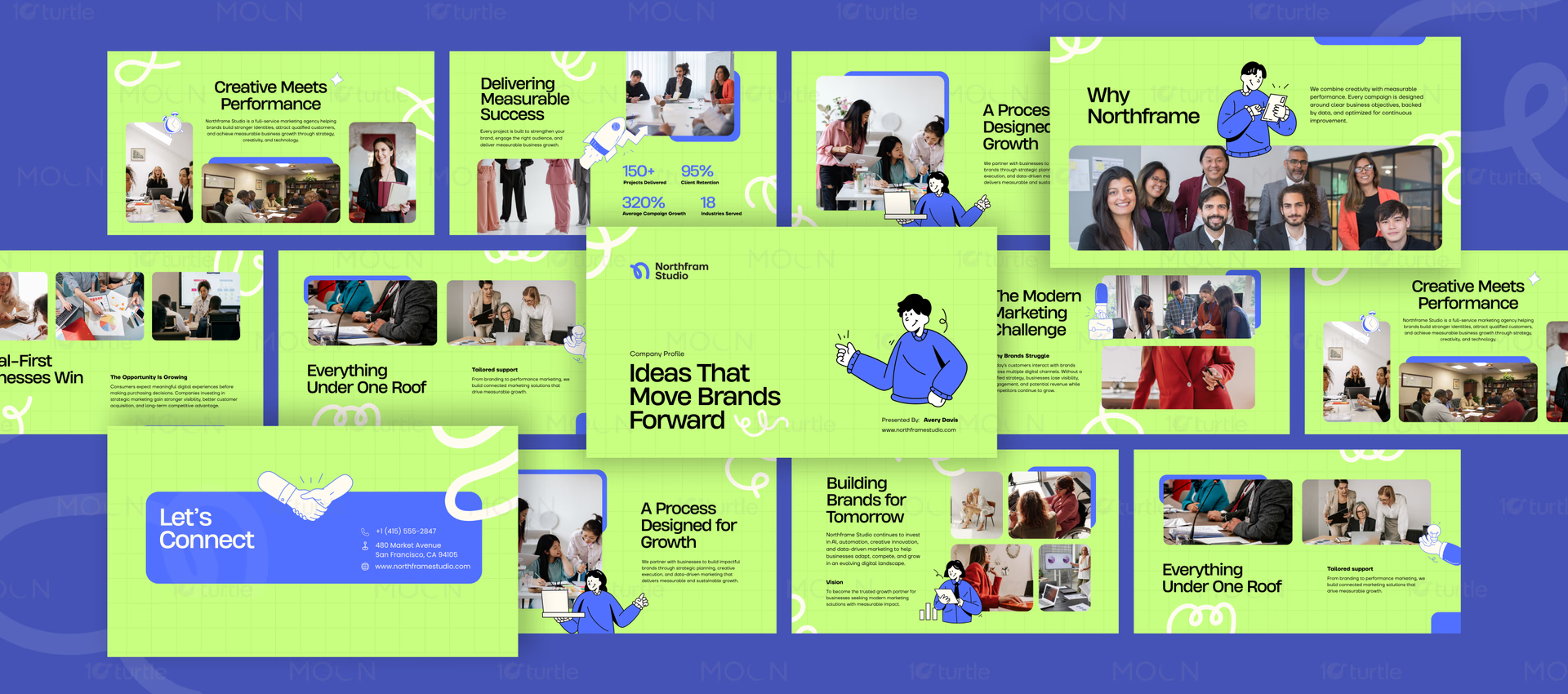
The deck uses a lime-green grid background to create consistency across every slide. Royal blue accents, rounded image containers, and bold black sans-serif headlines build a strong visual hierarchy. Business photography adds real-world context, while blue character illustrations and white scribble graphics make the slides feel approachable. The layouts balance large titles, compact body copy, statistics, contact information, and image-led storytelling.
/ Project Information
Northfram Studio is presented through a company profile deck designed to explain its marketing approach, services, process, and growth message. The slides use a high-contrast lime and blue palette, clean black typography, business photography, and simple illustration overlays to make strategic content feel approachable. With sections on challenges, performance, support, vision, and contact details, the presentation fits a modern marketing studio speaking to businesses that need visible, measurable brand growth.