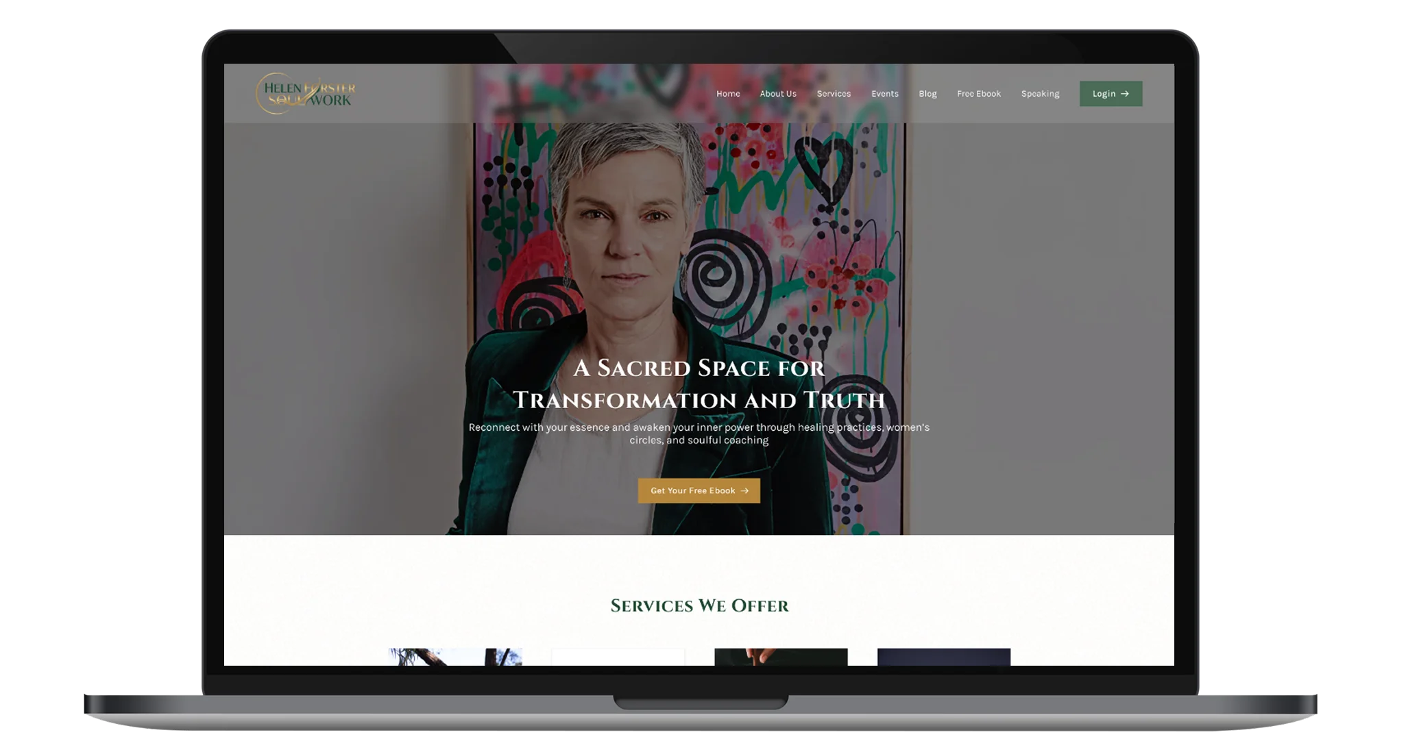
Helen Forster Soul Work: Transformational Coaching
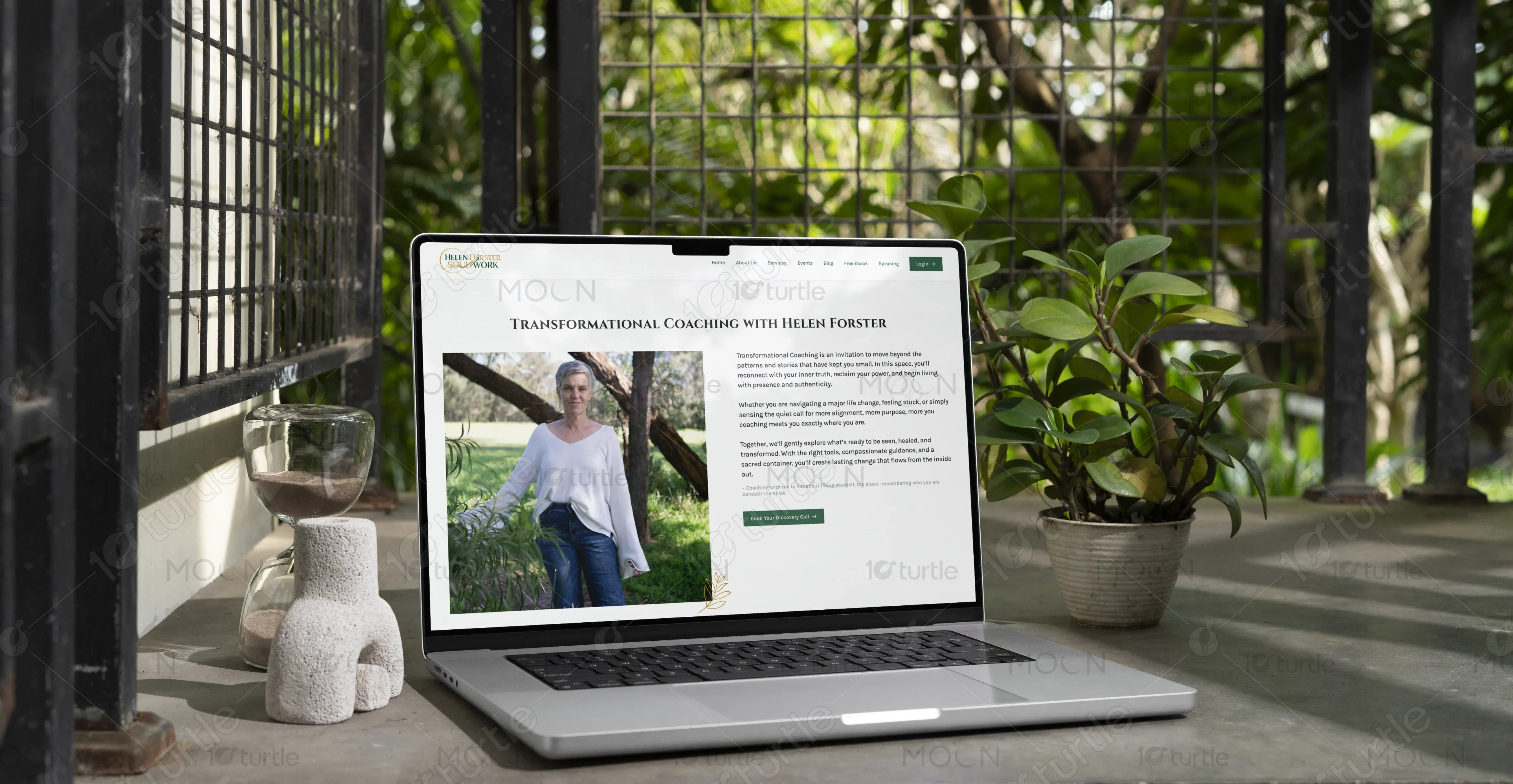
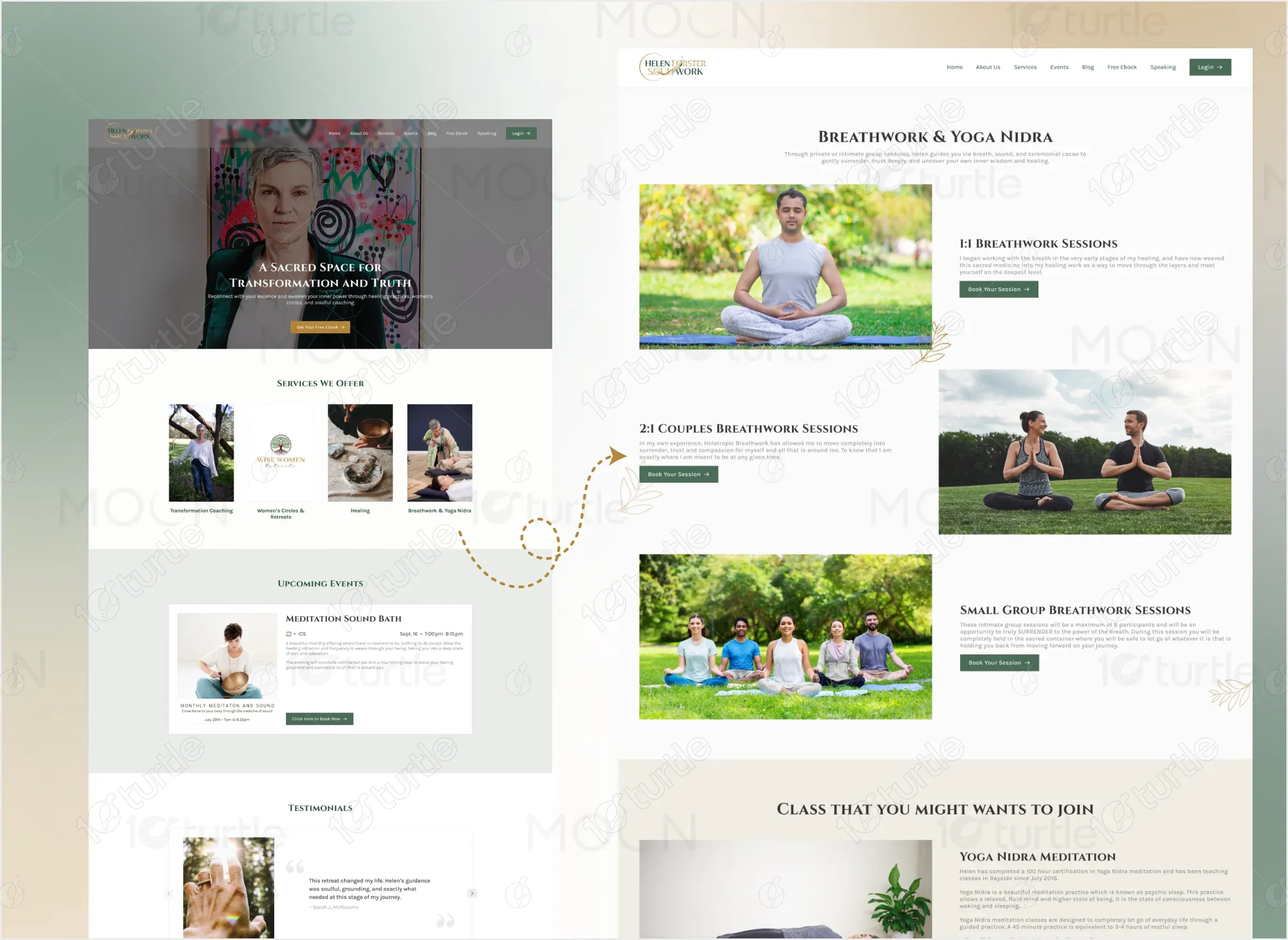
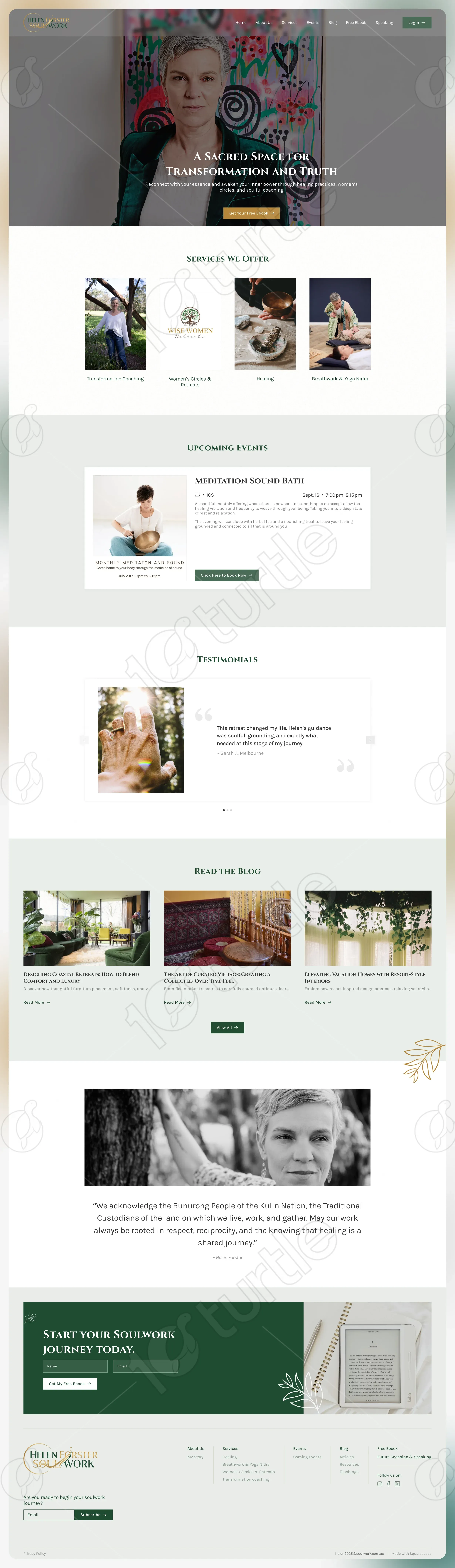
The design of the "About Us" page is centered around the personal journey and transformative nature of Helen Forster's work. The layout is clean and minimalist, focusing on the personal connection between Helen and the visitors. A balanced use of images and text creates a welcoming atmosphere, inviting visitors into the journey of healing and transformation.
Project Focus
UX/UI Design
Website Design
Industry
Healthcare & Wellness
Tools we used


Project Completion
2025
OVERVIEW
The "About Us" page uses a harmonious design with soft colors and spacious layouts, reflecting the soothing, transformative nature of the brand. The page highlights Helen Forster’s story with elegant typography and visual elements that align with the brand's identity. It creates a sense of warmth and trust, providing the audience with an intimate view of the brand’s essence.

Industry
Healthcare & WellnessWhat we did
User ResearchUI UX DesigningPlatform
-PROBLEM
Visitors were not getting a clear, emotionally engaging introduction to Helen Forster’s soul work and philosophy.
SOLUTION
The page now tells the story of Helen’s journey and the services provided in a direct, personable manner, incorporating visuals that deepen the narrative. This creates a stronger emotional connection, enhancing the website’s overall conversion potential.
CLIENT'S DESIGN VISION
How can we make the "About Us" section feel more personal and inviting to visitors?
The answer was to use a combination of soft, earthy tones, personal imagery, and a heartfelt story to convey authenticity. The goal was to make the visitor feel invited into a personal journey of healing and transformation.


LOGO
The logo for Helen Forster Soul Work features an elegant, timeless design that represents healing and personal transformation. The color palette used in the logo, combined with its sophisticated yet approachable font, aligns with the holistic and nurturing nature of the brand.
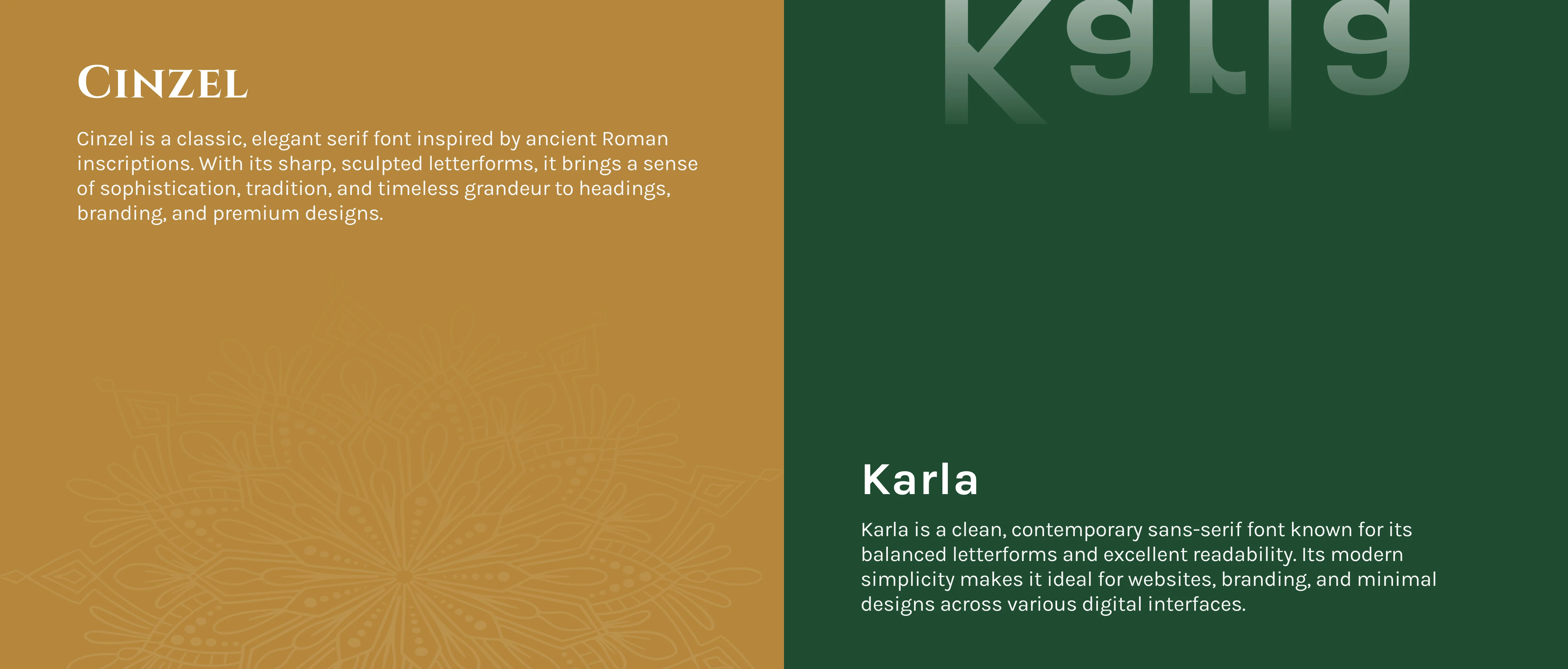
TYPOGRAPHY
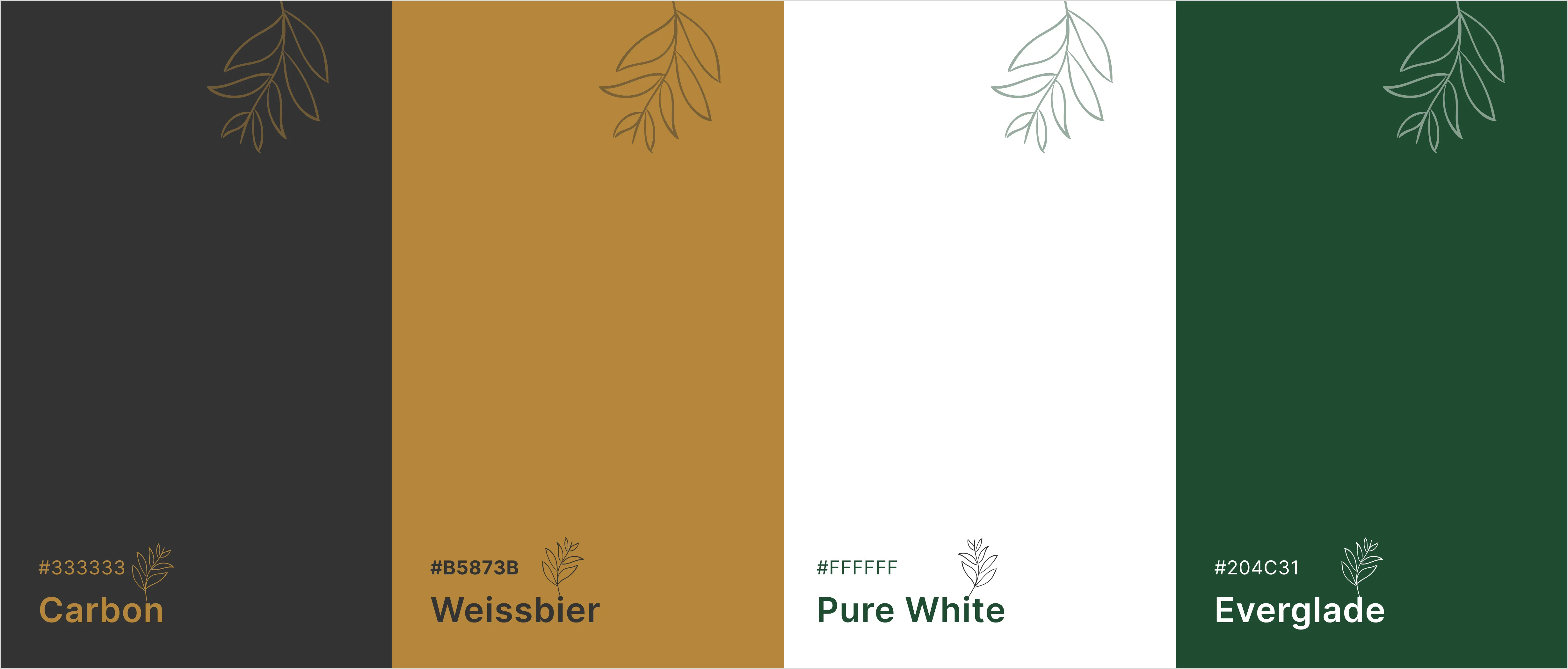
COLOR PALETTE
The color palette is a calming blend of earthy greens and soft neutrals, invoking a sense of peace and balance. These colors reflect the nurturing and grounded nature of Helen’s work, while also maintaining a modern aesthetic that is both professional and approachable.
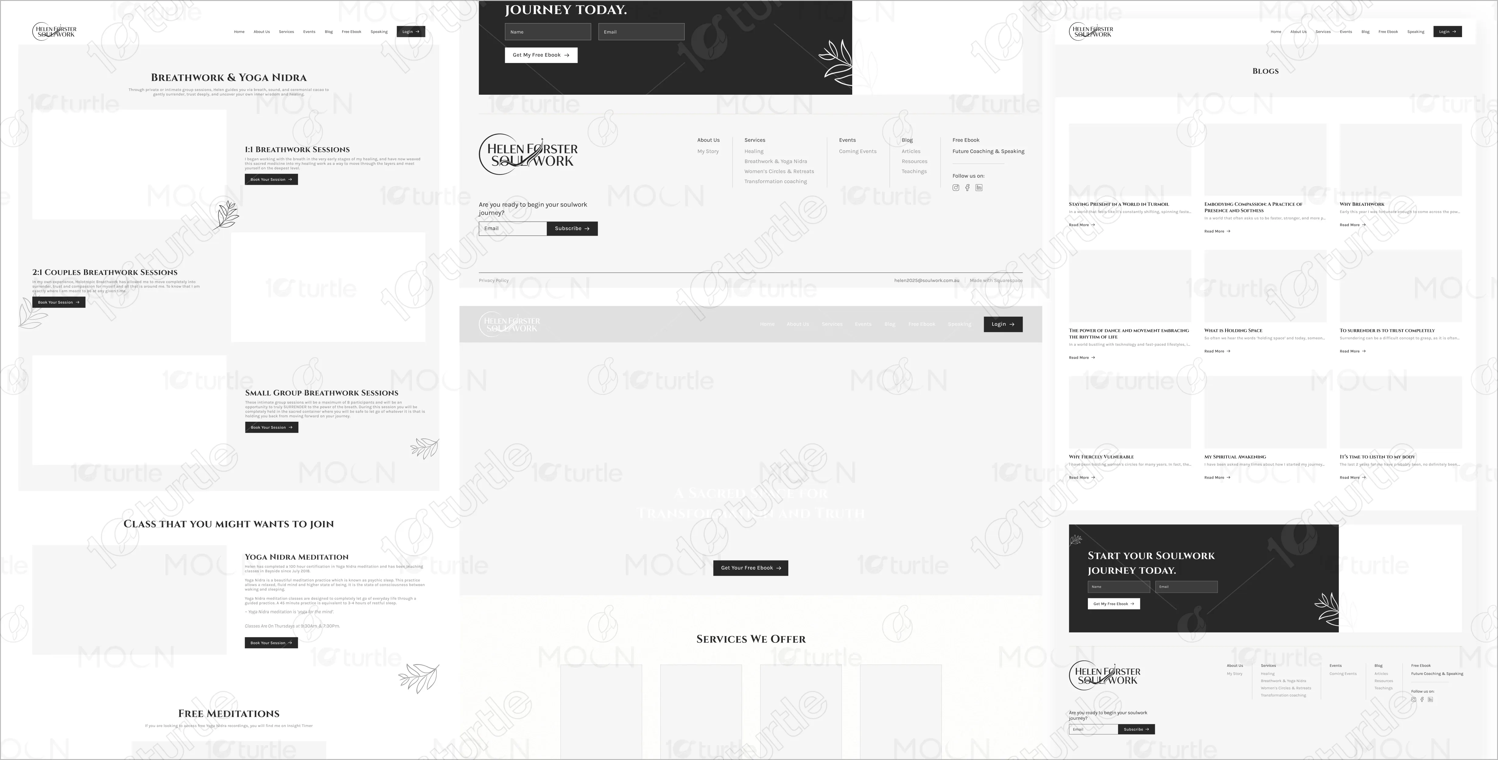
WIREFRAME
The wireframe features a simple layout with a top navigation bar, followed by a clear visual flow that moves from Helen's story to the services offered. Each section is well-defined, ensuring that visitors can easily navigate and engage with the content.
Let’s connect