
Art Book Design Case Study
A gallery-style book exploring abstract works, layered textures, and visual imagination.
The Challenge
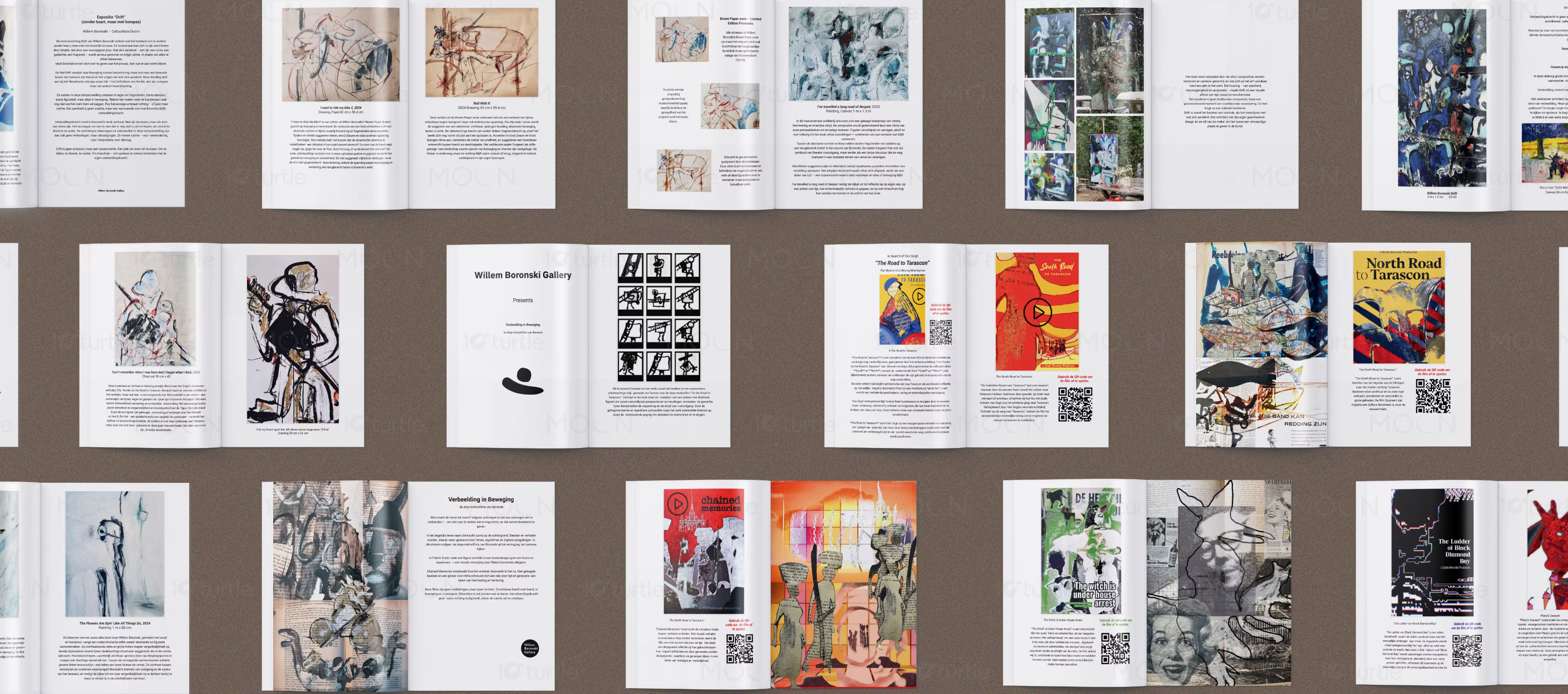
Art catalogues often struggle to balance visual impact with written context. In this design, the artworks include expressive brushwork, layered textures, abstract forms, charcoal marks, red line details, and mixed-media surfaces, which could easily feel crowded if overdesigned. The challenge was to present a large body of work clearly while keeping the focus on the artwork. The catalogue also needed to connect paintings, drawings, print editions, and stop-motion film references within one consistent visual system.
The Solution
The design uses a clean white page structure that allows each artwork to sit as the main visual focus. Large image placements are paired with simple italic captions, artwork titles, dates, medium details, and descriptive text blocks. The outer cover creates a strong first impression through oversized gold “DRIFT” typography, white “EXPOSITE” text, black artist name, and cropped abstract artwork. QR-code sections add a practical link between the printed catalogue and the artist’s stop-motion film work.
/ Project Information
Drift Exposite is a fine-art exhibition catalogue for Willem Boronski, built around abstract paintings, mixed-media drawings, Brown Paper Series works, and stop-motion film projects. Its purpose is to present the exhibition in a clear gallery format while preserving the raw energy of the artworks. Large image-led pages, white backgrounds, black captions, QR-code film references, and bold cover typography make it suitable for collectors, gallery visitors, curators, art buyers, and online audiences.