CRM Dashboard: Enhancing Sales Pipeline Management
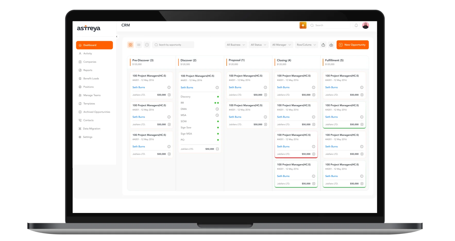
The CRM Dashboard was designed to streamline sales pipeline management, improve visibility into sales opportunities, and enhance decision-making for business managers. With an intuitive interface, the platform enables users to track leads, monitor deal progress, and manage sales operations efficiently.
Project Focus
UX Design
UI Design
Research
Website Design
Industry
Professional & B2B Services
Tools we used

Project Completion
2024
Overview
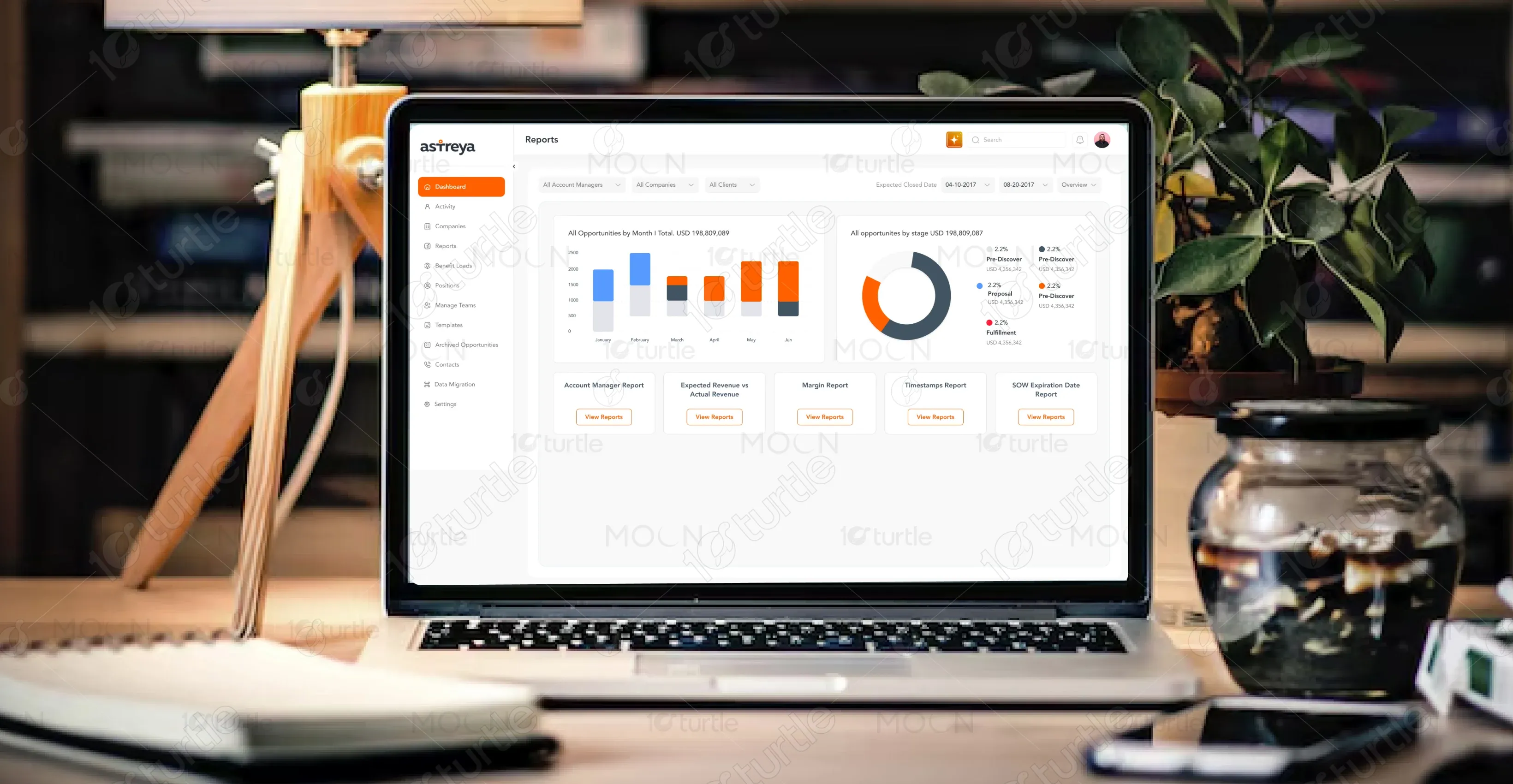
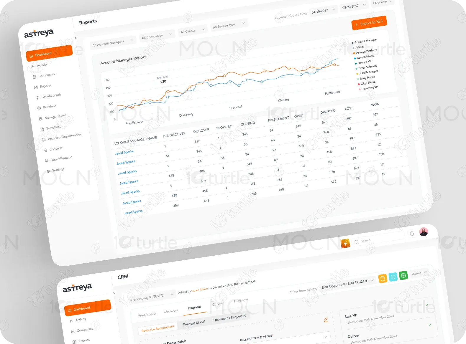
The client required a robust CRM solution that would simplify opportunity tracking, enable quick deal assessments, and facilitate smooth communication within sales teams. The project focused on developing a dashboard that visually represents the sales process in a structured manner. The key objectives included enhancing user engagement, providing real-time updates, and ensuring that all sales-related information is easily accessible.
Industry
Professional & B2B ServicesWhat we did
User ResearchUI UX DesigningDashboard DesignPlatform
-Problem
Sales teams often struggle with inefficient workflows, unclear sales tracking, and a lack of real-time insights. Traditional CRM systems can be overly complex, leading to underutilization and mismanagement of sales data. The need for an intuitive dashboard that provides clear, actionable insights was critical to overcoming these challenges.
Solution
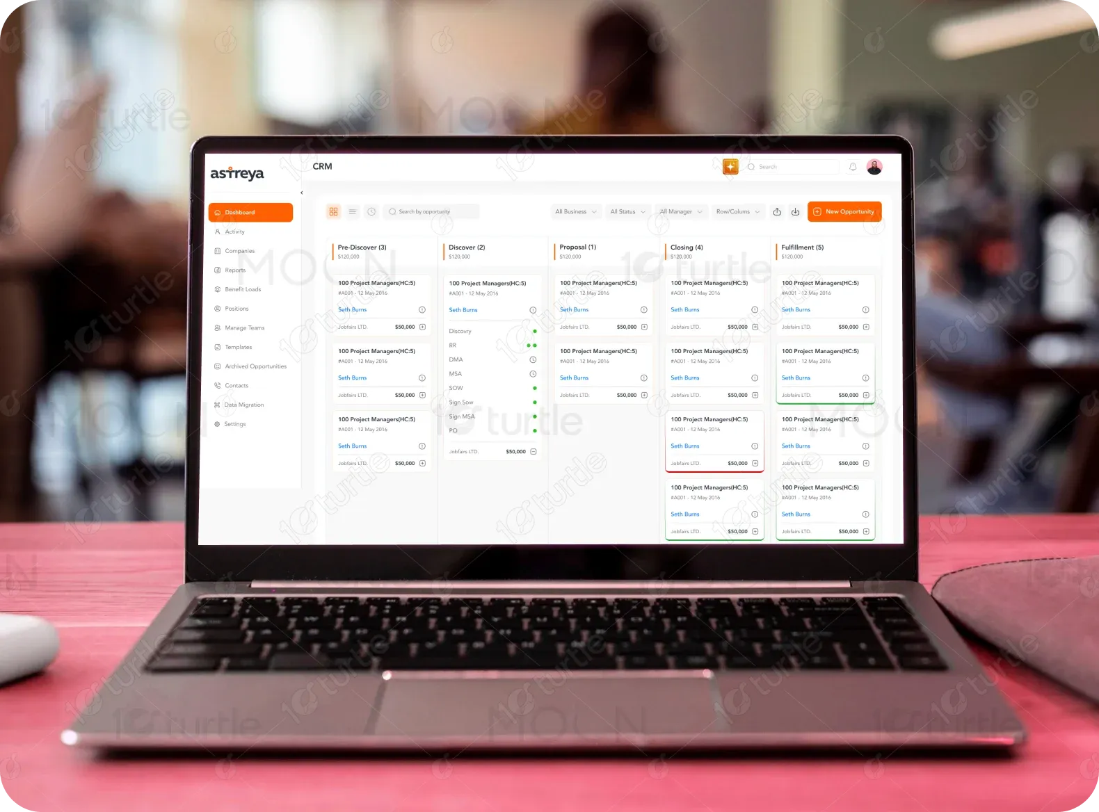
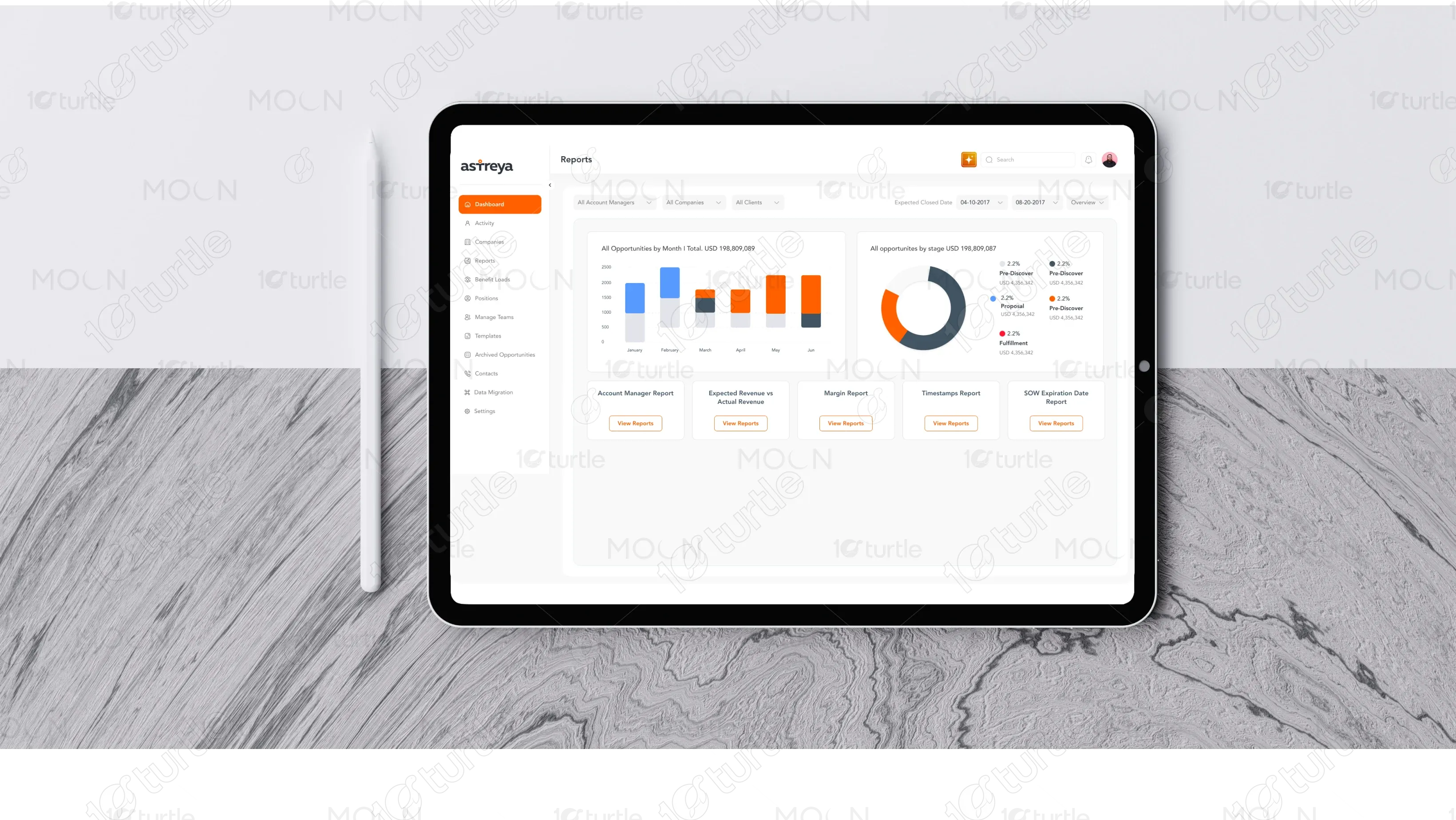
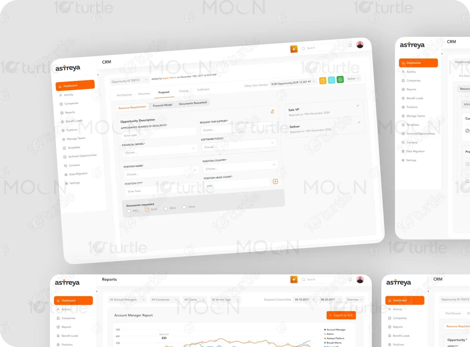
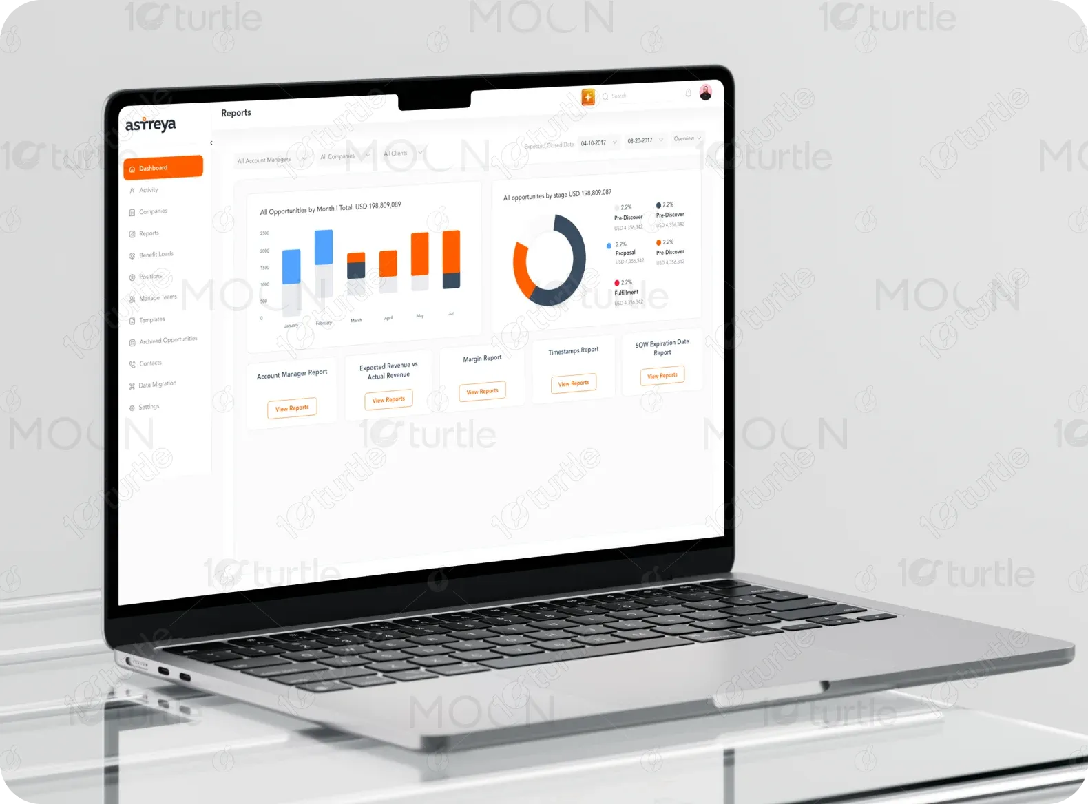
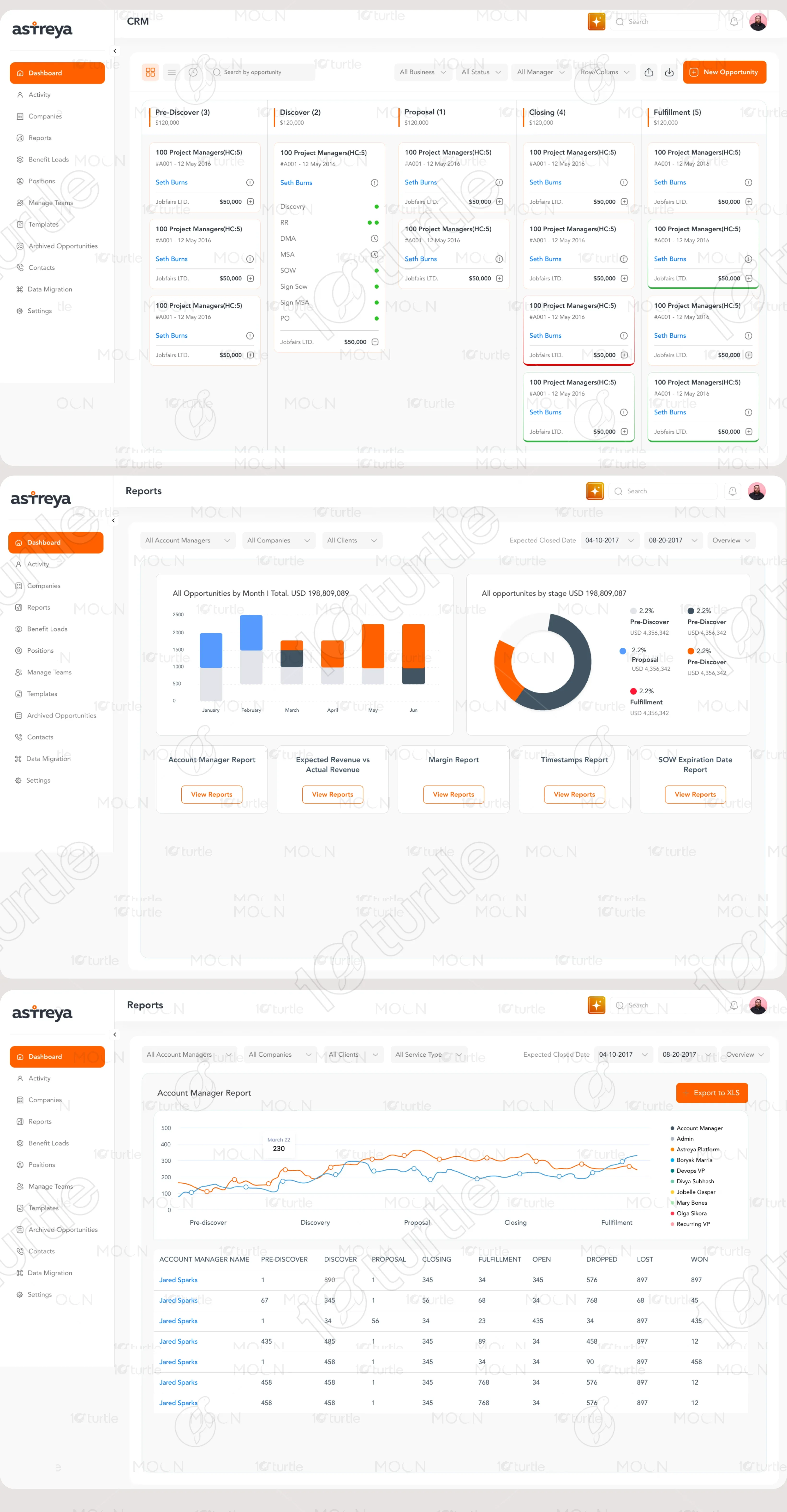
To address these issues, we developed a clean, responsive, and highly interactive dashboard that organizes sales opportunities into various stages—Pre-Discover, Discover, Proposal, Closing, and Fulfillment. Each stage displays critical information, such as deal value, assigned manager, and progress indicators. The dashboard integrates filtering options, quick access to client details, and clear visual cues for priority deals, ensuring sales teams remain informed and proactive.
Client’s design vision
How do we simplify the Sales ?
The client aimed for a sleek and modern UI that minimizes clutter while maximizing usability. The core design principles included high readability, an organized column layout, and clear visual distinctions between different deal stages. A key question guiding the design process was: How can we make deal tracking as intuitive and actionable as possible for sales teams? This led to a structured, Kanban-style interface with real-time indicators and status updates that empower sales teams to act promptly.
LOGO
The CRM Dashboard branding maintains a clean, corporate identity with a simple yet professional logo. The design reflects efficiency and reliability, aligning with the platform’s goal of enhancing sales operations.
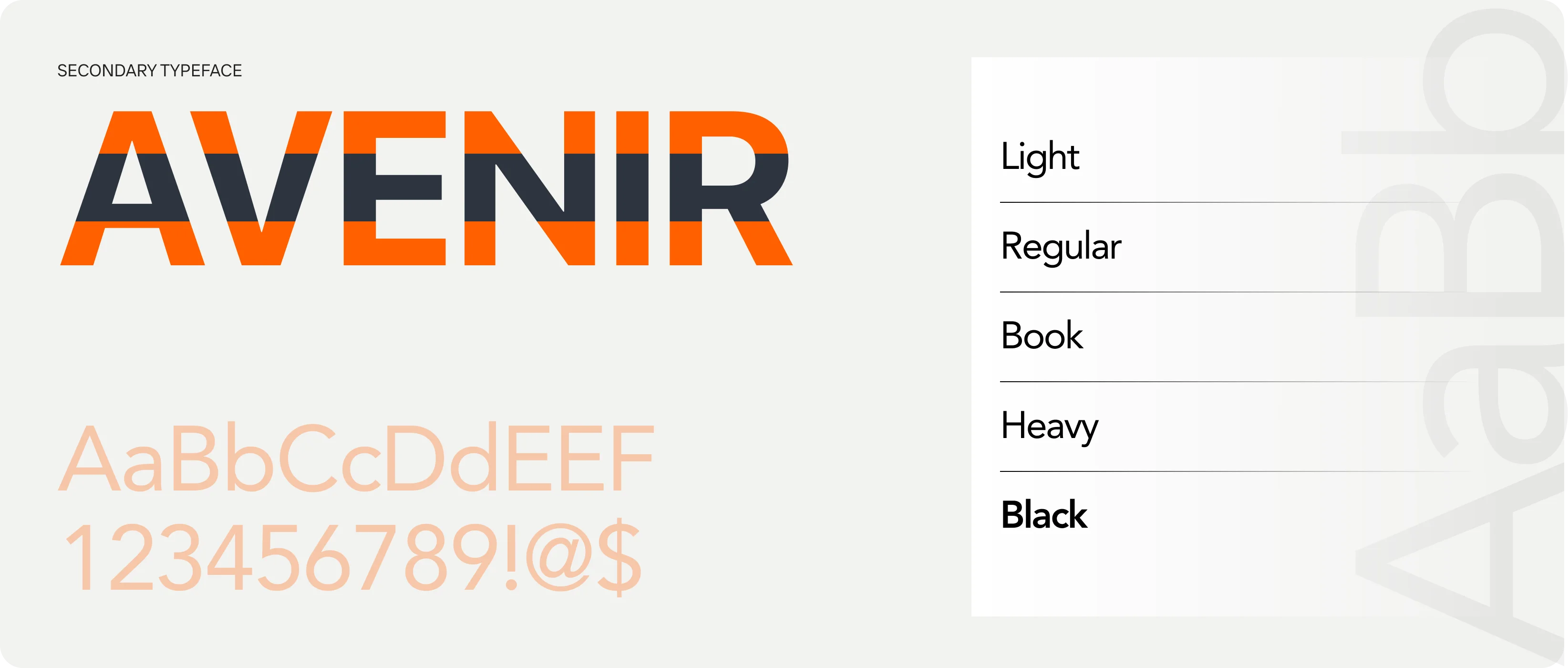
Typography
Color Palette
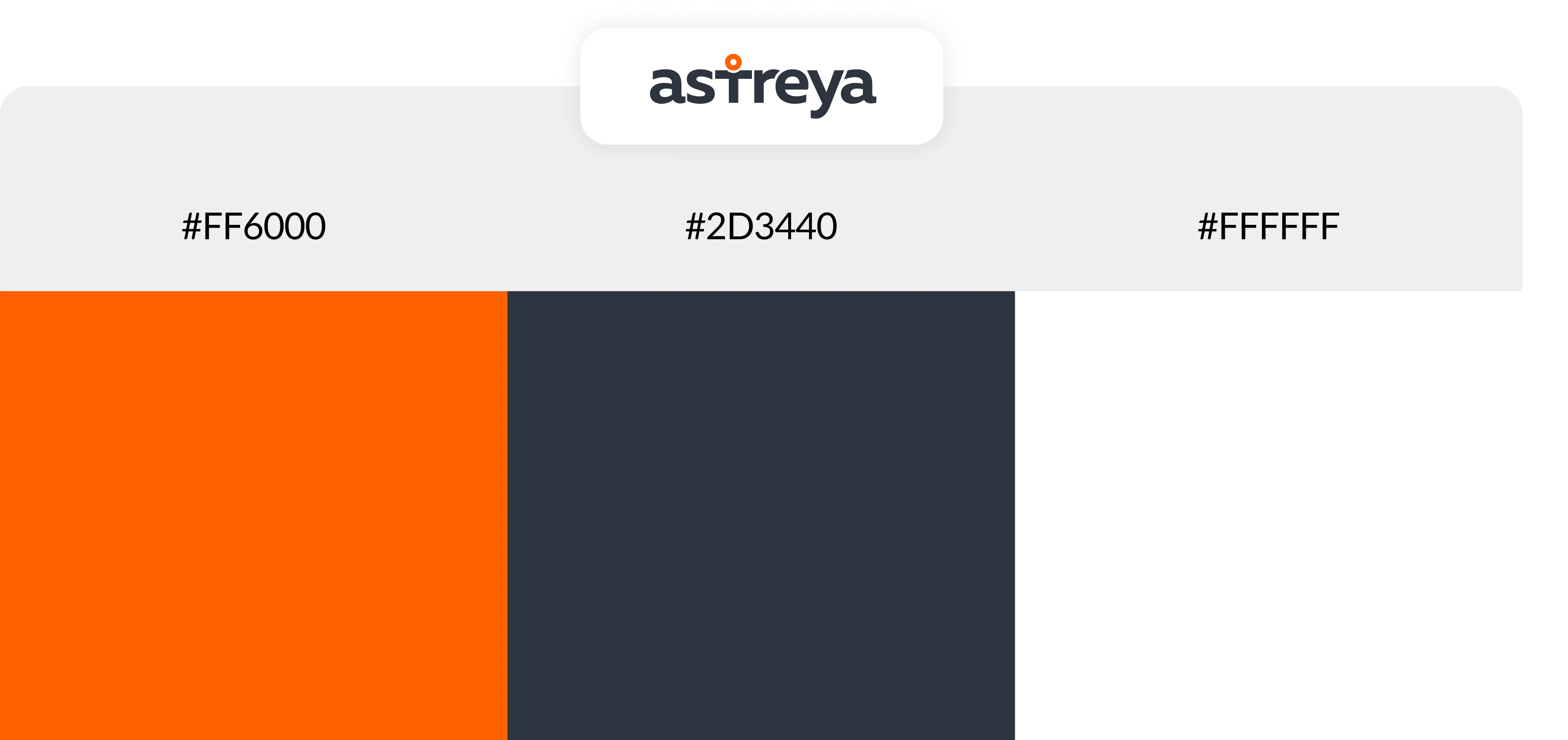
The color scheme is designed to balance clarity with a professional aesthetic. The primary color is orange (#FF6600), used for key action elements like buttons and alerts, reinforcing urgency and actionability. Neutral grays (#F5F5F5, #B0B0B0) are used for backgrounds and secondary text to maintain a clean and structured interface. Green (#28A745) and Red (#DC3545) are incorporated for deal status indicators, ensuring users can quickly assess the status of opportunities.
Wireframe
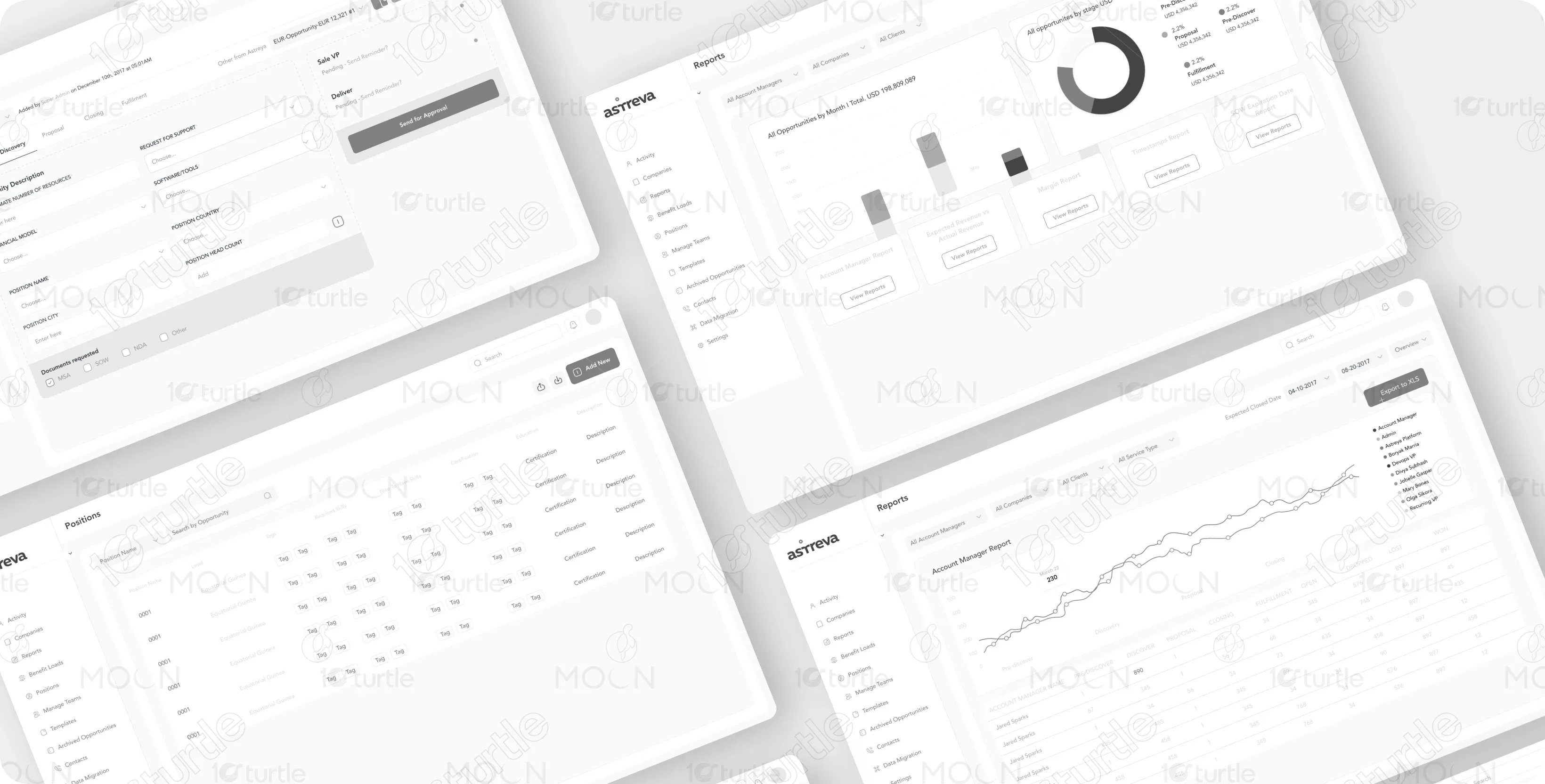
Before finalizing the design, we created wireframes to establish a logical layout and ensure user-friendly navigation. These initial prototypes helped refine the visual hierarchy and improve usability, ultimately leading to an intuitive and engaging user experience.
Let’s connect