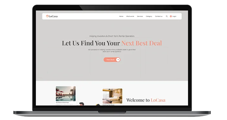
LoCasa – Connecting Investors with Profitable Property Opportunities.
LoCasa is a real estate solutions platform dedicated to connecting property investors and landlords with high-return opportunities. From market research to negotiation, the brand offers a comprehensive service that streamlines property acquisition and management.
Project Focus
UX Design
UI Design
Research
Websites Design
Industry
Real Estate & Property Investment
Tools we used

Project Completion
2024
OVERVIEW
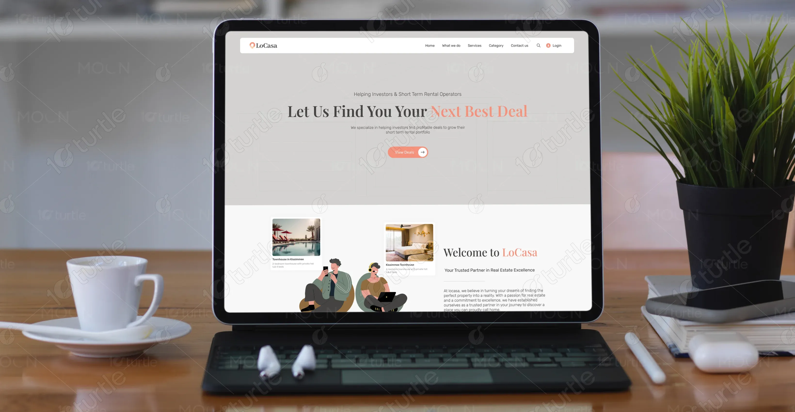
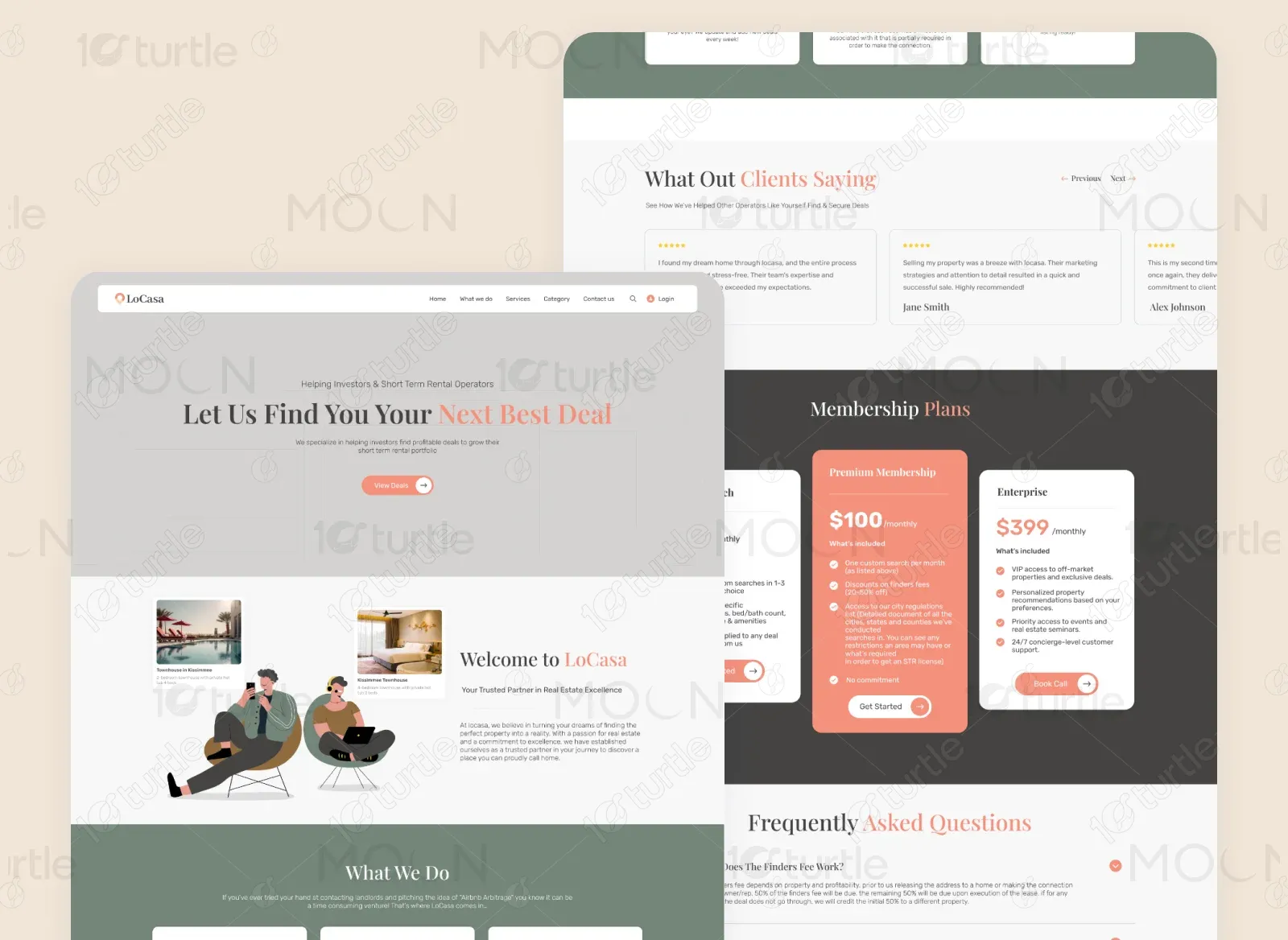
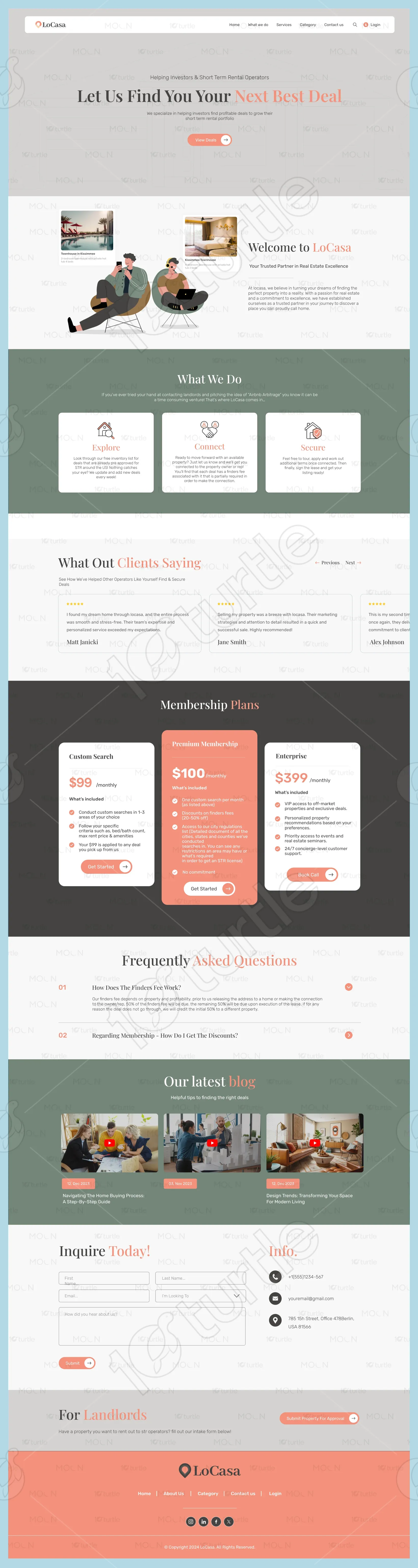
The project’s goal was to design a clean, modern, and trustworthy website that speaks directly to investors and property operators. LoCasa wanted a platform that would not only showcase their services but also act as a lead-generation tool. The scope included branding, UI/UX design, service presentation, and integration of easy-to-navigate membership and inquiry systems.
Industry
Real Estate & Property InvestmentWhat we did
User ResearchUI UX DesigningResponsive ExperiencePlatform
-PROBLEM
Investors and short-term rental operators often struggle to find reliable, profitable deals without sifting through hundreds of listings. They needed a centralized, trustworthy source that could filter and recommend properties aligned with their investment goals.
SOLUTION
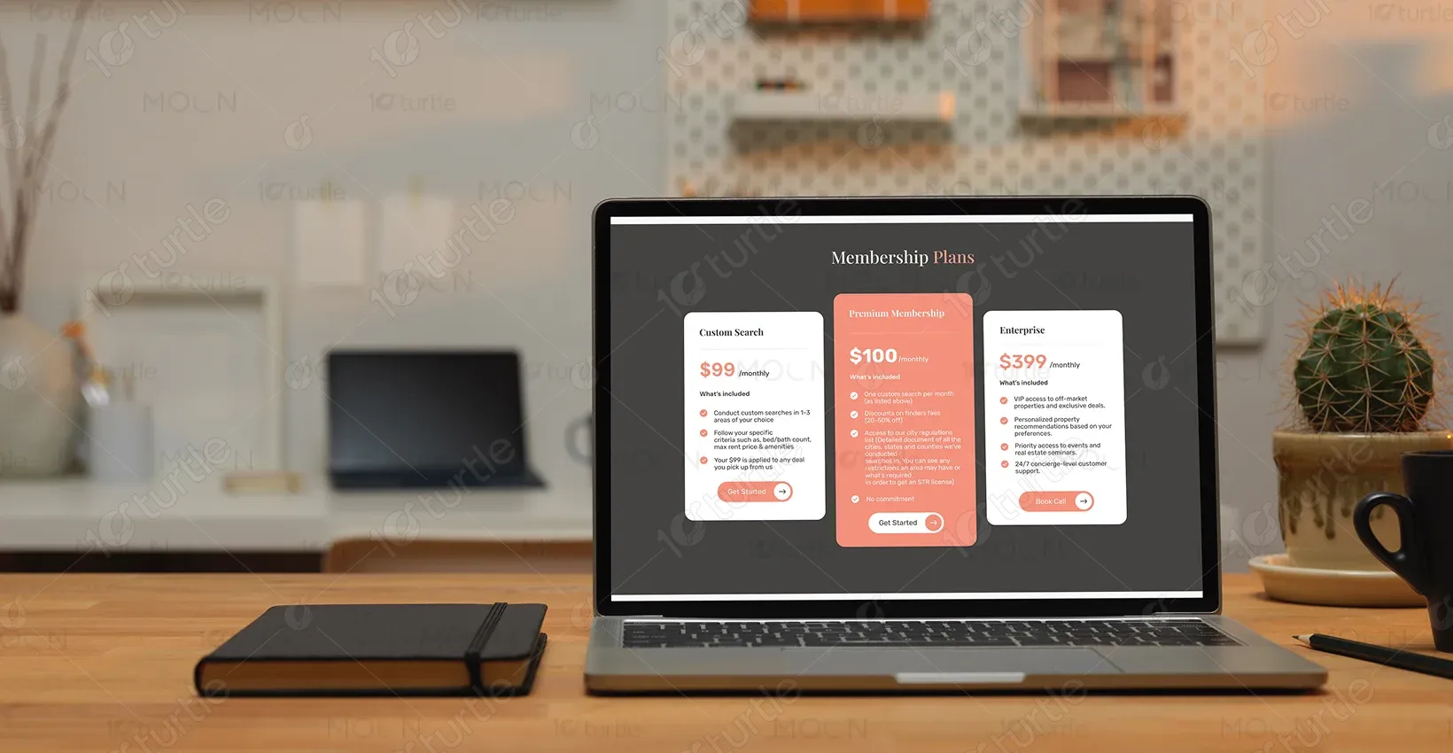
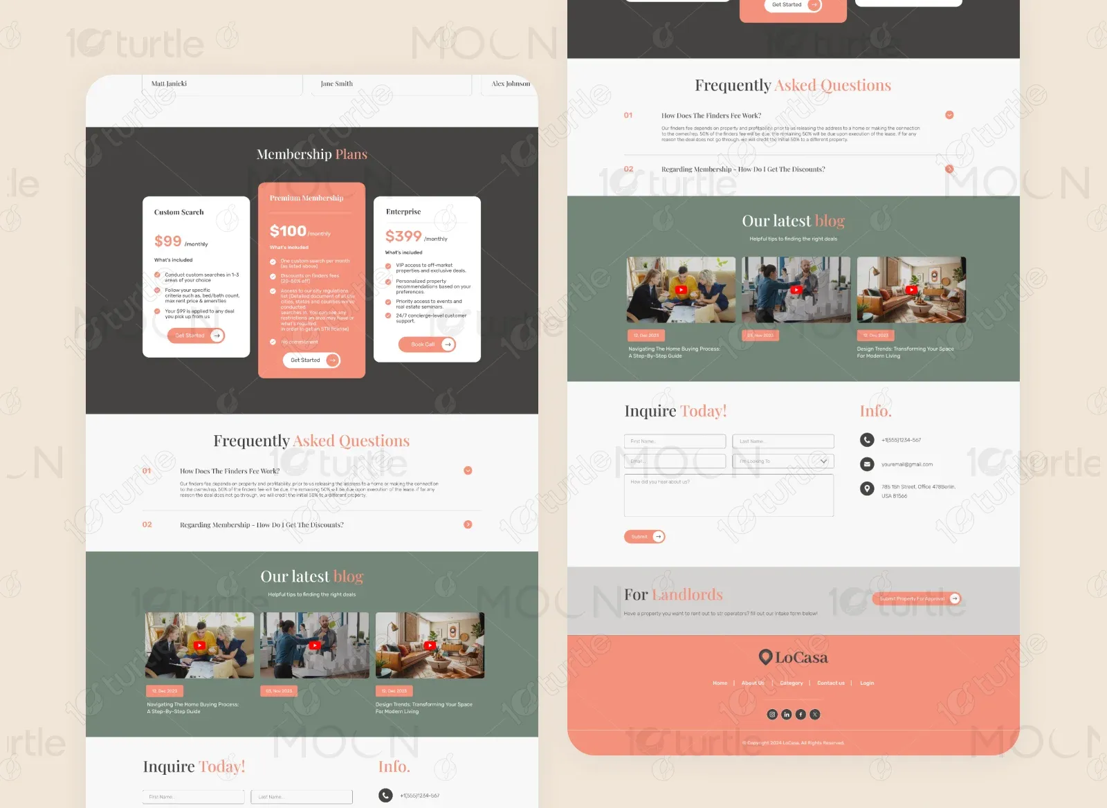
We developed a streamlined website experience that highlights LoCasa’s expertise, trustworthiness, and value. The design uses a calm, professional color palette to convey credibility, while clear CTAs guide visitors toward memberships, consultations, or inquiries. Membership tiers and client testimonials reinforce trust and value.
CLIENT'S DESIGN VISION
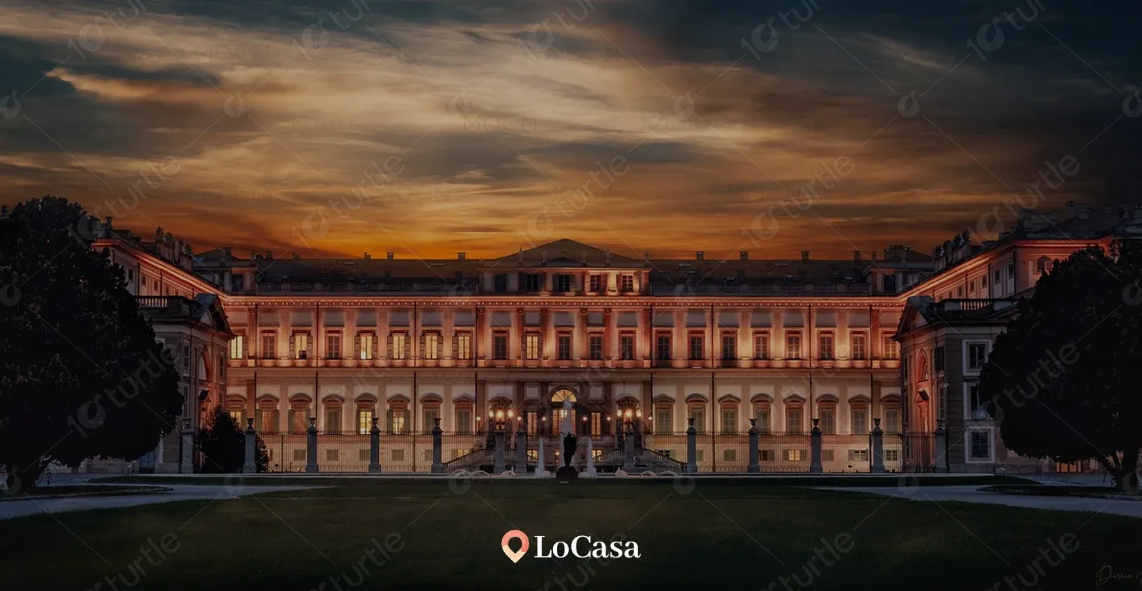
Creating a platform where modern real estate expertise meets warm, approachable elegance.
Creating a platform where property investors can easily connect with vetted, high-return real estate opportunities. The client envisioned a professional yet welcoming design that balances sophistication with approachability, inspired by minimalistic real estate brands with clean layouts and intuitive navigation.
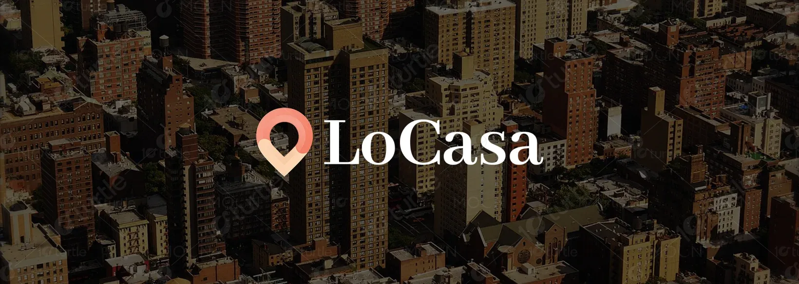
LOGO
The LoCasa logo combines a modern sans-serif typeface with a warm orange icon, representing energy, trust, and opportunity in the real estate sector. The symbol subtly conveys location and home imagery, reinforcing the brand's focus.
TYPOGRAPHY
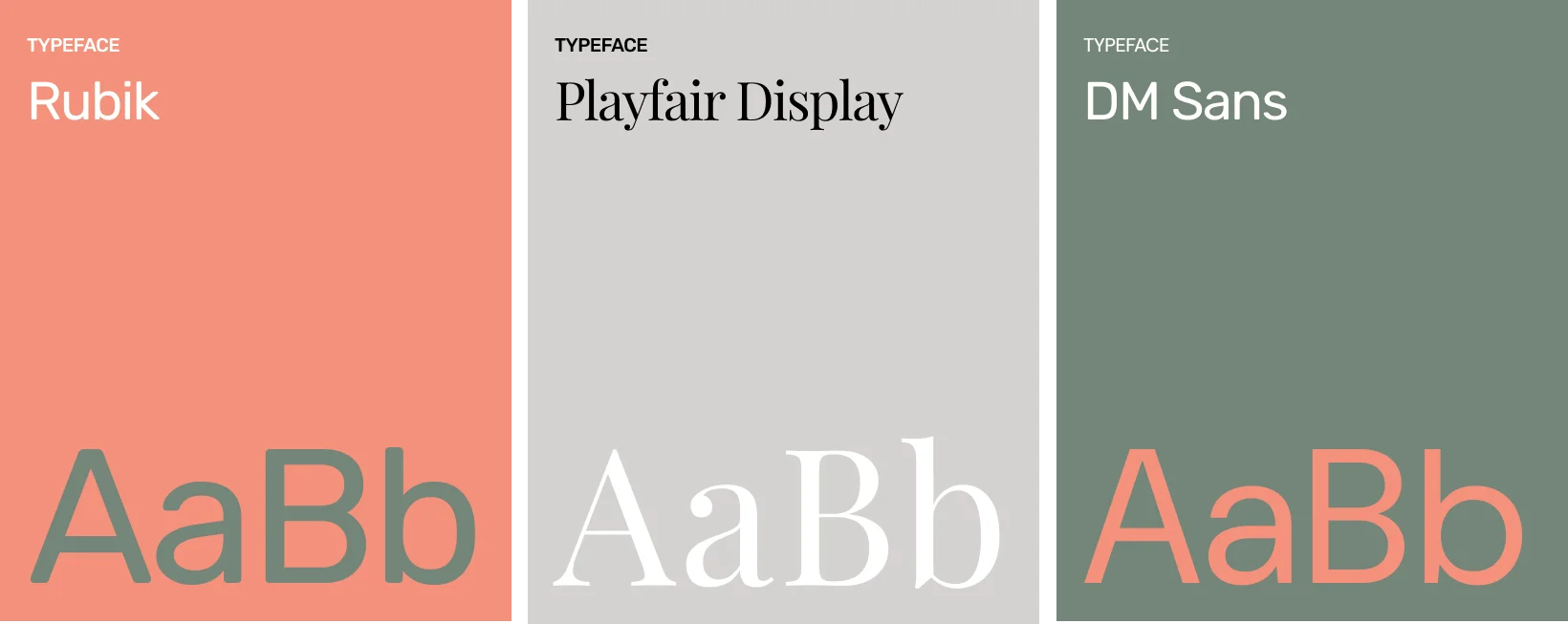
COLOR PALETTE
Your color palette blends warm (#F5917C) for approachability and energy, charcoal gray (#D4D3D1) for sophistication, light sage (#748579) for balance and calm, and white (#FFFFFF) for clarity and openness. Together, they create a modern, inviting aesthetic that feels both professional and personable, perfect for building trust in a real estate brand.

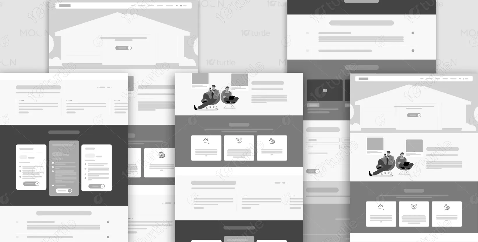
WIREFRAME
The wireframe focused on a simple hero section with a direct tagline and CTA, service highlights in a three-column grid, a testimonial slider for social proof, and a membership section to encourage conversions. The design intentionally minimized clutter to ensure focus on the key selling points.
Let’s connect