
Home / Blog / Logo Design Process: What Happens From Brief to Final Files
Logo Design Process: What Happens From Brief to Final Files
Discover the logo design process from the initial creative brief to final file delivery. Learn how research, concept development, revisions, and file preparation help create a professional logo that reflects your brand identity.
14 Oct, 2026
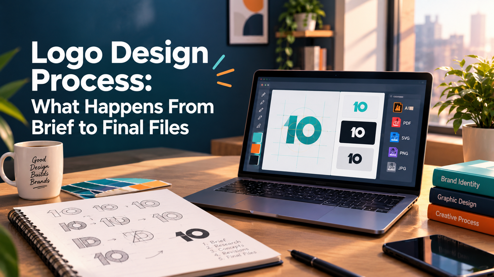
A logo project looks simple from the outside. You share a business name and a few preferences, and a mark appears. In practice, the result depends on what happens in between: how clear the brief is, how concepts are tested, how feedback is handled, and which files you receive at the end. This guide walks through the logo design process stage by stage, so you know what to prepare, what to expect from a designer, and what to check before you approve anything.
What to prepare before the brief starts
Most delays in a logo project begin before any design work does. Gather the basics first: your business name and any tagline, what you sell, who buys it, and two or three competitors you want to look different from.
List every place the logo will appear. A logo that only needs to sit on a website header has different demands from one that goes on packaging, signage, invoices, social profiles, and pitch decks.
Decide who approves the work. One decision maker, or a small group with one person holding the final say, keeps feedback consistent.
Stage 1: The creative brief
The brief turns preferences into criteria the design can be judged against. A useful brief covers your audience, how you want to be positioned, the tone you want to project, where the logo will be used, and any constraints such as required colors or a long business name.
References help most when you explain what you like about them. “I like how this mark stays readable at a small size” gives a designer something to work with. “I like this logo” does not.
A vague brief tends to produce revision loops later, because nobody agreed on what success looks like.
Stage 2: Research and direction
Before sketching, a designer should look at your category and your competitors. The aim is to find what is already crowded and where a distinct position is available.
This is also where the type of logo gets decided. Common directions include a wordmark (the name set in custom or carefully chosen type), a symbol, a combination of both, or a monogram built from initials.
It helps to separate the logo from the wider brand identity. The logo is one asset. A brand identity also covers color, typography, imagery, and the rules for using them together. If you need that wider system, the project scope changes, and the work involved in brand identity design goes well beyond a single mark.
Stage 3: Concept development
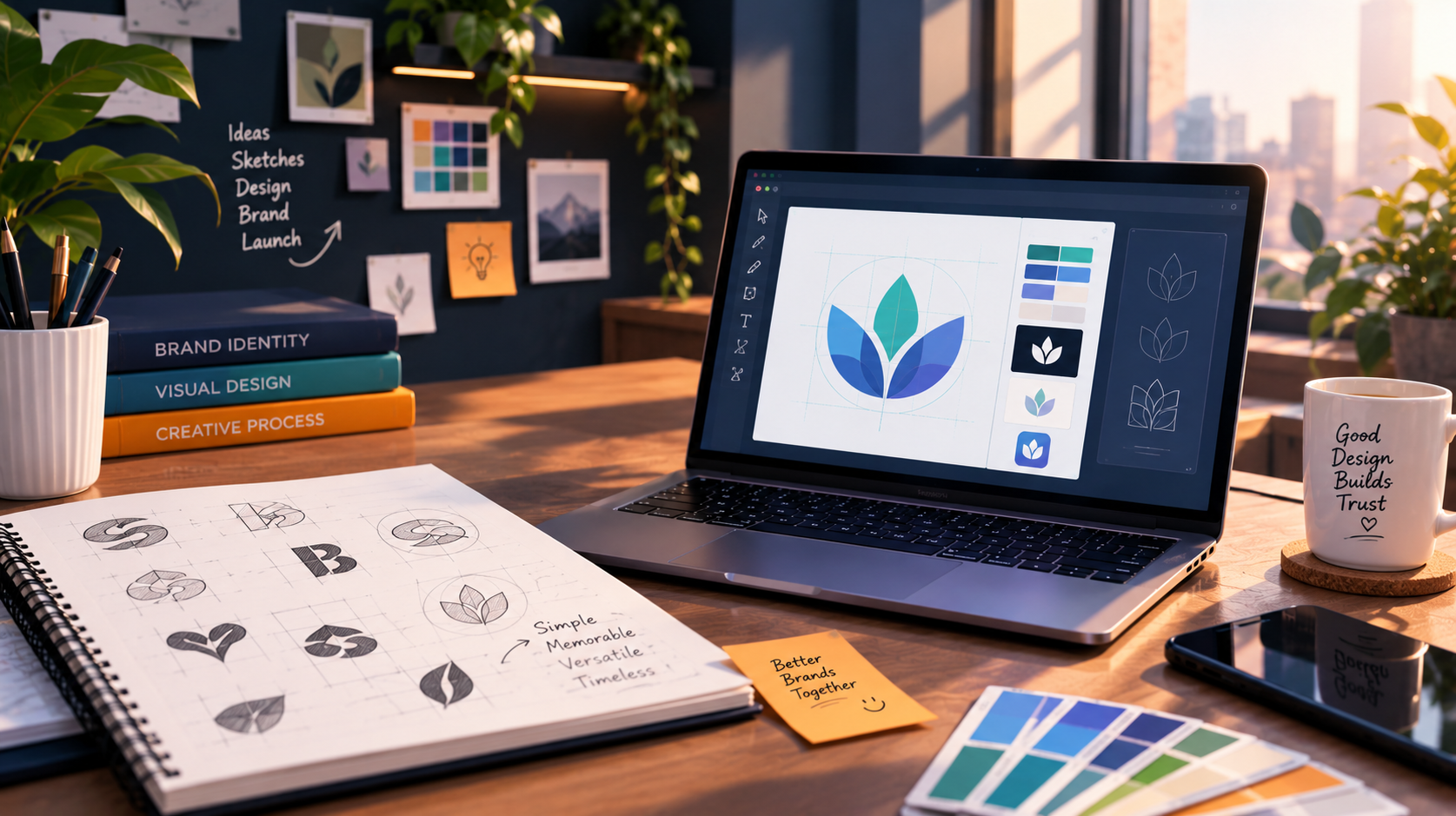
Concept work usually starts as rough sketches and moves to digital drafts. Good designers test early concepts in black and white first, because a mark that depends on color to work is usually weak.
They also check each concept at small sizes and on both light and dark backgrounds. A detailed symbol that looks impressive on a large mockup can turn into a smudge as a social avatar.
The number of concepts varies by provider and scope. Ask about it before the project starts, and ask whether fewer, better-researched concepts are part of the approach.
Stage 4: Presenting concepts and giving feedback
Concepts should be presented with reasoning that connects back to the brief, not just as a set of images. Your feedback should do the same.
Useful feedback names the problem instead of prescribing the fix. “This feels too playful for our audience” gives the designer room to solve it. “Make the font bigger and change the blue” does not.
Collect feedback from your approval group into a single set of notes. Conflicting comments from five people are the fastest way to stall a project. Asking friends or social followers to vote is rarely helpful, because they have not read the brief.
Stage 5: Refinement
Once a direction is chosen, refinement covers spacing, proportions, letterforms, color values, and alternate layouts. This is detailed work, and it is where a logo starts to look professional.
Agree on the number of revision rounds before the project starts, and agree what counts as a revision. A change of direction at this stage usually means going back to the brief, which has scope implications. Treat that as a conversation, not a surprise.
Stage 6: Final files and what to ask for
The handover is where many projects disappoint. Ask what you will receive and confirm it in writing. A practical checklist:
- Vector master files, such as SVG, EPS, AI, or PDF, which scale to any size
- Transparent PNG files for web and digital use
- A JPG version for situations that do not support transparency
- Color variations: full color, one color, black, and white for dark backgrounds
- Horizontal and stacked layouts, where the design supports them
- An icon or favicon version, and square versions for social profiles
- A short usage guide listing color values (HEX, RGB, CMYK), fonts, minimum size, and clear space
Also ask who owns the final artwork and whether any typefaces used need a separate license. These points are worth confirming in the agreement before the project begins, and a lawyer can advise on contract specifics.
Common mistakes in the logo design process
- Starting design before agreeing who approves
- Judging a concept only on a polished mockup instead of at real sizes
- Following a visual trend that will look dated quickly
- Asking about file formats only at the end
- Treating the logo as a finished brand, when it is one part of a larger identity
What to check after delivery
Open the vector files in more than one program to confirm they work. Place the logo in your website header, test the favicon in a browser tab, and print a small version to check legibility. Confirm the white version works on your darkest brand color.
Then look at consistency. Logos often arrive well and then drift, with old versions on social profiles, outdated decks, and mismatched colors on the website.
This is where 10turtle’s structure is relevant. Branding and web are handled by dedicated specialist teams, coordinated under one accountable partner, so the people preparing your logo files and the people applying them to a website are working from the same direction. If you already have a logo and are unsure how consistently it appears across your digital presence, 10turtle’s free audit includes a review of brand consistency among other areas.
Frequently asked questions
How long does the logo design process take?
It depends on how clear the brief is, how many concepts are developed, how quickly feedback is returned, and whether the work is a logo only or a wider identity. Ask your provider for a written schedule with feedback milestones, because most delays come from slow approvals rather than design time.
How many logo concepts and revisions should I expect?
This varies by provider and project scope, so agree it in writing before work starts. Also ask what counts as a revision. A small adjustment to spacing or color is different from a change of direction, which may mean returning to the brief.
What files should I receive at the end of a logo project?
At minimum, expect vector master files, transparent PNGs, and color variations including one color, black, and reversed for dark backgrounds. A favicon or icon version and a short guide covering colors, fonts, and minimum size are also worth requesting before the project begins.
What is the difference between a logo and a brand identity?
A logo is a single mark that identifies your business. A brand identity is the wider system around it, including color palette, typography, imagery style, and rules for how they work together. Many businesses start with a logo, then extend it into a fuller identity as they grow.
_1_11zon-1762758103181.webp)